


James opened with a solid update on momentum across several fronts (01:13). Membership functionality is now working end-to-end — signing up, paying for things, and a pay-what-you-can system have all been figured out, described as a "fun breakthrough." A smart access system tied to subscription status is functioning on both the back and front end. The Webflow [tag="webflow"] build is actively in progress, with James taking over directly from a team member who fell ill, noting that moving fast himself is actually better at this stage given the number of important architectural decisions involved in building each element for editability and future scalability.
The team is targeting the prototype being ready for a new wave of testers within the next couple of days, with front-end UI included (53:10). Mariko flagged that getting people into the prototype is a priority given that it's now March, and the team agreed to aim for something showcase-ready for the core team meeting on Thursday.
[technology="Custom Membership System"]
James demonstrated the current Stripe [tag="stripe"] integration, showing a working text-field input for custom payment amounts that routes through a familiar Stripe checkout — supporting Link, Amazon Pay, and other methods (18:35). Michael Shaun shared an earlier design concept featuring a two-screen slider approach: the first screen offering a suggested range (e.g., $15–$20/month) with a secondary option for users who need a lower tier, framed as a "scholarship" rather than a discount. The team responded positively to this framing.
Additional ideas surfaced in the discussion:
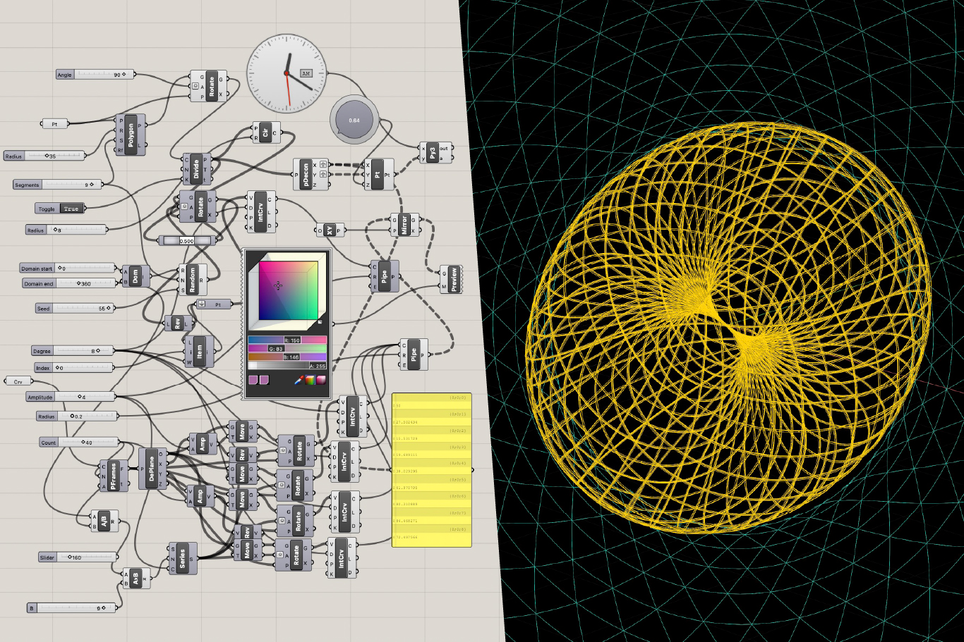
James also showcased a working wave-amplitude slider prototype he built, where predefined moments shift the wavelength visually — a component that could translate directly into the payment UX (19:47).
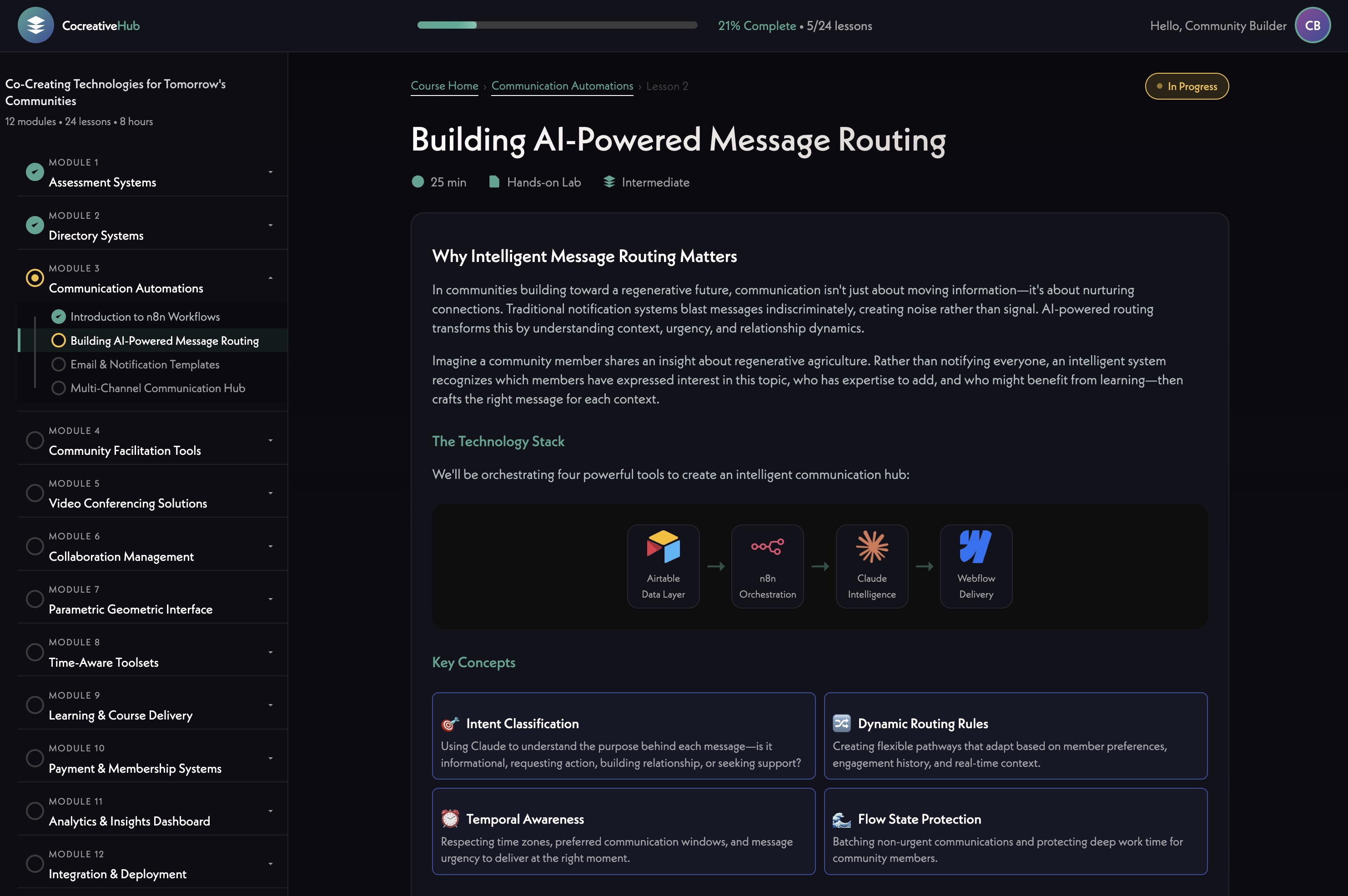
[technology="Communication Automations"]
A newer version of the globe interface was shared, featuring animated lines rising over the sky, a wrap/unwrap animation on the globe itself (described as "hologram-like"), and nation borders being added so users can better orient to where community members are located (21:29). The team responded enthusiastically — Michael Shaun called it "a big hit."
Design notes on the globe:
[technology="Parametric Geometric Interfaces"]
Michael Shaun shared detailed feedback on the redesigned icon set for the Engine for Good framework (02:54). The core concern: icons should be readable without words — a viewer should be able to glance and understand the concept. The prior AI-generated set was acknowledged as generic (money bags, bar graphs), while the newer designs trend abstract but lose communicative clarity.
Specific feedback by icon:
The order of icons was also updated following a session with Laura, now sequenced to tell a more logical story: Holons Form → Take Action → Fuel the Engine → Prove Impact → Fun to Work.
Mariko added a useful reframe: an icon that's intriguing enough to make someone stop and read can be a feature rather than a bug — reverse-engineering the psychology of fast media consumption.
The team discussed the design direction for Holon Pages, which don't yet have a dedicated design (30:50). James suggested they can borrow heavily from profile page components but feel more centered — group image in the middle, name on top, with members displayed beneath.
For member display scalability, James described dynamic circular layout scripts already built:
Mariko suggested a gold/yellow border on profile circles to distinguish admins within a Holon — not a size hierarchy, just a color signal. The team aligned on this approach.
On scope: Alliances are being deferred for now. Focus remains on individuals and groups as the core experience before adding that third layer.
[technology="Directory Systems"]
A significant portion of the meeting was spent planning the assessment engine (37:24). James demonstrated a recently built client assessment as a reference point — a multi-screen multiple choice flow that outputs 1–10 scores across five metrics, generates a spider graph, and classifies users into types. Simple, logic-based, no agentic analysis required.
The team aligned on building something similar with 5–6 domains (5 makes a pentagram shape; 6 makes a star). Michael Shaun committed to starting a shared document immediately with candidate domain names and questions.
Key design principles the team wants to apply:
Mariko advocated for including at least one fun, gift-like assessment (e.g., the numerology mandala tool) — something people would do just for the experience, that enriches their profile organically without feeling like data extraction.
James floated a longer-term vision: a garden of assessments users can choose from, with the power to decide which assessments inform their matching — so astrological or numerological inputs are opt-in rather than default.
James also shared a new version of the numerology mandala tool that builds the visual in real time as you type — the team expressed interest in integrating this into the platform (43:44).
[technology="Assessment Systems"]
[technology="Intelligent Matching Algorithms"]
Before the next wave of testers comes in, James will do a pass on existing test profiles — deleting obvious test entries while preserving any profiles where real effort was put in (53:23).
---
James Redenbaugh
Michael Shaun Conaway
Mariko Pitts
James opened with a solid update on momentum across several fronts (01:13). Membership functionality is now working end-to-end — signing up, paying for things, and a pay-what-you-can system have all been figured out, described as a "fun breakthrough." A smart access system tied to subscription status is functioning on both the back and front end. The Webflow [tag="webflow"] build is actively in progress, with James taking over directly from a team member who fell ill, noting that moving fast himself is actually better at this stage given the number of important architectural decisions involved in building each element for editability and future scalability.
The team is targeting the prototype being ready for a new wave of testers within the next couple of days, with front-end UI included (53:10). Mariko flagged that getting people into the prototype is a priority given that it's now March, and the team agreed to aim for something showcase-ready for the core team meeting on Thursday.
[technology="Custom Membership System"]
James demonstrated the current Stripe [tag="stripe"] integration, showing a working text-field input for custom payment amounts that routes through a familiar Stripe checkout — supporting Link, Amazon Pay, and other methods (18:35). Michael Shaun shared an earlier design concept featuring a two-screen slider approach: the first screen offering a suggested range (e.g., $15–$20/month) with a secondary option for users who need a lower tier, framed as a "scholarship" rather than a discount. The team responded positively to this framing.
Additional ideas surfaced in the discussion:
James also showcased a working wave-amplitude slider prototype he built, where predefined moments shift the wavelength visually — a component that could translate directly into the payment UX (19:47).
[technology="Communication Automations"]
A newer version of the globe interface was shared, featuring animated lines rising over the sky, a wrap/unwrap animation on the globe itself (described as "hologram-like"), and nation borders being added so users can better orient to where community members are located (21:29). The team responded enthusiastically — Michael Shaun called it "a big hit."
Design notes on the globe:
[technology="Parametric Geometric Interfaces"]
Michael Shaun shared detailed feedback on the redesigned icon set for the Engine for Good framework (02:54). The core concern: icons should be readable without words — a viewer should be able to glance and understand the concept. The prior AI-generated set was acknowledged as generic (money bags, bar graphs), while the newer designs trend abstract but lose communicative clarity.
Specific feedback by icon:
The order of icons was also updated following a session with Laura, now sequenced to tell a more logical story: Holons Form → Take Action → Fuel the Engine → Prove Impact → Fun to Work.
Mariko added a useful reframe: an icon that's intriguing enough to make someone stop and read can be a feature rather than a bug — reverse-engineering the psychology of fast media consumption.
The team discussed the design direction for Holon Pages, which don't yet have a dedicated design (30:50). James suggested they can borrow heavily from profile page components but feel more centered — group image in the middle, name on top, with members displayed beneath.
For member display scalability, James described dynamic circular layout scripts already built:
Mariko suggested a gold/yellow border on profile circles to distinguish admins within a Holon — not a size hierarchy, just a color signal. The team aligned on this approach.
On scope: Alliances are being deferred for now. Focus remains on individuals and groups as the core experience before adding that third layer.
[technology="Directory Systems"]
A significant portion of the meeting was spent planning the assessment engine (37:24). James demonstrated a recently built client assessment as a reference point — a multi-screen multiple choice flow that outputs 1–10 scores across five metrics, generates a spider graph, and classifies users into types. Simple, logic-based, no agentic analysis required.
The team aligned on building something similar with 5–6 domains (5 makes a pentagram shape; 6 makes a star). Michael Shaun committed to starting a shared document immediately with candidate domain names and questions.
Key design principles the team wants to apply:
Mariko advocated for including at least one fun, gift-like assessment (e.g., the numerology mandala tool) — something people would do just for the experience, that enriches their profile organically without feeling like data extraction.
James floated a longer-term vision: a garden of assessments users can choose from, with the power to decide which assessments inform their matching — so astrological or numerological inputs are opt-in rather than default.
James also shared a new version of the numerology mandala tool that builds the visual in real time as you type — the team expressed interest in integrating this into the platform (43:44).
[technology="Assessment Systems"]
[technology="Intelligent Matching Algorithms"]
Before the next wave of testers comes in, James will do a pass on existing test profiles — deleting obvious test entries while preserving any profiles where real effort was put in (53:23).
---
James Redenbaugh
Michael Shaun Conaway
Mariko Pitts
Complete Webflow front-end UI build and have prototype ready for tester access within next couple of days
Complete Webflow front-end UI build and have prototype ready for a new wave of testers within the next couple of days, with front-end UI included. Target showcase-ready for core team meeting on Thursday. James took over directly from a team member who fell ill. Discussed at 13:05 and 53:10.
Add PayPal to the payment flow for improved international accessibility
Add PayPal integration to the payment flow to support international users. James confirmed this is now easier to add given current infrastructure. Discussed at 19:30.
Implement two-screen pay-what-you-can slider design with wave animation and annual gift toggle option
Implement two-screen slider design: first screen shows suggested range (e.g. $15–$20/month) with secondary option for lower tier framed as 'scholarship'. Add wave-amplitude slider visual with increasing amplitude per Mariko's suggestion, annual gift toggle ('double the impact by making your gift annual'), and integrate James's working wave-amplitude slider prototype into the payment UX. Discussed at 16:43 and 19:47.
Refine Collaborative Commerce icon with fewer lines, slight rotation, and container framing element
Simplify Collaborative Commerce icon per Michael Shaun's feedback: reduce lines from 5 to 3, apply a slight off-angle rotation, and add a container or framing element. Current design feels too complex, like a Christmas tree with upward energy. Must remain consistent in style with full icon set. Discussed at 24:50.
Redesign Fun to Work icon to replace money bag concept with a new approach
Fun to Work icon needs a full rethink — money bag must go. Current concept does not communicate the intended idea. Team agreed it needs a completely new direction. Must remain consistent with full icon set style. Discussed at 24:50.
Apply gold border indicator to Holon admin profile circles to distinguish admins within a Holon
Add gold/yellow border on profile circles to distinguish admin members within a Holon page display. Not a size hierarchy — just a color signal. Team aligned on this approach at 34:41 as part of Holon page design discussion. Mariko suggested the gold border concept.
Build scalable dynamic circular layout for Holon Pages with molecule-style member packing beyond 13 members
Build dynamic circular member display layout for Holon Pages: up to 13 members arranged symmetrically in a single circle; beyond 13 members, two concentric layers packing like a molecule. James described scripts already built for this. Group image centered, name on top, members displayed beneath. Alliances deferred for now. Discussed at 34:41.
Fix numerology assessment model/API issue and explore integrating real-time mandala builder into the platform
Fix the numerology assessment which needs a model/API update. Also explore integrating the new real-time mandala builder (which builds the visual as you type) into the platform as an engagement and profile enrichment tool. Team expressed strong interest in this integration at 43:44. Discussed at 38:07.
Clean up test user profiles before next tester wave, preserving profiles with real user input
Do a pass on existing test profiles before next wave of testers — delete obvious test entries while preserving any profiles where real effort was put in by users. Discussed at 53:23.
Have front-end prototype ready to showcase to core team by Thursday meeting
Ensure prototype is showcase-ready for the core team meeting on Thursday. Mariko flagged this as a priority given it is now March. Target is something the core team can meaningfully interact with and evaluate. Discussed at 54:22.
Create and share assessment domains document with 5-6 candidate domains and multiple draft questions per domain
Michael Shaun committed to starting and sharing a shared document immediately with 5-6 candidate domain names and multiple draft questions per domain for team review. Assessment should have more candidate questions than needed so team can cull weak ones. Spider graph output with 5 domains makes pentagram shape, 6 makes a star. Discussed at 40:52.
Frame assessment questions as spectrum and identity-based rather than evaluative to minimize test-taking bias
Assessment questions should use spectrum/identity-based framing — 'does this sound like you or not?' rather than 'how good are you at this?' — to minimize bias similar to MMPI/Myers-Briggs problem where people answer how they want to appear. Should be completable in 10 minutes or less. Questions should feel neutral and interesting. Discussed at 48:29.
Hold internal review of assessment domains document with Hera before sharing more broadly with team
Michael Shaun to hold internal review with Hera Rose before socializing the assessment domains document more broadly with the full team. Discussed at 52:43.
Review and provide copy for onboarding flow document Hera started
Mariko to review and provide copy for the onboarding flow document that Hera started. Discussed at 35:37.
Contribute fun and gift-like assessment concept ideas for profile enrichment to assessment brainstorm
Mariko advocated for including at least one fun, gift-like assessment (e.g., the numerology mandala tool) — something people would do just for the experience, enriching their profile organically without feeling like data extraction. Mariko to contribute these concepts to the assessment brainstorm document Michael Shaun is creating. Discussed at 41:56.
Coordinate Thursday core team update meeting and prepare to showcase prototype progress
Mariko to coordinate the Thursday core team update meeting and prepare to showcase prototype progress. Team agreed to aim for something showcase-ready for the core team meeting on Thursday. Discussed at 53:50.
Custom membership system architecture for user authentication, progress tracking, and database management using Supabase for backend. Requirements include real database for user progress (not cookies), journal entry capture, API triggers for membership status and course purchases, and progress tracking across sessions. Decision made to build custom solution on Supabase rather than Member Stack. Includes Stripe integration for subscription management and automatic access revocation when subscriptions lapse. Multiple products may connect to same membership tier with bundled offerings granting multiple memberships from single purchase. Part of Phase One development with $16K-$29K budget. Requires hiring Supabase specialist for implementation. Timeline aligned with LMS development for February 10th launch. Authentication spike will establish foundation with Supabase login functionality on MAST template, implementing user profiles, password management, and session handling. System will sync membership status between Stripe and Supabase for automated access control. Backend successfully operational with membership login and content gating complete using Supabase and Stripe. Profile editing integration in progress to connect with directory system. Backend approximately 90% complete with primary goal to deliver working version on Holomovement site for team testing this week allowing account creation, login, and profile data editing. Front end minimal at this stage consisting mainly of login pages until profile pages developed. Profile creation flow now implemented as linear step-by-step process requiring profile completion before directory access. Sign-up flow includes friendly nudges for empty bios when hitting next, optional social profiles with language like 'you can always come back later' to reduce drop-off, loading screen during profile generation with engaging copy like 'making connections', AI-generated banner images based on user bios, and light/dark mode toggle inheriting system settings by default. System enforces profile completion to ensure data quality and prevent half-finished accounts cluttering database. Dark backgrounds use deep teal rather than pure black, light mode avoids stark white to maintain Holomovement brand feel. Simplified pill-style member modal implemented with collapsed/expanded states showing two lines by default, expanding on hover to reveal icons for messages, Holons, and light/dark mode toggle. Notifications aggregate into single indicator on Holon icon with changing number rather than multiple dots. Three profile image preview styles (circle, square, doorway/vertical) included in signup flow to ensure photos work across all use cases. In-app messaging system now live using custom-built architecture with no per-message cost, styled similar to iMessage with unread message counts, conversation threading, and future group chat capability. Email notifications handled via Resend - free up to 3,000 emails/month, then $20/month for up to 50,000. Holon management flow improved with clear delegation model between members and admins using invitation system rather than automatic adds. Location automation uses lightweight AI call to convert entered location into coordinates for near real-time map updates. Saving bug affecting profile updates, feedback, and location syncing identified and resolved during meeting. Community consent flow being added as pop-up on first messaging use with scrollable community agreements and required checkboxes covering non-partisanship, anti-spam, entity usage rules, and conduct standards. GDPR compliance considerations noted with Webflow plugin available for data erasure rights and cookie consent. Pay What You Want contribution system now under active development with slider UI allowing users to select suggested range ($15-$20/month) with secondary scholarship tier option for lower amounts. Two-screen approach framed as gift rather than discount with wave-based slider visual showing increasing amplitude. System includes familiar Stripe checkout supporting Link, Amazon Pay, and other methods. PayPal integration planned for better international accessibility. Working wave-amplitude slider prototype built with predefined moments shifting wavelength visually, translatable directly into payment UX. Prototype ready for core team testing within next couple days with front-end UI included. Thursday core team meeting target for showcase. Modal menu interface introduced featuring compact notification/settings control with light mode toggle - described as small detail that meaningfully elevates experience. Three developers now working on Webflow implementation: Sean (Ohio, senior), Siam (Pakistan, junior), with Ivan handling less bandwidth due to outside client work. Profile creation, editing, and regeneration flows confirmed working as of 03-31 meeting. Profile creation link added directly to member modal enabling re-run of full onboarding flow. Core team onboarding structured as daily feature drip starting with profile creation. 03-31 crash test revealed critical blocking issues preventing core team demo: n8n automation pipeline failing to complete profile data processing reliably, social links not saving due to LinkedIn field dependency, AI-generated cover image and tagline entering loop state without completing, JSON input error halting holon creation mid-flow, logout bug on holon detail page, light mode broadly non-functional requiring toggle to be hidden entirely, profile content fields not populating after form submission. Team consensus: crash test failed, reconvening following day to retest after critical fixes. Zero tolerance for processes locking up or halting before core team demo - visual imperfections acceptable but no mid-flow stoppage permitted. Hubcast partnership introduces potential single sign-on integration explored with developer Emilio Lopez enabling seamless profile creation handshake between broadcast access and Holomovement App reducing friction for new users discovering platform via livestream. Profile creation becomes the access ticket for global broadcast viewers immediately placing them inside ecosystem where they discover collaboration features. System now functional and operational with core team beginning onboarding process (meeting 05-04). Post-Wave deployment successful with members actively using platform. Critical gaps identified in 06-16 meeting: users cannot delete accounts (GDPR violation with European user base), users cannot remove themselves from Holons, stewards cannot remove members, automatic member addition on Holon creation needs approval workflow, privacy controls needed for Holon visibility, homepage globe displays names/locations without explicit opt-in requiring visibility toggle, cookie consent banner required for European compliance, Stripe webhook test-mode errors surfacing. Account deletion and member management now top cleanup priorities.
Strategic enhancement of directory system integrating with membership capabilities to enable member profile management, progressive assessment completion, and intelligent matching. Members can log in and edit their profiles directly with information stored in Supabase for flexible content management. Progressive engagement model starts with basic five-minute setup (name, website, purpose statement, location), then enables detailed assessments later. Each completed assessment adds profile elements and unlocks features including AI-generated visual representations (icons, tarot archetypes, numerology graphics). Integration with Claude AI enables sophisticated queries like 'who should I collaborate with on this project?' or 'who can provide funding?' across network assessment data. Advanced features include weekly emotional mapping interface with six-axis emotional space (excitement, nervousness, grief, etc.) aggregating into community climate visualizations. Reimagined map interface using flat Earth projection with layered filtering showing member locations, funding flows, collaborative connections, project relationships. Multiple view modes from simplified default to complex multi-layered 'Arcturian' views. Integration with Engine for Good grant program where applications link to member profiles, creating incentive structure for profile completion. Team pivoted to prioritize directory system over LMS development. Player card approach focuses on game-like profiles emphasizing what someone is doing (project/mission) and what help they need for AI-powered matching. System summarizes lengthy inputs into concise scannable formats. MVP launch target February 15 with login capability, profile editing, and integrated assessments. Beta testing program follows to identify next priority features. Critical development discussion revealed MapBox visualization provides initial visual interest but limited practical value beyond local connections - intelligent matching algorithms represent the true 'killer app' rather than map visualization. Profile data strategy shifting from personality assessments to actionable information: developmental stage, experience level, current project involvement, specific skills, and active needs. Visual consistency issues identified with user-uploaded images requiring standardization. Question emerged whether Holons function as independent entities or collections of individual members, requiring data architecture decisions. Simplified terminology 'members and groups' proposed over 'Holons' for newcomer clarity. Basic intake form planned capturing development level, experience, life stage, purpose, and current needs as primary assessment for matching foundation. Player card UI concept introduced featuring icons to symbolize key information, AI-generated summaries to condense lengthy responses, and achievement badges displaying completed courses, assessments, and accomplishments. Design iteration process planned where team scans test cards to validate information hierarchy. Sandbox database creation for core team to fill out profiles and review each other's player cards as real-world test. Prototype development progressing with profile creation, editing, viewing, and password resets functional in Supabase. Munia developing first draft UI designs. Team agreed to reduce text density, create more visual/scannable interfaces. Multiple views prototyped: alliance view, profile editing, directory search (list and map-based), member profiles, holon profiles. Core intake fields defined: name, date of birth, email, phone/SMS/WhatsApp, location, purpose/mission, gifts and requests, alliance affiliations, short bio (150 words max), photo. Matching deferred from numerical compatibility scores to simpler connection signals: complementary skills, matching needs/offers, alliance overlap, geographic proximity, shared purpose domains. AI interpretation via Claude for free-text fields, direct computation for explicit matches. App functionality to be hosted on separate subdomain (app.holomovement.net) with member-specific navigation, syncing public profile data to main site member globe. End of February target for core team interactive prototype. 3D globe navigation now live with lightweight custom rendering approach using continent outlines without full Mapbox tile loading for smooth performance (05:52). Globe features toggle for flat view, hover-activated profile cards, connection lines between members and holons. People appear as yellow dots, holons as teal hexagons algorithmically placed at center of members (01:22). Profile creation flow implemented as linear step-by-step process requiring profile completion before directory access (09:38). Photos strongly encouraged with friendly nudges if skipped, social profiles optional. AI-generated banner images based on user bios producing resonant results (15:47). Light/dark mode toggle available inheriting system settings by default (16:39). Dark backgrounds using deep teal rather than pure black, light mode avoiding stark white to maintain Holomovement brand feel (14:35). Vertical player cards chosen for directory view over horizontal layouts for gamified engaging presentation (37:52). Team seeding platform this week with core team members completing profiles Monday/Tuesday, creating holons Wednesday, reviewing experience Thursday core call (43:53). Polish focus prioritized over new features with delivery target Monday February 17 (41:20). New bento-style profile layout introduced with rounded corners, centered tagline, framed profile image, and subtle background color differentiation between sections (14:21). Rich text field with optional image upload added to represent projects or organizations more expressively beyond plain text (32:10). Testimonials system (potentially rebranded as 'Send Some Love' or 'Share the Love') enables mutual endorsements with reciprocal vouching mechanics (34:54). Field feature replacing 'wall' concept allows users to post updates and collaborative content with pinning capability (39:43). Long-term vision includes drag-and-drop section ordering for personalized profile storytelling. Assessment display framework showing sliders across domains added as visible badges on profiles. Seeking/Offering keywords auto-distilled from freeform text using AI summarization to aid readability and matching. On-demand match experience triggered by 'Match Me' button generates side-by-side comparison modal with numerical score (1-100, shown on hover), loading animation, and meaningful dimensions including complementary skills, needs/offers alignment, shared alliances, overlapping domains (26:00, 19:02). Match score and comparison view designed as sticky gamified feature incentivizing profile completion (24:35). Domain categories refined: 'Economics and New Systems' → 'Economics and Collaborative Commerce', 'Governance and Social Change' split into 'Collaborative Governance' and separate social change, 'Spiritual Activism and Inner Development' → 'Spirituality and Consciousness', additions include Ethics and Philosophy, Science, Leadership and Facilitation as 12th domain, potential Psychology embedded in community/relationships (43:00-48:22). Onboarding copy and tooltip language prioritized for clarity on unfamiliar terms with short hover descriptions (one sentence max). Implementation timeline: 7-10 day dev window for new design style, Field feature, preliminary matching functionality followed by internal testing with core four, then broader core team rollout (41:07, 40:08). First impressions prioritized with cautious rollout protocol to ensure solid initial experience. Messaging icon refined from email-style button to message icon to better reflect in-platform nature (13:29). Notifications aggregate into single indicator on Holon icon with changing number rather than multiple dots. Three profile image preview styles (circle, square, doorway/vertical) included in signup flow to ensure photos work across all use cases (07:44). In-app messaging system now live using custom-built architecture with no per-message cost, styled similar to iMessage with unread message counts, conversation threading, and future group chat capability (09:37). Email notifications handled via Resend - free up to 3,000 emails/month, then $20/month for up to 50,000 (23:56). Holon management flow improved with clear delegation model between members and admins using invitation system rather than automatic adds (04:08). Location automation uses lightweight AI call to convert entered location into coordinates for near real-time map updates (26:27). Saving bug affecting profile updates, feedback, and location syncing identified and resolved during meeting (26:27). Community consent flow being added as pop-up on first messaging use with scrollable community agreements and required checkboxes covering non-partisanship, anti-spam, entity usage rules, and conduct standards (18:00). GDPR compliance considerations noted with Webflow plugin available for data erasure rights and cookie consent (17:46). Pay What You Want contribution system now under active development with slider UI allowing users to select suggested range ($15-$20/month) with secondary scholarship tier option for lower amounts. Two-screen approach framed as gift rather than discount with wave-based slider visual showing increasing amplitude. System includes familiar Stripe checkout supporting Link, Amazon Pay, and other methods. PayPal integration planned for better international accessibility (18:35, 19:30). Working wave-amplitude slider prototype built with predefined moments shifting wavelength visually, translatable directly into payment UX (19:47). Prototype ready for core team testing within next couple days with front-end UI included (53:10). Thursday core team meeting target for showcase (54:22). Modal menu interface introduced featuring compact notification/settings control with light mode toggle - described as small detail that meaningfully elevates experience (38:05). Three developers now working on Webflow implementation: Sean (Ohio, senior), Siam (Pakistan, junior), with Ivan handling less bandwidth due to outside client work (34:00). Profile creation, editing, and regeneration flows confirmed working (04:14). Holon page active development with wheel of faces arc rendering, domain icons, and My Holons view improvements (04:14). Empty state for My Holons will show helpful message plus grid of all existing Holons to orient new users (21:50). Profile edit mode link navigation disabled to prevent losing unsaved changes (27:08). Profile image edit icon made more prominent (30:58). Banner image regeneration icon will get rollover tooltip explaining 'replace your banner' functionality (32:25). Skills rating feature demoed allowing users to rate themselves with visual bar indicators (44:04). Location map tooltip added showing actual location name on hover (23:11). Profile creation link added directly to member modal enabling logged-in users to re-run full onboarding flow (42:31). Test accounts and Holons being cleaned up before team-wide invite (06:47). Core team onboarding structured as daily feature drip: Day 1 profile creation, Day 2 assessment prototype, following days Holons/map/matching features one at a time (16:11). Homepage updates in progress including background color correction, animation circle restoration, scroll sequence improvements, auto-scroll implementation, mobile type scaling, icon-only logo, and updated CTA button (44:35). Dynamic map will become hero element of homepage with card preview leading to login/profile creation for non-members (52:57). Tag-based matchmaking architecture outlined: profiles generate seeking/offering/domain/focus tags, periodic comparison produces alignment scores, directory displays highest-alignment profiles larger and left-aligned (01:01:36). Sean actively working on matching grid view implementation (01:00:56). Wave event preparation targeting participants leaving activation day already inside at least one Holon using app as live tool (58:30). James confirmed ready to lead app presentations at wave event. One-to-two minute intro video of ecosystem planned for wave event (01:00:07). Platform designed as coordination layer - not an organization but a medium, connective tissue, energetic petri dish for collaboration to grow (20:30). Wave serves as on-ramp for Saturday-Monday - people get on the spaceship, then continue exploring projects, holons, and neighbors in platform Tuesday onward. 'We come together and create these big bonfires. We want ways to keep these campfires burning through the year' (55:30). Post-Wave system successfully operational with Portugal map section densely populated showing honeycomb patterns around Lisbon and Spain hubs. Meeting 06-16 identified map zoom scaling issue (13:53) - member dots need to proportionally shrink as users zoom in to maintain functionality at high-density locations. Profile image tooltip needed under editing icons since users don't know how to change pictures. Homepage globe visibility toggle required since names and locations display without explicit opt-in. Profile tab renamed from 'About' to 'Info' and repositioned as first tab for better UX.
Assessment system with AI-powered engagement features feeding automation workflows. Data from assessments, clicking patterns, lesson completion, and call attendance triggers personalized communication including immediate tailored emails, weekly progress updates, connection recommendations based on profile matching, and proactive check-in offers when engagement drops. Guatemala-specific assessment page created requiring customized copy. Current synergist directory demonstrates existing assessment capabilities: members complete form triggering automated n8n and Claude AI analysis of responses about purpose, projects, and ancestral wisdom influences. System generates personalized feedback and recommends connections to other synergists based on compatibility, facilitating introductions via email without exposing addresses. Also suggests relevant podcast episodes. No-login approach removes participation barriers while enabling intelligent matching and communication. Strategic shift to progressive engagement model: members start with basic five-minute profile setup (name, website, purpose statement, location), then complete more detailed assessments later. Each completed assessment adds elements to profile and unlocks new features. Gamification includes AI-generated icons, tarot card archetypes, or numerology graphics appearing on profiles as users complete different assessments. Incremental assessment launch strategy releasing new assessments every week or ten days leading to Wave event, using Ripple gatherings and Miracle Club to promote participation. Partnership opportunities with experts for themed assessments (Don Beck for Spiral Dynamics, Vedic astrologer for astrology, iOS Zone of Genius team for their assessment). Critical reassessment of assessment strategy prioritizing basic intake form capturing most important factors: development level, experience, life stage, purpose, and current needs as primary assessment for matching foundation. Systems like Gene Keys and numerology recognized as requiring belief in astrology/numerology to feel relevant, limiting universal applicability. Focus shifting to actionable, practical data enabling computational matching based on clear criteria rather than archetypal personality typing. When matching collaborators, users need to understand skills, experience, current needs, and project involvement rather than personality scores. AI-driven matching requires developmental stage, experience level, project involvement, and specific needs to avoid misaligned matches like pairing serial entrepreneurs with college freshmen. Meeting confirmed approach of using simple 1-to-10 scale assessments for numerical scoring and spider graphs but deferring complex compatibility scores for MVP. AI interpretation via Claude for free-text fields and nuanced alignment, direct computation for explicit matches like shared affiliations or complementary skill requests. Michael coordinating with Emmanuel on potential assessment questions to gauge user alignment. Team now planning 5-6 domain assessment (5 makes pentagram shape, 6 makes star shape) using simple multiple choice format outputting 1-10 scores per metric with spider graph visualization (37:24). Demonstrated working client assessment as reference - multi-screen flow with logic-based classification, no agentic analysis required. Key design principles: spectrum-based framing rather than qualitative scoring ('does this sound like you or not?' vs 'how good are you at this?'), questions should feel neutral and interesting to avoid test-taking bias (MMPI/Myers-Briggs problem of answering how you want to appear), completable in 10 minutes or less, more candidate questions per domain than needed for culling weak ones (40:52, 48:29). Mariko advocated for including at least one fun gift-like assessment (e.g. numerology mandala tool) people would do for the experience that enriches profile organically without feeling like data extraction (41:56). James floated longer-term vision of garden of assessments users can choose from with power to decide which assessments inform matching - astrological/numerological inputs become opt-in rather than default. New numerology mandala tool demonstrated building visual in real time as user types, team expressed integration interest (43:44). Michael Shaun starting shared document immediately with candidate domain names and draft questions for team review, holding internal review with Hera before broader socialization (40:52, 52:43). Working prototype built with five-domain assessment featuring slider-based positioning system across spectrums (22:37). Five domains: Holonic Worldview (separative/analytic to holistic/integrative), Purpose Orientation (exploring/emergent to directed/activated), Pro-Social Stance (deep one-on-one to community-wide/systemic), Collaborative Capacity (independent to collective), Time Horizon (near-term to long-arc/generational). Results render as nine-pointed spider graph and bar chart. Slider format keeps assessment accessible without overwhelming users (25:36). Community-level visualization capability floated - overlaying 100 profiles to reveal collective orientation of holons or comparing holons against each other (29:17). Next development step: adding archetype outputs (e.g., 'super connector') with brief descriptive text for each result profile. Assessment data feeds optionally into matching algorithm with users able to decide matching criteria when requesting analysis, though some default criteria apply automatically (36:00). Prototype ready for Holomovement team Thursday meeting demo (40:46). 03-31 meeting revealed spider graph assessment essentially unreadable without tutorial - 19 items across overlapping axes makes results incomprehensible (10:54). Team verdict: spider graph is good eye candy but doesn't deliver snapshot value. Simplified one-question assessment with triangulation output confirmed as right path forward, not using spider graph format (14:58). Working prototype committed for following day. Michael Shaun flagged standing to-do: writing one-page descriptive blurbs for each assessment area so AI can return robust grounded responses to user queries - Google Doc format for now (57:04). Mariko testing showed assessment accurate and trustworthy, validating credibility needed for matching layer to work for new users. Assessment confirms what users intuitively know about existing relationships, building trust for recommendations with unknown people (46:52). Beyond individual matching, assessments help working groups understand collective makeup - team strengths, shadows, support needs, leadership roles. Positions tools as ongoing collaboration infrastructure rather than just onboarding features (51:14). New triangular assessment visualization mentioned in meeting at 57:00 as co-designed by James. Assessment now functional with improved output format and ready for core team onboarding (meeting 05-04).
Custom 3D globe navigation system for member and holon visualization using lightweight rendering approach with continent outlines rather than full Mapbox tile loading for smooth performance. Globe features toggle between 3D and flat views, hover-activated profile cards showing member photos and information, and connection lines visualizing relationships between members and holons. Members appear as yellow dots, holons as teal hexagons with algorithmic placement at center of member clusters rather than geographic coordinates (01:22). System pulls real profile data dynamically with headshots appearing on hover (03:51). Dark mode enforced on map page since glowing member dots work best against dark backgrounds using deep teal rather than pure black (19:06, 14:35). Future enhancements include progressive zoom behavior borrowing from Google Maps patterns - at certain zoom depth globe transitions to list or directory view showing nearby members with potential matching integration (05:04). Architecture provides full control for implementing layered zoom experiences. Scaling considerations addressed including node resizing on zoom to prevent dense regions like U.S. East Coast from becoming unreadable (04:44). Photos appear only on hover to maintain clean graphical line-drawing aesthetic. System represents parametric approach to data visualization translating member relationships and geographic data into spatial interactive experience. Globe visualization provides initial visual interest but team recognizes intelligent matching algorithms represent true platform value beyond map display. Custom rendering approach gives platform distinctive visual identity while maintaining performance at scale. Connection axis visualization refined with subtle dividing line and potential arrowheads to make 'strong alignment / broader exploration' spectrum immediately readable at a glance (11:03). Logarithmic-style axis gives more visual space to closer connections. Color system expanded with distinct colors for Seeking and Offering states, and individual colors per domain tag (08:30). Highlight color flagged as slightly too dark for readability requiring palette revision. Newer version of globe interface now features animated lines rising over sky, wrap/unwrap hologram-like animation on globe itself, and nation borders being added for better member orientation (21:29). Team responded enthusiastically calling it 'a big hit' with strong positive reception. Design refinement notes: nation borders should be kept close to background color so continent outlines pop more strongly, transparency/see-through hologram effect on globe noted as striking and intentional. Prototype ready for core team testing within next couple days targeting Thursday showcase (53:10, 54:22). 03-31 crash test identified map rendering worse than previous version requiring revert to last stable state while addressing country vs continent line contrast issue (09:37). James working on making country border lines lighter while keeping continent outlines more prominent but encountering rendering quirk where national borders drawn twice (once per country) making them appear heavier than intended.
Refinement of Engine for Good framework icon set to improve immediate readability and communicative clarity without requiring text labels. Current AI-generated icons acknowledged as too generic (money bags, bar graphs) while newer abstract designs lose readability. Specific icon revisions needed: Collaborative Commerce icon requires simplification with fewer lines (3 instead of 5), slight off-angle rotation, some kind of container/framing element, and spiraling form with elements converging toward center with possible upward trajectory (18:36, 24:50); Ethics & Philosophy icon needs revision away from Euclidean/Da Vinci geometric style toward Japanese symbolism referencing Book of Five Rings concept of five balanced circles around central point (21:01, 23:24); Fun to Work icon requires complete rethink as money bag must be eliminated; Feel the Engine icon needs refinement though not terrible as money/fuel representation. Strongest icons from current set include Holons Form (three-people-in-a-circle reads clearly), Take Action (communicates reasonably well). Icon sequencing updated following session with Laura to tell logical story: Holons Form → Take Action → Fuel the Engine → Prove Impact → Fun to Work. All icon refinements must maintain consistency with overall set style so any new elements feel native to full collection. Category icon set also under review with positive overall response (15:17). Standouts include Health/Healing/Wellbeing, Culture/Creative Expression, and Education/Learning. Team split on Ethics & Philosophy buckyball/molecule expansion concept but leaning toward keeping it. Design work being handled by Munia with James providing feedback. Icons serve as visual identity system across Engine for Good materials, about page project slider section, and broader platform branding.
Design and implementation of dedicated Holon profile pages displaying group information, member roster, and group-specific content. Pages don't yet have dedicated design but will borrow heavily from individual profile page components with more centered layout - group image in middle, name on top, members displayed beneath (30:50). Dynamic circular member layout system already built: up to 13 members arranged symmetrically in single circle, 13+ members displayed in two concentric layers packing like molecule for scalability (34:41). Gold/yellow border on profile circles distinguishes admins within Holon - not size hierarchy, just color signal per Mariko suggestion. Alliances being deferred for now with focus remaining on individuals and groups as core experience before adding third layer. Holon pages must integrate with broader directory system, matching algorithms, and profile functionality. Implementation requires Webflow build, Supabase data integration, and custom JavaScript for dynamic member layouts. Pages serve as central hub for group coordination, visibility, and member recruitment. System supports three-administrator security model requiring multi-step creation process and invitation workflows. Holon profiles will appear as teal hexagons on globe visualization algorithmically placed at center of member clusters. Rich text field with optional image upload enables expressive project/organization representation beyond plain text. Field feature (replacing 'wall' concept) allows groups to post updates and collaborative content with pinning capability for important announcements. 03-31 meeting showed active work on Holon page including wheel of faces arc rendering, domain icons surfacing, and My Holons view improvements (04:14). Empty state for My Holons will show helpful message plus grid of all existing Holons to orient new users rather than dead end (21:50). Mission field and Gifts/Needs fields being added to Holon profiles - Needs field particularly compelling for recruitment showing specific openings like 'we need a graphic designer' (18:40). Center of arc/circle for small Holons will display word 'Purpose' (18:01). Join request flow currently shows 'coming soon' but easy to activate (19:47). Test Holons need removal before team-wide invite (06:47). 03-31 crash test identified message button on holon pages showing for all users when it should only show for members - non-members should see 'contact administrator' option instead (29:41). Logout bug occurring on holon detail page while working correctly from directory view (15:52).
00:00:00
james: Going.
00:00:00
Mariko Pitts: What's going on, James? How's it going? How was your weekend?
00:00:04
james: Pretty good.
00:00:05
Mariko Pitts: Yeah.
00:00:06
james: Finally trying to do our wedding thank you notes later.
00:00:13
Mariko Pitts: It's been a while.
00:00:17
Michael Shaun Conaway: Congratulations is what we meant to say, because you got thank you notes done ever in your lifetime, even once. You're like a hero. It's a hard thing, huh?
00:00:29
james: Oh, man.
00:00:30
Michael Shaun Conaway: It's such a good reason not to invite people to your wedding. A small wedding. Oh, you like it?
00:00:40
Mariko Pitts: It's me.
00:00:40
Michael Shaun Conaway: Intimate. No, just don't want to write thank you letters.
00:00:44
james: Yeah.
00:00:45
Mariko Pitts: Don't want to write thank you letters. My God.
00:00:49
Michael Shaun Conaway: All right.
00:00:50
Mariko Pitts: Jesus. We got so much going on just back to back. So I am gonna run to the potty for a minute and grab some water. Let you guys keep jamming. Michael, Sean, I'll just make you co host just in case Hera pops in and while I'm gone. Okay. I'll be right back.
00:01:08
james: Yeah.
00:01:11
Michael Shaun Conaway: So how did the week go?
00:01:13
james: Pretty good. We've moved the needle on a lot of frogs and I feel like there's lots of open needles and threads that want to come back around. I feel like we're gonna have a. The next level of the prototype for people to test Eddie in the next day or so.
00:01:42
Michael Shaun Conaway: Really?
00:01:42
james: Including if people want the membership functionality. Signing up for things, paying for things. We've got pay what you want figured out. That was a fun breakthrough. Oh, yeah.
00:02:01
Michael Shaun Conaway: We'll see that today, I guess, huh?
00:02:03
james: Yeah. And a smart system first getting access based on subscription status. So that's working really well. On the back end, front end, we're building out the pages and webflow based on the ui. We've got a few of those in. In progress and it's great to have full. Did it.
00:02:32
Michael Shaun Conaway: Did all my notes read okay on that. That document when you were going through it?
00:02:37
james: Yeah. Yep, no problem.
00:02:42
Michael Shaun Conaway: I'm sorry about my notes on the engine for good. They weren't very positive. Hera liked it, though. She likes everything you do.
00:02:50
james: So.
00:02:54
Michael Shaun Conaway: Yeah, there wasn't positive or negative. It was just. It was just a direction. It's like I want. I want the icons to be. To communicate, not just be pretty pictures.
00:03:06
james: And they were.
00:03:07
Michael Shaun Conaway: They were pretty pictures. I just. I'm. I'm. A visual vocabulary to me is so important. People just don't read if they. They actually have to read words, they just stop looking at it. It's a horrible thing to say about human beings, but, like, we've become quite lazy consumers of. Of media for sure. So also, I will. I'm just Imagining, you know, like we'll be on stage at the Wave and Lisbon and we'll want that on, you know, a huge 16 by 4 meter screen and that it kind of, you know, reads really well as a part of a. Being able to. To just do slideshow and animation, just, you know, animate, fade on each step around and describe, talk about them. We want the iconics to be strong.
00:04:01
james: Yeah. Yeah.
00:04:08
Michael Shaun Conaway: I did appreciate. I did appreciate that the design of them. I'm not saying it wasn't well done. It just wasn't done with what I was. Doesn't. Wasn't done with that in mind that you could, for example, could you look at the engine for good without any words on it and understand anything about it? Although the icons I did were not. Were just AI generated before. Not a lot of originality there probably stand a little bit better to understand
00:04:37
james: what they might mean.
00:04:38
Michael Shaun Conaway: It's a hard task, though. It's definitely a hard task getting that kind of thing nailed.
00:04:45
james: For me, when I look at the version you did with the AI generated icons, it feels very generic. Like there's a money bag, somebody putting a coin into something, bar graph. It's hard for me to tell that there's a novel thing happening here.
00:05:09
Michael Shaun Conaway: Yeah, absolutely. Absolutely. I mean, absolutely. I can't draw worse. If you've seen me, you've seen my whiteboard illustrations. I can't. It's really hard for me to create something like that. So. Yeah, I mean, I think they do. The Holland's form one isn't too bad. The impact one's not too different than. Than what got redesigned. The fun worker never liked the money bag. Take action. That's a hard icon. The fuel. The engine's not too bad in the sense that it shows money. Not, not, not liquid. It's not a gas can. So that's not too bad. But I. I totally agree.
00:05:47
james: They.
00:05:47
Michael Shaun Conaway: They definitely need redesign or. Or a fresh design, but they still have to read as things though. We still have to. We still have to. To like, be able. They still have to convey some meaning themselves.
00:06:03
james: Yeah.
00:06:05
Michael Shaun Conaway: So I. I would say not. Not tired and average like I put together, but. But certainly not so abstract that I can't tell what they're representing.
00:06:16
james: Mm.
00:06:21
Mariko Pitts: What you guys talking about? The icon for the engine. A good thing. I don't think I saw him.
00:06:30
Michael Shaun Conaway: Yeah, we're just talking that there's a lovely design done. I can share my screen, I think. Oh, James is already doing it. But I said that without the words. You couldn't. Without the words, you couldn't tell what they were. That's the original ones that. That AI and me did. And this is the new ones. I was saying I want the icons to communicate something so I can. I see it and I get it and I can kind of read it. I can read it without reading the words. And that the new is a little bit light. The. The line waitings are a bit light.
00:07:06
Mariko Pitts: Yeah, they're light.
00:07:09
Michael Shaun Conaway: I actually thought that the icon for engine for good actually looked a little more tweet. I know you're trying to get to sacred geometry, but the hearts around the circle feels. Yeah. I'd rather just see a single heart. So that actually the take action one's not too bad, but. Yeah, I mean, that one kind of communicates fun to work. Looks. Yeah. Like an Egyptian hieroglyph. So does feel the engine in a way. Either that or feel the engines like a gnome. A little gnome with his hat on. And that. The big thing. James, look at the.
00:07:54
james: The.
00:07:55
Michael Shaun Conaway: These changed after we had a session with Laura.
00:07:59
james: The.
00:08:00
Michael Shaun Conaway: The words changed and the positions changed. You can go back to the other one and see. So it starts with Holland's form. Then they take action. Then they. Then they fuel the engine. Then there's proving an impact stage and then there's fun to work and then Holland's form. So a little bit more in the order that things kind of are going to happen. I mean, I don't think they always happen exactly that order, but it just. I think it is a better story.
00:08:34
james: Cool.
00:08:36
Mariko Pitts: I mean, those are beefier. I mean, there's something. There's a little bit more to that. The other ones are a bit little. Just thin lines. And the good thing is, I mean, they're interesting where it actually compels me to read it because I have to figure out what it is. But I mean, that's the other thing. If someone. If it's. If it. If people know what it is, then they won't read it necessarily. They just assume what they think it is. But then there is an icon that's so interesting that it makes them read it because they're like, what is that? What does that mean? And then they get more information by the aspect of reverse kind of engineering, the psychology of what's happening in the world, which is like people just aren't paying attention to anything and they fly through things. But sometimes if it's a really interesting thing, then they'll have to stop and look at it, you know, so just kind of a reverse engineering way, looking at it. Thanks, too.
00:09:32
Michael Shaun Conaway: So, yeah, I. I think we're. I think we're halfway. Halfway in between the two styles.
00:09:38
Mariko Pitts: Yeah.
00:09:39
Michael Shaun Conaway: Let them convey a little bit more. I like, I do like. I want to say I do like the. The idea of the holons form icon here. That's the best one here because it's such an important thing to represent in some way a whole lot.
00:09:55
Mariko Pitts: The three people in a circle. I like that, too. That's pretty clear. I like that one.
00:09:59
Michael Shaun Conaway: The rest of them I can give or take. And I could definitely get rid of the fund. The work style being a money bag. Okay, so that's. That's. That's Notes on that.
00:10:12
james: All right.
00:10:13
Mariko Pitts: Looks like Hera is dealing with a earthquake, so she's can't come into her building until she's cleared to get back in.
00:10:21
Michael Shaun Conaway: Oh, my God. We have another team member on the Antarctica project that had a tsunami today. She lives in Fiji. It's like, we've not been able to talk to her all day long either. It's like crazy.
00:10:32
Mariko Pitts: Okay.
00:10:33
Michael Shaun Conaway: We talked to her a little bit at the beginning of the day, her night last night, and she said, my battery power is down to 10%. Like, after that, I'm gone. I'm talking about. The phone was still getting signal, but the battery on the computer was dying.
00:10:46
Mariko Pitts: Like, oh, my God.
00:10:48
Michael Shaun Conaway: Like the Philippines.
00:10:49
james: That's.
00:10:50
Michael Shaun Conaway: That's not a very. That's a pretty. That's a pretty shaky situation over there. She said something about the other day, we were talking about maybe trying to get to Spain.
00:10:59
Mariko Pitts: Yeah, she's wanting to. I mean, it's easier for her to get to Spain just because the Spaniard connection with the Philippines. Hopefully she can do that. Can stop working all night instead of decent hours, but. All right.
00:11:15
Michael Shaun Conaway: Okay, so. So let's move on to James. You're going to show the. I think. Well, the one I think I really want to see is the page. Pay what you can
00:11:25
james: screen. Yeah, let's look at that.
00:11:30
Mariko Pitts: And I heard, James, you were talking about somewhat this week or something. We should have the new prototype ready to go so we can invite some people in. That's my main thing is, like, when do we start inviting more another. Well, we need to play with the core team to get on to the prototype of it. Better play with it, see the new design in, and then maybe get some of the assessments going so that we can bring in another group, a batch group. Yeah, we're gonna really need to start inviting people in soon, given that we're getting It's March now.
00:12:00
james: Yeah, yeah.
00:12:03
Mariko Pitts: People playing in this thing.
00:12:05
james: Yeah, totally. Yeah. As soon as I finish building out the. The UI in, in webflow, I think that we can get people in there and playing with things, and that should only take a couple of days. I. I was wanting one of my guys, Siam, to help with the webflow build. He's been sick. And so I'm doing it myself now, and I'm actually glad to be doing it, especially at this stage, because there's lots of important decisions to be made as to how we are building each element to make sure that they are editable and, and we can continue to build on top of it as new layers come in. And I'm moving really fast now, doing it myself, so I should be able to do that in the next couple of days. The. The stripe integration here.
00:13:08
Michael Shaun Conaway: So we're looking at this as a beautiful. We're looking at this as a, as a no. No interface yet.
00:13:14
james: Okay, no interface yet. Yeah, that will come. And I'm. I'm thinking of making this a slider, but. Yeah, with a kind of illustration showing a suggested amount. And, and did you.
00:13:34
Michael Shaun Conaway: I said, did you see that? Did you see the slider that I had suggested in the beginning? Like, it had a little bit of a. A story to it, if you will. Let me go just grab that real quick.
00:13:46
james: Yeah,
00:13:48
Michael Shaun Conaway: let's see.
00:13:50
james: It's.
00:13:52
Michael Shaun Conaway: I remember where it is. Turn off my vpn. I might just disconnect for a second. I'm back. Let's see, where is this thing? Here we go. Here, let me just show you what I had here. And this is. This, I think, just shows up,
00:14:46
james: if
00:14:47
Michael Shaun Conaway: you will, like say, a narrative story. Basically the idea was you're offered a screen that says to fuel the movement your, Your shared gift, or what you want to call it. And that we had this range of like 15 to 20 and that you could slide along that, but 15 as low as you could. And then there was a button that said, help, my sweet spot is lower than this.
00:15:11
james: Like, I can't.
00:15:12
Michael Shaun Conaway: I can't do 15. And then you give them a second screen that goes 5 to 15. That way we have the suggestions is in there, but the minimum is. Is kind of. And I don't know if those numbers are the right numbers. We could talk about that amongst ourselves. But you wanted to kind of feel like if you're going to go below, let's say $10 a month, what do you think, Mara? That it would be, then I would be like a partial scholarship,
00:15:40
Mariko Pitts: practically yeah. Partial scarlet.
00:15:48
Michael Shaun Conaway: I could even say that. Help. I need a scholarship.
00:15:52
Mariko Pitts: Jesus. Okay. Yeah. No, I like what you're. You were just showing. I'm down with that. So that.
00:15:58
Michael Shaun Conaway: That means that there's a transforming moment there. I don't know if that's too difficult. Obviously, that still just puts a single number input into the stripe cart.
00:16:06
james: So
00:16:10
Michael Shaun Conaway: that's all that matters. And then it's a. I don't. I mean, we obviously have to let them know this is a. A monthly. A monthly gift. Do we also want to give the option to switch that to an annual gift?
00:16:26
Mariko Pitts: I love that. I think that being better,
00:16:31
Michael Shaun Conaway: double, double the good. Double. Double the impact by making your gift an annual gift. That would be. That'd be all right, too. And that could be a slider as well.
00:16:43
james: Cool. Michael, Sean, can you bring up that screen again real quick? And we're going to screenshot it.
00:16:49
Michael Shaun Conaway: I can. There's. There's actually two screens, but I can probably. I could probably just make this full transparency.
00:17:04
james: I don't know.
00:17:06
Michael Shaun Conaway: There's this one, and then this is the second one I'm shooting at all that.
00:17:11
james: I don't know. Yeah.
00:17:12
Michael Shaun Conaway: And Mariko had the idea of having it be a wave.
00:17:16
Mariko Pitts: Yeah.
00:17:17
Michael Shaun Conaway: Increasing amplitude.
00:17:22
james: Cool.
00:17:23
Michael Shaun Conaway: Is a little like that.
00:17:31
Mariko Pitts: Great.
00:17:31
Michael Shaun Conaway: So what else is up? We didn't. We talked to you on Wednesday last week. So I know there's not a lot, but.
00:17:37
james: Yeah, one sec. I want to show you something real quick. Let me see if I can find it. While I bring this up. We can look at this, then we'll come back to wave sliders. So, yeah, just to show, you know, the input can be a slider. Right now it's a text field. You can put in any amount. And it lets you check out right here with Stripe in a way that lots of people are familiar with. Yeah. And they can pay with Link or Amazon or anything. And we can go ahead.
00:18:35
Michael Shaun Conaway: PayPal to that
00:18:38
Mariko Pitts: Amazon. Interesting.
00:18:40
james: Yeah.
00:18:41
Mariko Pitts: That's how people use that. That's new.
00:18:44
Michael Shaun Conaway: And I'm not seeing that. This drive PayPal a lot.
00:18:47
james: Yeah.
00:18:48
Michael Shaun Conaway: PayPal gets us international a little bit better.
00:18:51
Mariko Pitts: Link is now better, I think, too. Link is actually pretty strong.
00:18:55
Michael Shaun Conaway: Link. Although Link.
00:18:57
james: Link does.
00:18:58
Michael Shaun Conaway: I think the hard thing about Link is part of Stripe. That's one of their. That's one of their.
00:19:03
Mariko Pitts: Yeah. Products.
00:19:04
Michael Shaun Conaway: But it does kind of lock you into credit cards. If you want to use a different credit card, you got to go, oh, does it?
00:19:11
Mariko Pitts: You can't switch it up. I thought it was easy to switch over it's maybe not easy. You have to change it, but it's not as, like, clear when you. When you need to do it, you know, it's kind of smaller or something like that, you know?
00:19:30
james: And actually, I'm going to make sure that we can add PayPal in this. In this flow. It used to be tricky to do that, but now it's easier. I just wanted to show you guys this slider I made. That changes the wavelength as you slide it.
00:20:11
Michael Shaun Conaway: Can you slide it?
00:20:12
james: Or is it. Is it just slow, slowly sticks? There's these predefined moments.
00:20:20
Mariko Pitts: Oh, okay.
00:20:27
james: And that. But obviously a very different thing here. Yeah.
00:20:32
Michael Shaun Conaway: Still in the same domain, though, so.
00:20:35
james: Cool. Cool. So that's working there. Oh, check this out. I haven't pushed the. The latest version yet, but.
00:20:52
Michael Shaun Conaway: Oh, look at the lines are going up over the sky. That's good.
00:20:57
james: Yeah, we've got cool lines going on here. And, you know, this transition. Not bad. Not bad. Yeah, but check this one out.
00:21:08
Mariko Pitts: Whoa.
00:21:10
james: Obviously, it's in pink, but this now actually unwraps and wraps.
00:21:17
Michael Shaun Conaway: Yeah, it's kind of cool.
00:21:18
james: Yeah. Like that tree.
00:21:20
Mariko Pitts: Oh, yeah, I like that.
00:21:22
james: And I'm adding the. The nation borders as well, so.
00:21:29
Mariko Pitts: Yeah, so we can kind of see a little bit more infinitive of where people are.
00:21:35
james: Exactly. So I'm working on taking what I figured out over here.
00:21:41
Michael Shaun Conaway: It'd be good if the. The nation borders were closer to the background color. So if it's black, there. Really, really just a couple of shades lighter that way that the continent borders pop out stronger. Oh, you can see through this one. That's bizarre. Yeah, you can see through the whole.
00:22:05
Mariko Pitts: It's cool. A little bit much, but I like it. I like it, though. It's different.
00:22:09
james: I thought it was kind of cool, like a. Like it's a hologram.
00:22:12
Mariko Pitts: Yeah, exactly.
00:22:14
james: Yeah.
00:22:15
Michael Shaun Conaway: This is gonna be. This is gonna be a big. A big hit.
00:22:19
james: That.
00:22:19
Michael Shaun Conaway: The design and the feeling of. That's a big hit. Oh, look again. We got our icons.
00:22:24
Mariko Pitts: Oh, look at that.
00:22:25
Michael Shaun Conaway: I see the. I see the.
00:22:27
Mariko Pitts: The whole design. The whole design is new. Is that up?
00:22:34
james: This is on a new page now. This is in webflow.
00:22:37
Mariko Pitts: Oh, yeah. Okay. Yep. Now it's in webflow for the design. Okay.
00:22:42
james: Yeah. And so we've got our icons. I think they're looking good. Jane Doe is interested in everything here.
00:22:54
Michael Shaun Conaway: It's all of them.
00:22:56
james: Yeah.
00:22:58
Mariko Pitts: Never sleeps.
00:23:01
james: Never sleeps. Added these little tool tips so that we can see what they are eventually. We probably want to have, like, these link To a page where we can see all the people that are interested in ethics and philosophy and maybe some information about that or people can share resources about that or maybe there's a wall about that. But yeah, we have a new ethics and philosophy logo. It's a. Actually, there's a different one. I thought that one was the way
00:23:43
Mariko Pitts: that it can expand. It's like the molecule or the atom when it contracts and then you can pull it and it's like a. It's the. What do you call it? It's not Lego. It's the other thing that you could put together. Yeah, the connect.
00:24:03
james: Totally. That one's a little. Or what do you think? Let's look at it over here. I made the technology one a little more technological. Do we think that. Do we like ethics and philosophy? Is it too much?
00:24:43
Michael Shaun Conaway: It is a buckyball. That's kind of cool.
00:24:45
Mariko Pitts: Yes. I'm not sure how I feel about the collaborative commerce one.
00:24:50
Michael Shaun Conaway: No, it's gotten a little. It's gotten a little too complex. Maybe we take a couple of the lines out instead of 5. 3. Also maybe have it be not just pointing up. Have it slightly off angle. Might be a way to. To dispel a little bit of the.
00:25:11
Mariko Pitts: Yeah. It's like a Christmas tree with energy flowing up it. So I think we need to turn the icon. Yeah. Icon is a little. Because everything is more circular. There's some squares to it, but this one's very different. It might need a container or something.
00:25:29
Michael Shaun Conaway: Some kind of a circle around it.
00:25:31
james: Yeah.
00:25:38
Mariko Pitts: Maybe. Kind of how we did the. What was it? The. The wave logo. You know how we kind of put little. Just like a little container around it? Sort of like little lines on each side in each corner. But not a full circle. No.
00:25:57
james: Oh, yeah.
00:26:01
Mariko Pitts: Remember what I was talking about? I had to look at.
00:26:03
Michael Shaun Conaway: That's cool. I like. I like how the end is going out of the circle too. The ending. The beginning could be in the circle.
00:26:09
james: The.
00:26:10
Michael Shaun Conaway: What do you say?
00:26:11
Mariko Pitts: The.
00:26:12
Michael Shaun Conaway: The bottom parts could all be contained, but if the top parts weren't, might be cool. That's escaping the circle. Well, not quite like that.
00:26:41
james: I hate editing vectors and figma. But Mariko, you're. You're saying something kind of like that.
00:26:50
Mariko Pitts: Yeah. Remember?
00:26:51
james: Yeah.
00:26:55
Michael Shaun Conaway: I hate doing all kinds of things in figma. Like having come from Illustrator. It's just so difficult sometimes.
00:27:03
james: Do they.
00:27:03
Michael Shaun Conaway: I understand that it's a different. A different paradigm, but. Oh, my goodness.
00:27:09
Mariko Pitts: Yeah,
00:27:13
james: I know. I wish Adobe was able to buy figmo.
00:27:18
Michael Shaun Conaway: Yeah. Where they. They Were talking about it, but they. They're pretty bad. Yeah, they're. They're pretty bad about. Though not. Well, I don't know. Adobe After Effects is a, A different company's product that was called COSA after effects in the 90s. So in general, though, they've not done great at, at taking over other companies. Macromedia was a massive early Internet and they did Macromedia Flash and all that stuff and Adobe Bottom, and it disappeared. Like it's gone. So those two arcs are. Yeah, they're asymmetrical right now,
00:28:02
james: so they'd
00:28:03
Michael Shaun Conaway: have to be a little bit more fitting to the image.
00:28:07
james: Yeah, but is. Is something like that gonna work? Maybe simplify it a bit more.
00:28:16
Mariko Pitts: Yeah, maybe simplify it some more. I mean, we gotta play with it. But it does need some kind of container, I feel like.
00:28:20
Michael Shaun Conaway: Yeah, yeah, you can go ahead and put this. I think the circle around it was fine. There is a. There is a shape. If you think about it, James, the, the initial Star Trek logo was that triangular thing and it had the circle behind it, so it extended beyond the circle as a, as a. Instead of the circle containing it could be the. Yeah, I mean, actually, I think that, that actually work.
00:28:54
james: Cool.
00:28:55
Michael Shaun Conaway: I mean, it does help it not to look like a triangle or Christmas tree or now it looks like some strange space portal.
00:29:03
Mariko Pitts: But
00:29:06
Michael Shaun Conaway: yeah, we can run it past Emmanuel and see if it passes his test. He might go, what the hell is that? And I'll have to say it's my fault. Yeah, I came up with that.
00:29:21
james: I think it'll be cool. Like it could be a little futuristic, But now it makes ecology, environment and regeneration feel a little boring.
00:29:35
Mariko Pitts: It's fine. It's fine.
00:29:38
james: Okay.
00:29:39
Mariko Pitts: We're simple and fine. It's like. Nah, nah, don't worry about that. We're good. We're good. We're good on that one.
00:29:47
james: Cool. Great. I'll update that. But yeah, we've got those in. In here now. Where's my screen? Yeah, connecting this in with the system, we'll have just the domains that people selected show up. And their banners, I think are looking good kind of framing things here. And. One thing we don't have right now is a design for the Holon Pages.
00:30:50
Mariko Pitts: Okay.
00:30:57
james: I think for now they can look pretty similar to the profile pages
00:31:06
Mariko Pitts: while
00:31:06
james: we get people in there. But then that can evolve. As we go on and. We don't yet have a way to. Make the alignment work for this interface. You know, I could do something simple for now that people could play with, but I was thinking of just for now, getting the next wave of testers in there, just having a grid of profiles and. And holons, and then we can add this when it's ready.
00:32:03
Mariko Pitts: Okay.
00:32:09
james: Do we want to add alliances in?
00:32:18
Mariko Pitts: I think we can add them later. I don't think we need to focus on it right now, but unless it's simple, I mean, that could be the next part.
00:32:30
Michael Shaun Conaway: Yeah, I think it's a bit. I think it's gonna be a lot for people to take in, and I want us to make sure that we get this nailed before we start adding that extra layer.
00:32:37
Mariko Pitts: Yeah, I agree. I think it says focus on the individual and the group. Those are the most important. Anyway, the alliances will come in, I think. Yeah, they'll be highlighting more of their logos and profiles of the orgs, but I think we need to get the. Let's focus on individuals and the groups.
00:32:54
james: Cool. Then I think actually the. The. The whole on page should be a bit different. And, I mean, it can use a lot of the same components, but maybe we want to make it feel more central. We can put the profile image in the center there, maybe the name on top. And then I definitely want to center the people in the whole lawn in an interesting way. Right beneath it. Maybe they're in a grid.
00:33:45
Mariko Pitts: Yeah. Think about scalability for that. Like, if it's three people, that's one thing, but if it's like 20 people in a whole lot that are coming in right away, because there are synergy groups that are more than just three, you know, what would that look like? So how do we want to. How would that grow for scalability?
00:34:05
james: Well, I have scripts that I've created that create dynamic layouts based on numbers of people, and they're built around circles, which could be a great view to see everybody in a circle. And after, if there's, like, up to 13 people, it'll put them in a circle arranged symmetrically, and then beyond 13, it does two layers like this. So they. They start packing together like a molecule. It looks really cool.
00:34:41
Mariko Pitts: Okay,
00:34:45
james: so something like that could be neat. And then we hover over the people and we can go into their profiles.
00:34:54
Mariko Pitts: Is there something we should do? Like, maybe the ring of the color of the circle changes if they're an actual admin as a whole.
00:35:01
james: Yeah, yeah.
00:35:04
Michael Shaun Conaway: In color. That's cool.
00:35:06
james: Yeah.
00:35:06
Mariko Pitts: A color shift rather than. Well, not like a hierarchy thing. I wouldn't want the bubble to be bigger, but maybe, you know, but maybe it's just a different color.
00:35:18
james: I think a Yellow border.
00:35:20
Michael Shaun Conaway: Yeah, I was going to say the same. That gold color.
00:35:22
Mariko Pitts: The gold, yeah. Okay. Something that stands out so you can tell something's different within that. But it's not like a different. It's not like a hierarchy thing though. Yeah.
00:35:32
james: Yeah. Okay.
00:35:37
Mariko Pitts: Okay. And I'm sure I need to look at it and I owe you some copy stuff. So we need to look at that.
00:35:45
james: Yeah. Made this onboarding. Hold on. Onboarding flow doc.
00:35:52
Mariko Pitts: She did. Okay. I know she was working on that.
00:36:00
james: She said for review. It doesn't have everything in there, but
00:36:10
Mariko Pitts: yeah, there's a number more stuff.
00:36:12
james: Copy items that we could. Benefit from having.
00:36:21
Mariko Pitts: Okay. So when do you think we should know? We should probably talk about these assessments. Like what do you think we. As what assessments? We should start with what should we add? What does that look like? You know, is it like they get a badge and we start designing what a badge looks like or something? If they complete one and then it adds to their profile. What are you thinking? Because obviously we want to activate the, the, the matching aspect of it. I think that'd be important first off, because that's very different. When they come in, even though we. The suggested connections that the area you're talking about, the grid, they might be able to just still receive email. An email of certain people that they're matched to before it ends up in the actual app, the way we're kind of mapping it and the suggested connection thing. But what are we thinking around the assessment piece? The initial ones and what do we want to launch with?
00:37:24
james: Yeah, good question. I think something that's simple and easy, that gives us data that's easy to work with, you know, and later we can do more complex things. I want to show you one here real quick.
00:37:51
Mariko Pitts: And notice your numerology one is offline. It needs to update. I had Lila do it. And yeah, and it was like it gave the numbers but it didn't give out the readout. All the information was like, oh man. I was like, I gotta tell James to fix that.
00:38:07
james: Oh, shoot. I probably have to update the model or Nadin or something. I haven't played with that in a while. Yeah, I mean we could totally do a numerology one. Here's one that I made for a client recently that's super simple. It's just a few screens of question, multiple choice questions, easy to answer different categories and then. Show my results. Oh, this is an earlier version of it. It looks better now, but it. It gives a 1 to 10 output on five different metrics and creates A simple spider graph and classifies them in one of several types based on those inputs. There's no agentic analysis. It's all logic based. And then these, you know, this, this chart can form a badge. There could be different icons for the different types and people could view, you know, this could be read as bar. Bar graphs as well. Show you the design real quick. So we could totally do something similar pretty easily. Questions around purpose worldview.
00:40:16
Michael Shaun Conaway: Yeah, I think why don't we. Why don't we just start jamming on that like in the next couple days. Mara, I can put together a document and just like this to start with a list of. You think five is the right number, James? Five. Five domains.
00:40:33
james: Five or six. Yeah.
00:40:37
Michael Shaun Conaway: Five makes a pentagram shape. Six makes a star shape.
00:40:43
james: Ish.
00:40:43
Michael Shaun Conaway: What do you think, Mark?
00:40:45
Mariko Pitts: Yeah, I think that's fine. Five is good.
00:40:48
Michael Shaun Conaway: Okay, so I'll just start up. I'll do it right now.
00:40:52
james: Let's stop
00:40:55
Michael Shaun Conaway: a document together, get my hole in account open.
00:41:06
Mariko Pitts: I also think it'd be nice to do something that's just fun. Like if we do the numerology one, it's just something for them. It's fun and it adds their profile, but it deepens the learning between who's who and, you know, I might be able to find something different. More of the spiritual implicate. You know, it's like a little bit more that's like, oh. That people would ponder and play with. It's. It's just, it's got something they'll come back and do. It's not just like, okay, let me. It's a gift to them. It's a gift to them. And it's fun and it's just, just that it's like, it's something that's just simply that it makes you want to do it. And, and it, yeah, it'll add to your information, but it's, it's a simple gift. It's just fun in nature. And I think some of those things, it doesn't have to feel like, okay, what is your purpose? Or it's, you know, pulling more information. Even though we get more information out of it, it's actually people will just do it and not have to think and it just be one of those popular things. You know what I mean? That it's you. You know? You know what I mean? It's just something simple and just fun.
00:42:12
james: Yeah.
00:42:12
Mariko Pitts: That we can just offer. And it's like, all right, why don't we start with that? And then there's other assessments that, you know, dive deeper. But I like that it's just wholesome, good, fun piece that you can add that no one else is doing.
00:42:26
Michael Shaun Conaway: Yes, I think. I think it's great. Can we not use that for matching?
00:42:32
Mariko Pitts: Can we do not have it in for matching.
00:42:34
Michael Shaun Conaway: Maybe we don't need to include that as matching information.
00:42:37
Mariko Pitts: No, no. I think it just goes on their profile. It's something that they can. They can have on their profile.
00:42:42
Michael Shaun Conaway: But to that, I think it's. If it's just fun for fun, I think that's great. Especially since it's done. Okay. I'm putting together a document.
00:42:57
james: Yeah. I think eventually we want to have, like, a garden of different kinds of assessments that people fill out, and we can see, you know, who's contributed what, what assessments. And then when we. When we do matching, I think we can put the power in people's hands to decide what. What kind of matching they're doing and what's being used to match. So if they want an astrological assessment of their whole on, they can do that. And if they're not into that kind of thing, nobody's forcing them.
00:43:39
Mariko Pitts: You're right. Exactly.
00:43:44
james: I. I was working on a new version of this numerology that's super responsive. It builds the mandala while you type.
00:44:00
Mariko Pitts: Oh, cool.
00:44:02
james: Yeah. And I could integrate something like this into the website.
00:44:12
Michael Shaun Conaway: Goodness. 9:15. That's my daughter's birthday.
00:44:15
james: Oh.
00:44:16
Mariko Pitts: Oh. What?
00:44:18
james: That's a great birthday.
00:44:20
Mariko Pitts: Russell Garn. Is that. That's your middle name?
00:44:23
james: Huh.
00:44:24
Mariko Pitts: Wow. Where did that come from? That's. That's my. I know the Garn aspect. Where's that? Where's the background for that?
00:44:32
james: G. Mormons. They were one of the interesting Mormon families going across.
00:44:40
Mariko Pitts: Okay, cool. Learning all kinds of stuff about you.
00:44:44
james: Yeah, they were like Joseph Smith's bodyguard or something.
00:44:49
Mariko Pitts: Dang.
00:44:51
james: Yeah. But I'm gonna change my name to James Red. I'll just keep the red from my last name as my middle name.
00:44:58
Mariko Pitts: Okay. Name Bolden.
00:44:59
Michael Shaun Conaway: Changing your numerology.
00:45:01
james: Wow.
00:45:02
Mariko Pitts: Yeah, it's crazy.
00:45:04
james: It works out. I like my new numbers. It aligns with the My next life phase pretty well. Yeah.
00:45:14
Mariko Pitts: Very cool. I like the Mandela.
00:45:21
james: Cool. So, yeah, we need to build an assessment engine.
00:45:27
Mariko Pitts: Yeah.
00:45:28
Michael Shaun Conaway: So what I. What I put is. I'll get. I just put the document. I should share it.
00:45:40
james: James.
00:45:41
Michael Shaun Conaway: I don't have an email address here, so I'm just going to unlock it. This is an email address. It's easy to
00:45:51
james: get.
00:45:52
Michael Shaun Conaway: But let's see. My.
00:45:55
james: And Hera.
00:46:00
Michael Shaun Conaway: And I would I would think that we would not share, not socialize this until we have a draft we're happy with. So I'll put the link in here. It's just got two words on it right now, but the first tab will just be what the six words are. And then we'll make tabs for each, like what are the questions? And maybe we generate five, six, seven questions and then pick three, four, five that work, you know, that help us to kind of get a clue about that. And then it still, I still think, would suggest that scale of 1 to 10 is probably the easiest way to build something that's easily scorable, quickly, easily score. And then you can say a one in that area is you're just starting in a 10 as you've well and truly mastered this, and then likewise across all five of them and that gets ultimately an overall score, which we probably won't show anybody, but we might be interested in ourselves as we start thinking about when we're connecting people. Depending on what the request is. I need lots of new excited people to help me on a project. Well, we can pick from the 1, 2, 3, 4 people, right? Because they're, they're, they're developing, they've got a lot of mentorship you can give them. Or if they say, I'm looking for a co founder, you're looking for a number that's close to theirs or overall or a bit better or complementary in some way.
00:47:33
james: I wonder if this first assessment, rather than being like 0 to 100, should be more spectrum based. Like questions like, are you, are you more solo person or are you more group extrovert, not necessarily qualitative. Like, how good are you at this?
00:47:59
Michael Shaun Conaway: I think that the point is not how good are you, is like, how does this, does this feel like you or not like you? So you say I, I, I share my purpose with people every day. Does it sound like you or does not sound like you? So it's not, not like how good is your purpose? But more is like, is this me or not me? We could look at that. Just, we have to figure out like in the domain of purpose, what are the, what are the spectrums around purpose? If you had to come up with five spectrum questions.
00:48:29
james: Yeah, let's, let's, let's brainstorm and if
00:48:35
Michael Shaun Conaway: we come up this week, questions that, questions that make sense and people kind of sort them out and then we come up with information on the other end that, that the information we can do something with and that makes sense. I know that, I know the I know the 0 and 101 to 1 to 10 is really easy to construct and really easy to score and really easy to do something with the informational.
00:48:57
james: So. Yeah. Yeah. And I mean, some things. It's hard. I mean, like, we. We're gonna just have to narrow it down and decide what. What do we want to. Yeah. Select for in this initial thing. And some things are helpful, like, how clear are you and your purpose? And obviously, we want people to be clearer, but other things are more. We don't necessarily need them. Want them to be a 10 or. On my.
00:49:28
Michael Shaun Conaway: Yeah, yeah, yeah, it's true. No, I think. I think it's. I think we don't. I think we think in terms of developmental. Like, if I've never really worked on my purpose, then it's not that I'm. Not that I don't have a connection to that or it's just I've not worked on it. So I need. That's something I need to grow into. And likewise, we have to get five areas. But I had, you know, the holonic worldview. Well, maybe if I've never heard of the implicate order, I wouldn't know it. I mean, I. I wrote that down. That's shorthand for me. I don't know if we tell the world that.
00:49:58
james: That.
00:49:59
Michael Shaun Conaway: That one is. I. If I've never heard of it, then it's not. It's not a matter of good, bad, or the other. It's just that my development level with that is. It's new to me. This is a new thing. We could even. Yeah. I. I don't. You have to be. I. You think. You have to be careful with saying, like, it's new to me, though. I've mastered this. Because people really get hung up on how that makes them look. So you have to make these questions that feel a lot more neutral than that. A lot more.
00:50:28
james: The people who say they've mastered it are probably in the middle, and the people who say. Who are more in the unknown could be at the beginning or the end. Yeah.
00:50:38
Michael Shaun Conaway: So you really want to just kind of. I mean, that's why the MMPI, the Myers Briggs asked the same question 15 times through the course of testing. Just rephrase different ways because of testing bias and people wanting to, you know, look. Look good or some people wanting to look bad. I mean, there's. There's all kinds of psychological factors that come into when you're being tested. So the best thing we can do is make something that just kind of shows up Neutral, like W. An interesting question. I'll try to answer it. Versus oh, I know what they're looking for here or I know who I want to be here. The best you can. Better we can avoid that, the more effective that'll be. And then it's got to be pretty simple so that people can kind of jam through it. Like just. It shouldn't take more than 15 minutes. Probably 10.
00:51:25
Mariko Pitts: Yeah.
00:51:26
Michael Shaun Conaway: Yes.
00:51:26
Mariko Pitts: So more than 10. Probably, yeah.
00:51:30
Michael Shaun Conaway: So the cool way to collaborate in these documents, If I write 10 and you want to revise them, instead of striking through or making notes, you can just copy it and paste another version. Say James's thoughts and then write your, write your five down. And that way we can get. Because sometimes it's, it's cool to just get like 15 choices like of topics. You know, we obviously between the three of us are probably for five ideas. There might be nine or ten. But it'd be good to see them all, like see them all spread out. And then as we come up theories, we start coming up with questions there again, it's good to have a lot more questions because then when we get to, when we start looking at them, we might go, oh man, that's going to really. Well, that's a really gender based question you just asked there. I think we, maybe we should not use things that hit gender bias really hard. Maybe we should try to find something that's more gender neutral so we can. We have to have ones to throw away. It's what I'm trying to say. We'll make some. It always happens to me. I write something down that I think, oh, that's pretty cool. And two days later I come back, I'm like, what the hell was I thinking? Or somebody will say something about it. Oh my God, I didn't mean that. So yeah, just give ourselves as much material as we can. And obviously when Hera gets this recording and hears this, she can pop in there and do that as well.
00:52:51
Mariko Pitts: Yeah, exactly.
00:52:53
james: Cool. Yeah.
00:52:56
Michael Shaun Conaway: So what are we going to get to by next Monday? You said you're going to have something.
00:53:00
Mariko Pitts: Yeah, maybe this week we might test something or what are we thinking end of the week?
00:53:07
Michael Shaun Conaway: With front end or without front end?
00:53:10
james: With front end.
00:53:11
Michael Shaun Conaway: Okay, great.
00:53:12
Mariko Pitts: Oh, fantastic. Exciting stuff.
00:53:16
Michael Shaun Conaway: Should we, should we keep our, our users that we've put in there already? Should we purge our users?
00:53:23
james: What do you think we should call them? There's a lot of like test profiles. I'll delete anybody who's put actual effort into creating their profile. I'll leave. Okay. But, yeah, we should. Refine that for sure.
00:53:47
Mariko Pitts: Okay. It might be. It would be good to have something. A bigger update that we can show or present to the core team on
00:53:56
Michael Shaun Conaway: Thursday or a week from Thursday if it's not ready.
00:54:00
Mariko Pitts: I mean, if it's not ready, but if there's. I haven't given them updates since we did the first invitation, and so maybe we can, you know, we can talk a little bit more about it. But if there's something I can even just showcase on my end, that'd be good.
00:54:12
Michael Shaun Conaway: Yeah.
00:54:12
Mariko Pitts: For that, I can just share screen. That's fine. I don't have to have it in it. But just an idea of what we're doing would be good too.
00:54:19
Michael Shaun Conaway: And if we had the web page done to share on Thursday, that would be just.
00:54:22
Mariko Pitts: Totally. That's fantastic, too.
00:54:26
james: Great. Let's do that.
00:54:28
Mariko Pitts: All right.
00:54:29
Michael Shaun Conaway: Gotta be getting close to the web page.
00:54:31
Mariko Pitts: Yeah, we're getting there.
00:54:34
Michael Shaun Conaway: I saw the slider. I saw the. The copy, and Hara has the rest of that. I didn't see the logos, actually, but then. So I'm here. I'm only here until Friday morning, though, so let's. Let's go. Love to get that one done.
00:54:48
Mariko Pitts: Yeah, let's move what we can this week. All right. Good job. Thanks, James. Yeah.
00:54:53
james: Okay, guys, see you soon. Bye. Bye.
00:54:56
Mariko Pitts: Bye.


.png)