


James opened with a development update, noting that Stripe [tag="stripe"] is integrated and working. Ivan is currently building out the "Pay What You Want" feature. Michael Shaun referenced earlier mockup concepts that included a slider allowing users to select a contribution amount, with a lower threshold around $3–$10 and a fallback path for users who can't pay the standard amount (03:37).
The group riffed on how to discourage zero-dollar transactions in a fun, on-brand way — James floated the idea of a small animated character who grows visibly sadder as the amount decreases (04:27). Michael Shaun suggested naming the character "Holo" — don't make Holo sad — which landed well with the team. The concept fits the platform's playful, human-centered tone and could double as a memorable UX moment.
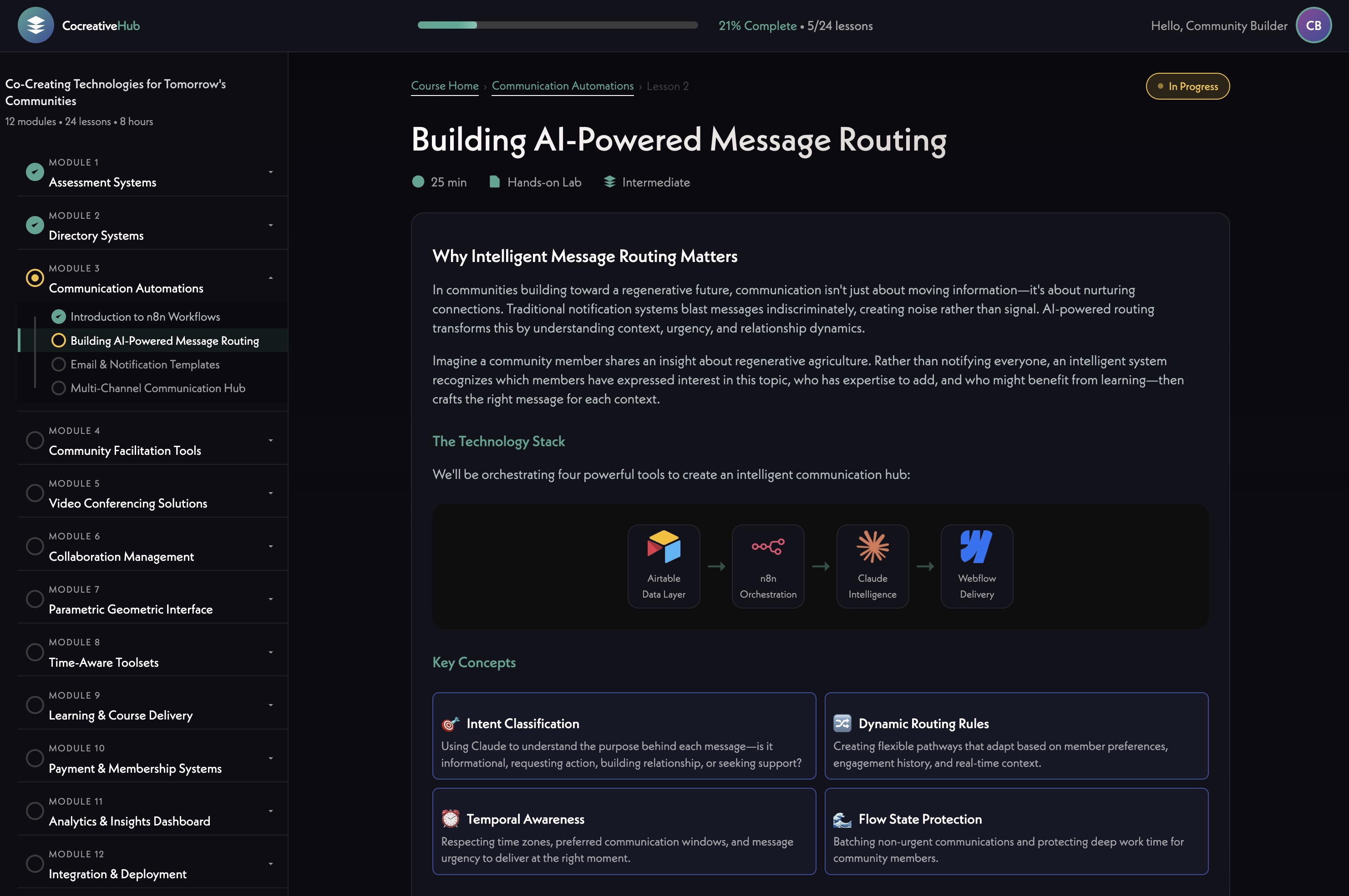
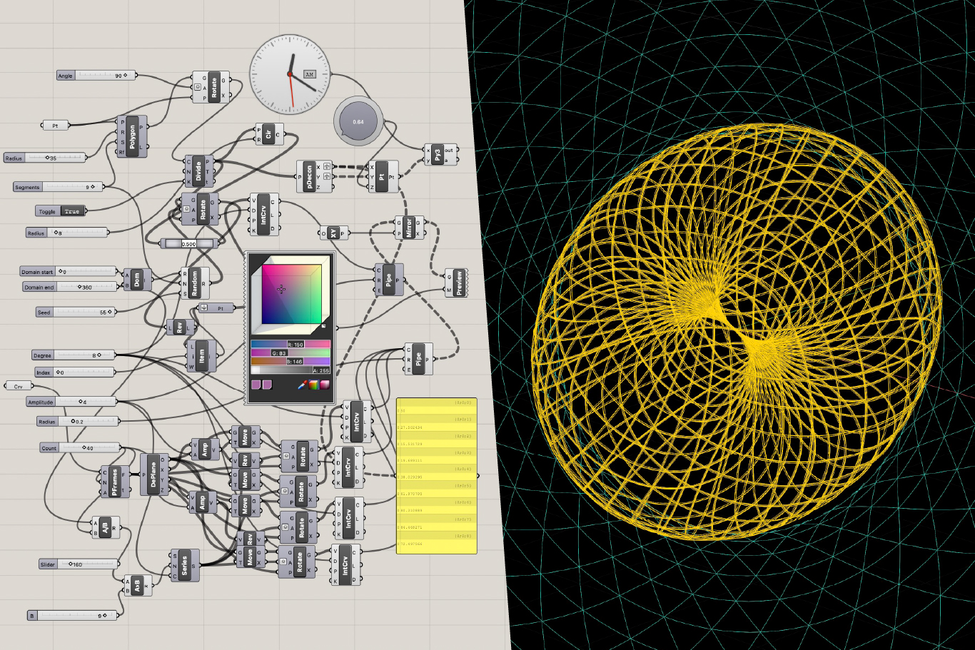
James walked through a new timeline view added to the project management tool, organizing all active work by week with filtering by content type, status, and assigned person (05:12). The intent is to make content needs visible at a glance — some items are small and just need approval, others require deeper reflection.
Hera raised the question of how to add subtasks for specific features like holon creation, drawing a comparison to how Asana structures work (08:47). James clarified the philosophy: keep hierarchies shallow so nothing gets lost. Features live in one tier, copy needs in another. The recommendation is to create small, focused cards rather than nesting tasks deeply (10:42).
A permissions issue was caught during the call — Hera couldn't see the + button to add cards. After some troubleshooting, it turned out she was in timeline view (which doesn't show the plus) rather than map view (13:32). Issue resolved live. James also noted he wants to add a notification system so new task additions don't appear silently (12:11).
The team aligned on making this tool central to weekly calls — using it actively to track progress and keep content moving rather than letting it sit idle between sessions (15:09).
[technology="Collaboration Management Tools"]
James brought up the category icons set in Figma — monochrome, minimal icons representing the platform's thematic domains (15:17). The team reviewed them together and responded positively overall. Standouts included Health, Healing & Wellbeing, Culture & Creative Expression, and Education & Learning.
The main flag was Ethics & Philosophy — the current icon felt too similar to a Da Vinci geometric diagram, described as "very Euclidean" (21:01). Michael Shaun suggested looking toward Japanese symbolism, referencing The Book of Five Rings (Go Rin no Sho) and the concept of five balanced circles as a possible direction (23:24). He sketched the idea live on the whiteboard — five circles arranged around a central point, each bounded by but not enclosed in an outer ring.
For the Collaborative Commerce icon, Michael Shaun sketched a spiraling form with elements converging toward a center — things coming from being apart and knitting together — possibly with an upward trajectory and the spiral tightening as it rises (18:36). James noted all icons should stay consistent in style, so any refinement to one should feel native to the full set.
James briefly shared his personal Obsidian + Claude [tag="claude"] + n8n [tag="n8n"] setup that auto-generates infographics from his research notes — one of the symbols it produced was described as very Holomovement-esque, a fourfold diagram that could be a reference point for the philosophy icon (24:04).
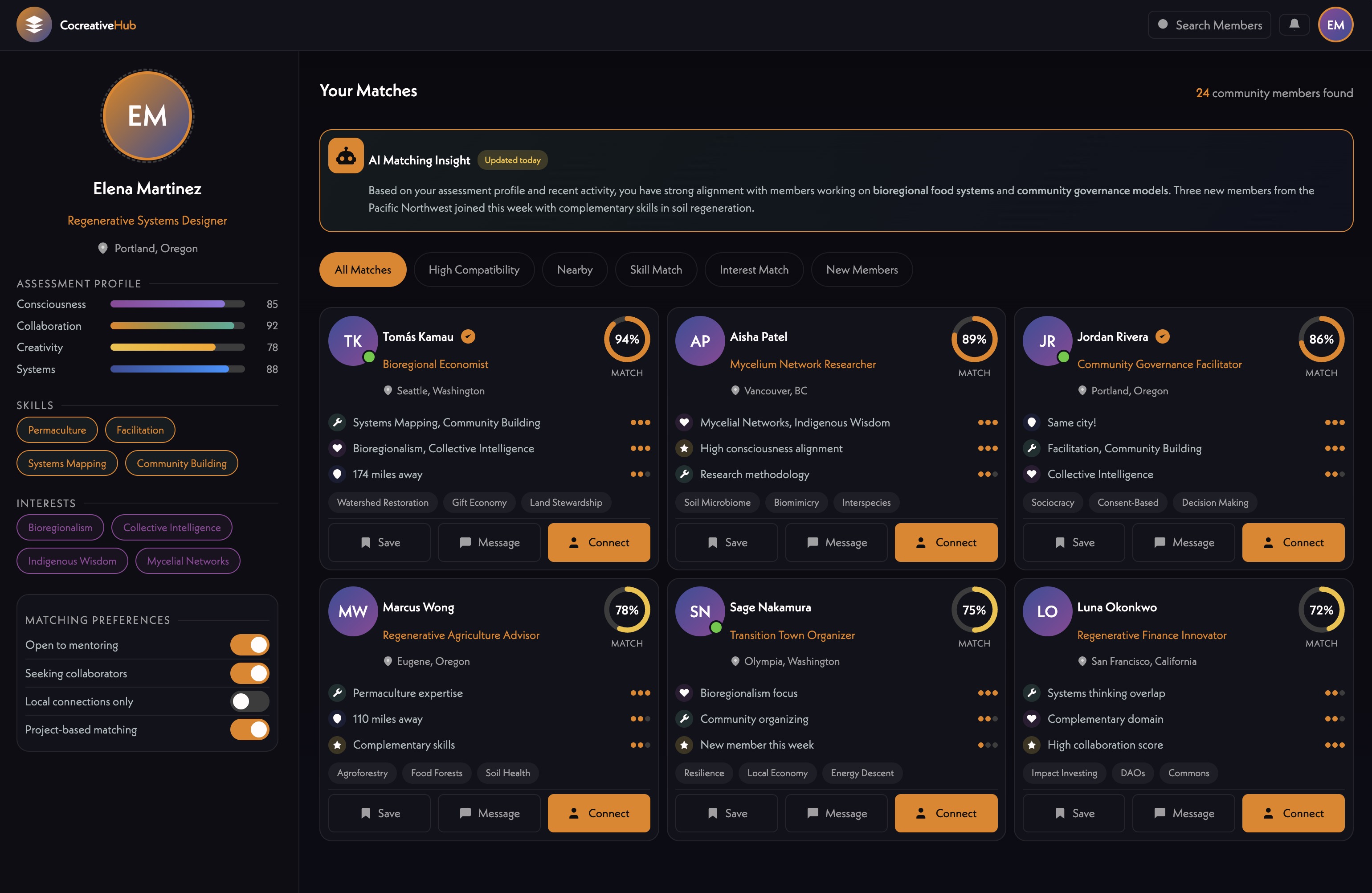
The team spent significant time on the member matching UI, reviewing a newer mockup alongside an earlier version (27:13).
Michael Shaun and Hera both expressed that the original version felt more alive — the newer one reads as sleeker but more corporate, with less warmth and weaker visual hierarchy (38:04). Specific feedback:
James proposed a direction: keep the computational tag-matching in the background, but surface it as friendly narrative — e.g., "You both mentioned community building in what you're seeking and offering" — written as a sentence, with the matched tag highlighted inline (33:42). Match bars per domain could still appear but as visual shorthand, not the primary read.
Michael Shaun suggested a left-column list of recommended connections so users can scan and click through without navigating back to a list (39:40). Hera referenced the app Pattern (astrology-based compatibility) as a UX reference for how connection depth can be presented in a way that feels personal and alive (39:53).
James also raised the idea of triggering this matching view from a profile page — a button that says "show me my connection with this person" — so it works both as a recommendation feature and as a way to deepen existing relationships (42:01). He noted the page could use yellow more heavily as a visual marker that you're in person-to-person connection territory, distinct from holons and alliances (42:32).
The team confirmed the matching feature is approximately two weeks out on the current timeline (44:37). New design elements are expected in the app by next Monday (45:13).
[technology="Intelligent Matching Algorithms"]
[technology="Assessment Systems"]
Michael Shaun flagged that the About page currently has partner logos at inconsistent sizes (45:54). Hera noted she's working with Ivan to normalize these — inverting some colors, making others transparent, and potentially implementing a grid so the logo block reads as clean and intentional (46:20).
The group discussed the Purpose Earth project slider — a horizontal scrolling section showcasing funded projects. Hera has assembled content: four projects from 2025 and two from 2024, totaling around 572,000 people across 64 projects in 35 countries (52:11). Jill has added photos and support details to the document Hera initiated, which lives in Slack and is being moved into the project doc tabs (51:39).
Michael Shaun shared a simple wireframe he'd put together previously — a basic horizontal slider with dot indicators — and noted the design team is welcome to elevate it (49:01). Hera suggested the cards could be compact with a pop-up or modal for deeper detail on each project (53:08).
James flagged that the Engine for Good graphic should be recreated in current brand style by Munia [tag="iris"] (53:19). Michael Shaun noted there are now effectively two visual languages — the website and the app — and as the app's design vocabulary matures, it should start informing the website in return (54:13). He also noted the slider format should be replicable for future microgrant showcases tied to Engine for Good waves (51:18).
---
James Redenbaugh
Hera Rose
Mariko Pitts
James opened with a development update, noting that Stripe [tag="stripe"] is integrated and working. Ivan is currently building out the "Pay What You Want" feature. Michael Shaun referenced earlier mockup concepts that included a slider allowing users to select a contribution amount, with a lower threshold around $3–$10 and a fallback path for users who can't pay the standard amount (03:37).
The group riffed on how to discourage zero-dollar transactions in a fun, on-brand way — James floated the idea of a small animated character who grows visibly sadder as the amount decreases (04:27). Michael Shaun suggested naming the character "Holo" — don't make Holo sad — which landed well with the team. The concept fits the platform's playful, human-centered tone and could double as a memorable UX moment.
James walked through a new timeline view added to the project management tool, organizing all active work by week with filtering by content type, status, and assigned person (05:12). The intent is to make content needs visible at a glance — some items are small and just need approval, others require deeper reflection.
Hera raised the question of how to add subtasks for specific features like holon creation, drawing a comparison to how Asana structures work (08:47). James clarified the philosophy: keep hierarchies shallow so nothing gets lost. Features live in one tier, copy needs in another. The recommendation is to create small, focused cards rather than nesting tasks deeply (10:42).
A permissions issue was caught during the call — Hera couldn't see the + button to add cards. After some troubleshooting, it turned out she was in timeline view (which doesn't show the plus) rather than map view (13:32). Issue resolved live. James also noted he wants to add a notification system so new task additions don't appear silently (12:11).
The team aligned on making this tool central to weekly calls — using it actively to track progress and keep content moving rather than letting it sit idle between sessions (15:09).
[technology="Collaboration Management Tools"]
James brought up the category icons set in Figma — monochrome, minimal icons representing the platform's thematic domains (15:17). The team reviewed them together and responded positively overall. Standouts included Health, Healing & Wellbeing, Culture & Creative Expression, and Education & Learning.
The main flag was Ethics & Philosophy — the current icon felt too similar to a Da Vinci geometric diagram, described as "very Euclidean" (21:01). Michael Shaun suggested looking toward Japanese symbolism, referencing The Book of Five Rings (Go Rin no Sho) and the concept of five balanced circles as a possible direction (23:24). He sketched the idea live on the whiteboard — five circles arranged around a central point, each bounded by but not enclosed in an outer ring.
For the Collaborative Commerce icon, Michael Shaun sketched a spiraling form with elements converging toward a center — things coming from being apart and knitting together — possibly with an upward trajectory and the spiral tightening as it rises (18:36). James noted all icons should stay consistent in style, so any refinement to one should feel native to the full set.
James briefly shared his personal Obsidian + Claude [tag="claude"] + n8n [tag="n8n"] setup that auto-generates infographics from his research notes — one of the symbols it produced was described as very Holomovement-esque, a fourfold diagram that could be a reference point for the philosophy icon (24:04).
The team spent significant time on the member matching UI, reviewing a newer mockup alongside an earlier version (27:13).
Michael Shaun and Hera both expressed that the original version felt more alive — the newer one reads as sleeker but more corporate, with less warmth and weaker visual hierarchy (38:04). Specific feedback:
James proposed a direction: keep the computational tag-matching in the background, but surface it as friendly narrative — e.g., "You both mentioned community building in what you're seeking and offering" — written as a sentence, with the matched tag highlighted inline (33:42). Match bars per domain could still appear but as visual shorthand, not the primary read.
Michael Shaun suggested a left-column list of recommended connections so users can scan and click through without navigating back to a list (39:40). Hera referenced the app Pattern (astrology-based compatibility) as a UX reference for how connection depth can be presented in a way that feels personal and alive (39:53).
James also raised the idea of triggering this matching view from a profile page — a button that says "show me my connection with this person" — so it works both as a recommendation feature and as a way to deepen existing relationships (42:01). He noted the page could use yellow more heavily as a visual marker that you're in person-to-person connection territory, distinct from holons and alliances (42:32).
The team confirmed the matching feature is approximately two weeks out on the current timeline (44:37). New design elements are expected in the app by next Monday (45:13).
[technology="Intelligent Matching Algorithms"]
[technology="Assessment Systems"]
Michael Shaun flagged that the About page currently has partner logos at inconsistent sizes (45:54). Hera noted she's working with Ivan to normalize these — inverting some colors, making others transparent, and potentially implementing a grid so the logo block reads as clean and intentional (46:20).
The group discussed the Purpose Earth project slider — a horizontal scrolling section showcasing funded projects. Hera has assembled content: four projects from 2025 and two from 2024, totaling around 572,000 people across 64 projects in 35 countries (52:11). Jill has added photos and support details to the document Hera initiated, which lives in Slack and is being moved into the project doc tabs (51:39).
Michael Shaun shared a simple wireframe he'd put together previously — a basic horizontal slider with dot indicators — and noted the design team is welcome to elevate it (49:01). Hera suggested the cards could be compact with a pop-up or modal for deeper detail on each project (53:08).
James flagged that the Engine for Good graphic should be recreated in current brand style by Munia [tag="iris"] (53:19). Michael Shaun noted there are now effectively two visual languages — the website and the app — and as the app's design vocabulary matures, it should start informing the website in return (54:13). He also noted the slider format should be replicable for future microgrant showcases tied to Engine for Good waves (51:18).
---
James Redenbaugh
Hera Rose
Mariko Pitts
Enforce minimum contribution threshold in Pay What You Want feature
Continue development on Pay What You Want feature with Ivan; ensure minimum contribution threshold is enforced around $3–$10 with fallback path for users who can't pay. Includes animated 'Holo' character that grows sadder as contribution amount decreases as on-brand UX moment. Discussed at 03:37 and 04:27.
Add notification system so new task additions appear visibly in project timeline tool
Implement notification system so new task additions in the project management timeline tool don't appear silently — team members should be alerted when new cards are added. Discussed at 12:11.
Refine Ethics & Philosophy icon to move away from Euclidean/Da Vinci aesthetic toward Japanese symbolism direction
Current Ethics & Philosophy icon feels too similar to a Da Vinci geometric diagram — described as 'very Euclidean' at 21:01. Michael Shaun suggested looking toward Japanese symbolism referencing The Book of Five Rings (Go Rin no Sho) — five circles arranged around a central point, each bounded by but not enclosed in an outer ring at 23:24. Must keep style consistent across full icon set.
Refine Collaborative Commerce icon using spiraling convergent form concept from whiteboard sketch
Michael Shaun sketched a spiraling form with elements converging toward a center — things coming from being apart and knitting together — possibly with an upward trajectory and the spiral tightening as it rises at 18:36. Icon must remain consistent in style with the full icon set. Discussed at 23:40.
Implement generative sentence logic for connection cards with tag-matched narrative and highlighted keywords
Surface computational tag-matching as friendly narrative sentences rather than raw data — e.g., 'You both mentioned community building in what you're seeking and offering' — with matched tags highlighted inline. Match bars per domain can appear as visual shorthand but narrative sentence is the primary hook. Michael Shaun used Strava analogy at 35:34 noting two AI-written sentences create more engagement than a full data dashboard. CTAs (Reach Out, View Profile) should sit at bottom of card per 36:41. Discussed at 33:42.
Add 'Show My Connection' button on member profile pages to trigger on-demand matching view
Add button on individual member profile pages that triggers the matching view for that specific person — so matching works both as a recommendation feature and as a way to deepen existing relationships. Page could use yellow more heavily as a visual marker distinguishing person-to-person connection territory from holons and alliances. Discussed at 42:01 and 42:32.
Push new matching UI design elements live in app by Monday February 2026
New design elements reflecting revised matching card UI feedback — warmer tone, CTAs at bottom, left-column recommended connections list — to be pushed live in the app by next Monday. Matching feature itself is approximately two weeks out. Discussed at 45:13.
Coordinate with Munia to recreate Engine for Good graphic in current brand style
Engine for Good graphic needs to be recreated by Munia in the current brand style to ensure visual consistency across website and app. Discussed at 53:19.
Implement Purpose Earth project slider on website using content prepared by Hera
Implement horizontal scrolling project slider on website showcasing Purpose Earth funded projects. Content prepared by Hera includes four projects from 2025 and two from 2024 totaling around 572,000 people across 64 projects in 35 countries. Michael Shaun provided basic wireframe with horizontal slider and dot indicators at 49:01. Cards should be compact with pop-up or modal for deeper detail per Hera at 53:08. Format should be replicable for future microgrant showcases tied to Engine for Good waves per 51:18.
Finalize Purpose Earth project content with photos and descriptions and confirm all entries are accessible in project doc
Finalize Purpose Earth project content including photos, descriptions, and support details for all six projects (four from 2025, two from 2024). Jill has added photos and support details to the document Hera initiated which lives in Slack and is being moved into the project doc tabs at 51:39. Confirm all entries are accessible and complete before slider implementation.
Continue working with Ivan to normalize partner logos on About page with consistent sizing, grid, and color treatment
Work with Ivan to normalize partner logos for the About page — inverting some colors, making others transparent, and implementing a grid so the logo block reads as clean and intentional. Michael Shaun flagged inconsistent logo sizes at 45:54. Hera noted the normalization work is underway at 46:20.
Add holon creation intro copy task card to project management tool
Add a card to the project management timeline tool for holon creation intro copy task, as noted during the call at 14:20. This ensures the copy need is tracked and visible.
Investigate and rename Slack website channel thread naming if possible
Hera to investigate whether the website Slack channel thread naming can be changed and rename if possible. Discussed at 56:47.
Review open copy tasks in project tool and assign or complete where ready
Mariko to review open copy tasks in the project management tool and assign or complete items where ready. Discussed at 14:14.
Review new matching UI design and provide feedback once Monday build is live
Mariko to review the new matching UI design elements once James pushes them live in the app by Monday and provide feedback. Discussed at 45:13.
Custom membership system architecture for user authentication, progress tracking, and database management using Supabase for backend. Requirements include real database for user progress (not cookies), journal entry capture, API triggers for membership status and course purchases, and progress tracking across sessions. Decision made to build custom solution on Supabase rather than Member Stack. Includes Stripe integration for subscription management and automatic access revocation when subscriptions lapse. Multiple products may connect to same membership tier with bundled offerings granting multiple memberships from single purchase. Part of Phase One development with $16K-$29K budget. Requires hiring Supabase specialist for implementation. Timeline aligned with LMS development for February 10th launch. Authentication spike will establish foundation with Supabase login functionality on MAST template, implementing user profiles, password management, and session handling. System will sync membership status between Stripe and Supabase for automated access control. Backend successfully operational with membership login and content gating complete using Supabase and Stripe. Profile editing integration in progress to connect with directory system. Backend approximately 90% complete with primary goal to deliver working version on Holomovement site for team testing this week allowing account creation, login, and profile data editing. Front end minimal at this stage consisting mainly of login pages until profile pages developed. Profile creation flow now implemented as linear step-by-step process requiring profile completion before directory access. Sign-up flow includes friendly nudges for empty bios when hitting next, optional social profiles with language like 'you can always come back later' to reduce drop-off, loading screen during profile generation with engaging copy like 'making connections', AI-generated banner images based on user bios, and light/dark mode toggle inheriting system settings by default. System enforces profile completion to ensure data quality and prevent half-finished accounts cluttering database. Dark backgrounds use deep teal rather than pure black, light mode avoids stark white to maintain Holomovement brand feel. Simplified pill-style member modal implemented with collapsed/expanded states showing two lines by default, expanding on hover to reveal icons for messages, Holons, and light/dark mode toggle. Notifications aggregate into single indicator on Holon icon with changing number rather than multiple dots. Three profile image preview styles (circle, square, doorway/vertical) included in signup flow to ensure photos work across all use cases. In-app messaging system now live using custom-built architecture with no per-message cost, styled similar to iMessage with unread message counts, conversation threading, and future group chat capability. Email notifications handled via Resend - free up to 3,000 emails/month, then $20/month for up to 50,000. Holon management flow improved with clear delegation model between members and admins using invitation system rather than automatic adds. Location automation uses lightweight AI call to convert entered location into coordinates for near real-time map updates. Saving bug affecting profile updates, feedback, and location syncing identified and resolved during meeting. Community consent flow being added as pop-up on first messaging use with scrollable community agreements and required checkboxes covering non-partisanship, anti-spam, entity usage rules, and conduct standards. GDPR compliance considerations noted with Webflow plugin available for data erasure rights and cookie consent. Pay What You Want contribution system now under active development with slider UI allowing users to select suggested range ($15-$20/month) with secondary scholarship tier option for lower amounts. Two-screen approach framed as gift rather than discount with wave-based slider visual showing increasing amplitude. System includes familiar Stripe checkout supporting Link, Amazon Pay, and other methods. PayPal integration planned for better international accessibility. Working wave-amplitude slider prototype built with predefined moments shifting wavelength visually, translatable directly into payment UX. Prototype ready for core team testing within next couple days with front-end UI included. Thursday core team meeting target for showcase. Modal menu interface introduced featuring compact notification/settings control with light mode toggle - described as small detail that meaningfully elevates experience. Three developers now working on Webflow implementation: Sean (Ohio, senior), Siam (Pakistan, junior), with Ivan handling less bandwidth due to outside client work. Profile creation, editing, and regeneration flows confirmed working as of 03-31 meeting. Profile creation link added directly to member modal enabling re-run of full onboarding flow. Core team onboarding structured as daily feature drip starting with profile creation. 03-31 crash test revealed critical blocking issues preventing core team demo: n8n automation pipeline failing to complete profile data processing reliably, social links not saving due to LinkedIn field dependency, AI-generated cover image and tagline entering loop state without completing, JSON input error halting holon creation mid-flow, logout bug on holon detail page, light mode broadly non-functional requiring toggle to be hidden entirely, profile content fields not populating after form submission. Team consensus: crash test failed, reconvening following day to retest after critical fixes. Zero tolerance for processes locking up or halting before core team demo - visual imperfections acceptable but no mid-flow stoppage permitted. Hubcast partnership introduces potential single sign-on integration explored with developer Emilio Lopez enabling seamless profile creation handshake between broadcast access and Holomovement App reducing friction for new users discovering platform via livestream. Profile creation becomes the access ticket for global broadcast viewers immediately placing them inside ecosystem where they discover collaboration features. System now functional and operational with core team beginning onboarding process (meeting 05-04). Post-Wave deployment successful with members actively using platform. Critical gaps identified in 06-16 meeting: users cannot delete accounts (GDPR violation with European user base), users cannot remove themselves from Holons, stewards cannot remove members, automatic member addition on Holon creation needs approval workflow, privacy controls needed for Holon visibility, homepage globe displays names/locations without explicit opt-in requiring visibility toggle, cookie consent banner required for European compliance, Stripe webhook test-mode errors surfacing. Account deletion and member management now top cleanup priorities.
Strategic enhancement of directory system integrating with membership capabilities to enable member profile management, progressive assessment completion, and intelligent matching. Members can log in and edit their profiles directly with information stored in Supabase for flexible content management. Progressive engagement model starts with basic five-minute setup (name, website, purpose statement, location), then enables detailed assessments later. Each completed assessment adds profile elements and unlocks features including AI-generated visual representations (icons, tarot archetypes, numerology graphics). Integration with Claude AI enables sophisticated queries like 'who should I collaborate with on this project?' or 'who can provide funding?' across network assessment data. Advanced features include weekly emotional mapping interface with six-axis emotional space (excitement, nervousness, grief, etc.) aggregating into community climate visualizations. Reimagined map interface using flat Earth projection with layered filtering showing member locations, funding flows, collaborative connections, project relationships. Multiple view modes from simplified default to complex multi-layered 'Arcturian' views. Integration with Engine for Good grant program where applications link to member profiles, creating incentive structure for profile completion. Team pivoted to prioritize directory system over LMS development. Player card approach focuses on game-like profiles emphasizing what someone is doing (project/mission) and what help they need for AI-powered matching. System summarizes lengthy inputs into concise scannable formats. MVP launch target February 15 with login capability, profile editing, and integrated assessments. Beta testing program follows to identify next priority features. Critical development discussion revealed MapBox visualization provides initial visual interest but limited practical value beyond local connections - intelligent matching algorithms represent the true 'killer app' rather than map visualization. Profile data strategy shifting from personality assessments to actionable information: developmental stage, experience level, current project involvement, specific skills, and active needs. Visual consistency issues identified with user-uploaded images requiring standardization. Question emerged whether Holons function as independent entities or collections of individual members, requiring data architecture decisions. Simplified terminology 'members and groups' proposed over 'Holons' for newcomer clarity. Basic intake form planned capturing development level, experience, life stage, purpose, and current needs as primary assessment for matching foundation. Player card UI concept introduced featuring icons to symbolize key information, AI-generated summaries to condense lengthy responses, and achievement badges displaying completed courses, assessments, and accomplishments. Design iteration process planned where team scans test cards to validate information hierarchy. Sandbox database creation for core team to fill out profiles and review each other's player cards as real-world test. Prototype development progressing with profile creation, editing, viewing, and password resets functional in Supabase. Munia developing first draft UI designs. Team agreed to reduce text density, create more visual/scannable interfaces. Multiple views prototyped: alliance view, profile editing, directory search (list and map-based), member profiles, holon profiles. Core intake fields defined: name, date of birth, email, phone/SMS/WhatsApp, location, purpose/mission, gifts and requests, alliance affiliations, short bio (150 words max), photo. Matching deferred from numerical compatibility scores to simpler connection signals: complementary skills, matching needs/offers, alliance overlap, geographic proximity, shared purpose domains. AI interpretation via Claude for free-text fields, direct computation for explicit matches. App functionality to be hosted on separate subdomain (app.holomovement.net) with member-specific navigation, syncing public profile data to main site member globe. End of February target for core team interactive prototype. 3D globe navigation now live with lightweight custom rendering approach using continent outlines without full Mapbox tile loading for smooth performance (05:52). Globe features toggle for flat view, hover-activated profile cards, connection lines between members and holons. People appear as yellow dots, holons as teal hexagons algorithmically placed at center of members (01:22). Profile creation flow implemented as linear step-by-step process requiring profile completion before directory access (09:38). Photos strongly encouraged with friendly nudges if skipped, social profiles optional. AI-generated banner images based on user bios producing resonant results (15:47). Light/dark mode toggle available inheriting system settings by default (16:39). Dark backgrounds using deep teal rather than pure black, light mode avoiding stark white to maintain Holomovement brand feel (14:35). Vertical player cards chosen for directory view over horizontal layouts for gamified engaging presentation (37:52). Team seeding platform this week with core team members completing profiles Monday/Tuesday, creating holons Wednesday, reviewing experience Thursday core call (43:53). Polish focus prioritized over new features with delivery target Monday February 17 (41:20). New bento-style profile layout introduced with rounded corners, centered tagline, framed profile image, and subtle background color differentiation between sections (14:21). Rich text field with optional image upload added to represent projects or organizations more expressively beyond plain text (32:10). Testimonials system (potentially rebranded as 'Send Some Love' or 'Share the Love') enables mutual endorsements with reciprocal vouching mechanics (34:54). Field feature replacing 'wall' concept allows users to post updates and collaborative content with pinning capability (39:43). Long-term vision includes drag-and-drop section ordering for personalized profile storytelling. Assessment display framework showing sliders across domains added as visible badges on profiles. Seeking/Offering keywords auto-distilled from freeform text using AI summarization to aid readability and matching. On-demand match experience triggered by 'Match Me' button generates side-by-side comparison modal with numerical score (1-100, shown on hover), loading animation, and meaningful dimensions including complementary skills, needs/offers alignment, shared alliances, overlapping domains (26:00, 19:02). Match score and comparison view designed as sticky gamified feature incentivizing profile completion (24:35). Domain categories refined: 'Economics and New Systems' → 'Economics and Collaborative Commerce', 'Governance and Social Change' split into 'Collaborative Governance' and separate social change, 'Spiritual Activism and Inner Development' → 'Spirituality and Consciousness', additions include Ethics and Philosophy, Science, Leadership and Facilitation as 12th domain, potential Psychology embedded in community/relationships (43:00-48:22). Onboarding copy and tooltip language prioritized for clarity on unfamiliar terms with short hover descriptions (one sentence max). Implementation timeline: 7-10 day dev window for new design style, Field feature, preliminary matching functionality followed by internal testing with core four, then broader core team rollout (41:07, 40:08). First impressions prioritized with cautious rollout protocol to ensure solid initial experience. Messaging icon refined from email-style button to message icon to better reflect in-platform nature (13:29). Notifications aggregate into single indicator on Holon icon with changing number rather than multiple dots. Three profile image preview styles (circle, square, doorway/vertical) included in signup flow to ensure photos work across all use cases (07:44). In-app messaging system now live using custom-built architecture with no per-message cost, styled similar to iMessage with unread message counts, conversation threading, and future group chat capability (09:37). Email notifications handled via Resend - free up to 3,000 emails/month, then $20/month for up to 50,000 (23:56). Holon management flow improved with clear delegation model between members and admins using invitation system rather than automatic adds (04:08). Location automation uses lightweight AI call to convert entered location into coordinates for near real-time map updates (26:27). Saving bug affecting profile updates, feedback, and location syncing identified and resolved during meeting (26:27). Community consent flow being added as pop-up on first messaging use with scrollable community agreements and required checkboxes covering non-partisanship, anti-spam, entity usage rules, and conduct standards (18:00). GDPR compliance considerations noted with Webflow plugin available for data erasure rights and cookie consent (17:46). Pay What You Want contribution system now under active development with slider UI allowing users to select suggested range ($15-$20/month) with secondary scholarship tier option for lower amounts. Two-screen approach framed as gift rather than discount with wave-based slider visual showing increasing amplitude. System includes familiar Stripe checkout supporting Link, Amazon Pay, and other methods. PayPal integration planned for better international accessibility (18:35, 19:30). Working wave-amplitude slider prototype built with predefined moments shifting wavelength visually, translatable directly into payment UX (19:47). Prototype ready for core team testing within next couple days with front-end UI included (53:10). Thursday core team meeting target for showcase (54:22). Modal menu interface introduced featuring compact notification/settings control with light mode toggle - described as small detail that meaningfully elevates experience (38:05). Three developers now working on Webflow implementation: Sean (Ohio, senior), Siam (Pakistan, junior), with Ivan handling less bandwidth due to outside client work (34:00). Profile creation, editing, and regeneration flows confirmed working (04:14). Holon page active development with wheel of faces arc rendering, domain icons, and My Holons view improvements (04:14). Empty state for My Holons will show helpful message plus grid of all existing Holons to orient new users (21:50). Profile edit mode link navigation disabled to prevent losing unsaved changes (27:08). Profile image edit icon made more prominent (30:58). Banner image regeneration icon will get rollover tooltip explaining 'replace your banner' functionality (32:25). Skills rating feature demoed allowing users to rate themselves with visual bar indicators (44:04). Location map tooltip added showing actual location name on hover (23:11). Profile creation link added directly to member modal enabling logged-in users to re-run full onboarding flow (42:31). Test accounts and Holons being cleaned up before team-wide invite (06:47). Core team onboarding structured as daily feature drip: Day 1 profile creation, Day 2 assessment prototype, following days Holons/map/matching features one at a time (16:11). Homepage updates in progress including background color correction, animation circle restoration, scroll sequence improvements, auto-scroll implementation, mobile type scaling, icon-only logo, and updated CTA button (44:35). Dynamic map will become hero element of homepage with card preview leading to login/profile creation for non-members (52:57). Tag-based matchmaking architecture outlined: profiles generate seeking/offering/domain/focus tags, periodic comparison produces alignment scores, directory displays highest-alignment profiles larger and left-aligned (01:01:36). Sean actively working on matching grid view implementation (01:00:56). Wave event preparation targeting participants leaving activation day already inside at least one Holon using app as live tool (58:30). James confirmed ready to lead app presentations at wave event. One-to-two minute intro video of ecosystem planned for wave event (01:00:07). Platform designed as coordination layer - not an organization but a medium, connective tissue, energetic petri dish for collaboration to grow (20:30). Wave serves as on-ramp for Saturday-Monday - people get on the spaceship, then continue exploring projects, holons, and neighbors in platform Tuesday onward. 'We come together and create these big bonfires. We want ways to keep these campfires burning through the year' (55:30). Post-Wave system successfully operational with Portugal map section densely populated showing honeycomb patterns around Lisbon and Spain hubs. Meeting 06-16 identified map zoom scaling issue (13:53) - member dots need to proportionally shrink as users zoom in to maintain functionality at high-density locations. Profile image tooltip needed under editing icons since users don't know how to change pictures. Homepage globe visibility toggle required since names and locations display without explicit opt-in. Profile tab renamed from 'About' to 'Info' and repositioned as first tab for better UX.
Intelligent matching feature triggered by 'Match Me' button on member cards or directory view generating dynamic side-by-side comparison between two members. System displays numerical compatibility score (1-100) shown on hover to avoid feeling like rating system, with loading/analysis animation making generation feel intentional and interesting (26:00). Match modal shows meaningful dimensions including complementary skills, needs/offers alignment, shared alliances, overlapping domains of interest, developmental stage, and geographic proximity - surfacing why people matched rather than just that they matched (19:02, 27:24). Implementation architecture: first layer distills each user's tags, domains, and seeking/offering data into simple numeric scores for lightweight computational matching. Users with closely matching numbers get high match score; divergent profiles get low score. This approach scales as user base grows without computational burden. Second layer uses Claude feeding each user's About Me and purpose responses alongside tag data into agentic prompt generating qualitative match analysis. Starting with top 25 numeric matches per person, Claude outputs readable explanation of why two people should connect. Results saved so matched users can share them - 'the HoloBot said we should connect, check this out' - without requiring other person to run own process (42:00). System designed as sticky gamified feature incentivizing profile completion - incomplete profiles result in lower matchability or 'unmatchable' status serving as playful motivator (24:35). Match generation happens on-demand rather than pre-computed to allow real-time incorporation of latest profile updates and assessment completions. Prioritizes actionable information over personality typing: what someone is working on, what help they need, what skills they offer, their experience level, and developmental stage. Avoids problematic mismatches like pairing serial entrepreneurs with college freshmen by incorporating context-aware filtering. Integration with assessment data enables queries across network like 'who should I collaborate with on this project?' or 'who can provide funding?' Technical architecture combines Supabase for profile data retrieval, Claude API for compatibility analysis, and custom JavaScript for interactive modal interface. Future enhancement could incorporate mutual matching where both parties express interest before facilitating introduction. System represents platform's 'killer app' - intelligent algorithmic connection-making that surfaces possibilities people would never discover through manual browsing alone. Current UI mockup under review with team feedback that original version felt more alive while newer version reads as sleeker but more corporate with less warmth and weaker visual hierarchy (27:13, 38:04). Key design feedback includes moving Reach Out and View Profile CTAs to bottom of card where users naturally scan (36:41), replacing tag-only displays with short generative sentences explaining connections in plain language with matched tags highlighted inline (33:42, 35:34), adding left-column recommended connection list for easy scanning (39:40), enabling match view trigger from profile pages via 'show me my connection' button for both recommendations and relationship deepening (42:01), and using yellow color more heavily to mark person-to-person connection territory (42:32). Match bars per domain could appear as visual shorthand but not primary read. Design approach references Strava's AI-written post-ride sentences that create more engagement than data dashboards (35:34) and Pattern app's astrology-based compatibility presentation (39:53). Matching feature approximately two weeks out with new design elements expected Monday (44:37, 45:13). 03-31 meeting detailed tag-based matchmaking architecture: profiles generate seeking/offering/domain/focus tags through onboarding, periodic function compares every profile against every other producing alignment score based on complementary tags and overlapping domains (01:01:36). Directory view displays highest-alignment profiles larger and left-aligned, decreasing by alignment rightward. Same data infrastructure powers matching grid view designed in Figma showing matched profiles above Living Network view. Sean actively working on implementation (01:00:56). Assessment data will feed into system making new assessment a dependency for full matchmaking. Meeting 05-04 confirmed working connections page with map-based and list-based views showing alignment scores, click-through to detailed comparison, and Connect button triggering n8n agentic analysis sending both profiles to Claude for domain-specific reports (00:10-00:22).
Custom 3D globe navigation system for member and holon visualization using lightweight rendering approach with continent outlines rather than full Mapbox tile loading for smooth performance. Globe features toggle between 3D and flat views, hover-activated profile cards showing member photos and information, and connection lines visualizing relationships between members and holons. Members appear as yellow dots, holons as teal hexagons with algorithmic placement at center of member clusters rather than geographic coordinates (01:22). System pulls real profile data dynamically with headshots appearing on hover (03:51). Dark mode enforced on map page since glowing member dots work best against dark backgrounds using deep teal rather than pure black (19:06, 14:35). Future enhancements include progressive zoom behavior borrowing from Google Maps patterns - at certain zoom depth globe transitions to list or directory view showing nearby members with potential matching integration (05:04). Architecture provides full control for implementing layered zoom experiences. Scaling considerations addressed including node resizing on zoom to prevent dense regions like U.S. East Coast from becoming unreadable (04:44). Photos appear only on hover to maintain clean graphical line-drawing aesthetic. System represents parametric approach to data visualization translating member relationships and geographic data into spatial interactive experience. Globe visualization provides initial visual interest but team recognizes intelligent matching algorithms represent true platform value beyond map display. Custom rendering approach gives platform distinctive visual identity while maintaining performance at scale. Connection axis visualization refined with subtle dividing line and potential arrowheads to make 'strong alignment / broader exploration' spectrum immediately readable at a glance (11:03). Logarithmic-style axis gives more visual space to closer connections. Color system expanded with distinct colors for Seeking and Offering states, and individual colors per domain tag (08:30). Highlight color flagged as slightly too dark for readability requiring palette revision. Newer version of globe interface now features animated lines rising over sky, wrap/unwrap hologram-like animation on globe itself, and nation borders being added for better member orientation (21:29). Team responded enthusiastically calling it 'a big hit' with strong positive reception. Design refinement notes: nation borders should be kept close to background color so continent outlines pop more strongly, transparency/see-through hologram effect on globe noted as striking and intentional. Prototype ready for core team testing within next couple days targeting Thursday showcase (53:10, 54:22). 03-31 crash test identified map rendering worse than previous version requiring revert to last stable state while addressing country vs continent line contrast issue (09:37). James working on making country border lines lighter while keeping continent outlines more prominent but encountering rendering quirk where national borders drawn twice (once per country) making them appear heavier than intended.
Comprehensive redesign of About page focusing on clear value proposition and ecosystem messaging. Key objectives include answering 'What is Holomovement?' immediately in hero section for first-time visitors from ad campaigns with concise statement explaining Holomovement as global network of gatherings, initiatives, and collaborators. Replace 'Underview Effect' section with 'Holomovement Effect' content focused on collective higher frequency states, emotional scale awareness, and conscious choice. Underwater wave imagery relocated to Wave page where more appropriate. Animation development showing text transitions incorporating logo movement connected to scroll. Visual hierarchy improvements to balance Purpose Earth partnership integration without overwhelming Holomovement branding. Creation of partners CMS collection for logos displayed in random order to avoid hierarchical implications as partnerships grow. Refinement of copy emphasizing 'living ecosystem' or 'operating system' positioning rather than just 'movement,' making initiative more fundable and easier to understand. Ecosystem serves as infrastructure for emergence, supporting complex living systems fostering higher frequency states and radical collaboration. Ongoing iteration to make language as plain-spoken and inspiring as possible. Potential renaming of page from 'About' to 'Manifesto' to better reflect content nature. About page redesign complete with Iván and Melina finalizing design elements. Design reached 100% approval with development taking one to two days to implement on live site. Implementation complete and integrated. Partner logo normalization in progress with Hera working with Ivan to standardize sizing, invert colors where needed, make backgrounds transparent, and implement grid layout for clean intentional presentation (45:54, 46:20). Purpose Earth project slider section being added showcasing funded projects - four from 2025 and two from 2024 totaling around 572,000 people across 64 projects in 35 countries (52:11). Hera has assembled content and Jill has added photos and support details to collaborative document (51:39). Michael Shaun provided simple wireframe with horizontal slider and dot indicators which design team will elevate (49:01). Slider cards will be compact with pop-up or modal for deeper project detail (53:08). Engine for Good graphic needs recreation in current brand style by Munia (53:19). Slider format designed to be replicable for future microgrant showcases tied to Engine for Good waves (51:18). Homepage and About page animation work in progress requiring prioritization following style shift from dark teal to lighter white-world aesthetic. 03-31 meeting confirmed About page nearly complete with final implementation needed - James checking with Yvonne on status (53:29).
Comprehensive color and visual identity system for platform UI ensuring consistency and immediate readability across member types, states, and categories. Color language assigns distinct colors to: Teal for Holons (brand-aligned), Yellow for Ambassadors/Synergists, Green (refined to sage or lighter tone) for Alliances, separate colors for Seeking versus Offering states, and individual colors per domain tag (08:30-09:03). Current highlight color flagged as too dark for at-a-glance readability requiring revision to more readable palette. System must work across both light and dark modes with dark backgrounds using deep teal rather than pure black, light mode avoiding stark white to maintain Holomovement brand feel while ensuring sufficient contrast (14:35). Colors need to 'pop' more clearly per Mariko's feedback while maintaining sophistication. Visual identity extends beyond color to include: three profile image preview styles (circle, square, doorway/vertical) presented during signup (07:44), vertical doorway-style cards as primary profile presentation format creating inviting entry feeling (37:52), and bento-style layout with rounded corners and subtle background color differentiation between profile sections (14:21). Domain icons require design with visual identity for each of 12 domains. Connection axis visualization needs subtle dividing line possibly with arrowheads to make spectrum immediately readable (11:03). System must scale across hover states, card styles, modals, and full profile pages while maintaining brand coherence. Implementation requires Figma design system documentation, CSS custom properties for theming, and testing across all UI contexts. Deliverable includes style guide documenting color values, usage guidelines, icon library, and component variations. Category icon set reviewed with positive response overall (15:17). Standouts include Health/Healing/Wellbeing, Culture/Creative Expression, and Education/Learning. Ethics & Philosophy icon flagged as too Euclidean/Da Vinci geometric - needs revision toward Japanese symbolism referencing Book of Five Rings concept of five balanced circles around central point (21:01, 23:24). Collaborative Commerce icon direction sketched as spiraling form with elements converging toward center, possibly with upward trajectory and tightening spiral (18:36). All icons must stay consistent in style with any refinement feeling native to full set.
Collaborative refinement of all user-facing questions, prompts, labels, and microcopy across profile creation, holon creation, and directory interfaces to ensure language is action-oriented, clear, and aligned with Holomovement brand voice. Key principles include using action-oriented questions for holons: 'What's your holon's project?' instead of 'Describe your holon' and 'What outcome do you hope to achieve?' instead of 'Purpose' (20:01). Simplified explanations for onboarding defining holons as 'group of people with shared project or outcome' rather than full theoretical framework. Profile creation flow needs friendly encouraging language when users skip recommended fields like bio ('you can always come back later') to reduce drop-off while maintaining data quality (12:42, 12:30). Loading screens should include engaging copy like 'making connections' or 'finding your people' to maintain user engagement during processing (15:15). Domain labels, tag categories, and filtering language require collective input to ensure accessibility for newcomers while maintaining conceptual accuracy. Alliance terminology and holon board language need clarity. James started shared Google Doc for collaborative editing of profile questions, domain labels, and tag language (40:24). Document allows async contribution from team members with diverse perspectives including Mariko's community voice, Hera's user journey expertise, Michael Shaun's clarity focus, and James' technical constraints understanding. Copy refinement impacts user experience across entire platform determining whether interfaces feel welcoming and clear or confusing and overwhelming. Ongoing process rather than one-time task as platform evolves and user feedback emerges. Initial focus on core profile and holon creation flows with directory filtering language following. Domain categories refined during meeting: 'Economics and New Systems' → 'Economics and Collaborative Commerce', 'Governance and Social Change' split into 'Collaborative Governance' and separate social change, 'Spiritual Activism and Inner Development' → 'Spirituality and Consciousness', additions include Ethics and Philosophy, Science, Leadership and Facilitation as 12th domain, potential Psychology embedded in community/relationships (43:00). Mariko flagged that unfamiliar terms like 'collaborative commerce' might cause people to skip domains they actually belong in requiring clear inviting onboarding copy and tooltip language (48:22). Short hover descriptions agreed upon (one sentence max) rather than full paragraphs. Testimonials system potentially rebranded as 'Send Some Love' or 'Share the Love' to feel warm and mutual rather than formal (34:54). Holon eligibility pop-up language being drafted by Hera drawing from existing Synergist page content and prior Holon documentation Mariko will share (27:44, 29:52). Michael Shaun will refine community agreement language and add checkbox structure with AI consent language layered in (19:22). 03-31 crash test identified wording issue in holon creation where phrase 'actively collaborating' may cause users in early ideation phases to feel they don't qualify - word 'actively' should be removed (33:53).
Communication automation workflows supporting holon formation through multiple pathways. Primary workflow handles three-administrator holon creation process: founding member drafts holon and identifies two additional administrators by email, system sends automated confirmation emails to identified administrators requesting participation acceptance, recipients create individual profiles if needed before confirming, and once both confirmations received holon profile goes live (22:08). Workflow includes three-week follow-up reminder emails for non-responding invitees. Secondary workflows support users seeking to form holons without existing team members including potential holon board posting system functioning like job board with tag-based browsing for project ideas seeking members (28:16), automated double-opt-in introduction emails connecting individuals tagged as 'looking for members' or 'looking for a holon' based on San Francisco tech community Webflow model where 'Ask to be intro' button triggers email introductions without exposing addresses (29:40, 26:00), and recommendation emails suggesting potential collaborators through matching algorithms before holon formation (25:34). All workflows designed to channel holon formation energy productively while preventing incomplete or abandoned holons from cluttering directory (24:24). Implementation requires n8n workflow development, email template creation, Supabase database triggers for status tracking, and integration with existing member invitation system being built by James (32:52). Workflows support broader strategic goal of ensuring every holon has committed multi-person leadership from inception. Team seeding workflows this week through real holon creation Wednesday generating actual invitation flows for testing and refinement (43:53). Email notifications to be completed before next core team onboarding push (51:42). 03-31 crash test revealed JSON input error halting holon creation mid-flow with 'Unexpected JSON input' error encountered on holon naming step, blocking primary workflow from completing (34:44).
Simple public posting system enabling text, images, links (with auto-preview), and comments on both individual profiles and Holon pages. Designed as 2009 Facebook stripped down focusing on collaboration rather than social noise. Page owner retains moderation control to delete content. Built using new Supabase table for Posts content type with roughly one day development for MVP, additional days for debugging (40:33). Architecture supports alternative visualization approaches beyond linear chronological feed including honeycomb image grids or text bubble fields. Posts can be integrated into agentic matching system to proactively surface relevant content to users rather than waiting for manual scrolling. Initial MVP focuses on one shared space - a Holon-seeking / people-seeking-Holons channel - before building out multiple spaces or live integrations. Replaces 'wall' concept with 'Field' feature allowing users to post updates and collaborative content with pinning capability (39:43). Long-term vision includes integration with resource library where content recommendations could be triggered by mood/feeling check-ins. System supports community facilitation by creating space for project visibility, collaboration requests, and organic network formation.
Integration of Holomovement magazine as interactive embedded experience on platform avoiding third-party tools like Issuu that would pull users off-site. Magazine has distinct brand identity with licensed fonts and spread-based layout design. Implementation uses PDF viewer approach with thumbnail navigation without page-turning animation. File remains internal-only for now as full team reveal being managed by Jill. Integration scheduled for next week (54:00), not immediate priority but near-term. Prototype demonstrated during meeting showing spread-based layout working well in viewer. File shared internally with James and Michael Shaun for design and usability feedback (01:00:26, 57:38). Represents first step in broader resource library vision where curated content including meditations, music, and podcasts could be surfaced to users based on AI-powered mood/feeling check-ins.
Lightweight weekly status reporting tool providing at-a-glance visibility into development progress without requiring full project management overhaul. System uses RAG (Red/Amber/Green) table format showing what's in progress, what's blocked, and summary of active bugs (54:50). Simple enough that Emmanuel, Laura, or any stakeholder can check status with minimal effort. Format distinct from existing project map which serves as architecture reference tracking pages, Supabase tables, custom scripts, and copy needs rather than sprint progress. Both tools serve different purposes and both needed. Hera drafting RAG table concept and emailing to full team as reporting template (55:32). Weekly cadence allows team to maintain momentum visibility while avoiding administrative burden. Implementation could be simple shared spreadsheet, Airtable view, or lightweight dashboard. Key is consistency and clarity rather than sophisticated tooling. Addresses need raised by Hera for better visibility into development status between meetings.
Enhancement of custom project management tool with timeline view organizing active work by week with filtering by content type, status, and assigned person (05:12). Tool designed to make content needs visible at a glance with shallow hierarchy philosophy - features in one tier, copy needs in another tier to prevent tasks from getting lost (10:42). Timeline view complements map view which shows + button for adding cards (13:32). Notification system planned so new task additions appear visibly rather than silently (12:11). Team aligned on making tool central to weekly calls for tracking progress and keeping content moving (15:09). Architecture prioritizes simplicity over deep nesting - recommendation to create small focused cards rather than complex subtask hierarchies. Tool represents continuation of project management philosophy shift away from ClickUp toward custom solution optimized for creative workflow and distributed coordination.
00:00:00
Boldly NOW: Under the bus. You shouldn't be late to calls. We say all kinds of mean and nasty things if you're late.
00:00:10
Mariko Pitts: Hilarious. Wait, we can't hear you. Can't hear you, James. Nope, nope, nope.
00:00:18
Boldly NOW: He's got that Cheshire. Cheshire cat smile, doesn't he?
00:00:23
Mariko Pitts: That is such a.
00:00:29
Boldly NOW: James must have been. I'm guessing, as a little boy, James was in trouble 84% of the time, and the rest of the time he was asleep.
00:00:37
Mariko Pitts: I didn't know it. He had no idea he was in trouble.
00:00:48
Boldly NOW: Oh, James, we're not laughing with you. We're laughing at you.
00:00:52
Mariko Pitts: Him. What happens when you're late?
00:00:56
Boldly NOW: Especially when you're late.
00:01:02
Mariko Pitts: Just a bunch of talkers on the other. It's fine.
00:01:08
Boldly NOW: No, we can't hear you. The tech guy is not supposed to have tech problems when he gets on calls. This is really a bad look.
00:01:16
Mariko Pitts: So bad for the tech guy. And not when Laura has problems with
00:01:20
Boldly NOW: the technology, which she does every single day. We expect it.
00:01:25
Mariko Pitts: Yeah.
00:01:25
Boldly NOW: I can't open this file. I can't open this link. Every time I email her something like, I can't open this file. I can't open this link. There's something wrong with it.
00:01:36
Mariko Pitts: Yeah. And it's like, no, no.
00:01:38
Boldly NOW: This is the fourth time this week you've said something like that.
00:01:42
Mariko Pitts: Yeah.
00:01:45
Boldly NOW: So funny.
00:01:48
Mariko Pitts: How's it going on your end? Heroin?
00:01:49
Boldly NOW: I hope the trouble. The toilet's not giving you troubles again.
00:01:53
Mariko Pitts: Oh, yeah.
00:01:54
Boldly NOW: There's the tools out behind him. And the door opened up to the bathroom.
00:01:57
Mariko Pitts: Hopefully it's not frozen nor'. Easter. That guy, he got stuck in.
00:02:05
Boldly NOW: Yeah, he was probably out, you know, like on a bender or something like that.
00:02:12
Mariko Pitts: We can keep doing this all day.
00:02:15
Boldly NOW: Sorry, I couldn't. I was shoveling snow up my nose. I mean, hear us.
00:02:21
Mariko Pitts: Could you hear us?
00:02:22
james: Like, wow. Wow. Great to see the last guys.
00:02:27
Boldly NOW: We're creative.
00:02:28
Mariko Pitts: Much good to film.
00:02:30
Boldly NOW: Really creative.
00:02:33
james: Awesome.
00:02:33
Mariko Pitts: We know how to use our time wisely. What's up, James? How you doing?
00:02:38
james: I'm doing all right. I've been on a bender.
00:02:42
Mariko Pitts: Yeah, A bender. What's going on?
00:02:48
james: Gosh.
00:02:49
Hera: Yeah, Right.
00:02:50
james: I've been in a. In a snow and. And got some kind of stomach bug, but.
00:02:57
Mariko Pitts: Oh, God. Really? God. Oh, that's awful.
00:03:03
james: It's okay. It's.
00:03:04
Mariko Pitts: You okay now?
00:03:08
james: I'm feeling a bit better at the moment.
00:03:12
Mariko Pitts: Hopefully all these jokes help.
00:03:15
james: Yeah, they.
00:03:16
Boldly NOW: It's gotta help. It's gotta be soothing to the soul.
00:03:20
james: Yeah, they help a lot. It helps a lot. How are you guys doing?
00:03:26
Hera: Yeah, yeah.
00:03:27
Mariko Pitts: Pretty good.
00:03:28
james: Pretty good.
00:03:28
Boldly NOW: You know, better. We'll be better once you show us the progress.
00:03:33
Mariko Pitts: Yeah. If you, if you did anything while you were sickling. Poor thing.
00:03:37
james: Cool. Yeah. We've done a lot. We've been doing a lot. There's not a ton to look at, but definitely some things for us to look at. We've got Stripe working and integrated. Ivan's working on Pay what you want today.
00:04:00
Boldly NOW: You had those, you had those kind of mock ups I made for a million years ago.
00:04:03
james: Right.
00:04:04
Boldly NOW: They weren't anything special. I don't know if we can do it where it looks like it did. I actually put a slider in, but, you know, might be harder to connect that up to Stripe, but it was like, pay what you can and if it goes below $10 or something like that, like, if it gets that, like there's a button that says, like, I can't pay that much, then there's a slider that goes from like $3 to $10. But, like, how do we get them to give us something? No zero dollars.
00:04:27
james: Yeah, come on. We could just have like a little animated guy who gets sadder as it goes.
00:04:41
Mariko Pitts: I like that, actually.
00:04:42
james: Oh, my goodness.
00:04:44
Boldly NOW: Let's call him Holo. Yeah, don't make Holo sad. Make Holo happy.
00:04:50
james: We need a little Holo Bot.
00:04:52
Hera: Oh, my God.
00:04:53
james: True. Accompanying the user. And check this out. This is very cool. We'll be glad to have this. So we have our app map, obviously, but now we have timeline view, so.
00:05:12
Mariko Pitts: Oh, nice. Okay.
00:05:14
james: We have everything organized by week, and we can still filter by content type and status. Yeah, and. And person, so we can see who's assigned to what. And actually we have. We lose our content button and timeline. I'll put that back in. But yeah, so I, I did my best to lay everything out. There's a lot that we're working on right now. There's a lot of content needs that we have, and a lot of them are pretty small. If we just look at content or just need approval, and then some of them are bigger and need more reflection, but would be great to just, you know, be. Be knocking those out. And the way I designed this is content can go right in here if we want, or, you know, or it can go in a Google Doc if that makes more sense. Whatever, we could link the link in there. But then once it's done, let's. Let's update the content statuses to see what's. What's left to do and we can put things into place.
00:06:51
Hera: Sounds good.
00:06:53
james: Yeah.
00:06:54
Boldly NOW: So I mean should we, we should just kind of dig through there and make sure we understand them or do you want to go through them and tell us what you want specifically in each one of those?
00:07:03
james: It should be pretty self explanatory. So like in profile creation we have the welcome slide. You know, I, I came up with some text to kick that off, but I think.
00:07:16
Boldly NOW: Is it in there right now?
00:07:19
james: Yeah.
00:07:19
Mariko Pitts: Do you have the current text in there that we can see?
00:07:23
james: No, it's on the profile can profile page.
00:07:31
Mariko Pitts: Can you drop the link to the app architecture we're just looking at in the chat?
00:07:36
Hera: I'll share it.
00:07:38
Mariko Pitts: Yeah, yeah, I can open up on my computer too.
00:07:42
james: It's always linked in the footer also down here and it's linked up here if you're logged in. Yeah.
00:07:51
Hera: Hera, is there a way that we could add sub tasks? I mean because for example, for the whole on creation sequence I'm looking at this week and it seems I couldn't find it. So I'll check if we have that in the previous or in the previous weeks. But I'd love to also just capture that here for this week. So for example, that I, I, I, for example, I'm in a situation where I don't have, I have a task in mind and I want to capture it here. Can, can we add a line item or something? How do you suggest. Because I want to make sure that we don't also just overpopulate everything here is, I mean we don't add further noise that it's just. Yeah, I'm looking at it right now.
00:08:47
james: Ui.
00:08:47
Hera: Oh, I think it's like the, oh, it's not the My Holons UI finalization. Okay. But anyway, for me, like it's, it's. I see this is still different from a task list in the sense like you know, in the, in an Asana board you fill out, you add all the tasks and those are like all, even the, the, the like from the smallest to the biggest. This one for me feels like these are the modules or these are the features that you're working on. And then so, so what I think what makes sense is I'm thinking of Asana. Maybe what we could do is like for every feature, for every line item, maybe you could add subtasks inside. Because I say for example for Holons, for, for the specific, for the whole on onboarding, the whole on creation feature, like register. Hold on. I'm imagining if we have that as a line item here, I could just enter and add a Subtask, like for me, update the copy, and then I could add a link to the Google document where the copy lives. Well, so just sharing a use case.
00:09:51
Mariko Pitts: But yeah, yeah.
00:09:52
james: Well, hold on. Creation. All of these features kind of are sub tasks in the holon creation task or meta feature. And then I made copy a separate kind of task because it helps us. It makes everything easier to organize and we can see, you know, exactly what are the copy needs and one of the technical things that. That we're working on. So if there's something in holon creation that needs updating, big or small, I think that it. It can just have a. A task in here. I want to avoid too many hierarchies of tasks because.
00:10:42
Hera: Exactly. Yeah, that too.
00:10:46
james: Then things get lost and. But you can just create small tasks and so if it's a feature, it can go up here. If it's a. It's a. If it's a small copy thing to update, it can go down here.
00:11:02
Hera: Okay. I'm trying to look for how. How do I add a card or how do I add a.
00:11:10
james: The little plus button down here?
00:11:12
Hera: Oh, because I don't have a plus button. That's why. Yeah, yeah.
00:11:16
james: You don't.
00:11:17
Hera: Yeah, I don't. I don't.
00:11:19
james: Are you logged in?
00:11:21
Hera: I am logged in, yes. Yes. Yeah, we can look into that after. After the call. Yeah, but I don't have the plus feature that's in your screen right now. I can send you a screenshot. Yeah, yeah.
00:11:32
james: And you're logging in with. With this account.
00:11:37
Hera: Yeah, yeah. I only have one account.
00:11:39
james: Okay, well, yeah, let's troubleshoot it later.
00:11:42
Hera: Okay.
00:11:43
james: You should have that. You should have the same control that I do. Not. Sure.
00:11:47
Mariko Pitts: Okay.
00:11:47
Hera: Okay. Yeah, I'll take a screenshot for now so that you can see my view.
00:11:53
james: Cool. Yeah, you should be able to add, you know, add as many tests as you want. I. I want to add an ability to like, create a notification when new things are added in here so that we can see.
00:12:11
Hera: That sounds.
00:12:12
Mariko Pitts: Good.
00:12:12
Hera: Yeah, yeah, yeah.
00:12:14
james: And that they don't just appear silently. And then the. In. In the timeline view, anything that's unscheduled will appear in this column over here. And then we can literally just drag and drop things around and it will put them in time. Or we can drag them back to unscheduled.
00:12:38
Mariko Pitts: Mm. I have a question around the. Some of the copy because I'm just going through the directory here under profile creation and it says the copy, like bio query where exactly how does that show up? Like and how much copy do we need? For example, like what is that a pop up? What does the bio query come. Where is it? Where does it show up?
00:13:05
james: Good question. So in. It's the. I just meant it's the question about. Tell us about yourself. So a brief bio that will appear on your profile. That's the text that we currently have and maybe we want to revisit that.
00:13:28
Mariko Pitts: Okay.
00:13:30
Hera: By the way, quick update.
00:13:31
james: Kind of boring.
00:13:32
Hera: Yeah. By the way, quick update. I actually found the plus so apparently I was geeking out in the timeline view. I wasn't looking at the at you sharing your screen. So I was looking for the plus at the bottom. But apparently we only have that in the map view.
00:13:48
james: That's right.
00:13:49
Hera: Yeah, I could see it now. Okay, perfect.
00:13:51
james: Great. Yay. Cool.
00:13:54
Hera: I'm adding that null.
00:13:55
Mariko Pitts: All right. Get on that. On it. Writing some stuff up. Okay. Yeah, I see. Like for example, in the My Holons section I actually added you here for the intro the copy because I think we talked about that.
00:14:14
Hera: Yeah, yeah. Actually it's in the chat right now.
00:14:17
Mariko Pitts: You did? Okay, yeah. Just plug it into here then. So that'll be great.
00:14:20
Hera: Yeah, yeah. I'm. I'm actually adding that here.
00:14:23
Mariko Pitts: That's funny. Okay. Because I'm just assigning. I was like, yeah, I think we already did that. So we'll just go through it and put my. To do this together.
00:14:30
Hera: I guess that means I. I guess that being like with. With all this update, maybe what we could do is we could. Let's just use this tool for a weekly calls and focus on the. The task weekly so that we could make the most use of this. This project management tool. Like I could imagine earlier the reason I was like so I. I didn't see the point plus icon was because I was like so engaged in this aspect. I was like what are the tasks for this week? And I think it would be a really nice way for us to also like just get caught up and just make it a habit to. To record everything here.
00:15:09
james: Great.
00:15:10
Mariko Pitts: Okay. Sounds good. I like it. I like it. All right.
00:15:15
Hera: Okie dokes.
00:15:17
Mariko Pitts: What's next?
00:15:17
james: Awesome. Next I want to talk to you guys about the category icons. Let's look at those. I just got to bring Figma back up.
00:15:51
Mariko Pitts: So
00:15:55
james: I'm excited about these. They're all. They're monochrome right now. On to you. I don't know if we want to introduce different colors.
00:16:05
Mariko Pitts: Look at that.
00:16:07
james: Super minimal. And yet they say a lot. I feel.
00:16:13
Hera: I love how economics and new systems look like that.
00:16:22
Mariko Pitts: Michael, Sean, you know, is that collective. Oh, you know, what is it? Oh, my God. What is our hope called now?
00:16:35
Boldly NOW: Yeah, it's called collective commerce. Yeah. Collaborative. Collaborative commerce. Thank you. You're right.
00:16:41
Hera: I was about to say collaborative.
00:16:43
Boldly NOW: Yeah, that should be collaborative comments. Commerce in there. That's our. That's our branded name. We had another.
00:16:52
Mariko Pitts: Does that icon really support that as you feel?
00:16:57
Boldly NOW: I guess. As well as anything else. I mean, maybe if we had. The only detail that might be too much is. Yeah, I don't know if you can get it. Maybe too much details, but if there were some dots of things in the, you know, coming through the circle, it might be. Might be interesting. Like the. If the spiraling circle thing was a process and there was something coming through the center of it.
00:17:28
Mariko Pitts: All right.
00:17:30
james: I don't want one to have dots, and all the others don't. But, you know, maybe. Definitely some. Up some more lines. Something like that.
00:17:40
Boldly NOW: Yeah. Could be a.
00:17:49
james: Here, I'll. Let's see.
00:17:52
Boldly NOW: Can I get to a whiteboard? I get to whiteboard without messing with you. No, I can't
00:18:02
james: go for it if you want.
00:18:10
Boldly NOW: So I'll try to draw what I'm thinking. It's probably not curved enough. It's probably not close enough together. Let's try again. And then you have. I don't know how your spirals went.
00:18:35
james: That might.
00:18:36
Boldly NOW: That might show things coming from being apart to knitting together.
00:18:42
james: Cool. Great. And maybe should it be horizontal or maybe kind of an upward trajectory?
00:18:48
Boldly NOW: It could be upward. I mean, I was thinking about that. There's a lot of symbolism and upward that we probably like. Then, you know, it could also be that the spiral then, instead of staying the same size, gets a little smaller as it comes up as well. Oops, I just got a little drunk there.
00:19:13
james: Cool. Good idea.
00:19:17
Mariko Pitts: All right, cool.
00:19:19
Boldly NOW: I'm so glad that this technology has a doodling board. For years, as a creative director, I had these enormous books. They were like, I don't know, almost. Probably 18, 19 inches tall by about 24 inches of just paper. Really beautiful paper. And then I would be in meetings and I would just draw and show people on these big books.
00:19:42
james: And
00:19:44
Boldly NOW: we don't use paper anymore and we don't meet together anymore. So like. Like this kind of weird skill that I. I grew up over many, many years is. Well, now it's a. A funky pencil and a. A whiteboard and zoom. Do you want me to take a picture of what I drew? Close enough.
00:20:07
james: I already did. Okay, cool.
00:20:13
Boldly NOW: Learning and education.
00:20:15
Mariko Pitts: I love the culture one and creative expression, governance and social change. Pretty cool.
00:20:20
james: Yeah.
00:20:21
Mariko Pitts: Education and learning. That's nice. I like that one.
00:20:24
Boldly NOW: Health, healing and well being is good. With the love there we got our choose love.
00:20:29
Mariko Pitts: I'm going on here the actual kind of maze. Spiral maze for that one. That's really cool. Yeah, I like that.
00:20:38
Hera: Leadership facilitation as well. Oh my goodness.
00:20:41
Mariko Pitts: No, it's pretty good too. Science, physics standard.
00:20:44
Boldly NOW: You know, I'm not sure about ethics and philosophy.
00:20:47
james: It looks a little.
00:20:47
Mariko Pitts: It looks a little pinpoint.
00:20:50
Boldly NOW: Looks a little bit like.
00:20:51
Mariko Pitts: Exactly.
00:20:51
Boldly NOW: Da Vinci's.
00:20:54
Hera: I was about to say that.
00:20:56
james: Yeah.
00:20:57
Mariko Pitts: Some philosophy. Maybe that one.
00:21:01
james: Yeah, it's very Euclidean. Yeah.
00:21:05
Boldly NOW: There's a target. What's the. What's the symbol for? Like five stones in a circle.
00:21:12
james: Five stones in a circle. What do you mean?
00:21:19
Boldly NOW: Very Japanese style. Just trying to think. Let me just see if. I was just wondering if I could find something that was like this,
00:21:37
Mariko Pitts: like technology and innovation.
00:21:39
Hera: Pretty good.
00:21:40
Mariko Pitts: All the system pieces that work together on a grid.
00:21:43
Boldly NOW: I'll draw again if you let me.
00:21:46
james: Yeah, you can actually draw on my screen if you want.
00:21:49
Boldly NOW: Oh yeah, I can. I have to get a tool here. Oh, there's a tool that says drag to move.
00:21:54
james: Oh yeah.
00:21:55
Boldly NOW: And then I guess.
00:21:55
Hera: Yeah, the remote. Yeah.
00:21:57
Boldly NOW: And then what's the draw? I got an eraser. I don't see a pencil though. Oh, this thing, It's a brown dot. Okay, so see how this works?
00:22:10
Mariko Pitts: I love it.
00:22:17
Hera: I thought he was about to draw something and he said it have to
00:22:21
Boldly NOW: be perfectly balanced and centered. I guess my outer circles.
00:22:24
Mariko Pitts: Right.
00:22:26
Boldly NOW: So five circles and then a circle.
00:22:29
Hera: Yeah. Kind of like the hole on icon in the upper right.
00:22:36
Boldly NOW: Except there.
00:22:37
james: Yeah.
00:22:37
Boldly NOW: It's like they're bounded by a circle versus.
00:22:42
james: Yeah. And why that?
00:22:49
Boldly NOW: Just instinct. There's a term in. There's a famous book in Japanese called Goren no show. The book of the Book of Five Rings. And that's what came to to mind. It's by a famous swordsman that once he mastered swordsmanship, he was a master. Powerful power. Master flower arranger, master strategist, master poet, master. Like everything, everything he did after that he had MA because he mastered one thing. He was a master of all things. So it's an interesting, interesting idea or symbol.
00:23:24
james: Cool. Yeah, we definitely can play with philosophy here.
00:23:32
Boldly NOW: Otherwise, great job at all of them. And if. If we didn't change, it wouldn't be the end of the world. But if we can upgrade, we might as well upgrade.
00:23:40
james: Yeah.
00:23:41
Boldly NOW: Yeah.
00:23:43
james: I want to show you Guys, something real quick. It's a bit unrelated, but it's related to philosophy. I use obsidian to organize my own notes and thinking.
00:24:03
Hera: Oh, my God.
00:24:04
james: And I've connected it with Claude and N8N now running on my own computer and I've. I have a little app that creates infographics for my notes and research.
00:24:21
Hera: Yeah.
00:24:22
james: Automatically. And they're. They're pretty cool. So I'm.
00:24:28
Boldly NOW: Is it Nan and a banana? It looks very Nana Banana.
00:24:30
james: Ish. Yeah, yeah, yeah. The concepts and the prompt and the nano banana creates the images.
00:24:41
Boldly NOW: Yeah, there's something.
00:24:42
Mariko Pitts: It's really interesting right there though, that symbol.
00:24:45
Hera: So cool.
00:24:47
Boldly NOW: Yeah, that's a cool symbol for sure.
00:24:48
Mariko Pitts: Yeah, I like that symbol.
00:24:50
james: Not bad.
00:24:52
Boldly NOW: The one in the center of the screen.
00:24:55
Mariko Pitts: Yeah, that one. Yeah.
00:24:57
james: Four fold. Yeah. Yeah, it's very hollow. Movement. Esque.
00:25:04
Mariko Pitts: Yeah, I like that one.
00:25:06
Boldly NOW: Go for philosophy. Could be as well. Yeah.
00:25:12
james: I reread Plato's Timaeus where he kind of breaks down the. The origin of the universe and it's one of the works where he explores the Platonic solids and the five elements and those things. But he essentially identifies these four domains of space, the receptacle of all everything, time, the flow in which everything happens, and, you know, matter. And that's where the elements come in and intelligence and humanity. And I've just become recently fascinated with finding parallels of that through time of these four archetypes, kind of beyond the. The elements and beyond integral. And having lots of fun, kind of finding these echoes of these patterns pretty much in everything. Yeah. Cool.
00:26:21
Hera: Look at you being an alien.
00:26:23
james: Yes. Yeah. Oopsie daisies, by the way. Yeah. So great. We've got these category icons. I think they work well, you know, large as cards, but they can also be little symbols on people's profiles so that we can definitely see, oh, this person's into this thing and if you hover over it, maybe the name shows up. Then if you forget what. What symbol is what.
00:27:04
Hera: And.
00:27:13
james: So I think that they should show up on the. I'll share this again. In the search as well. We can put them. Instead of this domain area, we can have a, you know, maybe a two row grid of those of our primary domains and then maybe a drop down for tags. We have while we're in here, mock up simple matching ui. Okay,
00:28:00
Boldly NOW: journey phase.
00:28:03
Mariko Pitts: What do we got here?
00:28:05
Boldly NOW: So this is again, these are my keywords to match now. Or is this like a percentage match like I was recommending?
00:28:11
Mariko Pitts: There's a percentage higher?
00:28:14
Hera: Yeah, there's a percentage number 92. And then the others are based on what they added in the profile.
00:28:25
james: Yeah. So the idea is to get to. Computational matching by analyzing rich text input and coming up with hidden sets of tags. So people have an option to choose tags in their profiles, but then we can also assign different kinds of tags based on what they write in their bio, what they write and what they're seeking and what they're offering. And then we can use those markers to computationally match people. And then we can also do agentic matching and explanation of those matches as well.
00:29:17
Mariko Pitts: Maybe could we do like, a short summary paragraph? Like, the one thing that I did like about the other one next scene is that it had like a simple sentence of, like, certain. The connections that we have. Because when I look at the tags and I look at the recommendation, I feel less excited about that. When I'm just looking at tags. I need a write. It requires to me more.
00:29:40
Boldly NOW: It requires reading. And really, I just want.
00:29:43
Hera: I want.
00:29:43
Boldly NOW: I want people to get the hit just like a. Like at a glance, like, oh, I see. I see what's cool.
00:29:49
Hera: Yeah, yeah.
00:29:50
Mariko Pitts: And you get that with the original, the first one that you had, the first recommendation card, it's like, oh, okay. So you and I, you know, we both attended this. We both studied with Thomas Hugo or something. And like, oh, okay.
00:30:00
Hera: And the pop of colors, too. Yeah.
00:30:03
Boldly NOW: Even if you scroll to the sentences
00:30:06
Mariko Pitts: would be good writing. We need it.
00:30:07
Boldly NOW: And then scroll to the right again to the words that. That pane where you see those green lines are. I'd be super happy with just some lines without even numbers on them. So if I scan down the page, I'm like, oh, we had those. These are the areas we match in. And without any. Honestly, just without any more detail, which is a lot less compute power, really. Honestly. Because we could put anything up there and they'll believe it. But I mean, the thing is that we want to give. We want it to be a magic trick. It's like sometimes we get stuck up on real information. But what we really want is to have people get their imagination going and get inspired in some way. And so sometimes logic or rational. Rational stuff slows people down. I mean, try having a date. And on the date you rationally discuss your compatibility. You're probably not going home tonight. Together, you're like. Well, on a scale, like, I think you're like. You could just imagine that.
00:31:12
james: That.
00:31:12
Boldly NOW: That skit going really poorly. But if.
00:31:14
james: If.
00:31:15
Boldly NOW: If it. If it's more Marco Polo today, like, I find you interesting. I find you interesting as well. Can I sit a little closer? Yes, you can. You know, like, there's this magnetism to that and it's very short, handy. And so how do we get magnetism and shorthanded? Because we want people to feel. To feel compelled to action. We don't want to get any. We don't want anything that slows them down, let's put it that way. We want them to connect to people more than we want them to know why they connect with people. But we want to give them the vibe that this is important. I think this is a really good connection for you. Does that make sense? James is knitting his brow. He's thinking about it. I want to read the bio. Most people don't want to read the bio.
00:32:02
james: No, I agree. It. This is a really important feature and it needs proper consideration. And I think it can be. It could be both exciting and dynamic.
00:32:15
Boldly NOW: And so you could have the lines and underneath it, you could have a little carrot. When you spin the carrot around, it shows the tags.
00:32:21
Mariko Pitts: Yeah. Something that just got where it gives it a little bit more of a write up or a summary of like, kind of. Or some of the best points that you see.
00:32:30
Boldly NOW: Yeah, that would be cool too if it just had two sentences about white. Like a. Like, of course that retakes now it takes compute once again. But it'd be really cool if you can give me, you know, two sentences about why I should connect with Mariko other than these, these numbers and these kind of scores.
00:32:45
james: Yeah, no, I'm. I'm not worried about the compute at all. It's like marginal cost.
00:32:51
Boldly NOW: I'm.
00:32:53
james: I just want it to be on the back. I want it to be grounded and rationale on the front. I want it to be, you know, a vibe. And so maybe people don't even see these tags or does this tagging matching in the, in the background. But on the front it could generate sentences. I was about those tags and highlight them. So it's like you both mentioned community building in. You know, what you're seeking and offering. And then it doesn't just say community building, it writes a sentence about that. And we have an agent that says like create a sentence with these words, you know, explaining this thing and then it highlights that tag. So it feels really grounded and it's not random and it's not a roll of the dice every, every generation, but it is friendly and interesting and makes sense. And then also I like the, the I. You know, I don't love the simple emojis, but I Like the feeling of the, the different things here, it feels, you know, too uniform. Even though I like these little icons, we can bring in different colors to show, you know, the kinds of things that were, you know, the domains that the system is looking at here. And, and then I agree, like a little bar for each one, even if it's a bit arbitrary. But like, let's say we have five tags in this domain of complimentary skills match. Maybe that bar is all the way to the right and maybe by default your top match has, you know, a full bar somewhere, something like that. But this can definitely be more exciting.
00:34:54
Boldly NOW: Yeah, if it had better to match a sentence and then that, that, that like set of bars beneath it, that would be super cool. They introduced AI to Strava. Strava is a mostly for cyclists and runners to just record your outdoor rides, indoor rides, whatnot. And they added AI to it and there's just this little box after your ride that's maybe two sentences. It says really simple things like, hey, this is a stronger than normal effort and you did performed well across the anaerobic zones. I mean and it's just so cool and it's, it's really, it's actually not even that interesting of information. Strava's packed with like power data information and heart rate data information and like there's all this stuff but that little two sentences because it's narrative, it, it makes me want to see it. I've been using Strava for 10 years, so it's like to, to have an app that's a database app suddenly have some reason that I want to get off my ride and read what the lay eye has to say. It's silly, but it does let us know what kind of features are compelling, what things and it doesn't need to be a lot. I think that's the really cool thing. I've seen some people's attempts where they really go into gross detail saying no, it just needs to be a hook. That's it. Just a little bit to get my curiosity going. So let's think about that.
00:36:20
Hera: Yeah. Also from my end, there's something about the original version that feels alive for me. And also you ux wise like as far as just how your eyes naturally explore like a, that this virtual real estate, the reach out and the view profile makes sense to be at the
00:36:41
Boldly NOW: bottom, at the bottom of that card
00:36:43
Hera: because I realized I was looking for that actually. And then I realized it was in the upper right section of the new version and I was like, oh, I didn't see that right away, but in the old version I could see that and I, I, I get excited because it's like I knew right away as soon as I saw that page that, oh, this was meant to explain how I, how, how, how James and Maro actually, you know, like match as a, you know, as a member of the community. And I also like the extra card at the bottom for like another a more of like a, an extra cta. Like a, like, like it's kind of like a deepening. So the first one is like, oh, these are, these are how you're connected. You could view their profile and it actually reminds me, it really reminds me of dating apps. And the, the view profile section is like, you know how when you see like the, the how the percentage of the percentage of compatibility then you could learn more about that person. Not that I use that a lot but, but it's, it's.
00:37:43
Mariko Pitts: Yeah.
00:37:44
Hera: I really love that gamification.
00:37:46
james: So awesome. Yeah, I think that there's a lot.
00:37:51
Hera: And the emojis as well. Like the, the other one, the new version is nice and it's super sleek. I know that it's using the current branding, but it looks very techy to me. It looks, it now looks, it feels corporate now.
00:38:04
Boldly NOW: Which one feels corporate?
00:38:06
Hera: The new one.
00:38:06
james: The new one? Yeah.
00:38:12
Boldly NOW: It's just a little, it's actually just, it's because it's gotten larger too. It's just become a little bit.
00:38:18
Hera: Yeah.
00:38:19
Boldly NOW: Less tasty I mean because it loses, it loses the design detail just a little bit I think on the other one and. Yeah, but, but functionally it's, you're, you're definitely going in the right direction.
00:38:31
Hera: Yeah, Yeah, I do.
00:38:32
Boldly NOW: I, I think Kara's right. I think the, especially the, the reach out and stuff being at the bottom, the whole, the whole box being a little bit smaller and a little more sparse feeling I think will help too.
00:38:44
Hera: And also while we were exploring all the, the, the prototyp reasons why this page really stood out the most for me was because of. It looked different than the rest of the pages. And I think that's what's going to make. And I think if we, if we apply the same principle, that's, I feel a lot of people would feel the same way as well because everything looks like it's, everything looks so expensive and all of a sudden you have this page and the only thing that you could see is of this, this, this card in the middle with just like telling you all like all the reasons why you need to connect to this person. For me, that's a totally different experience. Experience.
00:39:20
Boldly NOW: I've. I've got an hair that really. That's super. That's super, right? I mean that. It's a different kind of a feeling, like you're. You're dealing with a little. A little machine that's different. Machine. What if we had James on the left hand side a column that was all the recommended people?
00:39:39
Hera: Oh, yes.
00:39:40
james: Yeah.
00:39:41
Boldly NOW: I could just click down that instead of going back up to the list of people that I'm recommended. It's just a little column. I could just click one after the other and go down that list really easily. Yeah, that'd be super, super cool.
00:39:53
Hera: You know what it reminds me? What? It reminds me of? Pattern, the app Pattern, the bonds where you actually, like, see your astrology, how you're astrologically matched with your friend, Any friend who you formed a bond with. You need to check that app out if you don't have it yet.
00:40:10
Boldly NOW: I don't. I don't know that one.
00:40:11
Hera: Oh, my God. We should.
00:40:13
Mariko Pitts: We should.
00:40:14
Hera: You know, I always, like, tell people, do not add anybody in your pattern app unless if that person is really close with you, because that person is literally going to be able to, like, to understand your destiny, like your entire pattern. Everything that you're. Yeah, I'm gonna. I'm gonna. But that being said, I'm gonna add each of you in my pattern.
00:40:33
Boldly NOW: Okay, you do it.
00:40:35
Hera: I only have three friends in my pattern because I'm realizing I always tell people, don't. Do not give your birthday and your time of birth with anybody, especially people you don't trust.
00:40:45
james: Well, I think. I think that puts me in my app. I'm gonna use it against you.
00:40:53
Mariko Pitts: What if we did connection? We actually can analyze our connection with our network too. Not just the people in the field, the general.
00:41:01
james: Yeah. So I'm thinking we could. We could get here a few ways. One way is show me some SIM connections. And I think that it should start something like this where we see not just one person, but a few people. And not in a list, but maybe around me. And maybe there's some relative sizes based on connection strength. And then I can go into each one and see them and. Yeah, and then I think we should have a column over here that shows other connections. But I think that we should also have maybe a button on profile pages where I'm on Michael's page and I say, like, show me my. My connections with. With Michael. And then it can generate a page like this to open conversation. So, you know, I'm browsing the directory and I find somebody who's offering something I need and I'm like, wow, that's cool. I want to start a conversation. But first, let's see, you know, what do we have in common? I could read their whole. Whole profile or whatever, or click a button and, and leverage this feature. And I, I really like the idea of it feeling more special and I wonder if we even shift the background of this page. And also we're using yellow as a color for profiles and I think that this can generally be a lot more yellow and maybe the whole background of the site gets this hue and we have more yellow details to, to show. Like this is a person to person connection here. Different from, you know, understanding a holon or an alliance.
00:42:58
Hera: Okay.
00:42:58
Mariko Pitts: Yeah, I like that. Okay. I do like the idea because once we have people like when it's like, yeah, it's like, oh, I'm gonna add you guys all into my network because I know you guys, right? But, but, but the deeper thing is actually I know you, but do I actually know you? So there's something really fun about like going through and saying, oh, Michael, Sean and I actually, we. We've been working together, but I had no idea that you did this and this and that too. So it actually deepens, it helps deepen the relationship to those that you already have, you know, rather. So I think that's just really fun. Especially when we do assessments and other things are added. Then it's like, oh my God, like your destiny number or whatever in your numerology is so aligned with me. Or, you know, me and Alex are projectors and human designs, like, oh, that's fantastic, you know, then you can see why you actually connected already. But you know, when you're already connected, which is so fun. That's a gamified way. So having both elements where it's like new people, the recommendation, but also understanding you're already your network in a deeper layer too, is really cool.
00:44:03
james: It's also incentive for people to bring their friends onto the platform to say like, hey, come check this out and let's see. Like, I know you so well, but come on here and let's see what happens.
00:44:14
Mariko Pitts: Exactly. Yeah.
00:44:18
Boldly NOW: And those things may be future features,
00:44:23
james: a lot of them.
00:44:24
Boldly NOW: Yeah, the connections and stuff. I mean, I think the recommendation is. We're, we're probably pretty close, wouldn't you say, James? And now we're just talking about user experience. Or you're still a long ways away from Even be able to recommend people.
00:44:37
james: We're close. I have it on the timeline two weeks out. Okay, great.
00:44:42
Mariko Pitts: Oh, cool. Okay. Because that's based off a basic profile and assessment. Just the AI really kind of learning everything, right?
00:44:49
james: Yeah. And then as we add assessments, we can weave those into the. Into the matching and recommendation.
00:44:56
Mariko Pitts: Yeah.
00:44:57
Hera: Okay.
00:44:58
james: Okay, cool.
00:45:03
Boldly NOW: Yeah, really super cool. And so what on the timeline. When does. When do we start seeing the.
00:45:07
james: You.
00:45:07
Boldly NOW: The new design come into the app?
00:45:13
james: Next week, I think Monday. We'll see a lot in place. We're building it out now
00:45:23
Mariko Pitts: and
00:45:25
Boldly NOW: yeah, it's looking. It's looking super great. And Marco's been into some conversations around funding and I'd love to get. We need to get this thing to the point where. Yeah, we could show winkstar sharing it and talking about talking, you know, spinning. Spinning yarns about what it could be, what it can grow into.
00:45:48
james: Yeah.
00:45:48
Boldly NOW: Can we spend five minutes now talking about the website?
00:45:53
james: Yeah.
00:45:54
Boldly NOW: The about page and the. The new animation or the. The revised anime. I mostly just want to make sure that we're doing. And here I noticed you had a bunch of logos that were all different sizes and we need to get.
00:46:07
Hera: Yeah, I told Ivan to. I. I'm also working with Ivan to invert some of the colors and, like, others transparent so that. And I think maybe we need to, like, implement a grid so that everything doesn't look. Yeah.
00:46:20
Boldly NOW: Yeah. It doesn't need to be messy. Yeah. I've even done. I've even done things here where we've taken all the logos and removed all the color and made them all one color and things like that. What we want to do. Often a bunch of logos on the page can look really bad. Sometimes they can look really cool.
00:46:38
Hera: Or like, the safest sometimes is making sure just adding all of them in a canva where all of each logo is in the same size. So when you.
00:46:45
Boldly NOW: Yeah, same size.
00:46:46
Hera: And they all look like they've. They look like a very clean grid.
00:46:50
Boldly NOW: So there's that. There was some notes that I gave a couple of weeks ago on the first build of the page that I haven't heard anything or seen back on. And now we have this third. This last. Last piece slider for the Purpose Earth stuff. Hera, do you have that? Is that stuff ready to go?
00:47:11
Hera: Oh, say. Say again. Which one, Michael?
00:47:13
Boldly NOW: The slider for Purpose Earth. Do we know what's going in there?
00:47:17
Hera: Oh, so I created. So Jill used the. My first version and she has a new document. Did you see it?
00:47:25
Boldly NOW: I have not seen it.
00:47:26
Hera: Oh, okay. There's a new document with. So she basically build. Build on the first document that I created. Hold on, let me look for that. It's in. It's on Slack
00:47:40
Mariko Pitts: Sec.
00:47:41
Hera: We could line that up. Where is that? Oh, I think it's in the other chat.
00:47:51
Mariko Pitts: Jill, Jill, Jill.
00:47:56
Hera: It's crazy. I'm currently reaching the point where. Oh, I think Jill emailed that to us. Yeah.
00:48:35
Boldly NOW: James, is that on the schedule?
00:48:39
james: The purpose now, the getting all this completed?
00:48:45
Hera: Yeah, the purpose of slider. I'm. I'm adding it to the.
00:48:49
Boldly NOW: Did you. I didn't. I made a really super simple design for it. You guys are welcome to upgrade that. Have you seen that?
00:48:56
james: I haven't seen it. Yeah. Where. Where is this?
00:48:58
Boldly NOW: It's on the V1 of the figma.
00:49:00
james: That, that.
00:49:01
Boldly NOW: Which is the only one that I had. I can grab it and show you. I don't. I. Again, it's.
00:49:13
james: It's.
00:49:14
Boldly NOW: It's functional, but it's not. I wouldn't say it's, You know, great design or anything like that. Let's see. Just gonna. I got it open now just give me a second. I'll zoom in and. Just share screen. It's a little thing. And I know we're. We're doing such huge, amazing, heroic, big things, but we have been talking to Lauren Emanuel about getting this done for a couple of months now. So I just did a very simple, like horizontal slider with. With the little dots underneath it. It could have arrows maybe, but just something very simple. And obviously we could have something on direct drive. And how many, how many projects do we have on there right now?
00:50:10
Hera: So currently, I, I suggest. I currently added. I know that originally you asked me for like four to five. I've had. I think I added four for 2005 and two from 2004.
00:50:22
Boldly NOW: The 2005 ones. Are those the ones they haven't announced yet?
00:50:26
Hera: No, no, it's the 2 to 2000. It's the 20, 26 ones that haven't been announced.
00:50:32
Boldly NOW: Okay.
00:50:32
Hera: Yeah, yeah, that's.
00:50:33
Boldly NOW: That's fantastic. I think that. I think something like that would do it there. Again, I'm, I'm not.
00:50:37
james: I'm a.
00:50:38
Boldly NOW: What am I. I'm a. I'm a creative director. I'm not a designer, but I can. I design things all the time. But not, not that it's. You know, somebody who had. Who has a real design skills could probably do a better job of it. This is my just imagination how there's a container and how does it. How does it flow apart? And then once we get. James, just so you know, once we get. The micro grants happening in the engine for good, we'll want to replicate this kind of thing around the time of the wave so that you can see the, see some of the projects that have got funded and maybe they're, they're smaller, I don't know. I mean ultimately it'd be just super great to have, you know, many, many, many projects that are in that, that kind of slider space and it can have, it can have a boundary on the side, you know, where things get chopped off or it can go to the edge of the screen. It's up to you guys.
00:51:32
james: Up to you.
00:51:33
Boldly NOW: However you want to put that together.
00:51:36
Mariko Pitts: Cool.
00:51:39
Hera: James, I sent a document. I'm also going to send it. It's actually in our Slack thread, but Jill added it in one of the threads which. Yeah, I realize that that's going to be a headache once we've added, once we have all of these documents shared across the board. So I'm adding it to the tabs of the document tab, but I also added it in our chat. So Jill. So all in all, Michael, Sean, it's 572,000 to 64 projects in 35 countries. And yeah, there's a. Jill added the actual file to the photo because from my end I just added the links to the project. Jill added the, the details on the Purpose Earth grant support. So I originally just added the name details at the title of the project, the project description and the Learn More ad. And then Jill added the photo and the nature of the support.
00:52:38
Boldly NOW: Okay.
00:52:39
Hera: Would be super cool to include as well. But maybe, maybe we need to be, we need to implement a pop up like we could, we could use that. I'm imagining smaller cards like the one that you designed with a, with a, with an option for them to maximize it as a. Into it like for it. For it to be a pop up and show the, the rest of the details if they want to learn more.
00:53:08
Mariko Pitts: Okay.
00:53:09
Hera: But I'll leave it to you, James. You're the, the UX expert.
00:53:15
james: Cool.
00:53:15
Hera: The UI UX
00:53:19
james: sounds good. Okay. For this engine for good graphic. Should I have Munia recreate this in our brand style? Of course.
00:53:37
Boldly NOW: Yeah, yeah, absolutely. I mean it's, that's, I mean that and I think, I think we've got two brand styles now. We got the brand style that is the website and then we've got the website the style that's the app. And the app is now starting to, you know, It's. It's starting to become the cooler thing. And eventually we'll want to make sure that we leak some of that back into the website as we, you know, like, remember. Remember that a lot of this. Like, if you think about where this conversation started. We talked in January about how the player cards on the. On the old map were like you said they were. They were just temporary. And now we have amazing player cards. And so like, there's. Yeah, there's these. There's things now that there's little design. There's a design vocabulary that can find its way back in some of the little icons or things like that that don't even need to have unnecessarily explanations. The engine for good, by the way, is an Illustrator file that's been uploaded into there a number of times. It looks different than this version that's in there in that space right now. But yeah, the new version. Just make sure you've got it so that.
00:55:00
Hera: It's so exciting, guys. Oh, my goodness.
00:55:04
james: Cool.
00:55:12
Hera: And then I'll just send a slack message about the holon cards, like the. The hole on the. Create a hole on intro messages.
00:55:24
Boldly NOW: I'm just gonna throw this. This. Sorry. Sorry to interrupt.
00:55:27
Hera: It's okay. It's okay.
00:55:29
Boldly NOW: I'm just gonna throw this link into. To our. What's called the HMI002 chat thread, which I'm not really sure what that means. I think it's supposed to be for the website.
00:55:42
Hera: I think it's their naming. It's. It's their internal naming convention. Right. For you guys.
00:55:50
james: Holo new homepage.
00:55:53
Hera: The HMO1006. Oh, I002.
00:56:00
Mariko Pitts: Why did I say
00:56:05
Hera: numbers?
00:56:06
james: It just shows up as Holo new homepage for me.
00:56:09
Boldly NOW: Oh, it just shows up for us as HM I002.
00:56:13
james: Really? Yeah.
00:56:15
Hera: Yeah, that's. Yeah, that's how it's like for me. For us, that's always like, I wonder what the IO means.
00:56:22
Boldly NOW: See, here's Team Holo movement infrastructure. I can get that one pretty well. But this one, where all this stuff is. Is hmio.
00:56:30
Hera: Yeah, that's how it looks like for us, James.
00:56:32
james: Oh, no. Weird. Can you rename it? Why does it. Why does it look like for me?
00:56:38
Boldly NOW: Doesn't look like it.
00:56:39
Hera: No, I can't. I don't think I can rename it. Okay, let me see. Oh, actually, we can.
00:56:47
james: You can?
00:56:48
Mariko Pitts: How do you do? We got to run over to another meeting game.
00:56:50
Boldly NOW: Yeah, we got to go just before we go over there now.
00:56:54
Mariko Pitts: I'll see you guys over there, okay?
00:56:55
Boldly NOW: In the hmi.


.png)