

Jan opened by clarifying his preference around creative production: he'd rather provide conceptual input and let James and team execute on image sourcing and visual development, given his demanding schedule (00:17). He emphasized budget isn't a constraint — he wants to invest more in the homepage to get it right.
James confirmed this works well, noting the team can find imagery in cohesive styles that complement each other (00:56). They aligned on a working order: settle the broad style and color direction first, then move into specific design features, with Jan's reference papers to come later.
The team discussed a hybrid approach to visuals (01:48). They want to avoid an overly "stocky" feel while still leveraging the right photography and video where it adds dimensionality. James outlined his approach: use real photography for things like landscapes, mountains, and Earth imagery where authenticity matters, and AI-generation for architectural spaces, human arrangements, mood, and color where human-created scenes are needed.
Jan shared key feedback from his team meeting: too much green risks signaling "green ideology" (11:03). The team leaned toward bluish tones as more entrepreneurial and business-appropriate, with green reserved for specific contexts like planetary sustainability sections. He also flagged that yellowish undertones in earlier explorations felt heavy and lacked freshness — he wants bright, clean backgrounds especially on the business side.
Direction crystallized around:
A central question emerged around how to differentiate the scholarly and business sides without the two pages feeling disintegrated (13:00). James proposed using a serif font for scholarly headlines and sans serif for business headlines, while keeping body fonts consistent to maintain visual unity. Tags and label fonts would also stay consistent across both.
Jan suggested exploring a classic typewriter or Times New Roman feel on the scholarly side to evoke academic conference aesthetics — dry, typeset, paper-like — in contrast to the colorful, direct, practitioner-facing business side (30:17).
After reviewing multiple style directions, the team converged on mixing elements: the business side treatment from the "relational field" direction (with blue/red color and clean font) paired with the scholarly side treatment from "fragile under pressure" or a similar typeset-feeling option (27:07). James confirmed mixing left/right pairings across style sets is possible.
James presented two foundational frameworks as visualization candidates (06:00):
Both could be stacked, overlaid, or animated to show paradigm transition (with dark/old on left moving to bright/new on right).
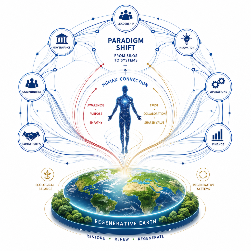
Jan's consistent feedback: the visualizations are cool but too abstract — practitioners arriving at the page need to see immediately what it's about without heavy cognitive work (33:00). The planet illustration (depleted → regenerative) was singled out as the right level of concreteness and clarity. Other scales need similar grounding with recognizable symbols — people, groups, structures — while staying sophisticated enough to avoid feeling like a children's illustration.
James proposed focusing the homepage attention-capturing animation on three concrete layers rather than illustrating everything (38:14):
Jan articulated the deeper conceptual thread the visualization should communicate (41:06): the difference between paradigms is where the individual identifies. In the old paradigm, the individual identifies with self or immediate team — making decisions at the cost of larger systems. In the new paradigm, the individual identifies with successively larger groups (organization, market, planet) as part of themselves, dissolving the trade-offs. The animation should make this identification shift visible across scales.
For the seven performance domains, James described how each could animate meaningfully — not just an overlay swap, but actual functional change (well-being's jagged graph leveling out, resilience shifting from shattered to flexible, agility from linear to an infinity loop, societal effects from walled off to radiating).
[technology="Parametric Geometric Interfaces"]
Jan flagged that "what is measured" risks framing the site as a performance measurement tool rather than a management framework (43:00). He proposed reframing as "effects on performance dimensions" to clarify that measurement is one part of a broader management approach.
The team agreed to a tighter weekly rhythm ahead of Jan's three-week absence beginning August 13th (45:32). Meetings will run Tuesdays and Fridays at 14:15 for the next two weeks, with James preparing a six-week proposal outlining the workflow and bringing more of his team in. James feels closer than ever to a clear style direction and will flesh out the strongest candidate for testing in context.
Next meeting will focus on style guide refinements and animation storyboard developments (47:05).
Jan Pfister
James Redenbaugh
Jan opened by clarifying his preference around creative production: he'd rather provide conceptual input and let James and team execute on image sourcing and visual development, given his demanding schedule (00:17). He emphasized budget isn't a constraint — he wants to invest more in the homepage to get it right.
James confirmed this works well, noting the team can find imagery in cohesive styles that complement each other (00:56). They aligned on a working order: settle the broad style and color direction first, then move into specific design features, with Jan's reference papers to come later.
The team discussed a hybrid approach to visuals (01:48). They want to avoid an overly "stocky" feel while still leveraging the right photography and video where it adds dimensionality. James outlined his approach: use real photography for things like landscapes, mountains, and Earth imagery where authenticity matters, and AI-generation for architectural spaces, human arrangements, mood, and color where human-created scenes are needed.
Jan shared key feedback from his team meeting: too much green risks signaling "green ideology" (11:03). The team leaned toward bluish tones as more entrepreneurial and business-appropriate, with green reserved for specific contexts like planetary sustainability sections. He also flagged that yellowish undertones in earlier explorations felt heavy and lacked freshness — he wants bright, clean backgrounds especially on the business side.
Direction crystallized around:
A central question emerged around how to differentiate the scholarly and business sides without the two pages feeling disintegrated (13:00). James proposed using a serif font for scholarly headlines and sans serif for business headlines, while keeping body fonts consistent to maintain visual unity. Tags and label fonts would also stay consistent across both.
Jan suggested exploring a classic typewriter or Times New Roman feel on the scholarly side to evoke academic conference aesthetics — dry, typeset, paper-like — in contrast to the colorful, direct, practitioner-facing business side (30:17).
After reviewing multiple style directions, the team converged on mixing elements: the business side treatment from the "relational field" direction (with blue/red color and clean font) paired with the scholarly side treatment from "fragile under pressure" or a similar typeset-feeling option (27:07). James confirmed mixing left/right pairings across style sets is possible.
James presented two foundational frameworks as visualization candidates (06:00):
Both could be stacked, overlaid, or animated to show paradigm transition (with dark/old on left moving to bright/new on right).
Jan's consistent feedback: the visualizations are cool but too abstract — practitioners arriving at the page need to see immediately what it's about without heavy cognitive work (33:00). The planet illustration (depleted → regenerative) was singled out as the right level of concreteness and clarity. Other scales need similar grounding with recognizable symbols — people, groups, structures — while staying sophisticated enough to avoid feeling like a children's illustration.
James proposed focusing the homepage attention-capturing animation on three concrete layers rather than illustrating everything (38:14):
Jan articulated the deeper conceptual thread the visualization should communicate (41:06): the difference between paradigms is where the individual identifies. In the old paradigm, the individual identifies with self or immediate team — making decisions at the cost of larger systems. In the new paradigm, the individual identifies with successively larger groups (organization, market, planet) as part of themselves, dissolving the trade-offs. The animation should make this identification shift visible across scales.
For the seven performance domains, James described how each could animate meaningfully — not just an overlay swap, but actual functional change (well-being's jagged graph leveling out, resilience shifting from shattered to flexible, agility from linear to an infinity loop, societal effects from walled off to radiating).
[technology="Parametric Geometric Interfaces"]
Jan flagged that "what is measured" risks framing the site as a performance measurement tool rather than a management framework (43:00). He proposed reframing as "effects on performance dimensions" to clarify that measurement is one part of a broader management approach.
The team agreed to a tighter weekly rhythm ahead of Jan's three-week absence beginning August 13th (45:32). Meetings will run Tuesdays and Fridays at 14:15 for the next two weeks, with James preparing a six-week proposal outlining the workflow and bringing more of his team in. James feels closer than ever to a clear style direction and will flesh out the strongest candidate for testing in context.
Next meeting will focus on style guide refinements and animation storyboard developments (47:05).
Jan Pfister
James Redenbaugh
Share recently published academic paper on academic freedom with James
Jan to share a recently published academic paper on academic freedom with James to support ongoing domain immersion and content work. Timestamp: 49:13
Flesh out strongest style direction combining business side from 'relational field' with scholarly typeset treatment and apply in context for review
James to develop the converged style direction: business side uses 'relational field' blue/red/clean font treatment, scholarly side uses a typeset/Times New Roman/academic conference aesthetic. Apply both in context (actual page layouts) for Jan and team review. Timestamp: 44:10
Refine layered homepage animation around three concrete layers — planet, individual, and organizational systems — illustrating the identification shift across scales
James to redesign the homepage animation concept around three concrete layers: planet (depleted to regenerative at base), individual (isolated to connected at center), and organizational systems (rigid grid to fluid/interconnected on periphery). Animation should make the identification shift visible across scales as the core narrative. Timestamp: 41:06
Develop concrete symbolic graphics for five scales and seven performance domains replacing abstract treatments with recognizable elements
James to replace abstract dot/line treatments for the five scales (individual, group, organization, market, planetary) and seven performance domains (financial, compliance, sustainability, well-being, resilience, agility, societal effects) with concrete, recognizable symbolic imagery — people, groups, structures — that practitioners can immediately understand without heavy cognitive work. Each performance domain should animate meaningfully (e.g., well-being graph leveling, resilience shifting from shattered to flexible, agility becoming an infinity loop). Timestamp: 39:53
Update site terminology from 'what is measured' to 'effects on performance dimensions' across design and content materials
James to update all instances of 'what is measured' framing to 'effects on performance dimensions' to correctly position the site as a management framework rather than a measurement tool. Timestamp: 43:51
Take ownership of image and video sourcing blending real photography with AI-generated imagery per agreed hybrid approach
James to lead all image and video sourcing for the project. Real photography to be used for landscapes, mountains, and Earth imagery where authenticity matters; AI-generation for architectural spaces, human arrangements, mood, and color scenes. Jan will provide conceptual input rather than handling sourcing himself given his schedule. Timestamp: 00:17
Draft six-week workflow proposal outlining team involvement and twice-weekly check-in structure
James to prepare a six-week workflow proposal covering team involvement, cadence (Tuesdays and Fridays at 14:15), and milestone structure ahead of Jan's three-week absence beginning August 13th. Timestamp: 44:10
Prepare style guide refinements and animation storyboard updates for Friday's session
James to prepare updated style guide tweaks reflecting decisions from this session (blue primary, red/gold accents, serif/sans-serif pairing, bright clean backgrounds) and animation storyboard developments for review at the next Friday session. Timestamp: 47:05
Attend twice-weekly check-ins on Tuesdays and Fridays at 14:15 through August 13th
Jan to commit to twice-weekly check-in sessions (Tuesdays and Fridays at 14:15) for the next two weeks ahead of his three-week absence beginning August 13th. Timestamp: 46:39
Develop comprehensive brand identity for Pro-Social Market Economy including visual language, typography, color palette, and aesthetic direction that balances credibility for business executives with accessibility for broader audiences. Process includes brand questionnaire exploration, metaphor development (flat world/round world, parallel worlds), philosophical stream mapping, and creation of visual precedents. Visual direction should communicate paradigm shift from individual optimization to relational management while feeling fresh, professional, and modern (not dated/yellowed). Core brand metaphor: weaving/tapestry representing relational fields - adaptable across icons, illustrations, and diagrams in both subtle and bold expressions. COLOR DIRECTION (as of 2026-07-05): Primary palette confirmed as red, green, blue, yellow with bold, saturated tones inspired by Google's bright, simple, inviting quality (24:40, 29:20). Blue as primary entrepreneurial tone with red and gold accents. Avoiding excess green to prevent "green ideology" signaling - reserve green only for specific sustainability contexts. Bright, clean, uniform white backgrounds required - no trending darker (20:08). Yellow adjusted toward more saturated, sunny tone rather than muted/dark (34:15). "Bold and fresh" established as guiding direction (37:00). Strong contrast between old paradigm (darker) and new pro-social paradigm (bright, fresh) essential to visual storytelling (25:56). COLOR REFINEMENT (as of 2026-07-08): Bright yellow, red, green repositioned as accent/support colors only rather than dominant backgrounds following Jan's external reviewer feedback (16:59). Darker blue singled out as particularly strong for grounding, especially as background for writing-heavy sections. Primary backgrounds established as dark blue, white, gray, or image. Bright colors used as accents in illustrations, tags, borders, card details. Overall goal: more concrete, less abstract. All website colors built as variables in Webflow allowing global updates (21:09). TYPOGRAPHY STRATEGY (as of 2026-07-01): Variable fonts unified into working Figma style guide (08:23). Moondial Narrow variable sans-serif for modern, versatile, Scandinavian feel with precise weight control. Paired with clean, readable variable serif font suited to academic dimension. Differentiate scholarly vs business sides through font pairing - serif headlines for scholarly sections (evoking academic conference, typeset, paper-like feel), sans serif headlines for business/practitioner sections. Body fonts remain consistent across both to maintain visual unity. Tags and labels consistent throughout. TYPOGRAPHY REFINEMENT (as of 2026-07-08): Serif font repositioned as reserved, intentional accent across site rather than wholesale switch on scholarly page to avoid mixed identity concern (23:03). Color usage stays consistent site-wide with variation introduced through visualized content (individual papers/citations shown as images within consistent containers) rather than structural shifts (24:01). Exploring bolder fonts possibly reviving earlier bolder primary font and sharper corners moving away from heavily-rounded feel to introduce more impact (36:00). IMAGERY APPROACH: Moving away from AI-generated imagery toward original illustrative language. Monya developing simple, geometric domain illustrations that lend themselves to animation - connections forming, geometries shifting, layers expanding on hover rather than static image swaps (03:00). Hybrid strategy using real photography for landscapes, mountains, Earth imagery where authenticity matters - approved especially for corporate/executive audience (32:31). Strategic use of real imagery and video for bringing paradigm shift to life deeper on page (38:41, 40:37). Avoiding overly "stocky" feel while leveraging appropriate photography and video for dimensionality. Hero section should not overwhelm with imagery - geometry is inclusive and lets people find own meaning. Real imagery, intelligently generated visuals, and curated stock deeper on page to make paradigm shift tangible (12:10, 20:19). Subtle texture to be added to solid color blocks for depth (38:41). VISUAL REQUIREMENTS: Concrete rather than abstract - practitioners must immediately understand content without heavy cognitive work (33:00). Recognizable symbols (people, groups, structures) while maintaining sophisticated presentation. Planet illustration (depleted → regenerative) established as right level of concreteness and clarity. Nature imagery (trees, water, ecosystems) as supportive presence connecting to sustainability. Circular graphics preferred over squared grids to represent how relationships operate. Figures should almost always include humans. Must feel distinct from Prosocial World's dark aesthetic. More contrast and brightness needed - avoiding muted/dark palettes from previous IRIS projects. STYLE DIRECTION CONVERGENCE: Business side treatment from "relational field" direction (blue/red color, clean font) paired with scholarly side treatment featuring typeset aesthetic. Eight homepage mockup variations developed spanning conventional to experimental to seed visual field. Latest homepage design from Munya represents "a real step forward" with clean, clear tone (19:00). Jan to review in Figma with direct commenting access and share with 2-3 collaborators for broader input (13:11, 48:12). DESIGN DIRECTION SHIFT (as of 2026-07-08): Jan's external reviewers confirmed current explorations by Munia are shaping nicely with strong details and softer textures but need more edgy, bold, straight-to-the-point quality from earlier editorial-style direction. Concern that current softness risks reading as "new idea we're writing about in a magazine this week" rather than grounded field that's here to stay (13:27, 15:32). Resolved through business vs. academic balance - business side carries bolder, more radical energy while academic side stays quieter and deeper, both communicating permanence and rigor (15:51). Next iteration explores bolder fonts, sharper corners, darker blue grounding (36:00). NEXT MILESTONE: 100% alignment on style guide by July 11 meeting before Jan's departure (17:44).
Design and develop an 8-page informational website for the Pro-Social Market Economy paradigm. Site serves as credible resource for executives, researchers, practitioners, and policymakers explaining how economic performance emerges from relational quality. Core structure includes: Home (paradigm hub with world-building metaphor visualization featuring weaving/tapestry metaphor to illustrate relational fields), Explore the Paradigm (interactive overview), Research and Resources (CMS-driven publications with chronological mapping of intellectual history from Ostrom through Wilson to current work, external journal links and PDFs), Practice and Policy (CDP diagnostics - four design mechanisms functioning as both diagnostic and interventionist tools), People, News and Events (simple calendar), Get Involved, and Evaluation and Tools. Built in Webflow with Airtable backend synced via Whalesync for easy content management. HOMEPAGE ANIMATION CONCEPT (as of 2026-06-26): Three-layer attention-capturing animation illustrating paradigm shift through identification across scales - (1) Planet at base moving from depleted to regenerative, (2) Individual at center moving from isolated to connected, (3) Organization/system structures on periphery moving from rigid grid to fluid interconnected. Animation should make visible how individual identification shifts from self/immediate team to successively larger groups (organization, market, planet), dissolving trade-offs between scales (38:14, 41:06). VISUAL FRAMEWORKS: Five Scales of Relationship (individual, group, organization, market, planetary) and Seven Performance Domains (financial, compliance, sustainability, well-being, resilience, agility, societal effects) as foundational visualization structures (06:00). Performance domains animate functionally not just as overlay swap - well-being's jagged graph leveling, resilience shifting from shattered to flexible, agility from linear to infinity loop, societal effects from walled off to radiating. Terminology refined to "effects on performance dimensions" rather than "what is measured" to clarify management framework vs measurement tool focus (43:00). VISUAL STRATEGY: Complementary aesthetics within one identity - scholarly sections with grounded research feel (serif headlines, typeset aesthetic evoking academic conferences), practitioner sections with fresh/modern feel (sans serif headlines, clean blue/red color palette), achieved through subtle shifts in typography and color rather than separate designs. Strategic nature imagery as supportive presence. Four design mechanisms need clear icons/visualizations to make diagnostic/interventionist framework approachable. CONCRETE GRAPHICS REQUIRED: Five scales and seven performance domains need recognizable symbolic elements rather than abstract treatments - practitioners arriving at page must immediately understand content (33:00, 39:53). Planet illustration style (depleted → regenerative) established as appropriate concreteness level. Sophisticated presentation maintaining recognizable symbols for people, groups, structures. KEY MESSAGING: This is cultural evolution of existing market economy, not alternative economy - markets where pro-sociality becomes driving force of value creation. Site must function as experience of paradigm shift itself - visitors should feel contrast between stressful fragile world of dominant paradigm and stable peaceful world of pro-social paradigm. Performance dimension (creativity, resilience, sustainability, economic outcomes) must remain central throughout. Content must be AI-accessible with accurate structure for indexing. TIMELINE CORRECTION (as of 2026-07-05): Heavy design work continues through next week to finalize direction before Jan's three-week holiday (July 13 - August 2). Build phase in Webflow starts during Jan's absence with locked design. August 4-8 continues build and refinement. August 11-15 for review, feedback rounds, and launch targeting end of August funding deadline (08:38, 14:20). Site map with wireframes to be generated for Jan's review before departure, flagging missing content areas (42:24). All content highly editable in Webflow allowing font/color/parameter adjustments after Jan returns (14:20). DESIGN DIRECTION (as of 2026-07-05): Background stays bright white rather than trending darker, referencing Google search page brightness and bold saturated primary colors (20:08, 24:40). Color palette confirmed: red, green, blue, yellow with "bold and fresh" as guiding direction (29:20, 37:00). Site tells story of old paradigm (darker) giving way to new pro-social paradigm (bright, fresh) requiring strong contrast (25:56). Subtle texture to be added to solid color blocks for depth, video integration in key places for aliveness including aerial earth imagery (38:41, 40:37). Real photos and people approved especially for corporate/executive audience (32:31). Four-mechanism figure needs more vibrant colors (31:48). DESIGN REFINEMENT (as of 2026-07-08): Jan's external reviewers provided clear directional feedback - current explorations by Munia are strong on details and softer textures but need more edgy, bold, straight-to-the-point quality from earlier editorial-style direction to communicate grounded field that's here to stay rather than new idea in magazine (13:27, 15:32). Bright yellow, red, green repositioned as accent/support colors only rather than dominant backgrounds (16:59). Darker blue singled out as particularly strong for grounding, especially as background for writing-heavy sections. Primary backgrounds: dark blue, white, gray, or image. Bright colors used as accents in illustrations, tags, borders, card details. Overall goal: more concrete, less abstract. Typography strategy refined - serif font used in reserved, intentional ways as accent across site rather than wholesale switch on one page. Color usage stays consistent site-wide with variation introduced through visualized content rather than structural shifts (24:01). All website colors built as variables in Webflow allowing global updates (21:09). Consistent main frame throughout site with variation brought in through individual papers/citations shown as images within consistent containers (23:03). NEXT ITERATION DIRECTION (as of 2026-07-08): Exploring bolder fonts possibly reviving earlier bolder primary font, sharper corners moving away from heavily-rounded feel to introduce more impact, darker blue brought back as grounding background color, bright colors repositioned as accents only (36:00). Logo development initiated reflecting planet-economy connection without green-activist framing (36:00). AI OPTIMIZATION: Content structured for AI readability through AIO/GEO (generative engine optimization) - properly structured headlines, tags, semantic markup, crawlable linked research. Research papers hosted directly on site when external sources block bots while maintaining links to originals. Ensures "pro-social market economy" becomes clearly defined and discoverable across AI-driven search (44:00, 46:24). NEXT MILESTONE: 100% alignment on style guide, agreed direction on graphics/illustrations, and sign-off on homepage design by July 11 meeting before Jan's departure (17:44).
Develop sophisticated parametric animation for PSME website homepage that serves as attention-capturing visualization of paradigm shift from individual optimization to relational management. Animation centers on three concrete layers illustrating identification shift across scales: (1) Planet at base - depleted ecosystem transitioning to regenerative thriving Earth, (2) Individual at center - isolated figure moving to connected being within relational field, (3) Organization/system structures on periphery - rigid grid structures dissolving into fluid interconnected networks (38:14, 41:06).
CONCEPTUAL FOUNDATION: Animation should make visible how individual identification expands from self/immediate team (making decisions at cost of larger systems) to successively larger groups (organization, market, planet) as part of themselves, dissolving trade-offs between scales. This identification shift is the core narrative distinguishing old paradigm from new (41:06).
VISUAL FRAMEWORKS TO ANIMATE: Five Scales of Relationship (individual, group, organization, market, planetary) and Seven Performance Domains (financial, compliance, sustainability, well-being, resilience, agility, societal effects) as foundational structures (06:00). Each performance domain requires functional animation showing actual change - well-being's jagged graph leveling out, resilience shifting from shattered to flexible, agility moving from linear to infinity loop, societal effects transitioning from walled off to radiating outward.
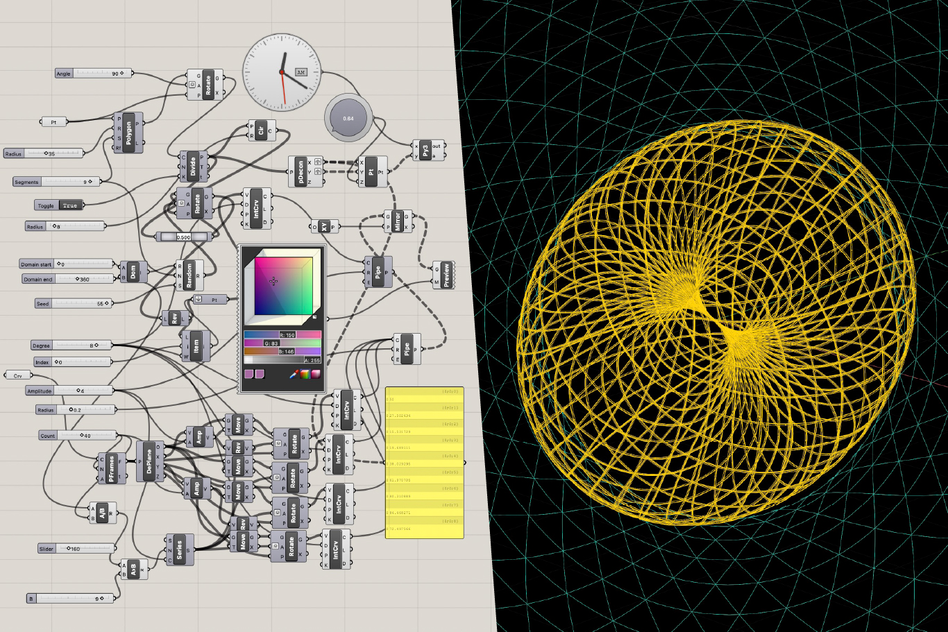
DESIGN REQUIREMENTS: Concrete rather than abstract - use recognizable symbols for people, groups, structures while maintaining sophisticated presentation. Planet illustration style (depleted → regenerative) established as appropriate concreteness benchmark (33:00). Must integrate seamlessly with brand direction: blue/red color palette, bright clean backgrounds, weaving/tapestry metaphor as core visual language. Simple geometric domain illustrations allow connections to form, geometries to shift, layers to expand on hover rather than static image swaps (03:00). Experimenting with overlaying different domains into single composite image - circular quality reinforces scientific microscope/telescope-like framing. Animation may be developed using Grasshopper for parametric geometric logic then translated to interactive JavaScript in Webflow.
TERMINOLOGY: Frame performance domains as "effects on performance dimensions" to clarify this is management framework not measurement tool (43:00). Animation should communicate paradigm shift as cultural evolution of existing market economy where pro-sociality becomes driving force, not alternative economy model.
DEVELOPMENT APPROACH (as of 2026-07-01): Monya developing simplified geometric illustrations that lend themselves well to animation potential (03:00). James experimenting with composite overlays and hover interactions. Hero section animation should be inclusive and non-overwhelming - letting visitors find own meaning. Strategic balance between geometric abstraction in hero and more literal real-world imagery deeper on page.
DELIVERABLES: Animation storyboard, style frames showing three-layer transitions, functional prototype for homepage integration, documentation of parametric logic for future adaptations.
00:00:00
Jan Pfister: Until until then, you know, this meeting. Is being recorded as input for you. And then, and then. Yeah. That maybe in early August we could, could get somewhere that that's realistic for you.
00:00:15
James Redenbaugh: Yeah, definitely. Yeah.
00:00:17
Jan Pfister: And, and one more thing I was thinking, you know, because you sent the, the links for searching photos and, and, and things and in a way I had hoped, you know, that kind of. I don't need to do this because I mean, we are paying you. Right. I get it that for you it's easier if I search this, but I think I rather prefer to give you input of what the ideas are and. Then it's executed by you, if that's okay. I just, I'm quite a busy job, but I don't want to complain, but there is quite a lot of stuff all the time going on.
00:00:55
James Redenbaugh: Yeah.
00:00:56
Jan Pfister: So. Yeah, because I would love to do more, but that's why I'm kind of, you know, I want to pay a bit more on the home page. That's fine. I'm also, I have budget so it's,. You know, whatever is needed that you are paid. But then if, if you can take it on that, that will be.
00:01:13
James Redenbaugh: Yeah, of course, no problem. It's just some, some people sometimes want to be involved in those things and finding images themselves and Yeah, I want to give that, give that opportunity, but it's it that can sometimes be more difficult than just doing it ourselves because we can find things in the right style, you know, that match each other, that we know are going to work,.
00:01:46
Jan Pfister: You know, how it goes anyway.
00:01:48
James Redenbaugh: Yes. Yes. Yeah. Yes. So, yeah, no problem. And we can talk about how, How and if we want to use stock images on the website, we definitely don't want it to feel too stocky. We don't want images that feel like stock images. But using the right stock photography can help illustrate the, the picture that we're trying to paint. And I find especially video, if it's the right video, it can, it can show the dimensionality of things. It can show things happening over time, but it's not mandatory. We don't necessarily need it on the website. We can use custom graphics and illustrations and other things to create the life that we want to feel on the site.
00:02:59
Jan Pfister: Yeah. And I guess this, what we discussed last time with this kind of. We had quite visible descriptions, I think. Of kind of paradigm shift illustrations. Isn't it in the room? And I guess I don't know what. Kind of tools that needs, but probably this needs something more than. Because I guess it would be still. Good to make this almost like real, isn't it? Kind of that, that it, that it. Maybe it is almost real. I don't know what the tools here are, but I guess AI probably provides all kinds of things.
00:03:40
James Redenbaugh: Yeah, yeah, we can generate pretty much anything these days. And I've gotten pretty good at creating things that are, they don't feel like they're AI generated, but. And you know, it works better for some things than, than others. And sometimes I'll generate a starting place and then I'll find an actual image that, that fits the mood. For example, if we're using an image of the Earth, of a landscape, of a mountain, I don't want to AI generate that. If we can find a real picture of, of the earth that, that fits the need that, that we have. But if it's like a particular architectural space and people in an arrangement and a mood, color and things that are human created, I'll generate those all day. No need to rely on what already exists for that.
00:04:58
Jan Pfister: And so, so would it be because now you sent a few of those designed types, so would it be kind of from the order of things, is it kind of. We'd have to decide on the broad. Color scheme and then, and then we would go from there into these design features and then. Oh, and then I, I still owe you also the papers, which I will. At some point give you also that, that they are there,. But I guess for now it's important to have the design. Right. Right. So the overall or what's the best order of working it through?
00:05:36
James Redenbaugh: Yes, great question. So I want to look at the different style possibilities with you today and see if there's one or aspects of one that feel like the direction for us. And they all now have these two parts that we discussed on the last call that I hope will be complementary. One side that's more scholarly and one side that's more, I say, business oriented, for lack of a better term, that more, more public and accessible. And the logos here are just placeholders. You know, we can get, get deeper into those. It's more just an opportunity to see the colors in, in an icon. But I brought a lot more care and specificity to the colors here and to the fonts that we picked than previous versions. So I want to take a close, a close look at these with you. And then also the idea I'm most excited about on our last call is the overlaying of the different systems. Or we can, we can think about them as systems. We can think about them as, you know, there's different layers that we can choose. But I mocked up two versions. One that uses the seven domains that you identify in the work, and one that uses the five scales. This one. And here they are side by side and just super simplified to start. Not. Not the graphics that we want to end up with, but just super simple. The five scales of relationship, from the individual to the planetary. And then the seven performance domains, what gets measured. So financial compliance, sustainability, well, being, resilience, agility, societal effects. And it doesn't necessarily have to be either of these. We can talk about this today. It could be some, like, more abstract version of the two combined or something like that. But, you know, here they are stacked, and they could also be overlaid, and we could have some kind of simple animation showing that transition. I guess maybe the dark side is the old, and that should probably be on the left, but you get the idea. So that's the other thing that I want to get into today.
00:09:01
Jan Pfister: Yeah, no, that's. I mean, that's cool with the different layers and to visualize that. That's really cool. I mean, do you think we could still have this as. Again, kind of more real in a. Sense of, you know, having their people kind of symbols and then several people,. And then, I don't know, some house. With a factory or something. I. I don't know what. But something that it's more concrete that. That it's visually immediately. Ah, okay. This is what it is. But it's still being abstract enough so. That it's not kind of like it looks like a children's play. But I think the layers. That's really cool. If you can Illustra this. Yeah, that's a really major thing to make that clear. And then the other one was, I think, that we talked about was the economic performance. Yeah. Which is, of course, these. These layers below. Yeah,.
00:10:11
James Redenbaugh: Yeah,.
00:10:16
Jan Pfister: Yeah. So I guess here the risk is only if they are listed like this. And you go on this page, then it almost looks like we have a tool to measure all that. I'm just. I mean, it's good that it is. Concrete because that makes it for somebody, you know, that's a practitioner. They go there and they see, okay, this is really about concrete stuff. And that's good.
00:10:40
James Redenbaugh: Mm,.
00:10:44
Jan Pfister: Yes. So how. So is it that we discussed this. First and then the different colors.
00:10:54
James Redenbaugh: Let's start with the style here. We can start wherever you want, but.
00:11:03
Jan Pfister: Yeah, yeah, the style. I checked a bit,. And,. I mean, there are really nice ones with it. But what I had an issue with. So one is I think green, as was also in this recording. I don't know whether you saw it. In that summary of the team meeting. Right. Green is the color. If too much green is there, people. Think, ah, this is some, you know, green ideology thing. So the team was kind of coming. Up more with blue bluish as kind of being for entrepreneur, business economy as a good color. But of course not blue alone, but. Kind of that that would be. Would make it probably more appealing in this. Then the other thing that I thought is here is still quite a bit of this yellowish and it makes it a bit, you know, I kind of. The freshness is a bit missing in. These color tones here for me, in. A way is this yellow. That makes it a bit darkish bit. I don't know. And also some of the backgrounds, I. Think depending probably on the screen, because I see here now it's looks whiter. Some are a bit white and some are a bit yellowish. So I tend to would go with. Quite a bright one, especially for the business side. Quite bright probably. And then straightforward fonts. And then. And then about the. The two types of fonts. I think there we. We said for the scholarly page. Just wondering how. How can this be done that it. It doesn't look like these two pages. Are kind of completely disintegrated. You know, when you have been won something. I think the. Was it somehow so that then the. The typesetting of the academic would be like what. I'm just thinking here loud. What was kind of like some typewriting or some, you know, like there you would have these kind of pages that. Are a bit yellowish maybe in the academic to illustrate. I don't know how to do that. But that it looks more. Here's the heavy stuff. And then the other side should be fresh, direct, passive. So concrete. Meaning. Is it maybe the last on the right side. That could be good for practitioners,. The relational field, I think it's called. Right. The right side of that.
00:14:04
James Redenbaugh: Yeah. Good for practice.
00:14:07
Jan Pfister: Something like that.
00:14:10
James Redenbaugh: What do you mean?
00:14:12
Jan Pfister: Yeah, something like that, I guess. And then if. If maybe blue bluish is the main color, but then there could still be. A bright green and a bright red or I don't know, something like for some places.
00:14:33
James Redenbaugh: Yeah.
00:14:39
Jan Pfister: Would that work design technically or is that. Yeah. Messing it up.
00:14:43
James Redenbaugh: Yeah, you can work.
00:14:46
Jan Pfister: Just. I think then it's kind of bright clear. Here it is. But of course still.
00:15:02
James Redenbaugh: Cool. I'm gonna.
00:15:05
Jan Pfister: And. And just once more, is it. Is it a good idea to have now two fonts for scholarly and the. Business or is it better to go with one and make it integrated and then have in the scholarly part still. The same font general, but then some. Parts, you know, that are kind of made with typewriting or kind of more. As design features that the page doesn't disintegrate. That's. I'm a bit worried.
00:15:31
James Redenbaugh: Yeah. I think as long as they're compatible, it could be. It could be really good to have a serif font for the scholarly side and the sans serif font for the business side through the headlines. But I think that the body fonts should be the same to create that consistency. And then we'd have certain consistent elements like the. Like the tags and, you know, label. Label fonts and things like that. Because often these days we'll. We'll want to have different headline styles anyway. A san. Serif style and. And a serif style and they can be mixed and matched. And I think some of these play better with the. Their counterpart than others. Maybe it's the colors here, but. I think that the. This one here, for example, even though the. The serif font and the sans serif font over here are, you know, are very unique fonts, they. They complement each other well. You want the right combination of similar and different. These are maybe a little too different. And these are maybe a little too similar.
00:17:38
Jan Pfister: Yeah, I see. So the paradigm gradient block there. Yeah, that's actually quite nice. Yeah. Font itself, then the colors. With maybe different colors.
00:17:53
James Redenbaugh: Yeah. But I'm hearing we want, you know, clarity generally a bright background, maybe a red accent. Avoiding blues.
00:18:14
Jan Pfister: Not avoiding blues.
00:18:15
James Redenbaugh: No, sorry. Avoiding greens. And.
00:18:18
Jan Pfister: And of course, I think. Is it, of course, a bit of green? Right. When. When, for example, we design the planetary. Level, of course, where there is sustainability in the page somewhere, then of course it might be good to have greenish involved. If that's just that the overall page doesn't appear as green. That's kind of.
00:18:48
James Redenbaugh: So these have more reds now. Less colorful backgrounds, brighter backgrounds. How are these feeling? I know it's a lot of. Of new options now.
00:19:15
Jan Pfister: Yeah,.
00:19:30
James Redenbaugh: Yeah.
00:19:31
Jan Pfister: Tough one to. So is there a possibility to kind. Of set the background in each one the same? Yeah, yeah, just. I guess then it will be easier to kind of. But is it now in the paradigm gradient, I think now the two change. Swapped sides. Right. Because I think the left is more. The business. Yeah, it's even there.
00:20:20
James Redenbaugh: Yeah, I switched it because I feel like the. The business is going to see what. Going to be what people see first and then they dig into the scholarly. Do we want A. A dark mode, light mode switch on this site like I have here on my website. Or do we want to just be light?
00:21:04
Jan Pfister: Yeah, I think probably just light. Of course, then we had. We talked about these animations where there. Is dark and bright in it. Yeah, I think. I think it's good if that page. Is something as a bright appearance. General.
00:21:30
James Redenbaugh: Yeah, I think you're right. I'm just working on changing the background colors to make them all the same. Real quick.
00:22:04
Jan Pfister: This is really tough to do. My God, so many choices.
00:22:19
James Redenbaugh: Yeah. Are there any that you can eliminate off the bat?
00:22:24
Jan Pfister: Well, I think I like. So first impression is now below. You have this on the bottom, I think.
00:22:34
James Redenbaugh: So.
00:22:34
Jan Pfister: That on the left side, I think. Would that be kind of business, like?
00:22:45
James Redenbaugh: I think so.
00:22:46
Jan Pfister: Or is that too much? But I think this is a belief. What I had in mind, kind of.
00:23:02
James Redenbaugh: I like the brighter backgrounds. I'm missing a fuller spectrum. I like having the red accents, but. I think that we also want to have the orange. So I would eliminate four. Even though I like the consistency. I think it's missing blue, but I like having the gold in here. My favorite right now is the bottom, but I feel like now it's missing a gold to kind of round things out. This feels a little weak to me, but I actually like the. I like the gradient that's used in the circle in the icon here. These feel. These feel good to me. They feel safe. I think number two is maybe my second favorite. We're not really seeing the red accent in there yet, but that's okay. And the. The headline here is the same font as the headline over here. It's just a different weight, But I think it works. It works well. And the background. The difference in the background is very subtle, but I think it works.
00:25:00
Jan Pfister: For me. I think the font here is too. Bold for the business, making it a. Bit not clear enough. I think the one below is like. You see it and it's clear. The one further below that we had, I think. Was it.
00:25:15
James Redenbaugh: Yeah.
00:25:16
Jan Pfister: This one, I think, you know, when you look at this, it's immediately clear. Did you now change the background or. A little bit.
00:25:34
James Redenbaugh: There we go. So I can make all the backgrounds uniform.
00:26:03
Jan Pfister: Yeah. So I kind of feel the left side there is good. But what you say is about the color. Right. So there is. So now it uses basically the dark blue, isn't it? So the bright blue there is not in it in this relational field. I mean,.
00:26:25
James Redenbaugh: Sorry. Yeah, there's not a super dark. There is up here.
00:26:46
Jan Pfister: So would it Be possible then to. Match that left side from this relational field also with another scholarly tone? Or they are kind of. They are matched that they're ideal. The. The left and the right for each thing is they are kind of a fixed pairing.
00:27:07
James Redenbaugh: What do you mean a fixed pairing?
00:27:09
Jan Pfister: So the relational field. So if, you know, the business side. That I really like, kind of the. Font at least, and the blue and the red and. Then on the right side, the font is that kind of a fixed one that connects with the other. So my question is basically, can you mix a left side business with another. One from the scholarly.
00:27:42
James Redenbaugh: Yeah, definitely.
00:27:43
Jan Pfister: Yep. Yeah.
00:27:48
James Redenbaugh: Which scholarly side do you think works the best?
00:27:57
Jan Pfister: Is it maybe that fragile under pressure?
00:28:01
James Redenbaugh: Yeah, I like that one.
00:28:04
Jan Pfister: Or is that too far off from the. Yeah,. The other hand, the one that is now there is kind of just. Black font, which is also quite a good idea. So if the. The business side, you know, is more. Colorful with blue, red, maybe some green, where it's about sustainability, if that's possible. And then the scholarly part is a. Little bit, you know, when you go, for example, to presentations from scholars in. Conferences, I mean, I guess you see them also. Right. Because you go to. To depends where you go. Scholarly presentations are really dry based on. On typing and stuff. And when you go to business presentation,. It's kind of colorful. And so maybe it is a bit in that sense. That last pairing is quite a cool one.
00:29:10
James Redenbaugh: Yeah.
00:29:16
Jan Pfister: I just wonder whether the. The font could still be more. No. So the small font. Right. We said it's the same left and right. The titles are changing. That's actually quite cool.
00:29:37
James Redenbaugh: I think that this might be a little bold. I like the font weight here. These two are the same font and white. And this is actually the same font. It's just boulder. But let's, let's come back to this in a minute. I want to make sure we have time to explore the. The scales and the performance domains. So just.
00:30:17
Jan Pfister: If I, if I just have one comment just to that scholarly. What? To that scholarly font. You know, would it be kind of a classic Times New Roman, maybe written over? I don't know whether you have variations of that. That kind of really is typical typesetting. For. For the scholarly page. That could just be one.
00:30:40
James Redenbaugh: Yeah.
00:30:41
Jan Pfister: But can also have a look at next time.
00:30:47
James Redenbaugh: Sure. So this. I've taken the simple graphics and made them more detailed. I don't think that this is. This is it yet, but it's getting. It's getting closer and maybe we can have some more overlay happening. But overlap. But these are the five scales. So on the individual moving from kind of localized and isolated to connected, similar with groups. Maybe we could show kind of distinct separate groups kind of merging into one. I'd play more specifically with having the graphics match and kind of combine. The organization would be moving from a grid to something a lot more circular. The market similar to groups. But we want to make it different from kind of separate and orthogonal to something that's a lot more interconnected and whole the planet from depleted to regenerative.
00:32:46
Jan Pfister: So yeah, I mean that looks already. Much better I think. So what my first impression is. So the last one of the planet that I think is the direction that. I really like that it's concrete. You look at it, you see it. So if we could do the others because they're still quite, I mean they look cool but they are quite abstract. So as a, you know, somebody having no time, I go to this pro social market web page. I open in and think oh what, what is this you see here? Kind of. Right. So that people have anyway no time. So they see immediately oh that's what's going on here. So I wonder would, would that be possible in a way to. How to. How to illustrate this then when. Yeah, so the, the organizations are competing. Basically against resources but in the other way. So I mean the, the competition is one for efficiency and cuts vers for service. I think the kind of. That's the mindset that you. That might be inspiring for creating something. Yeah, yeah, I see what you do. Yeah, it's kind of separated versus connected.
00:34:14
James Redenbaugh: And then down here we have the performance domains so financial, you know, moving from one metric to many. Compliance. Moving from checking the box to self regulating. I'm not sure if we need the additional graphics over here, if we don't have that over here. But sustainability moving from an add on, you know, whitewashing to it being embedded. Some way to show that embeddedness, Well being strain, jagged change to steady. Resilience. Moving from shattered to you know, something that. That is brittle and breaks to something that's flexible. Agility. Moving from linearity to adaptive. This could be more like an infinity symbol infinite loop and then social effects walled off to radiating. And for these, these could actually be. Animated relatively easily if we want to. Like you could picture the well being graph here. The slider doesn't just kind of overlay a new image like this one does, but actually changes the function of the graph so that it levels out. Or here, you know, this would in having these things be separate they would be combined and then turned into something like this. You know, here the, the color would change in these other metrics would kind of rise up from the same ground. That could be interesting if it's worth doing.
00:37:04
Jan Pfister: Yeah, I mean, it looks really cool. I guess it is. My, I guess my concern is the same. Right. It's still quite abstract and if it, if the, if these visualizations can somehow. Be made more realistic, that would be because it's still. I have to really think so if I go to sustainability, I really have to think so what does that mean here on the left, to the right? I mean, you have to do a lot of thinking work to understand what's going on.
00:37:35
James Redenbaugh: Yeah.
00:37:37
Jan Pfister: Even though it looks cool. So it's just, I guess, you know, you look at it, you see, okay, that's what's happening. How could that be done?
00:37:48
James Redenbaugh: So, so maybe for the, the attention. Capturing animation on the homepage, we focus on the elements that are. Really clear and obvious rather than trying to illustrate everything.
00:38:14
Jan Pfister: Yes.
00:38:15
James Redenbaugh: So the planet one, I think is super straightforward. What others?
00:38:24
Jan Pfister: So if, if, if you can go. Up again to these different layers, I. Mean, cool would be here. So I mean these different layers. So if you go even further up. So then you have the individual. I just wonder in the end, it is it everywhere. It is individuals that make decisions and act in a certain way. And they are embedded in the group and embedded in the organization and embedded in the market and the planet. So wonder.
00:39:00
James Redenbaugh: Still.
00:39:01
Jan Pfister: I think this is kind of cool. If this could be illustrated that you know, what comes from the individual behavior to the group to. Because the, the point of this is to in a way illustrate that the big behavior and the small behavior is. As the same cause.
00:39:21
James Redenbaugh: Yeah.
00:39:25
Jan Pfister: So, yeah, that, that's, that's, I think really good. We could do that.
00:39:32
James Redenbaugh: Cool.
00:39:34
Jan Pfister: Or so what you meant is to. Just use the planet, but that's, I think too easy. Then it. So I think what you have done here is great. It's the only thing I'm asking is. Kind of, you know, making it more visibly concrete.
00:39:53
James Redenbaugh: Yeah, right. I think that there's. If we're really going to overlay them on top of each other, maybe three layers is the maximum for that initial visual conversation. So we could have the planet kind of moving from depleted to regenerative at the bottom. And then in the center, maybe we have something representing the individual moving from isolated to connected. And then on the periphery, maybe we have the system structures, organizations that that individual is embedded in. Moving from rigid and grid to Fluid, adaptable, interconnected. I think that those three things would fit. We could potentially add. Yeah, add a bar graph in there too. What were you going to say?
00:41:06
Jan Pfister: Yeah, no, I think when, when you go up to the. So. So I think the illustration if. If that could be captured. So you have an individual and the individual identifies with the self as part. Of the organization and of course makes decisions concerning the self, meaning it ignores. The planetary level in the other one. You have an individual being identified with. The group, the organization, the planet as part of. Of it. So the separation happens from the individual. To the group, whatever that group is in the old paradigm and the new paradigm it is the identification with the bigger groups that. So I mean if. Because that's. For example, when, when I present this. It's usually exactly the planet or the individual. I think I sent you this, some of this. So the individual, the organization and the planet. And that you can say there are. All the trade offs happening and you need to. The trade offs in sense of people make decisions for their own team at. The cost of organization or for the. Organization at the cost of the planet. And it comes from that mindset we need just to align the individuals with. The organization while the other one has the mindset of creating mission and purpose. Driven to the larger groups one is part of that could be illustrated in parallel somehow.
00:42:48
James Redenbaugh: Okay, cool. Why don't I play with that. And see what comes with it. Yeah.
00:43:04
Jan Pfister: And actually one more thing that I just see now when you have these dimensions, it's written what is measured. And I think. Yeah, so I think it's the performance. Dimensions because the thing is it's not a. It's not a performance measurement page, you. Know, in the sense it's a page of how to manage organizations and measurement is a part of it. So I think just that it's not misunderstood. So it should be kind of effects. On performance dimensions, for example. That could be. And then the performance dimensions are. Are illustrated what some of them. What this actually would do.
00:43:48
James Redenbaugh: Yeah.
00:43:51
Jan Pfister: Okay, good. Yeah.
00:43:55
James Redenbaugh: Cool. Good.
00:43:57
Jan Pfister: Yeah. So I. I'm now quite flexible in. Having meetings, especially in my evenings. So what would be a good timing to talk again?
00:44:10
James Redenbaugh: Great. I think that we should set up a weekly rhythm and I can outline essentially a little proposal for the next six weeks of a ideal flow of getting this done, what that can look like, especially bringing in more of my team and putting them to work on things. I feel closer than ever to identifying a clear style to. To run with. And there's probably some. Some refinement that's needed. But based on our conversation today, I think I should take the. The one that we're closest to and flush it out and then we can tweak it as needed. But let's look more closely at it, see what it looks like in context, Play with it, kind of put it to the test, and then if we want to. To tweak a color or a font, that's more than easy. Super easy. So.
00:45:32
Jan Pfister: Yeah, and. And just timing wise, as I said. So now it's the 24th, right? Yes. And then I'm still here, so I'm still two weeks around. So maybe is it good if we have, for example, meeting Tuesday and Friday and then again Tuesday and Friday so that we have. Or is that too much? I mean, I don't know what it. Because then afterwards there will be the. Three weeks where I'm off.
00:46:01
James Redenbaugh: Yeah, yeah, great point. So, yeah, let's stay in a tighter loop. And so the. The three weeks that you're off start on which date?
00:46:12
Jan Pfister: On the 13th. So 13th until 2nd of August.
00:46:17
James Redenbaugh: Cool. So at that point, we want to make sure that we have what we need to really run with things and make a lot of progress. While you're done or while. While you're off, do you want to meet again on Friday this week, even for a shorter meeting? We don't need a whole hour to check in on progress.
00:46:39
Jan Pfister: Yeah, that's good. So I could do. So actually, if we would do the same time as today with the kind of 10 post or 15 post,. That would work quite well.
00:46:55
James Redenbaugh: Great.
00:46:59
Jan Pfister: So 15 past 2. Yeah,.
00:47:05
James Redenbaugh: Let's do this. All right, let's hit your calendar invite there. Let's check in then, and let's use that time to tweak the style guide and look at some developments in that animation storyboard.
00:47:57
Jan Pfister: Cool, Good. Great.
00:48:00
James Redenbaugh: Sounds good.
00:48:01
Jan Pfister: Then have. I think I got it. Just. Just checking that it's.
00:48:08
James Redenbaugh: Yes.
00:48:12
Jan Pfister: So, by the way, do you have. So what is your name now? Is it James Redenbow or James Bolden or how does that work?
00:48:21
James Redenbaugh: Good question. Technically, it is still James Redenbaugh. We're in the process of changing it, and it'll become James Bold. And my. My wife and I are combining our names.
00:48:35
Jan Pfister: Are you combined the names?
00:48:37
James Redenbaugh: Yeah, we both have long names and we wanted a new name for our family to be. So we took three letters from each of our names and made Bolden.
00:48:52
Jan Pfister: Cool. So you can do this? You can just change the name.
00:48:56
James Redenbaugh: You can do whatever you want in America.
00:48:58
Jan Pfister: Is that so?
00:48:59
James Redenbaugh: Wow.
00:49:00
Jan Pfister: I think this will be quite. I have never heard that you can just.
00:49:04
James Redenbaugh: Wow.
00:49:05
Jan Pfister: That's the country of freedom. Yep, kind of.
00:49:13
James Redenbaugh: Kind of. Yeah. In certain domains. Yes.
00:49:16
Jan Pfister: Yeah, that's right.
00:49:17
James Redenbaugh: Oh, there's not so much.
00:49:19
Jan Pfister: Yeah, yeah. Actually. Actually had a really good week. I got a paper published in an u. S. Top journal and it's about academic freedom, so.
00:49:28
James Redenbaugh: Oh, cool.
00:49:29
Jan Pfister: That was. It's gonna be interesting what this is gonna do.
00:49:33
James Redenbaugh: Yep. Awesome. Feel free to send that through. I'd be happy to read it.
00:49:39
Jan Pfister: Yeah, I can. And at will still take a few. Weeks, but then it will be. We'll be ready.
00:49:45
James Redenbaugh: Cool.
00:49:47
Jan Pfister: Good. Yep. Thanks.
00:49:49
James Redenbaugh: Okey doke. I'll see you soon.
00:49:51
Jan Pfister: Yep. See you. Bye.
00:49:52
James Redenbaugh: Bye.








.svg%20(1).png)


.png)