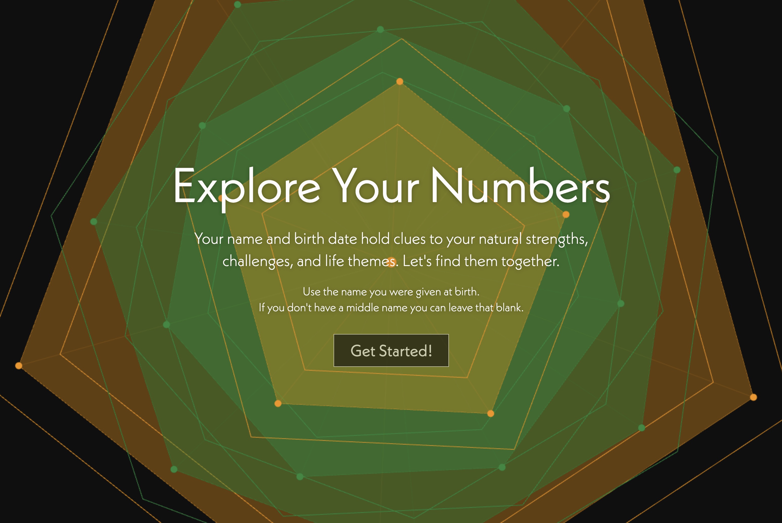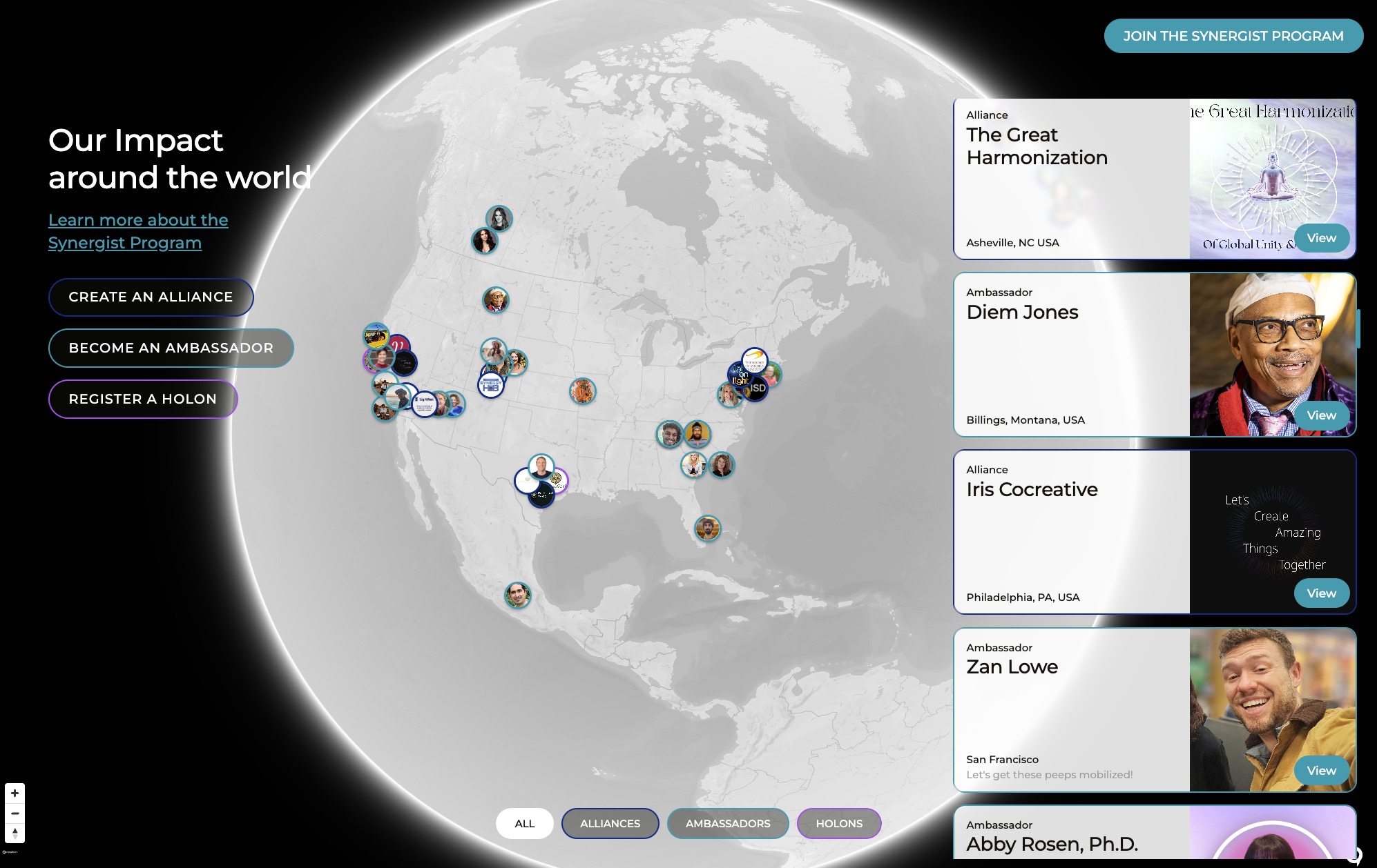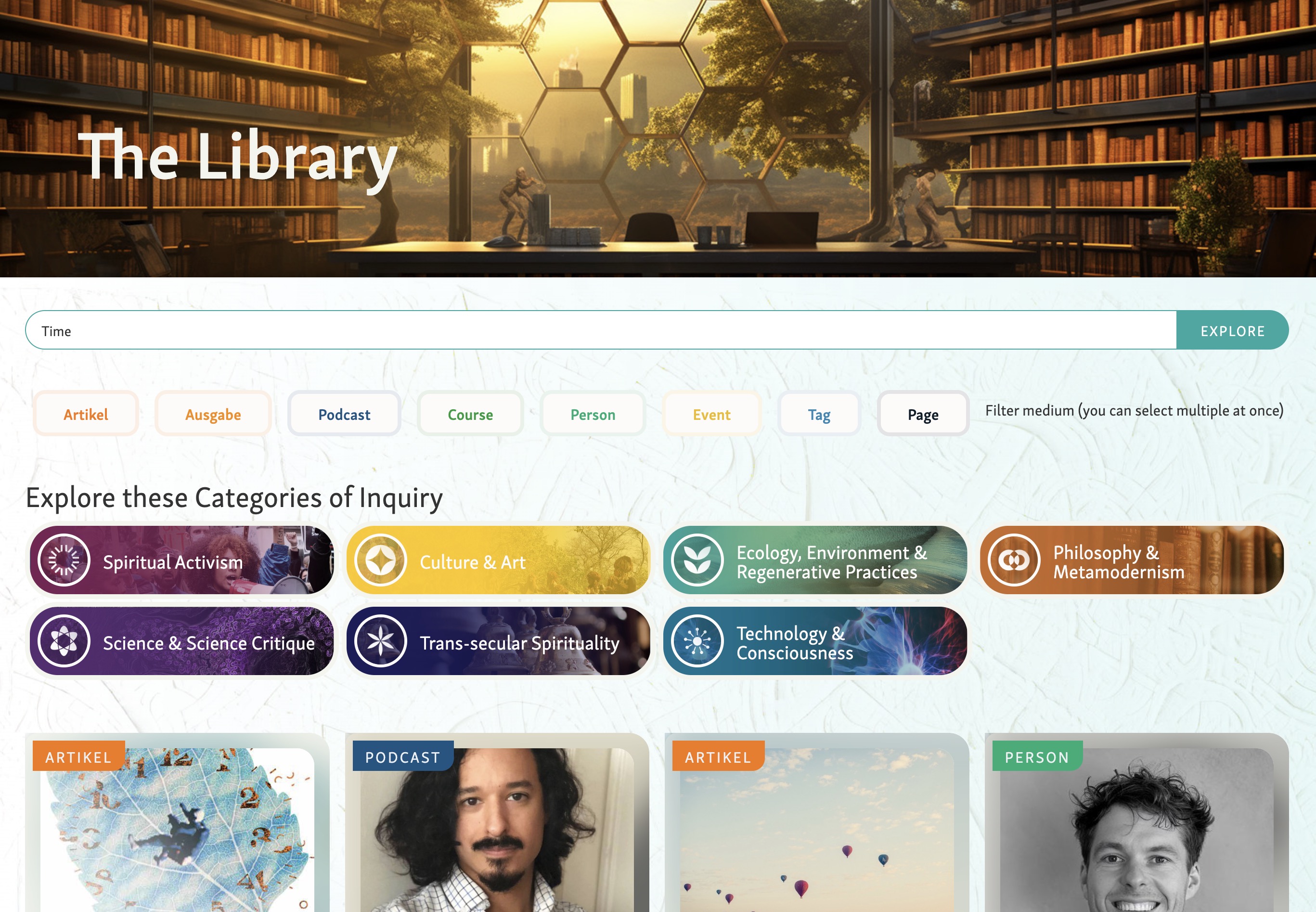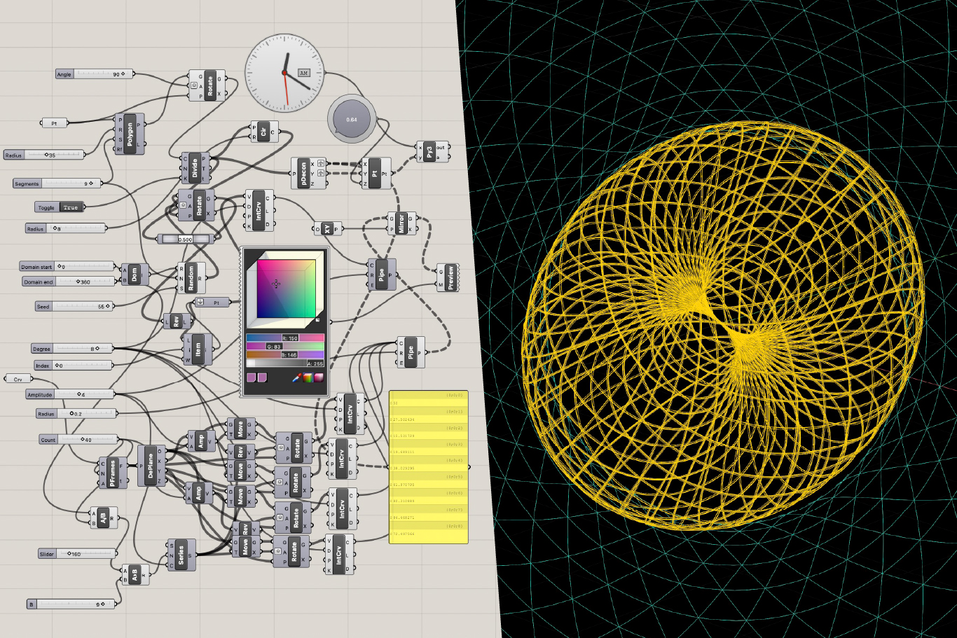
James presented eight homepage mockup variations to seed the visual field with possibilities rather than commit to a single direction (03:12). The mockups intentionally spanned a spectrum from conventional and clean to more experimental and boundary-pushing, with the goal of finding a design language that mirrors the innovation of the pro-social paradigm itself.
The first two options (A and B) presented straightforward, readable layouts — one warm with gold and terracotta tones, the other cooler with yellow pops and funky typography. James noted these felt generic without strong imagery to elevate them. Options C and D leaned more academic and literary, with text-based layouts breaking templated feels. The final pair (G and H) began weaving in custom AI-generated graphics and people-centered imagery, including a standout image of people sitting within a woven tapestry of relationality.
A recurring theme emerged around weaving as a potential core brand metaphor — adaptable across icons, illustrations, and diagrams in both subtle and bold expressions. James also shared a visual mood board exploring light, woven patterns, and the interplay of gold and terracotta against cooler alternatives (13:57).
Zachary Sherman expressed a personal preference for the cooler blue and gold palette seen in options B and F, while noting the circular woven logo elements felt particularly strong. Jan clarified that while Finland would naturally pull cool, the platform aims to be global, so geography shouldn't dictate the palette (17:21).
Jan offered a deeper framing: the site should function as an experience of the paradigm shift itself. Visitors should feel the contrast between the stressful, fragile, psychologically unsafe world of the dominant paradigm and the stable, peaceful, purposeful world of the pro-social paradigm. Color tones could carry this — moving from darker to brighter, with nuance in the middle rather than a naive black-and-white binary (19:34).
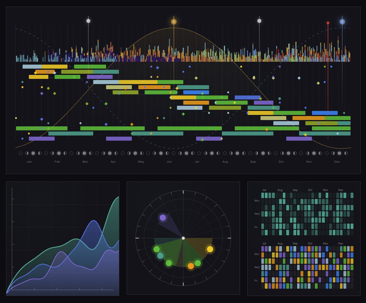
Jan responded strongly to the circular graphics over the more squared grid patterns, noting that relationships don't operate in squares (22:58). Circles could illustrate the contrast between old and new paradigms — what happens among people, across multiple levels, and in economic performance outcomes.
A key creative direction emerged around illustrating the planet (or a portion of it) with people and nature, showing how behavior under each paradigm produces different outcomes:
James emphasized that the new paradigm isn't a bulldozing of capitalism but an evolution building on existing structures, so the visual articulation should avoid the typical "global destruction vs. solar-punk utopia" trope (29:14).
Jan articulated the philosophical center: the paradigms differ in mindset — separation versus interdependence, self-interest versus shared purpose (34:04). These mindsets produce dramatically different outcomes in meetings, organizations, and gatherings. A powerful insight surfaced about parallels between macro and micro behaviors — the same dynamics people decry in geopolitical conflict play out in everyday business meetings around recognition, resource allocation, and competition. The site could help individuals recognize their own participation in patterns they may otherwise only see at the global scale (40:23).
James proposed a spectrum running from literal representation (detailed people, places, connections) to abstract geometry (shapes, light, pattern). Jan felt strongly that real photographs should remain part of the mix to ground the concepts — pure abstraction would feel disconnected. Zachary Sherman noted the practical challenge of choosing a consistent illustrative style (hand-drawn vs. graphic) that can carry the nuance of "how blurry the line is" between paradigms (37:08).
A guiding principle emerged from Jan: figures should almost always include humans somewhere in the composition, since the paradigm is fundamentally about how humans act (55:11).
Jan proposed grouping the site's audiences into two natural pairs (43:40):
Case studies for education may eventually warrant their own section, but can start as a placeholder.
A key opportunity is visually mapping the chronological evolution of the paradigm — showing how Elinor Ostrom's work on the commons and self-governance converged with David Sloan Wilson's evolutionary theory on group-level performance, leading to the generalized core design principles, and then to Jan's own extension into performance management, competition culture, and the relational/sustainability dimensions of the pro-social market economy (46:36). This trajectory should be easy for academics to grasp at a glance, and equally valuable for practitioners who tend to lose sight of the foundations once they begin applying the work.
Research papers will live primarily as external links to journals or PDFs, with the option for users to choose between both. The site will support a research post type allowing flexible display — embedded widgets within thematic sections, a searchable archive page, and visual representations of how the pieces connect over time.
James raised an important consideration: the site needs to be digestible not just for human readers but for AI systems that will increasingly mediate how people encounter this work [tag="claude"]. Jan recognized this as critical — making the foundational content highly accurate and well-structured for AI indexing.
Jan closed with a reminder not to lose the performance dimension in pursuit of beautiful imagery (56:47). The pro-social paradigm's core business argument is that it produces better outcomes — creativity, resilience, sustainability, and economic performance. This is the hook that convinces business leaders to reconsider their assumptions, and it must remain visible throughout the visual and narrative design.
James is leaving for Portugal and will be reachable asynchronously until June 3rd, fully back June 13th. The plan is to continue gathering inspiration and refining direction during this window, potentially beginning backend CMS setup so Jan can start organizing research content and exploring the content structure. James offered to create a FigJam space for collaborative inspiration gathering as an alternative to Google folders.
[technology="Directory Systems"]
James Redenbaugh
Jan Pfister
Zachary Sherman
James presented eight homepage mockup variations to seed the visual field with possibilities rather than commit to a single direction (03:12). The mockups intentionally spanned a spectrum from conventional and clean to more experimental and boundary-pushing, with the goal of finding a design language that mirrors the innovation of the pro-social paradigm itself.
The first two options (A and B) presented straightforward, readable layouts — one warm with gold and terracotta tones, the other cooler with yellow pops and funky typography. James noted these felt generic without strong imagery to elevate them. Options C and D leaned more academic and literary, with text-based layouts breaking templated feels. The final pair (G and H) began weaving in custom AI-generated graphics and people-centered imagery, including a standout image of people sitting within a woven tapestry of relationality.
A recurring theme emerged around weaving as a potential core brand metaphor — adaptable across icons, illustrations, and diagrams in both subtle and bold expressions. James also shared a visual mood board exploring light, woven patterns, and the interplay of gold and terracotta against cooler alternatives (13:57).
Zachary Sherman expressed a personal preference for the cooler blue and gold palette seen in options B and F, while noting the circular woven logo elements felt particularly strong. Jan clarified that while Finland would naturally pull cool, the platform aims to be global, so geography shouldn't dictate the palette (17:21).
Jan offered a deeper framing: the site should function as an experience of the paradigm shift itself. Visitors should feel the contrast between the stressful, fragile, psychologically unsafe world of the dominant paradigm and the stable, peaceful, purposeful world of the pro-social paradigm. Color tones could carry this — moving from darker to brighter, with nuance in the middle rather than a naive black-and-white binary (19:34).
Jan responded strongly to the circular graphics over the more squared grid patterns, noting that relationships don't operate in squares (22:58). Circles could illustrate the contrast between old and new paradigms — what happens among people, across multiple levels, and in economic performance outcomes.
A key creative direction emerged around illustrating the planet (or a portion of it) with people and nature, showing how behavior under each paradigm produces different outcomes:
James emphasized that the new paradigm isn't a bulldozing of capitalism but an evolution building on existing structures, so the visual articulation should avoid the typical "global destruction vs. solar-punk utopia" trope (29:14).
Jan articulated the philosophical center: the paradigms differ in mindset — separation versus interdependence, self-interest versus shared purpose (34:04). These mindsets produce dramatically different outcomes in meetings, organizations, and gatherings. A powerful insight surfaced about parallels between macro and micro behaviors — the same dynamics people decry in geopolitical conflict play out in everyday business meetings around recognition, resource allocation, and competition. The site could help individuals recognize their own participation in patterns they may otherwise only see at the global scale (40:23).
James proposed a spectrum running from literal representation (detailed people, places, connections) to abstract geometry (shapes, light, pattern). Jan felt strongly that real photographs should remain part of the mix to ground the concepts — pure abstraction would feel disconnected. Zachary Sherman noted the practical challenge of choosing a consistent illustrative style (hand-drawn vs. graphic) that can carry the nuance of "how blurry the line is" between paradigms (37:08).
A guiding principle emerged from Jan: figures should almost always include humans somewhere in the composition, since the paradigm is fundamentally about how humans act (55:11).
Jan proposed grouping the site's audiences into two natural pairs (43:40):
Case studies for education may eventually warrant their own section, but can start as a placeholder.
A key opportunity is visually mapping the chronological evolution of the paradigm — showing how Elinor Ostrom's work on the commons and self-governance converged with David Sloan Wilson's evolutionary theory on group-level performance, leading to the generalized core design principles, and then to Jan's own extension into performance management, competition culture, and the relational/sustainability dimensions of the pro-social market economy (46:36). This trajectory should be easy for academics to grasp at a glance, and equally valuable for practitioners who tend to lose sight of the foundations once they begin applying the work.
Research papers will live primarily as external links to journals or PDFs, with the option for users to choose between both. The site will support a research post type allowing flexible display — embedded widgets within thematic sections, a searchable archive page, and visual representations of how the pieces connect over time.
James raised an important consideration: the site needs to be digestible not just for human readers but for AI systems that will increasingly mediate how people encounter this work [tag="claude"]. Jan recognized this as critical — making the foundational content highly accurate and well-structured for AI indexing.
Jan closed with a reminder not to lose the performance dimension in pursuit of beautiful imagery (56:47). The pro-social paradigm's core business argument is that it produces better outcomes — creativity, resilience, sustainability, and economic performance. This is the hook that convinces business leaders to reconsider their assumptions, and it must remain visible throughout the visual and narrative design.
James is leaving for Portugal and will be reachable asynchronously until June 3rd, fully back June 13th. The plan is to continue gathering inspiration and refining direction during this window, potentially beginning backend CMS setup so Jan can start organizing research content and exploring the content structure. James offered to create a FigJam space for collaborative inspiration gathering as an alternative to Google folders.
[technology="Directory Systems"]
James Redenbaugh
Jan Pfister
Zachary Sherman
Share all mockups and visual mood board materials from today's session with Jan and Zsher
James to distribute all eight homepage mockup variations and the visual mood board explored during today's session so Jan and Zsher have reference materials for ongoing feedback. Timestamp: 54:36
Set up a FigJam space for collaborative inspiration and resource gathering
James to create a FigJam space (or Google folder as alternative) where Jan and Zsher can collectively gather inspiration, reference images, and resources asynchronously during James's Portugal trip. Timestamp: 55:27
Update brand guidelines questionnaire with content from Jan's notes on psychological safety and paradigm adjectives
James to incorporate Jan's recent notes — specifically around psychological safety framing and descriptive adjectives for the paradigm — into the working brand guidelines questionnaire document. Timestamp: 02:18
Articulate clear homework and resource gathering instructions for Jan and Zsher following this call
James to communicate concrete next steps and homework expectations to Jan and Zsher — covering what to gather, where to put it, and how to organize inputs during the asynchronous window before James returns June 13th. Timestamp: 01:00:53
Coordinate backend CMS setup during Portugal trip so Jan can begin organizing research content
James to explore initiating backend CMS architecture during the Portugal trip (before June 3rd) so Jan can begin populating and structuring research content asynchronously. Discussed as a way to make productive use of the asynchronous window. Timestamp: 58:24
Gather and share examples or ideas for illustrating the paradigm contrast using planet-view, people, nature, and light/dark imagery
Jan to collect and share visual references, descriptions, or conceptual sketches illustrating the contrast between paradigms — one side showing pollution, fragmentation, and self-interest; the other showing sustainability, shared purpose, and interdependence. The dividing line should feel subtle and blurred rather than cliché. Timestamp: 28:16
Refine thinking on research and education page structure including chronological mapping of Ostrom, Wilson, and subsequent foundational work
Jan to develop clearer thinking on how to structure the research and education section of the site, including how to visually map the chronological intellectual history from Ostrom's commons work and Wilson's evolutionary theory through to the generalized core design principles and Jan's own extensions into performance management and the pro-social market economy. Timestamp: 46:36
Continue exploring mockup directions and provide feedback on color tone preferences and metaphorical imagery
Jan to review the eight mockup directions presented in today's session, continue forming preferences around warm vs. cool palette, circular vs. grid visuals, and the weaving/tapestry metaphor, and share feedback with James asynchronously. Timestamp: 15:18
Share relevant research papers and readings with James for ongoing domain immersion
Jan to continue forwarding relevant academic papers, readings, and research to James to deepen his understanding of the pro-social market economy framework during the asynchronous window. Timestamp: 01:02:09
Reflect on visual options including circular woven logo treatments and warm vs. cool palette preferences
Zsher to continue thinking through the visual options presented in today's session — particularly the circular woven logo treatments and the contrast between warmer gold/terracotta and cooler blue/gold palettes — and share preferences with James. Timestamp: 15:35
Contribute ideas for imagery and resource integration as inspiration emerges during asynchronous window
Zsher to gather and contribute visual inspiration, imagery references, and resource ideas into the shared FigJam or folder space as they emerge, particularly around illustrative style (hand-drawn vs. graphic), paradigm contrast visuals, and the blurry dividing line concept. Timestamp: 01:02:38
Design and develop an 8-page informational website for the Pro-Social Market Economy paradigm. Site serves as credible resource for executives, researchers, practitioners, and policymakers explaining how economic performance emerges from relational quality. Core structure includes: Home (paradigm hub with world-building metaphor visualization featuring weaving/tapestry metaphor to illustrate relational fields), Explore the Paradigm (interactive overview), Research and Resources (CMS-driven publications with chronological mapping of intellectual history from Ostrom through Wilson to current work, external journal links and PDFs), Practice and Policy (CDP diagnostics - four design mechanisms functioning as both diagnostic and interventionist tools), People, News and Events (simple calendar), Get Involved, and Evaluation and Tools. Built in Webflow with Airtable backend synced via Whalesync for easy content management. HOMEPAGE ANIMATION CONCEPT (as of 2026-06-26): Three-layer attention-capturing animation illustrating paradigm shift through identification across scales - (1) Planet at base moving from depleted to regenerative, (2) Individual at center moving from isolated to connected, (3) Organization/system structures on periphery moving from rigid grid to fluid interconnected. Animation should make visible how individual identification shifts from self/immediate team to successively larger groups (organization, market, planet), dissolving trade-offs between scales (38:14, 41:06). VISUAL FRAMEWORKS: Five Scales of Relationship (individual, group, organization, market, planetary) and Seven Performance Domains (financial, compliance, sustainability, well-being, resilience, agility, societal effects) as foundational visualization structures (06:00). Performance domains animate functionally not just as overlay swap - well-being's jagged graph leveling, resilience shifting from shattered to flexible, agility from linear to infinity loop, societal effects from walled off to radiating. Terminology refined to "effects on performance dimensions" rather than "what is measured" to clarify management framework vs measurement tool focus (43:00). VISUAL STRATEGY: Complementary aesthetics within one identity - scholarly sections with grounded research feel (serif headlines, typeset aesthetic evoking academic conferences), practitioner sections with fresh/modern feel (sans serif headlines, clean blue/red color palette), achieved through subtle shifts in typography and color rather than separate designs. Strategic nature imagery as supportive presence. Four design mechanisms need clear icons/visualizations to make diagnostic/interventionist framework approachable. CONCRETE GRAPHICS REQUIRED: Five scales and seven performance domains need recognizable symbolic elements rather than abstract treatments - practitioners arriving at page must immediately understand content (33:00, 39:53). Planet illustration style (depleted → regenerative) established as appropriate concreteness level. Sophisticated presentation maintaining recognizable symbols for people, groups, structures. KEY MESSAGING: This is cultural evolution of existing market economy, not alternative economy - markets where pro-sociality becomes driving force of value creation. Site must function as experience of paradigm shift itself - visitors should feel contrast between stressful fragile world of dominant paradigm and stable peaceful world of pro-social paradigm. Performance dimension (creativity, resilience, sustainability, economic outcomes) must remain central throughout. Content must be AI-accessible with accurate structure for indexing. TIMELINE CORRECTION (as of 2026-07-05): Heavy design work continues through next week to finalize direction before Jan's three-week holiday (July 13 - August 2). Build phase in Webflow starts during Jan's absence with locked design. August 4-8 continues build and refinement. August 11-15 for review, feedback rounds, and launch targeting end of August funding deadline (08:38, 14:20). Site map with wireframes to be generated for Jan's review before departure, flagging missing content areas (42:24). All content highly editable in Webflow allowing font/color/parameter adjustments after Jan returns (14:20). DESIGN DIRECTION (as of 2026-07-05): Background stays bright white rather than trending darker, referencing Google search page brightness and bold saturated primary colors (20:08, 24:40). Color palette confirmed: red, green, blue, yellow with "bold and fresh" as guiding direction (29:20, 37:00). Site tells story of old paradigm (darker) giving way to new pro-social paradigm (bright, fresh) requiring strong contrast (25:56). Subtle texture to be added to solid color blocks for depth, video integration in key places for aliveness including aerial earth imagery (38:41, 40:37). Real photos and people approved especially for corporate/executive audience (32:31). Four-mechanism figure needs more vibrant colors (31:48). DESIGN REFINEMENT (as of 2026-07-08): Jan's external reviewers provided clear directional feedback - current explorations by Munia are strong on details and softer textures but need more edgy, bold, straight-to-the-point quality from earlier editorial-style direction to communicate grounded field that's here to stay rather than new idea in magazine (13:27, 15:32). Bright yellow, red, green repositioned as accent/support colors only rather than dominant backgrounds (16:59). Darker blue singled out as particularly strong for grounding, especially as background for writing-heavy sections. Primary backgrounds: dark blue, white, gray, or image. Bright colors used as accents in illustrations, tags, borders, card details. Overall goal: more concrete, less abstract. Typography strategy refined - serif font used in reserved, intentional ways as accent across site rather than wholesale switch on one page. Color usage stays consistent site-wide with variation introduced through visualized content rather than structural shifts (24:01). All website colors built as variables in Webflow allowing global updates (21:09). Consistent main frame throughout site with variation brought in through individual papers/citations shown as images within consistent containers (23:03). NEXT ITERATION DIRECTION (as of 2026-07-08): Exploring bolder fonts possibly reviving earlier bolder primary font, sharper corners moving away from heavily-rounded feel to introduce more impact, darker blue brought back as grounding background color, bright colors repositioned as accents only (36:00). Logo development initiated reflecting planet-economy connection without green-activist framing (36:00). AI OPTIMIZATION: Content structured for AI readability through AIO/GEO (generative engine optimization) - properly structured headlines, tags, semantic markup, crawlable linked research. Research papers hosted directly on site when external sources block bots while maintaining links to originals. Ensures "pro-social market economy" becomes clearly defined and discoverable across AI-driven search (44:00, 46:24). NEXT MILESTONE: 100% alignment on style guide, agreed direction on graphics/illustrations, and sign-off on homepage design by July 11 meeting before Jan's departure (17:44).
Develop comprehensive brand identity for Pro-Social Market Economy including visual language, typography, color palette, and aesthetic direction that balances credibility for business executives with accessibility for broader audiences. Process includes brand questionnaire exploration, metaphor development (flat world/round world, parallel worlds), philosophical stream mapping, and creation of visual precedents. Visual direction should communicate paradigm shift from individual optimization to relational management while feeling fresh, professional, and modern (not dated/yellowed). Core brand metaphor: weaving/tapestry representing relational fields - adaptable across icons, illustrations, and diagrams in both subtle and bold expressions. COLOR DIRECTION (as of 2026-07-05): Primary palette confirmed as red, green, blue, yellow with bold, saturated tones inspired by Google's bright, simple, inviting quality (24:40, 29:20). Blue as primary entrepreneurial tone with red and gold accents. Avoiding excess green to prevent "green ideology" signaling - reserve green only for specific sustainability contexts. Bright, clean, uniform white backgrounds required - no trending darker (20:08). Yellow adjusted toward more saturated, sunny tone rather than muted/dark (34:15). "Bold and fresh" established as guiding direction (37:00). Strong contrast between old paradigm (darker) and new pro-social paradigm (bright, fresh) essential to visual storytelling (25:56). COLOR REFINEMENT (as of 2026-07-08): Bright yellow, red, green repositioned as accent/support colors only rather than dominant backgrounds following Jan's external reviewer feedback (16:59). Darker blue singled out as particularly strong for grounding, especially as background for writing-heavy sections. Primary backgrounds established as dark blue, white, gray, or image. Bright colors used as accents in illustrations, tags, borders, card details. Overall goal: more concrete, less abstract. All website colors built as variables in Webflow allowing global updates (21:09). TYPOGRAPHY STRATEGY (as of 2026-07-01): Variable fonts unified into working Figma style guide (08:23). Moondial Narrow variable sans-serif for modern, versatile, Scandinavian feel with precise weight control. Paired with clean, readable variable serif font suited to academic dimension. Differentiate scholarly vs business sides through font pairing - serif headlines for scholarly sections (evoking academic conference, typeset, paper-like feel), sans serif headlines for business/practitioner sections. Body fonts remain consistent across both to maintain visual unity. Tags and labels consistent throughout. TYPOGRAPHY REFINEMENT (as of 2026-07-08): Serif font repositioned as reserved, intentional accent across site rather than wholesale switch on scholarly page to avoid mixed identity concern (23:03). Color usage stays consistent site-wide with variation introduced through visualized content (individual papers/citations shown as images within consistent containers) rather than structural shifts (24:01). Exploring bolder fonts possibly reviving earlier bolder primary font and sharper corners moving away from heavily-rounded feel to introduce more impact (36:00). IMAGERY APPROACH: Moving away from AI-generated imagery toward original illustrative language. Monya developing simple, geometric domain illustrations that lend themselves to animation - connections forming, geometries shifting, layers expanding on hover rather than static image swaps (03:00). Hybrid strategy using real photography for landscapes, mountains, Earth imagery where authenticity matters - approved especially for corporate/executive audience (32:31). Strategic use of real imagery and video for bringing paradigm shift to life deeper on page (38:41, 40:37). Avoiding overly "stocky" feel while leveraging appropriate photography and video for dimensionality. Hero section should not overwhelm with imagery - geometry is inclusive and lets people find own meaning. Real imagery, intelligently generated visuals, and curated stock deeper on page to make paradigm shift tangible (12:10, 20:19). Subtle texture to be added to solid color blocks for depth (38:41). VISUAL REQUIREMENTS: Concrete rather than abstract - practitioners must immediately understand content without heavy cognitive work (33:00). Recognizable symbols (people, groups, structures) while maintaining sophisticated presentation. Planet illustration (depleted → regenerative) established as right level of concreteness and clarity. Nature imagery (trees, water, ecosystems) as supportive presence connecting to sustainability. Circular graphics preferred over squared grids to represent how relationships operate. Figures should almost always include humans. Must feel distinct from Prosocial World's dark aesthetic. More contrast and brightness needed - avoiding muted/dark palettes from previous IRIS projects. STYLE DIRECTION CONVERGENCE: Business side treatment from "relational field" direction (blue/red color, clean font) paired with scholarly side treatment featuring typeset aesthetic. Eight homepage mockup variations developed spanning conventional to experimental to seed visual field. Latest homepage design from Munya represents "a real step forward" with clean, clear tone (19:00). Jan to review in Figma with direct commenting access and share with 2-3 collaborators for broader input (13:11, 48:12). DESIGN DIRECTION SHIFT (as of 2026-07-08): Jan's external reviewers confirmed current explorations by Munia are shaping nicely with strong details and softer textures but need more edgy, bold, straight-to-the-point quality from earlier editorial-style direction. Concern that current softness risks reading as "new idea we're writing about in a magazine this week" rather than grounded field that's here to stay (13:27, 15:32). Resolved through business vs. academic balance - business side carries bolder, more radical energy while academic side stays quieter and deeper, both communicating permanence and rigor (15:51). Next iteration explores bolder fonts, sharper corners, darker blue grounding (36:00). NEXT MILESTONE: 100% alignment on style guide by July 11 meeting before Jan's departure (17:44).
00:00:00
Zachary Sherman: Hello.
00:00:01
James Redenbaugh: How's it going? This meeting is being recorded. Yeah.
00:00:05
Zachary Sherman: Very good. Good morning. I guess. Right?
00:00:09
James Redenbaugh: Yep. Morning. Over here. Good to see you both. Happy Friday.
00:00:15
Jan Pfister: Yeah. So it's. It's. How.
00:00:18
James Redenbaugh: How.
00:00:18
Jan Pfister: What's the time for you?
00:00:20
James Redenbaugh: 9:00Am Oh, 9:00am yeah. Early for me. I'm a night owl.
00:00:31
Jan Pfister: Okay. So you mean it's not so good to book you that early?
00:00:37
James Redenbaugh: It should be fine.
00:00:39
Jan Pfister: So better. Better the late night meetings for. For creative maximization.
00:00:46
James Redenbaugh: Yeah. Yeah. I. I mean I don't. I usually don't plan to but lately I've had so much to do that I'm working pretty late. So it's actually I can even meet in your. In your morning in my late night. But this is totally fine for today and happy to see you both and excited to share some things. And I just saw Yan, the document that you sent over or the email.
00:01:22
Jan Pfister: Yeah. I finally took time properly again to go through and I hoped the recording with. With somebody to kind of go through everything and then kind of transcribed it. It's. But not much new I think that we already said. But the psychological safety I think was coming up and a few things I guess you see. And also I think I wrote it. So the. The payment is now finally on the way after several hurdles to get this out.
00:01:53
James Redenbaugh: So thank you very much.
00:01:55
Jan Pfister: Paper as well.
00:01:57
James Redenbaugh: Great. Yeah. I haven't had a chance to read through what you sent fully yet. But we can look at what we have today and. And take this into account and keep processing stuff and I can also update the. The brand information or the. Our brand guidelines questionnaire with this content because I've updated it since our last meeting with notes from our last meeting and some additional questions and. And maybe those have already been answered here. So I can. I can totally do that. But why don't we start with looking at some mock ups together. Just jump right in to that as a way to frame the conversation and then we can get more into the details. If that works for you guys.
00:03:10
Jan Pfister: Sure.
00:03:12
James Redenbaugh: Cool. So let me just bring this up over here. So I've actually created. I wanted to do two different versions to kind of. We talked about exploring two different aesthetic directions and for me that has turned into eight somehow. But it's because I just. I've iterated these. These two kind of three times but kept the steps along the way and I thought we could look at them and then also look at a kind of mood board and graphic articulation of the space between them together. But why don't we start with this here. And for now this is just the, the home pages. I didn't do the whole sites, but just the homepage to kind of look at some different vibes and possibilities. So this is option one, kind of simple evolution from what we were looking at last week. Definitely some, some great things going for it. Very straightforward, readable. We have a simple kind of weaving graphic over here. You'll see a theme that has come up around weaving that I think could be a potential strong metaphor for us to use. And you'll see more about why, why that is. But clear, simple to the point. I'm liking the, the, the kind of gold and terracotta colors that are coming through here. But this is just first, first option, first possibility here and then to contrast that, option two a bit cooler, the yellow pops a bit more. Kind of a funky font going on here. Another experimental graphic in the field. And similarly, you know, simple, clear, digestible frames, things, rounded corners, some nice little gradients, things like that. Not, not bad. But my issue with these first two is they're obviously pretty generic and if we have some great graphics and images, it could take it to the next level. Not that we're trying to reinvent the wheel or blow people's minds with some never before seen design, but it's an innovative offering and we want it to be innovative idea and domain field. We want that to be mirrored with an innovative design. So these next ones push the boundary a bit more and break the mold. So this one, option C, very text based, kind of academic. We have your content but also space for little, little notes or sidelines, side links. And all of these have more or less the same content. There's some minor, minor details and a few little reframings, but content wise they're pretty the same. So this is interesting. You know, big section up here kind of breaks the mall. It doesn't feel so templated as, as those first two versions and then similarly this one as well, Breaking things up a bit more. This feels, you know, both of these two options feel more academic to me when where this one feels a little more literary, this one feels a little more scientific, science based. You know, we can have a nice graphic to kick things off and a sticky little sub nav up here with different parts breaking things down and some nice little, you know, details. I think the font, the font choices here, well, I like the larger font. I'm not sure if this is play fair. The others might feel a little too technical or techie. And then in the last two, I'm trying To. Integrate the best parts of the first four and then also start to weave in some custom graphics and images. So I generated a bunch of images to play with and different graphics. I'm really liking this. One of these people sitting in this woven tapestry of relationality. Nice. Kind of unconventional without being radical. Layout here might feel a bit too much like a magazine. We can talk about that. But definitely some interesting things going on. Going for it here. Framing the. The graphics mixed in with the content, some dividing images, things like this. And then lastly another combination of the two. Weaving in some different graphics, playing with things here and. Yeah, kind of structuring things in this way. And so I know there's a whole lot I want to talk about that. That with you and get your impressions. But real quick, I want to show you this one as well, which is a. All the different images I generated to play with. I've only put a few of them into the mock ups so far. And so this is kind of my visual mood mood board. And the first part of it, I'm sharing this idea I'm having of an aesthetic direction around playing with light and weaving and these kind of patterns that to me represent that relational aspect of everything that you're talking about and the light coming in. But it's also a very adaptable. Visual idea that could be used for icons and illustrations and diagrams, so in subtle and bold ways. And then, you know, we could use images to kind of frame space of creativity and potential when discussing these ideas. These, you know, feel kind of stocky, but I think they could be interesting, especially if there's things that tie them together. Like, I'm playing a lot with these two colors which can be used in a lot of different ways. This gold and this terracotta red. Kind of planting. Planting them and not super obvious ways, but in ways that tie everything together. And, you know, we're not tied to those colors. We have two different palettes here. And so on one hand we could go with something more warm, or you guys up. Up there in Finland, you know, might want to go with a cooler direction. Not that it has to be cool up in Finland, but we can, we can feel it out. It'll make the most sense. Here's a. Just a little material study on. On the use of those colors contrasted and these different font treatments back and forth. Some of the different graphics we were playing with brought. Brought together here nature as a support, some expressions of the weave going on. I really like these ones. Something interesting happening in there. And yeah, so that's A whole lot, but I wanted to just kind of quickly lay it on you and I can also share all of this with you guys to explore later. But I wanted to see if we're. If there's things here that feel like they can work, if we're starting to be on the right track and how it feels.
00:15:18
Jan Pfister: Yeah, thanks. Well, that kind of nice. It's really good to have like variations to, to think about. Maybe before I say something, maybe. Tuck. What. What did you think? Did you see something that kind of.
00:15:35
Zachary Sherman: I think for me the fact that this kind of boils down to a bunch of like this or that decisions that we have to make, like whether the. It's going to be warm or cool, like that's something that we're going to have to decide on. The, you know, the type of the, the typeface, but also the, the logo, like the, the woven elements. I think some of the circular ones, for me, I think they look pretty attractive. I think they're, they're pretty cool. I'm curious what Yan has to think about that, but I, I do like, like, I don't like every aspect of the weaving, but I like some of it. I definitely like some of it. Like the, the circular logo. Like I said. As far as the cool and warm, again, Yan, I don't know how you feel about any of this. I, I can see the positives of, of both. I like the yellow and blue. Personally. I kind of like the way that I, I think B and maybe F were, were kind of blue and golden. I'd have to see him again, but I think I'm personally more a fan of that than the warm. And you made the comment about Finland like, I don't know if, if, if that tends to be the case up here. I can think of a couple brands maybe that are more cool. No idea about that. But y. How do you feel about the, the br. The warm versus Cool colors, do you feel or.
00:17:21
Jan Pfister: Yeah, anyway, so Finland in that sense doesn't play much of a role since we want to kind of be kind of global platform. But yeah, of course if you take the Finnish way, it would be more. The cooler color because there's, you know, the blue and the bright blue and so. Yeah, definitely. Yeah. So I think it was, was really good to see the contrasts of. For example, the first page that you showed and then the second where it was creates like such a different feel to it when the first one. I thought, because we kind of talked about it last time, I thought there is a possibility to use to use some of this in if he said, you know, there's an academic page with papers where this could be kind of, you know, could some of those. Where we refer to papers, maybe this could be illustrated in kind of these ancient papers. Right. So that it kind of looks very academics, you know, these old papers. But of course, it shouldn't look too old either, because it is not so old and it should be fresh and new. But there is something about this that we could make the academic literature that we present there kind of because we want to create credibility for that there is scientific substance behind this paradigm. And when you enter that academic education sphere, that it looks fresh but at the same time, you know, academically. So maybe there's something about this, if you see what I mean, like, you know, papers in. Yeah, that was just a thought that came up. And then when you went to the second page, I think that you had. Yeah, exactly. So then it immediately when you look at this, it's kind of fresher. It's more like, okay, I'm a business person, so here I go. Right. So it's for. Maybe if you differentiate these two types.
00:19:34
James Redenbaugh: Of.
00:19:37
Jan Pfister: Users, then that is more for business. I'm not saying now this design because I think the later ones are even better, but just that was the impression of those two quite clearly and then. And then about the fonts. So also something, you know, when I now went again through the questions, I think something that came up among the questions was really, what do I want this page to be? And I think it is this that it's experience. So you want to go on this page and you have. You experience the paradigm shift. And therefore there needs to be how to. How to do that, of course, is your. Is a. Is a challenge for you. I don't know, but I guess you want to get to that page page and you experience. We talked about darkness. And I have added more of these adjectives into that message that I sent you. You know, one is kind of stress, all kinds of fragile, kind of no social safe as psychological safety, all those things. The other is, you know, more stable. You feel at peace. You can do your work. So when the. When the user goes on the page and that for anybody kind of that they experience this somehow kind of in the same way as I just experienced. Experienced. You know, there's more academic and then it's more consulting guys kind of that this experience happens. And then maybe there might be a way to combine those color tones into, you know, the cold tones versus the warm tones. That kind of could play in. In some way to, to make this experience happening. And also that we, I guess the different tones of the colors make it so that it doesn't look like too naive black and white. You know, it's kind of just like a bit more nuanced.
00:21:37
James Redenbaugh: Right.
00:21:37
Jan Pfister: So it can, it can come from the darker sides to the brighter sides. And the reality is of course always somewhere in the middle. But we want to go a bit more to that brighter side. So that's I guess what the attempt is of this paradigm shift. So that would be a few things. And then, and then about the patterns that you had. I mean just, just graphically I really like already how these rooms look, you know, with, with the different, the, the. The offices. So I think this is really good if you can bring in people at work and if you can bring in nature and I mean the core topics that we care about here, you know, people fighting with each other in a meeting, let's say, right. For who gets what when you are not so good as me and recognition and all that stuff. So when you have a pro social paradigm, then it's we are together, we want to achieve this. So how do we do it? So if we can create such things. Just trying to get your input. I hope this is good. So and then when I look at the grid, so these patterns that you have. So yeah, it looks really nice but then again they are very squared in some places and I mean do relationships, they don't work squared in some sense, right?
00:22:58
James Redenbaugh: Yeah.
00:22:59
Jan Pfister: The way you have designed them in the other one, the circles that you had, I think they were. I think that's really great because that immediately with these circles I think you could illustrate the new and old paradigm in some way. You know, what happens among the people and what happens in multi level. What happens, happens in and what happens with economic performance out of this. Why. So I think we could, we could really illustrate, I mean we could illustrate nature or the planet with this and the people and how the people act actually with it. I mean maybe it is even possible to bring the planet back in some way and have the people on the planet and the nature on the planet and then showing when you act, you know, according to one paradigm, what happens among the people and the planet and when you have the other, the other paradigm, how do we act then? I mean, because that will be of course the core message of this whole thing.
00:24:06
James Redenbaugh: Right.
00:24:06
Jan Pfister: So it's. It's like you change the economy, the culture and economy to create behavior that is that leads to A sustainable future for humans and for nature.
00:24:17
James Redenbaugh: So.
00:24:18
Zachary Sherman: Right. I think this page that you have up right now, this is kind of what I was talking about before with the circular imagery and Jan was kind of talking about it right now as well. So I think some of these are. Are quite attractive. I'm not sure about all of the icons and marks down at the bottom, but a lot of the ones on the. In the right square, I think some of those could be quite interesting. Jan, do you have any feelings about any of these?
00:24:54
Jan Pfister: So, yeah, I, I really like the. The graphs there, up there that we just talked about. And I wonder if we would go further with this kind of thinking that we just talked about with the planet and the people and so on, whether out of such a figure that could be kind of more illustrative, you know, with the planet and the people. Out of that could be an abstraction that would symbolize this. Then, then I think the figure would somehow make sense to me. Otherwise it's just kind of an abstract figure that you have no, no connection to it. But I think. And then it could.
00:25:26
Zachary Sherman: This type of artistic style, you know, that's kind of what I'm. What I'm talking about. If you can incorporate all of that, I think it would be nice.
00:25:33
Jan Pfister: Yeah, yeah. But my point is kind of from the figure that might be created to see say, old, new and then abstracted to such a figure could be the thing.
00:25:46
James Redenbaugh: Yeah. If we have an illustration that, you know, tells a more visual story detailed with. With people, something like this, but uses, you know, some geometry, visual language of that, then when these get abstracted into icons or the logo, that can make more sense for people and hold that. And I also want to share. This site I've been working on for the hollow movement, just because these images I put on the homepage here are kind of telling a similar story in a different, different brand. It's not contrasting the. The dark. We might say. It's all. We have a very dark aesthetic here, but the way that we're showing the individuals kind of coming together in groups might be inspiring for you guys here. I especially really like this one. And I, I think this is a little too mystical probably for pro social market economy. But just to give you a sense of what's possible, I really like this image. And then also I'll share this one we're using for the social share on the site where we have these different kinds of things happening, people gathering in different ways, building together and they're connected. And so again, different, different brand different vibe, but definitely pro social. And so this might conjure some ideas for you guys as well in terms of what's, what's possible, what we could illustrate.
00:28:16
Jan Pfister: Yeah, and I think so if, if you could have optically illustrate, illustrated kind of the, the planet or not the whole planet, you know, maybe just like a side of it could also be. And then having like what would this process, market economy be represented? So it means. Yeah, you have, you have people that strive, there is productivity, there is in a sense all the good things. Right. So you have sustainability, you have whatever. I mean would have to think kind of how to illustrate this. But yeah, and then the other side where you have pollution and these things, I mean would need to be a bit t. But that would look really good. Yeah,.
00:29:14
James Redenbaugh: Yeah, we could, I'm just thinking out loud. One thing we don't yet have in these as you're saying is that. That divide and will want to play with how to draw that in a way that's not so that's not cliche and also not like doom and gloom, but is interesting. And we can also play with how fuzzy the line is because on one hand what you're saying is, you know, a new paradigm is, is possible and it's a whole new paradigm, it's a whole new dimension, it's a whole new world. But on another hand it's, it, it's building on the market, it's building on existing structures. It's not denying capitalism, it's not, you know, bulldozing everything and starting fresh. It's not communism or something like that. And, And so you know, these days we see a lot of like one path global destruction, other path utopia, solar, punk future. And, and that is kind of what we're talking about here. But I think we can be subtler in our articulation of these things. Do you know what I mean?
00:31:28
Jan Pfister: Yeah, so, so I guess it is. So I guess we have discussed it before. So it's, it's kind of that the par, the pro social paradigm is already operating, but it is the, the one that is institutionalized, has different assumptions that creates kind of the trouble that kind of, you know, humans that would actually be acting maybe often rationally act irrationally because of the institutional structures of, of how markets are set up. And, and I mean even markets. So then you have the moral sentiments of Adam Smith would have meant that we have a culture, you know, where you have moral standards and kind of certain values and all those things. And then this does have been forgotten. So I guess I'M saying all this is that it is kind of an awareness for what is the paradigm based on? What we actually normally would want to act quite often, but then we don't because we think of another one that is kind of overriding it in the institutions. And. Yeah, and, and therefore it's, it is a bit with this light and dark and, you know, acting differently depending on the assumptions people are in.
00:33:03
James Redenbaugh: So. Can you illustrate for me, like, for you, what those different paradigms could look like, like, as a metaphor, What's.
00:33:38
Jan Pfister: Yeah,.
00:33:41
James Redenbaugh: How do I say this? Yeah. Are there, are there visual ideas that come to mind for you when you think of the, the new world that's possible here and the kind of what's emerging from what's already there?
00:34:04
Jan Pfister: Yeah, well, I guess the. So it all happens in the mindset. So. And of course we talk about. If you talk about individuals, then it's about me being separate from the rest. Therefore, I need to care about myself and I, I need to. Whatever that self is kind of is, is at the center of the problem. And that means I'm detached from nature and I'm detached from other people because I kind of operate on my own within that setting where nature and the others are. And then when you see it this way, then of course you think of. Yeah, then you need to protect yourself and you know, take care of all that. And then the other one is, well, you can't really do much without kind of nature because you can't even stand without, or you can't feed yourself or nothing.
00:35:05
James Redenbaugh: Right.
00:35:05
Jan Pfister: So that kind of there is an awareness more that there's a connection and a dependence in some way. I mean, in a interdependence and then with the other people as well. So you have, so, so if you are part of this crowd here on this planet, then kind of there is a shared purpose and kind of, if that's the philosophy, then it's all beyond the self. So, yeah, it's basically connection, disconnection, self interest to selfishness and of course up to antisocial behavior versus caring about the shared purpose and what one can contribute to this. And I mean, these two mindsets, they are really amazing how they change, you know, meetings or gatherings of people. You know, when kind of one mindset is prevailing or the other mindset is prevailing. You have completely different outcomes from, from, from places. So that's, I think, how it can be illustrated.
00:36:18
Zachary Sherman: And I know, I mean, for us it's difficult to kind of, to put it to an artistic metaphor that is something that's practical for you guys to do. I mean I'm trying to think of even just the style like, because I know a lot of this has like kind of the hand drawn feel to it. And then some of the sites like it's very graphic arts moving all these types of things. So I'm not sure what's best for like, let's say we're using the, the website template that you have up right now and you're drawing some of these images. Like I'm, I'm not so sure what looks best when you're talking about, you know, how blurry the line is and what exactly is going on either side. Like I, it's a tough, tough question for me personally. I mean,.
00:37:08
Jan Pfister: Yeah, I think the light isn't it. I mean with the light you could kind of make it kind of. You have the extremes and then it blurs in the middle. For example, like. So is it just to understand, James, when, when talk about this, what I just talked about is, was that what you actually were after, you were after something more abstract?
00:37:31
James Redenbaugh: No, that's, this is the kind of thing that's really helpful and we don't have to know yet. It can. Looking at these mock ups, I don't want it to feel like it needs to look like one of these directions. I'm more trying to seed the field with possibilities. So over the next few weeks we can think about what's, what's possible and what's going to make the most sense and play with different things and, and look at things. And then when I come back from Portugal will really be more honing in on a graphic direction and seeing what, that's what's going to make sense here. Because there's, there's so many different ways that we can tell this story. Obviously there's a million ways and we want to find the way that's most authentic to you guys and reflective of, of the world that, that you want to create. And so it, you know, we can identify different spectrums and then see where we fall on those spectrums. So one of those spectrums could be literal versus abstract. Or on one hand literal is not, it's not going to be like objective like we're showing people doing one thing and the other, but more a literal representation of, of this world and that world with lots of details and people and how they're connected or disconnected and then more abstract on the other hand could just be shapes and light and geometry and we kind of glean what we're talking about. Based on that. And, and so within either of those directions, there's lots of possibilities. So we just want to think, think about and sit with what's. What's going to make the most sense for you guys and, and see what comes up. And you guys can also explore and find images and do your own drawings to see when mobile work.
00:40:23
Jan Pfister: I mean, something that comes to mind now as you speak about the spectrum. Somehow I think having some, you know, real pictures in it is definitely, I think, making it kind of more concrete in some way. So just when you look at that tree and that water. Right. Or something. So I think I would definitely not go with just abstract. That's how it feels kind of to have it in and another just optical thing. And I'm just saying it so we can do something with it or not, but just for the record. So, you know, then I think it's also quite good to illustrate the parallels. I always think when you see, you know, a war in Ukraine and between Russia and Ukraine and then you see what's going on there and then everybody is kind of really astonished how people are with each other, you know, that there is this poutine doing all these bad things. But then, then in, in the business world, people sit in meetings where, you know, one doesn't recognize the other's efforts or in small things. Right. Happen exactly the same things and the same behaviors from the same partially, sometimes the same people, you know, that kind of then say, oh, there is this happening. And I think, I think the paradigm operates in a way to show that this behavior that we kind of don't like to see in the big picture, we also want to see it in the small picture and that we are all responsible for it in daily life. So kind of that the. That it breaks down the individual that goes on that page that actually can make the link from oh, actually that, that I don't like, but I do it actually here in my own life. You know, don't know where it's possible. But I think this would make it. I think this is sometimes astonishing that the parallels that are not seen and it is because the paradigm on competition and you know, and the way, of course all this, what we study as accounting research is like budgets and resource allocation and whatever are core to these issues. So it's not surprising that it happens.
00:42:40
James Redenbaugh: Cool. Speaking of that research, I'm curious about how you want to present that research on the website. And are we, are we making a home for it? And what kind of home do we want to make for It.
00:43:06
Jan Pfister: So when you say a home for it, what do you mean by that? Like a separate page or a separate. As we discussed last time that you kind of.
00:43:16
James Redenbaugh: Yeah, yeah. Like how, how do we want. What's most important when we're thinking about how we are framing the research and making it accessible and, and publishing it.
00:43:40
Jan Pfister: Yeah. So. So for the one thing I realized also when talking about these different groups, so we have research, education, practice, policy, I think the probably the logical groups would be research and education kind of to be one and practice and policy may be another. Or maybe we need four. But it probably that makes it kind of. So I mean for researchers and educators they want more of you know, the substance behind it, how it has been built up. So that might be kind of one group and practice and policy might be the other. Where the practitioners want to know hands on, what does this mean for my daily way of how I manage and policymakers, what kind of rules would support this?
00:44:36
James Redenbaugh: Or what.
00:44:36
Jan Pfister: What does a policymaker need to understand in terms of paradigm shift? So then either it's four categories or at least a bit of two and two maybe. And then about the what, what to the research side would be interesting to understand. I think we could make it a possibility to really show kind of the history of how this paradigm emerged, how we use it. So because you have on the one hand Ostrom, you know this large research on. On. I mean you know all this because you have created a pro social world page. So Ostrom's work on. On the commons and kind of showing the. The way to use self governance instead of regulation and markets. But I mean her point was that you can create groups which doesn't exploit resources. And then the other side would be the evolutionary theory perspective from Wilson and colleagues who kind of brought in that the. The performance criteria so that groups outperform pro social groups outperform groups that dominated by self interest. So you would have kind of this arm and then you could kind of show, you know the two connect. So Wilson and Ostrom meet and kind of create a combination of this through, through this generalized core design principles and kind of then the next step would be, would be the continuation of that work and then what we do basically bringing it to performance management and performance in organizations and through that also to competition and culture of competition that changes. So that will be kind of for the reader quite easy to understand. Also why is there a multi level paradigm and why is the pro social paradigm? And kind of they are like very closely related but there are some nuances. And how kind of what connects to what. So that the, the academic sees immediately the, the chronology or where it comes from. And I think that would. Would make it understandable. And then of course, yeah, then we had also I think on that side it would be important to on the one hand show this. This paradigm and kind of. And yeah, just to conclude that here it is important to show what we changed now. I think we worked even more on the relational aspect, so relations between and with. Between and within groups and to bring in this sustainability aspect in the shared purpose that is a must which is in. In our. In it. And yeah, these things. And that's the paradigm. And then the separate discussion is also of course, what is then this pro social market economy and how does it differ from a social market economy or from other types of economies? And I guess these are two. Yeah, two discussions in a way. So one is what is this paradigm and what is the pro social market economy? It's basically the evolution. If the pro social paradigm becomes more established because of the, because this new paradigm is more established, then automatically it would lead to a pro social market economy as the culture in the market market would kind of go back to the ideas of Adam Smith originally in some ways, to some extent.
00:48:29
James Redenbaugh: Cool. So when we share research on the site, I wonder, will most things be external links like this to the PDF here?
00:48:48
Jan Pfister: Yeah, I think that would be really good.
00:48:51
James Redenbaugh: Cool.
00:48:52
Jan Pfister: So I think to the PDF might be even. Yeah, it could be to the journal or then to the PDF or both.
00:49:01
James Redenbaugh: You know, users can choose. So we can create a post type for research where you can put in those different links and add different information and then we can have those things show up in different ways around the site. So if you want to share all the research, you know, within this category over here, we can add a little widget to show all the research in those items here we could also have a. A page with all the research and people could even search through it and just see everything in. In one big grid. Kind of like this. On this site we have all these different resources and they're mostly PDFs, but we screenshotted them and gave a little description here and you can, you can download them really easily. So it's up to you and something to think about how we want them to live on the website.
00:50:42
Jan Pfister: Is that what I described? Would that be doable, you know, to have kind of a chronology, how the different pieces kind of came together? Because I think if that could be. I mean how this looks is already great to have such database, but somewhere optically illustrate kind of connections. Because, you know, what happens is if people start applying this, then they forget all the details.
00:51:09
James Redenbaugh: Right.
00:51:09
Jan Pfister: Often it's kind of. And it's used in. In. In various forms. And if it could be easily visible, you know, what are the different pieces? Then also people that apply this will. Will have a much easier way to replicate the history of this paradigm and these pieces.
00:51:28
James Redenbaugh: Yeah, yeah.
00:51:29
Jan Pfister: In this world where people don't read papers anymore, it's kind of. Because AI works on it, of course, you know, for. For some. So I think.
00:51:42
James Redenbaugh: Yeah. And that's something we have to think about with the site is it's not only humans that are going to be reading it, that we're. Yeah. We want to make it digestible and usable for AI as well.
00:51:58
Jan Pfister: Oh, that's. Yeah, I haven't even thought. Yeah, that's of course key. Isn't it kind of the. Yeah. So it's actually really important that we make that part really accurate. Yes. Now I can see that's.
00:52:12
James Redenbaugh: Yep, exactly.
00:52:15
Zachary Sherman: Now, I think that's a good idea about the timeline. I think something that we were talking about last time was perhaps the research and resources tab, the one that we're on right now, if that was going to remain its own tab or be some type of separate page or something. I know we discussed that and so maybe we want to revisit that. The other thing that I wanted to say, I think we covered it. I think we covered it. But. Yeah, so is. Is that research and resources, are we planning on keeping that to be its own tab like this or no?
00:53:00
Jan Pfister: Yeah. Actually now the more we work on it, the more I feel it. It needs definitely to be on the same page because I think now this research and education becomes quite clearly, you know, the resources, the definitions in the more detail and the historical trajectory of how this paradigm emerges and you know, that people see what it is and what it is not and how it relates to other things. So. So I think that's kind of becomes now very clearly the substance behind it. And then when you go to the practice and policy, then you see, oh, okay, how is this. This will become much more practical. What does this now mean for. And I guess we have to think and illustrate what does this mean for an executive of a large organization and maybe few examples, maybe even cases or something. What does this mean for different practitioners? I think then the two sides become quite. It. It becomes actually quite clearly one. And of course, for education purposes, that's still a question now because over time, I guess we will have case studies to teach this paradigm and then it would need. Then it would need a separate page, I guess because then it's somewhere in between these two. Yeah. But maybe not at the beginning or just as a placeholder.
00:54:36
James Redenbaugh: Okay, Great. Well, We have a lot to sit with and play with and think about. I can share everything we looked at today with you. And.
00:55:11
Jan Pfister: Maybe. Maybe one more thing just to say when you. When there are figures. I guess this is. Anyway, what's happening, guys? We need to always have the human in the picture somehow. Almost, isn't it? Because it's almost about humans that act in some way.
00:55:27
James Redenbaugh: Great, great. That's really helpful. Yeah. Cool. Well, yeah, I think. Yeah. Is there anything more we should explore while we're here together? I feel like I want to spend time with the content that you shared and. And I'd love for you guys to spend more time with these mock ups and do your own exploration and inspiration, finding and collecting. And I can also start a figjam space for us to gather that inspiration in a format that's a little more friendly than a Google folder. Although Google folders work. Work fine for me as well if you want to just if that works better for you.
00:56:29
Jan Pfister: Yeah, that's good. So you kind of share a Google link where these. Whatever comes up new as well that we can. Just one more thing that comes to mind I think that we shouldn't forget. This is also. Again, it's the performance aspect.
00:56:47
James Redenbaugh: Right.
00:56:48
Jan Pfister: So because it's. This is always the core. So to illustrate this is about creating better performance in. In multiple ways. Creativity, resilience, sustainability, economic. Kind of just to keep that we keep this in mind that it's not just optically, You know, let's say. So that's kind of. So we have the planet and then we have. In one side you have pollution and all these things and then the planet looks good and everybody is nice to each other. That's of course good. But we need to always remember that for the business people it's also better performance somehow that this remains at the forefront because that's the key argument to convince people to rethink. Cool. Yeah.
00:57:50
James Redenbaugh: Yeah. People love performance.
00:57:55
Jan Pfister: Yes. I mean, you know, that's very. Catch it. So I guess if you want to have a shift, that's. Then you need. I mean, it's also true.
00:58:04
James Redenbaugh: Yeah, yeah. Great, good. So what.
00:58:16
Jan Pfister: What's the timing wise next meeting? When. When would that be good?
00:58:24
James Redenbaugh: Yeah. So it won't be for a bit now because I'm taking off next week to Portugal. So let's stay in touch asynchronously. I'll be reachable while I'm gone until around June 3rd and then I'll be fully back here June 13th. And so in the meantime we can move things along and I'll have you guys cooking on some some different ideas, gathering more inspiration, putting things together and, and so before I take off, we can keep in touch about what we might want to have my team working on while. While I'm gone if we. If we feel like we're in a place where we want to start. Building and. We can also think about technology wise how to. I've become quite quite blurry. How to think about how you want to organize your your research in the content management system. So so maybe we'll set up the back end for you so you can start plugging things in, playing with content at least organizing research and if you want to have like a blog or something like that, starting to play with creating blog posts and and that kind of thing so that when we get into. So that when we get deeper into development we already have that that content in place and you guys already know how to use the. The system and add to it.
01:00:35
Jan Pfister: Yeah yeah, sounds great. So so how do. How do we. So so you will reach out to us or we should we schedule something a meeting then after the 15th somewhere.
01:00:53
James Redenbaugh: Yeah yeah, you can use my link if it. If it works that far. Otherwise you know, right now I'm very flexible so you can just let me know what what works for you and we can coordinate and yeah, I'll try to articulate some clear homework for you guys in terms of that that resource gathering after this call.
01:01:23
Jan Pfister: Okay great. So then yeah, catch up in a few weeks.
01:01:31
James Redenbaugh: Awesome Great Good.
01:01:34
Jan Pfister: Enjoy your. Once you have done our work, enjoy the holidays. Honeymoon. Right. So yeah yeah, my brother in law was was really he said it was wonderful there. So.
01:01:52
James Redenbaugh: Good time. Yeah I'm very much looking forward to it. It's been like a year since I've had a good vacation so it'll be. It'll be really nice.
01:02:04
Jan Pfister: Yeah, that's really needed.
01:02:09
James Redenbaugh: Well, take care guys. I'll also be continuing to think about this this world and if there's things you really think I should meet should read like a particular research paper or or a blog post or something like that. Feel free to send it my way. So I'm interested in this anyway as a topic.
01:02:38
Zachary Sherman: Yeah it was really cool to see the. The mock ups today. Oh I will be thinking about some ideas some of the pictures great. Maybe some of the resources I can. I can think of a few right now but it's been really cool. It's been cool to see the process be part of this.
01:02:58
Jan Pfister: Yeah And I. I think it became really clear now for me the scholarly page and what this actually needs to have so that was really good I guess to. It's nice how it emerges but so just that I understand now. Right. Because there are so many things happen all the time so kind of for us it's just waiting for you opening this Google Doc at some point you will maybe add some stuff we can think of it and then comment on it when we meet again.
01:03:27
James Redenbaugh: Right.
01:03:27
Jan Pfister: That was it. And if there's anything send it just to you by email or.
01:03:31
James Redenbaugh: Yep.
01:03:32
Jan Pfister: Yeah that's about what we need to do.
01:03:34
James Redenbaugh: Yep. Exactly. Great.
01:03:37
Jan Pfister: Good. Have a good weekend.
01:03:39
James Redenbaugh: You too.
01:03:40
Zachary Sherman: Take care the vacation enjoy.
01:03:43
James Redenbaugh: Thanks so much. Ciao ciao.
01:03:45
Jan Pfister: Bye bye.








.svg%20(1).png)


.png)