

The session opened with Matt and Tori having just completed James's brand purpose questionnaire, which both found to be a meaningful alignment exercise. Monya's latest logo explorations in the FigJam file were shared for the first time with the full team, revealing a range of directions built around a central botanical illustration — shown across square, oval, and negative-space compositions, with and without text lockups, and mocked up against photographic backgrounds.
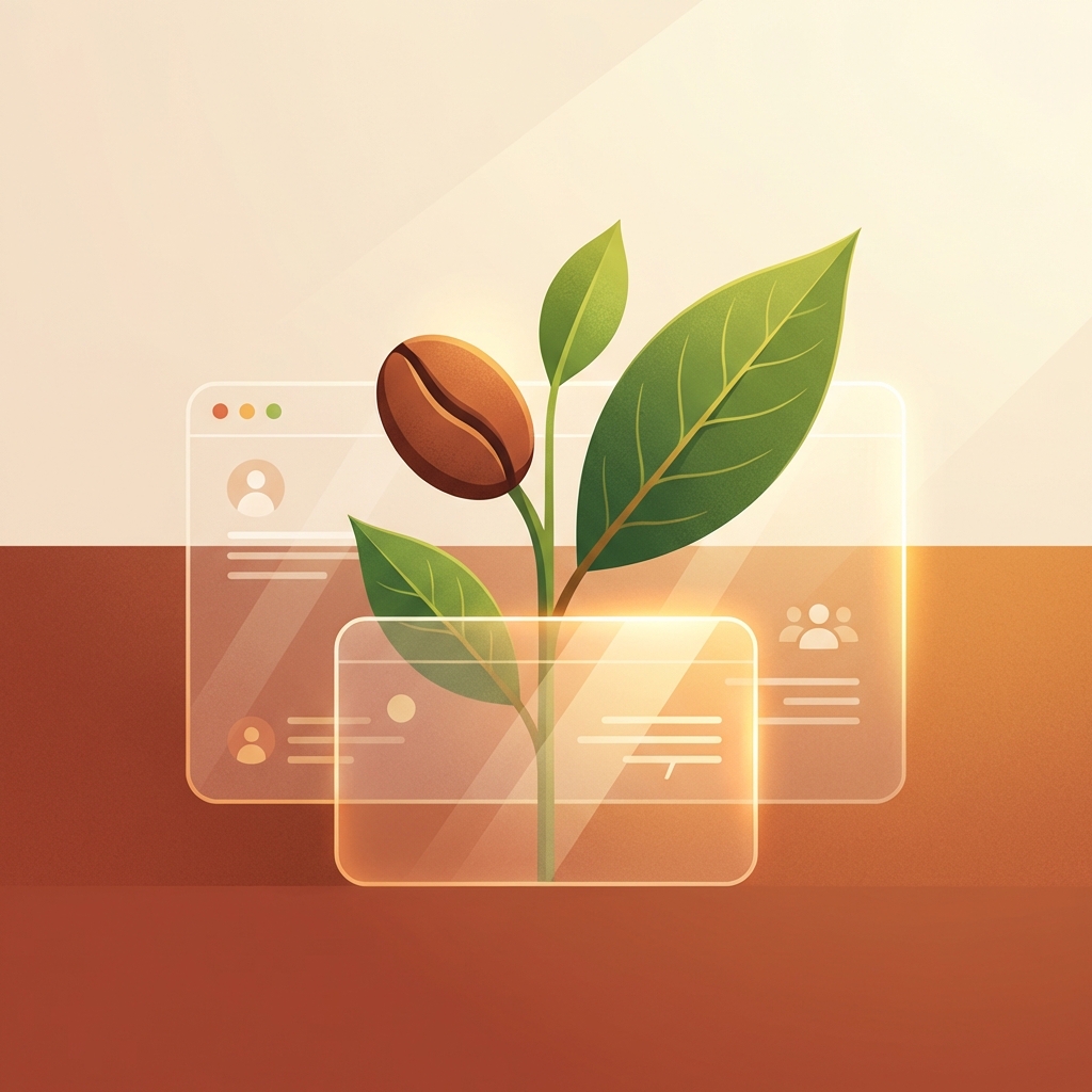
The overall response was enthusiastic. Tori noted that seeing the coffee bean rendered as an illustration softened her earlier reservations about coffee-forward imagery, finding particular resonance in the five-lockup composition — describing it as "really alive and movement-filled." Matt's main flag was that the coffee bean, while visually compelling, could read as too narrow for what Revillage is trying to be: a full public house centered on food, culture, and community, not just coffee. He suggested that if the illustration metaphor wants to evolve — toward something like bay laurel, kelp, or another local ecological form — that door remains open (05:29).
The team agreed to share the updated directions with Adrian and Farrell for their input, with a goal of finalizing a direction within approximately one week so the mark can be used on signage and cups.
[technology="Parametric Geometric Interfaces"]
Having each answered the questionnaire independently, Matt and Tori were struck by the degree of alignment in their responses. Tori framed the core creative challenge as distilling a genuinely complex vision into something approachable and vibrant — "an arc towards crispness and clarity" — while still leaving a door open for people who want to understand the deeper roots of the work (12:25).
Matt articulated the central tension the brand needs to hold: being multi-generationally aspirational while remaining tangibly rooted in the now (13:45). He described a spectrum of audience — from a local community member signing up to bring a pie to Grayton Day, to a solarpunk-minded funder steeped in bioregionalism — and asked how the website could speak to both in a way that actually reveals their commonality. The solar punk funder should feel more grounded; the community neighbor should feel more aspirational.
James noted that brand alignment isn't just a prerequisite for building the website — the website itself becomes a tool for creating that alignment, both internally and with the broader circle of contributors. Rather than a committee-built product, the process will involve core stewards most closely connected to the work, with the wider team invited in at key moments through FigJam sharing and comment prompts (29:00).
A key strategic concept emerged around building a versatile backbone for the Revillage digital presence — one that can support connected but distinct sub-sites over time. Matt used the events and calendaring system as a concrete example: a centralized event database in Airtable [tag="airtable"] with location tags could power a unified view on the Revillage site, while filtered views could serve Grayton Station's standalone page or a future Town Square page — each showing only what's relevant to that context (18:30).
This approach frames the website not as a single destination but as the connective tissue of an ecology of brands — Revillage Earth as the overarching vision, with individual ventures like Grayton Station legible on their own terms while remaining navigable back to the larger whole. Tori added that a shared iconographic language — pulled from the logo mark and applied across signage, menus, and materials — could serve as the visual breadcrumbs linking these entities together (51:22).
[technology="Directory Systems"]
The team reviewed several website precedents to triangulate a visual direction:
Across all of this, the team converged on wanting something that sits between Shorefast and the Ecology Center: structurally grounded and easy to navigate for anyone, while visually alive and emotionally resonant. The typography in the agroecology case study was noted as lending warmth and accessibility. Matt flagged that he's not attached to the current Revillage wordmark font and is open to it evolving as a visual language emerges (49:44).
James introduced the idea of using video textures — hosted on Sprout for efficient embedding and adaptive bitrate delivery — as background elements that bring nature imagery to life in non-literal ways. He shared an After Effects experiment using time-bleed effects on water footage, noting that distorting or playing with time in nature imagery opens up possibilities that feel more true to how nature actually experiences itself, rather than just a decorative video loop (44:44).
On interactivity, the team discussed the appeal of map-based or circular navigation as a "jaw-drop" moment, while acknowledging it needs to coexist with dead-simple usability for community members who may be newer to digital interfaces. The north star: make the simple things feel special — an events calendar that works intuitively but feels nothing like a standard WordPress post (01:08:20).
One of the most generative threads of the session was the idea of the website as a listening device for the village. Tori introduced the concept of participation pathways — not just a "get involved" menu item, but an invitation for people to be seen in their gifts and their responsibility to bring those gifts forward (01:12:20).
Matt connected this to a community design survey he ran nearly three years ago, which captured detailed input from roughly 150 residents — now stale, but pointing toward the ongoing need for a digital commons that reflects the community's evolving direction. He described a smart matching capability for volunteers: rather than sending out individual asks, an intake process where people share what makes them most alive could power a behind-the-scenes matching system that connects the right people to the right needs (01:19:30).
James shared his own excitement about building participatory interfaces — tools where people can submit dreams and ideas that are then visualized collectively, perhaps as a generative collage or honeycomb. He noted this connects to his broader interest in community-designed environments, and that while these features aren't in the current scope, they're very much in the spirit of where this work is headed (01:14:32).
Matt also noted the possibility of a physical touchpoint — a tablet in the Revillage shipping container at the Town Square, or a corner of the Grayton Station coffee shop — as a way to reach community members who won't find the site through digital channels (01:23:44).
[technology="Intelligent Matching Algorithms"]
[technology="Assessment Systems"]
[technology="Community Facilitation Tools"]
Tori raised the importance of bilingual access for the Latino and migrant farmworker community in Graton — noting that if someone can't read the flyer, they won't come to the event, and if they can't navigate the website, they won't donate or engage (01:24:38).
James confirmed that Webflow [tag="webflow"] makes this straightforward through its Locales feature: the platform auto-translates all page content into any target language at a monthly fee, allows manual editing of translations, and propagates content updates across languages without requiring duplicate maintenance (01:25:34).
---
James Redenbaugh
Matt Jorgensen
Tori Immel
The session opened with Matt and Tori having just completed James's brand purpose questionnaire, which both found to be a meaningful alignment exercise. Monya's latest logo explorations in the FigJam file were shared for the first time with the full team, revealing a range of directions built around a central botanical illustration — shown across square, oval, and negative-space compositions, with and without text lockups, and mocked up against photographic backgrounds.
The overall response was enthusiastic. Tori noted that seeing the coffee bean rendered as an illustration softened her earlier reservations about coffee-forward imagery, finding particular resonance in the five-lockup composition — describing it as "really alive and movement-filled." Matt's main flag was that the coffee bean, while visually compelling, could read as too narrow for what Revillage is trying to be: a full public house centered on food, culture, and community, not just coffee. He suggested that if the illustration metaphor wants to evolve — toward something like bay laurel, kelp, or another local ecological form — that door remains open (05:29).
The team agreed to share the updated directions with Adrian and Farrell for their input, with a goal of finalizing a direction within approximately one week so the mark can be used on signage and cups.
[technology="Parametric Geometric Interfaces"]
Having each answered the questionnaire independently, Matt and Tori were struck by the degree of alignment in their responses. Tori framed the core creative challenge as distilling a genuinely complex vision into something approachable and vibrant — "an arc towards crispness and clarity" — while still leaving a door open for people who want to understand the deeper roots of the work (12:25).
Matt articulated the central tension the brand needs to hold: being multi-generationally aspirational while remaining tangibly rooted in the now (13:45). He described a spectrum of audience — from a local community member signing up to bring a pie to Grayton Day, to a solarpunk-minded funder steeped in bioregionalism — and asked how the website could speak to both in a way that actually reveals their commonality. The solar punk funder should feel more grounded; the community neighbor should feel more aspirational.
James noted that brand alignment isn't just a prerequisite for building the website — the website itself becomes a tool for creating that alignment, both internally and with the broader circle of contributors. Rather than a committee-built product, the process will involve core stewards most closely connected to the work, with the wider team invited in at key moments through FigJam sharing and comment prompts (29:00).
A key strategic concept emerged around building a versatile backbone for the Revillage digital presence — one that can support connected but distinct sub-sites over time. Matt used the events and calendaring system as a concrete example: a centralized event database in Airtable [tag="airtable"] with location tags could power a unified view on the Revillage site, while filtered views could serve Grayton Station's standalone page or a future Town Square page — each showing only what's relevant to that context (18:30).
This approach frames the website not as a single destination but as the connective tissue of an ecology of brands — Revillage Earth as the overarching vision, with individual ventures like Grayton Station legible on their own terms while remaining navigable back to the larger whole. Tori added that a shared iconographic language — pulled from the logo mark and applied across signage, menus, and materials — could serve as the visual breadcrumbs linking these entities together (51:22).
[technology="Directory Systems"]
The team reviewed several website precedents to triangulate a visual direction:
Across all of this, the team converged on wanting something that sits between Shorefast and the Ecology Center: structurally grounded and easy to navigate for anyone, while visually alive and emotionally resonant. The typography in the agroecology case study was noted as lending warmth and accessibility. Matt flagged that he's not attached to the current Revillage wordmark font and is open to it evolving as a visual language emerges (49:44).
James introduced the idea of using video textures — hosted on Sprout for efficient embedding and adaptive bitrate delivery — as background elements that bring nature imagery to life in non-literal ways. He shared an After Effects experiment using time-bleed effects on water footage, noting that distorting or playing with time in nature imagery opens up possibilities that feel more true to how nature actually experiences itself, rather than just a decorative video loop (44:44).
On interactivity, the team discussed the appeal of map-based or circular navigation as a "jaw-drop" moment, while acknowledging it needs to coexist with dead-simple usability for community members who may be newer to digital interfaces. The north star: make the simple things feel special — an events calendar that works intuitively but feels nothing like a standard WordPress post (01:08:20).
One of the most generative threads of the session was the idea of the website as a listening device for the village. Tori introduced the concept of participation pathways — not just a "get involved" menu item, but an invitation for people to be seen in their gifts and their responsibility to bring those gifts forward (01:12:20).
Matt connected this to a community design survey he ran nearly three years ago, which captured detailed input from roughly 150 residents — now stale, but pointing toward the ongoing need for a digital commons that reflects the community's evolving direction. He described a smart matching capability for volunteers: rather than sending out individual asks, an intake process where people share what makes them most alive could power a behind-the-scenes matching system that connects the right people to the right needs (01:19:30).
James shared his own excitement about building participatory interfaces — tools where people can submit dreams and ideas that are then visualized collectively, perhaps as a generative collage or honeycomb. He noted this connects to his broader interest in community-designed environments, and that while these features aren't in the current scope, they're very much in the spirit of where this work is headed (01:14:32).
Matt also noted the possibility of a physical touchpoint — a tablet in the Revillage shipping container at the Town Square, or a corner of the Grayton Station coffee shop — as a way to reach community members who won't find the site through digital channels (01:23:44).
[technology="Intelligent Matching Algorithms"]
[technology="Assessment Systems"]
[technology="Community Facilitation Tools"]
Tori raised the importance of bilingual access for the Latino and migrant farmworker community in Graton — noting that if someone can't read the flyer, they won't come to the event, and if they can't navigate the website, they won't donate or engage (01:24:38).
James confirmed that Webflow [tag="webflow"] makes this straightforward through its Locales feature: the platform auto-translates all page content into any target language at a monthly fee, allows manual editing of translations, and propagates content updates across languages without requiring duplicate maintenance (01:25:34).
---
James Redenbaugh
Matt Jorgensen
Tori Immel
Design and build a new Webflow website for Revillage Foundation to replace existing Squarespace site. Inspired by Shorefast model with clean structural clarity combined with The Ecology Center's vibrancy and approachability. Building a versatile backbone that can support connected but distinct sub-sites over time - an ecology of brands approach.
Core page architecture restructured (25:11) to center dual-entity clarity: Foundation and Development pulled up to top-line navigation as distinct pages, Mission and About consolidated into single About page, dedicated Projects page showcasing flagship initiatives like Grayton Town Square and cafe. Homepage serves two primary user flows: (1) action-oriented visitors arriving via QR codes who need quick navigation to specific destinations, and (2) inspired newcomers with no context who need enough signal about the larger vision to feel drawn deeper.
Homepage features portal/doorway shape hero section evoking Christopher Alexander pattern language. Terracotta color confirmed at hex #B55633 (10:07) - represents bridge between Earth and human, ties to Grayton Station, provides warmth and hand-of-maker texture feeling. First section after hero helps visitors orient: why are they here, what do they want, what depth are they looking for.
Watershed topography illustration identified as one of three critical signature graphics (36:46) - will be expanded to include subtle human infrastructure elements layering human activity into ecological reading. Three-dimensional horizon visualization to show layered timeline: café (present), town square (near future), future projects as shapes on horizon. Foundation × Development relationship diagram makes business/nonprofit relationship instantly legible. Progressive disclosure approach inspired by Naia Trust investments page precedent.
Projects page uses flexible tile-based grid (44:00) where some tiles link to internal subpages, some link to standalone project sites (e.g., Grayton Station), some are static coming-soon placeholders. Tile sizes can vary within grid to give landmark projects more real estate.
Rounded corner aesthetic across cards affirmed (37:20) - professional but friendly, good nervous system feeling. Light background color accents on cards to help text pop while preserving soft, image-forward feel. Mission language organized around six core convictions as potential website pillars with icons: (1) Joyful by Nature, (2) Rooted in Place, (3) Layered by Design, (4) Tangible Before Theoretical, (5) Bridging Worlds, (6) New and Ancient Coherence. Key through-line: 'Joyful by nature, participatory by design.'
Design approach shifted from philosophical manifesto to tangible-first - lead with visible reality of work (cafe, town square, events) and let deeper philosophy emerge through exploration. Visual language: terracotta primary brand color (#B55633), oat milk companion, black grounding neutral, blues/yellows as seasonal accents. Portal/threshold framing devices, curvilinear patterns, earth-from-above imagery, hand-feeling imperfection aesthetic. Integrating geodesic/organic architecture references and cultural glyphs - grounded solarpunk aesthetic.
Typography: Primary typeface I am Fel DW Pika (Google Font) for headlines and body (05:07). Secondary pairings: Baskerville, Montserrat, Open Sans, or Inter for menus and supporting assets.
Future projects (housing, farming, wholesale processing, sauna club) presented with progressive disclosure - balancing transparency for solarpunk philanthropists while respecting community input process. Partner section shows both local Sonoma County relationships and global organizational connections. Bilingual accessibility through Webflow Locales feature.
Donate/Contribute/Support page features sliding scale contribution interface with Stripe integration - drag slider to choose amount, paid once/monthly/annually (18:43). Page encompasses donations, investment conversations, gifts of land/assets, legacy bequests, and volunteering time. Slider shows what each tier enables. Integration with GiveButter for foreseeable future, including upcoming Friends of Grayton Public Spaces monthly-giving campaign.
Get Involved surfaces: attending events, volunteering/co-creating, deeper commitment pathways. Events linked to existing platforms (Eventbrite/Partiful) initially, with option for custom event CMS later. Participatory-by-design meta-treatment being added - small sticky-note function inviting visitors to share skills, giveaways, or things that would light them up to offer in service of community (22:30).
Process shift (28:32): Moving into Webflow build earlier rather than perfecting copy in Google Docs first. Team will workshop copy directly in Webflow, leaving comments on design elements needing adjustment. This allows testing sentence length, rhythm, and visual fit against live site rather than switching between docs and prototype.
Design philosophy guided by Christopher Alexander's pattern language (13:28) - lean into generosity, move away from pressured CTAs, create entryways and approaches that invite landing, honestly display who team is and what's alive. Also weaving in Fernando Flores's action language (45:40) - designing for deeper, slower actions (sitting with, witnessing, communing, transforming) beyond typical click/scroll/share patterns. Measuring against Alexander's 'quality without a name' as design principle (39:50).
Timeline pressure driven by crowdfund launch this week and community nonprofit fundraising festival in two weeks (34:00). Recent community town hall surfaced questions about who Revillage is and how moving parts relate - making basic site (especially homepage and foundation/development pages) genuinely time-sensitive. Target launch: May 27th, before James departs for Portugal.
Build intelligent, easy-to-update calendar system using Webflow CMS synced with Airtable for event management. Enables multiple team members to create and manage quarterly programming events. Centralized event database in Airtable with location tags (Town Square, Grayton Station, Grayton Green, etc.) and descriptor tags (e.g., family-friendly) powers unified view on main Revillage site, with filtered views serving individual entity pages showing only contextually relevant events (50:43).
Events should support flexible tile-based grid display matching Projects page architecture (50:18) - some tiles link to internal event pages, some link to external registration platforms (Eventbrite/Partiful initially). Location-based filtering and descriptor-based filtering functionality to help users navigate growing events list. Future iteration could include map view of events using MapBox integration (50:43).
Calendar should be regularly updatable as new nonprofit programming emerges. Foundation for future automation triggers based on event signups. Part of building versatile backbone that supports ecology of brands approach.
Develop automated communication workflows triggered by event signups and other user behaviors. Integration with calendar/CMS system to enable intelligent, contextual outreach for Revillage programming. Would support both nonprofit and development entity communications.
Finalize Grayton Station botanical logo mark and comprehensive brand identity system. Square logo version with finer leaf linework and updated mountain fill confirmed as primary direction (11:43). Team needs PNG and SVG exports across all color variants except sage (which is still being workshopped), with versions both with and without paper texture overlay (04:48). Isolated icon exports and star favicon asset required (13:24).
Horizontal monument sign for physical site needs refinement (14:18) - rebalance proportions to make 'Coffee Culture Kitchen' more prominent for distance legibility (15:29). James prefers oval treatment over literal rotation of vertical lockup, with thinner and more rounded linework for signage application (19:21). Sign builder quotes being sourced by Nika (17:17).
Typography system finalized: Primary typeface I am Fel DW Pika (Google Font) works for both headlines and body copy (05:07). Secondary font pairings for menus and supporting assets: Baskerville (versatile serif), Montserrat (modern sans-serif, Tori's favorite), Open Sans or Inter (clean readable alternatives).
Comprehensive brand color palette: Terracotta confirmed as primary brand color at hex #B55633 (10:07) - consistent since early firehouse heritage conversations, represents bridge between Earth and human. Paired with oat milk as standard companion and black as grounding neutral. Blues and yellows available as seasonal/contextual accents. Concept of limited-edition colorways for future merchandise.
Distinctive visual language and brand guidelines covering: curvilinear/flowing forms, hand-feeling imperfection, earth tones with less stark contrast, geodesic/organic architecture references, earth-from-above imagery, cultural glyphs and ancient markings integration, fractal but grounded (not digitally trippy) aesthetic. Working aesthetic anchor: 'grounded solarpunk'. Portal/doorway shapes emerging as compelling visual device.
Guidelines must address multi-generationally aspirational positioning while maintaining tangible rooted-in-now expression - speaking to spectrum from local community members to solarpunk funders. Avoiding spiritual bypass/Mexico City boutique hotel aesthetic in favor of lived-in, rooted feeling.
Using hand-drawn sketching to develop visual and verbal ideas, distilling brand ecology into early website concepts. Logo finalization critical for sign fabrication (wooden form with vector projection, jigsaw cut or CNC approach). Complete brand purpose questionnaire analysis to extract alignment threads. FigJam board with website precedents, mood board images, and inspiration informing direction.
Design and develop participation pathways and community listening infrastructure for Revillage website. Create intake system where community members can share what makes them most alive, their gifts, and how they want to contribute. Build smart matching capability using AI to connect volunteers to opportunities behind the scenes based on their expressed interests and capacities.
Explore interfaces for submitting dreams and ideas with collective visualization - potentially using generative collage, honeycomb patterns, or other organic forms that reflect the participatory place-making ethos. Core philosophical framing: moving from cultural individualism back into choiceful relationship - rebuilding conditions for genuine community, belonging, interdependence, and place-based connection. System should embody the vision of 'joyfully remembering our interdependence with each other and the living earth' where joy is primary, remembering (not inventing) is the mode, and human-to-human and human-to-place relationships are co-equal.
Consider physical touchpoint (tablet in shipping container at Town Square or Grayton Station) for non-digitally native community members to ensure broad accessibility. Potentially refresh and digitize 2023 community design survey data (150 resident responses) as foundation for understanding existing community voice.
System serves as ongoing listening device for the village, making participation invitations feel special and matched to individual gifts rather than generic volunteer asks. Supports true participatory place-making where many people's hands are genuinely on the work - a barn-raising ethos where the project couldn't have happened any other way. Long-term hope is that two generations from now, people won't leave because the fabric was built by the people who belonged to it.
Listening identified as underrepresented theme in current mission language - this system embodies that commitment to genuine responsiveness rather than projection. Tied to 'Rooted in Place' conviction and the three-layered engagement model: core stewards (dozens), co-creators/volunteers (hundreds), event participants/local commerce (thousands). Even outermost ring should feel genuine intimacy and invitation, not a sense of being sorted into tiers.
00:00:04
James Redenbaugh: This meeting is being recorded.
00:00:25
Tori Immel: It's. It.
00:01:27
Matt Jorgensen: Hey James.
00:01:28
James Redenbaugh: Hey Matt.
00:01:30
Matt Jorgensen: I forgot to share with you my brand questionnaire. This is Tori's that she did in the doc.
00:01:37
Tori Immel: I actually.
00:01:38
James Redenbaugh: Oh cool.
00:01:39
Tori Immel: Hey guys. I just moved almost all of mine. I'm almost done with it over to just one doc so we can just go side by side.
00:01:46
Matt Jorgensen: Okay, great. It's in your doc mat in the. In the drive. Great. I got it.
00:01:57
Tori Immel: Cool.
00:01:57
Matt Jorgensen: Let me share that with you here. James, you're getting us both sick. You're not getting us sick. We are sick. You're catching us sick.
00:02:07
James Redenbaugh: I've been sick too. Well, not sick, but I've had this terrible tooth pain the last few days. Oh, it's just like so annoying because it's so hard to get anything done when you have this constant like pulsing in your head.
00:02:23
Tori Immel: Too. I feel like it's like you can't unsee it in those moments like we don't think about our teeth that much until they're in pain.
00:02:32
James Redenbaugh: Yeah, totally take them for granted.
00:02:36
Tori Immel: What were you going to say, Matt?
00:02:39
James Redenbaugh: I don't.
00:02:40
Matt Jorgensen: I don't remember. Are you going to the dentist?
00:02:45
James Redenbaugh: Yeah, I had a crown. I had a crown put in last week. Oh yeah. And I've had one before. I don't remember it being this painful. But if it doesn't stop, I'm going to go back and just have them take all my teeth out or something.
00:03:02
Matt Jorgensen: It's definitely the path of least resistance.
00:03:05
James Redenbaugh: Yeah, just get a wrench.
00:03:09
Tori Immel: Have you done some like jaw releasing? I don't know if that would feel good at all.
00:03:13
James Redenbaugh: But it's on the upper one, so I'm not sure. I'm doing a lot of clove oils and ibuprofen but today, today it's a little better than it's been. So that's good.
00:03:30
Matt Jorgensen: James, you wanna. Do you wanna chat logo for two minutes before we go into website stuff?
00:03:36
James Redenbaugh: Yeah, sure. I just finally said this loom video I've been meaning to send you guys about the logo.
00:03:43
Matt Jorgensen: I didn't even see that. Great.
00:03:45
James Redenbaugh: It was like right before we got on the call. And have you seen these updates in the figjam file?
00:03:52
Matt Jorgensen: No.
00:03:53
Tori Immel: No?
00:03:53
Matt Jorgensen: No.
00:03:55
James Redenbaugh: Cool. So I actually like them on the black background but they're the. They're the same. I really love what Munya's been been doing here. And it's. There's a lot here but it's basically two different versions and they all kind of utilize this, this simple illustration. And I was just saying in the video too, if there's like, if there's something about this that we want to evolve or add, like that's totally fine. I mean, depending on what it is. But seeing them like this gives us a chance to, to kind of tune into the overall feel of what it could be. And there's some directions here that I wasn't even thinking of before. Like, I really like these big, these big squares and this more oval composition and I like the versions that are more just the, the illustration, but I also like the ones that are utilizing this form and the negative space. So yeah, a lot here. And then I, I really like the mock ups of, Of these with these images in the background and stuff like that. So, yeah. Curious to get your guys's input.
00:05:29
Matt Jorgensen: Sweet. Yeah, these, these feel really good.
00:05:33
James Redenbaugh: I think.
00:05:35
Matt Jorgensen: I think the biggest question is going to be the coffee beans. I think I had written a note about in. In our. That direction email about just like not wanting to be too coffee house forward because we're really like, we're trying to be really a public house that's like all day and you know, food and culture and kitchen and you know, it's like the, the coffee bean might be a little forward for me. That's my, that's my initial take. But we'll chat about it. The, the vibe is great.
00:06:14
James Redenbaugh: Yeah. And that, that's why I'm saying with the illustration, it's like, maybe there's something a better metaphor that could work for you guys. But the coffee beans do. You know, I think people would get a sense that it's not just about coffee. And most of the, most of these say coffee house. I think Monya was really kind of building on that. But some have the coffee culture kitchen.
00:06:49
Matt Jorgensen: Yeah.
00:06:51
James Redenbaugh: But yeah, give it a look and let us know what you think.
00:06:54
Matt Jorgensen: Sweet.
00:06:56
Tori Immel: I'm excited about this. I actually, hilariously, I feel like I was the one that was more like, okay, let's stay away from the coffee cup. And seeing it in bean form is, is actually softening that for me a bit. So I'm sure that Adrian and Farrell will have other thoughts, but I think especially in this 5 lockup on the middle left, just that organ. Wow, that's really, really speaking to me. It's. It feels really alive and movement filled and it's amazing to see it in so many different iterations. So what a starting point or continuation, I guess rather. But thank you both so much to you and, and Mona for.
00:07:32
James Redenbaugh: Is it Mona Munya.
00:07:35
Tori Immel: Monya. Monya. Yeah. Thanks for taking this pass. We're really excited to get it over to Adrian and Farrell and get back.
00:07:43
Matt Jorgensen: Yeah. You all are incredible.
00:07:45
Tori Immel: Truly.
00:07:46
Matt Jorgensen: This is like. This is an unbelievable process. I mean, I know a lot of this process is gift, but it's like, it just is amazing being part of the. Being part of the process like this and then seeing the just like Cambrian explosion and letting that be kind of directed by our evolutionary input pulses live. It's like, what the hell? So cool.
00:08:15
James Redenbaugh: Great. Awesome. Yeah, we'll have to get.
00:08:17
Matt Jorgensen: These are cool.
00:08:19
James Redenbaugh: A testimonial from you guys.
00:08:21
Matt Jorgensen: Yeah, totally. Absolutely. Video, audio, text, whatever you want.
00:08:26
James Redenbaugh: Interpretive dance, ideally.
00:08:28
Matt Jorgensen: Yeah. Yeah. Well, well, for sure you can dream.
00:08:33
Tori Immel: Interpret the fig jam board. It'll be perfect.
00:08:35
Matt Jorgensen: Yeah, Cool. Super exciting update. I'm like, really. I'm really eager to get this locked soon so that we can put it on some cups and put it on a sign. So thank you. I know that this is like something you're just fitting in, so haven't wanted to pester you on it, but I'm like, super stoked to see this.
00:09:05
James Redenbaugh: Great. Yeah, no problem.
00:09:07
Matt Jorgensen: Yeah, also like the Sonoma Hills and the Bay Laurel and then Tori's cool with the coffee bean. Okay, cool.
00:09:17
Tori Immel: It's giving seaweed too. I don't know if anyone's picking that.
00:09:21
Matt Jorgensen: Up, but I like kiwi.
00:09:23
James Redenbaugh: Could be seaweed.
00:09:25
Tori Immel: Yeah.
00:09:26
Matt Jorgensen: Yeah. Not a native plant, but kelp. Kelp, yeah. Boom. Okay, James, this. This Brandon purpose questionnaire was like moving actually to be. To be. To sit down with for both of us, I think, for an hour. Give us a better sense of your. Your. I think just heart in all of it, which I kind of knew, but maybe Tori didn't have as much of a sense of and was just a really nice reflection opportunity for us. So thank you for that.
00:10:06
James Redenbaugh: Awesome. Yeah, it. These questions have evolved over like 10 years and yeah, people get a lot out of them.
00:10:15
Matt Jorgensen: Yeah.
00:10:15
James Redenbaugh: Cool. So high level. What's. What's most present for you guys having a chance to sit with these questions? Let's. What's taking shape in your consciousness?
00:10:36
Tori Immel: Well, I can.
00:10:40
Matt Jorgensen: Yeah, yeah, go ahead. I got it.
00:10:42
Tori Immel: I want to interrupt your meditation.
00:10:44
Matt Jorgensen: No, I got it.
00:10:46
Tori Immel: Well, having just transferred, like, I intentionally just answered it, the questionnaire and just echoing. Yeah, thank you so much for the thoughtfulness there and the invitation. Yeah, I just answered it separately. Like Matt sent his over and then I just took my own swipe and just this morning transferred over and was re. Reflecting on just the level of alignment and kind of this great opportunity that we have to just Continue to take that internal alignment and bring it to more and more external layers and viewpoints. And just this, like this arc towards crispness and clarity in ways that can be really approachable to a lot of different people. I think there's like a unique challenge in the complexity of the vision. Distilling it down into a space that is really approachable and palatable and vibrant for folks, but then also, if they so choose, helping invite them into the roots of that really expansive tree and seeing where everything is growing from. Yeah, in some ways it feels like a really tall order. And also I have full confidence that we're well on our way there. Yeah, I think I just find these processes, such amplifiers, just taking the time to intentionally dive in and write and discuss a little bit more and get to draw some lines in the sand of what actually goes up and what stays back and. Yeah,.
00:12:25
James Redenbaugh: Great. Awesome.
00:12:28
Matt Jorgensen: Yeah, I think we've spoken to this a bunch, but just to name it again, what's most alive for me in going through this exercise is just wanting to be. I mean, I mean you gave us the five to ten year prompt, but it's, it's even like wanting to be like multi generationally inspirational or multi generationally thinking while being extremely tangibly rooted in the now. And I think that some of our website examples kind of speak to that synthesis we're trying to do of, of the like solar punk visionary with the cup of coffee and just having that be an experience that is navigable for. If we think of like the local community member booking an event ticket or like registering as a volunteer on one end of the spectrum who might not know what permaculture is, might not care about seven generations thinking on its surface or as an idea. If we think about them at one end of the spectrum and the sort of solar punk funder psychedelic billionaire on the other end, it's like, how, how can we speak to both of those in a way that actually makes them realize their commonality In a way, you know, it's like the solarpunk billionaire feels more grounded experiencing our website and the community member feels more when looking at the website.
00:14:26
James Redenbaugh: Did you say relational?
00:14:28
Matt Jorgensen: Aspirational.
00:14:29
James Redenbaugh: Aspirational, yeah.
00:14:31
Matt Jorgensen: Or like, yeah, they're seeing themselves as part of something, you know, maybe bigger or longer term than they thought they did when they, when they were like, I want to register to bring a pie down for the Great and Day this year.
00:14:50
James Redenbaugh: Cool.
00:14:51
Matt Jorgensen: We do a pie baking contest and now a zucchini race as annual events at Great and Day in the fall.
00:14:59
James Redenbaugh: What's a zucchini race?
00:15:01
Matt Jorgensen: Well, it's. It's a new. It's a new event created by a community member with three tracks on a 30 foot luge and people bring their oversized zucchinis and then there's a bin of wheels and decorations and they race them down the track. We can send a video like the.
00:15:17
Tori Immel: Boy Scout, like, like box car racing but way too many zucchinis that time of year. So innovation struck.
00:15:25
James Redenbaugh: Nice. Awesome. Wonderful. Great. So where should we start? Where should we go into this? I'm curious if there's particular questions that feel most relevant to start with. I'm curious to know if a deeper sense of your brand's becoming is forming. If you're starting to see things as you engage with these questions.
00:16:18
Matt Jorgensen: Two things are coming up for me. One is like we've been, we've been talking about doing values work for a while and we haven't. So this is just like a nice. In terms of our brands becoming. I think this website exercise is a really nice. And we, we knew this would be the case which is kind of like part of the. Besides fundraising like a big motivation for doing this is just the forcing function to kind of like re articulate the becoming. And it's just nice to like scrolling down and seeing how aligned Tori and I are on. On values. And I think the architecture of the site is yeah, both like a question and there's something that's coming into focus a little bit more and Tori and I were talking about it a bit yesterday which is like creating a backbone here that really explains the overall vision and values and ethos and allows people to kind of see the breadth of the work happening. And then how does that relate to for example a great and station standalone page which is outside the scope of this project or a standalone website. And we talked about, you know, the opportunity here to. To keep. As we're kind of developing this like venture studio interstitial fabric kind of foundation for everything. What are some opportunities to start building a versatile backbone that can like bolt on other appendages over time. So a very tangible example of that would be like building an events and calendaring. Maybe it's linked to Airtable that has tags on it and we can show on the Revillage website a bunch of events with tags of different locations. But then we could also potentially in future have a filtered view of that on the Grayton Station website that just shows events happening at Grayton Station or at a different location like the town square. We could have a standalone Town square page with just events at the town square. And I think just thinking about how people can navigate to sub parts of the effort in a way that doesn't overwhelm them while also having some level of connectivity back to the. The larger whole.
00:19:24
James Redenbaugh: Cool. So you may end up with a kind of ecology of, of brands with these different projects existing whole unto themselves, but also a part of a cohesive, bigger narrative,.
00:19:53
Matt Jorgensen: A hierarchy. Spencer's favorite word. Yeah.
00:20:00
James Redenbaugh: Excellent. Cool.
00:20:04
Tori Immel: I think, I think part of what's coming forward for me too is can find my little asterisk, but it's kind of specific. Just like I think it would be fun beyond the written word maybe to dive a little bit deeper into the website specifics, beyond broad stroke structure and how they end up getting played with in people's interaction with the website. But the color pieces like sure. Fast resonance like the website's main objectives and the architecture as well. I found this exercise in the questionnaire to be really helpful because I think a lot of it will inform the copy that we use. But one thing I'm curious, just given that you've built so many websites and so many specifically ethos aligned websites, James is just to hear a bit more about where past clients have had, you know, snags in conveying the message they want or you know, flows that really make sense for people or I don't know if Parallax is on the board or just like kind of creative ways that we could think through what we're trying to put forth and how that could actually come to life as people start jumping on and getting to the URL.
00:21:30
James Redenbaugh: Yeah. So in the beginning here we want to start with broad exploration, big funnel of harvesting inspiration and ideas. Not worry too much about how it's going to end up, but you know, make sure we take sufficient time to understand the terrain together. And then. From an understanding of that terrain grows the ingredients. Like once we get a lay of the land, then we can start to look closer at the land and see like, oh, there's this flower and this stream. And these are important, these are keys and they become a color scheme or a graphic metaphor or concept like spaciousness or circularity or a visual shape that we don't even have a, have a word for. And those concepts kind of become the, the backbone of the brand. If we nail those kind of metaphysical steps, then we can. Kind of co. Embody a shared sense of what this brand is and then creating the visual representation of that becomes a lot easier because the brand is not the, the logo that we create or the colors or the textures. The brand is a deeper, unnamable thing. It's not even the words that we use to describe it. It's a, an energy and, and an intelligence. And we'll use different tools to approximate that energy and intelligence and because the, you know, the maps that we make of the territory aren't, aren't the territory, but the website is like a sign that guides people to the, to the thing. They see it and they're like, oh yeah, there's that place I've been looking for, or here's this exciting land I want to go visit. They're not just like, oh yeah, here's, here's the thing. I'm glad it exists. And I, and I don't, don't engage it. I want them to come engage it. So where people, where clients get stuck, I feel like 90% of the time it's due to misalignment, either different understandings of what it wants to be in a team or just a miss, a lack of internal alignment with what, what wants to become. Because if we can find that alignment and cohesion within ourselves and within the team, everything else becomes easy.
00:25:18
Matt Jorgensen: I'm curious how you think about that alignment for a brand like a startup brand like ours, knowing of course, that there's lots of, there's, there's a lot of concentric circles, you know, like sort of been like me and then me and Tori and then Tori and I and a stewards group and a board and a core group of volunteers. And you know, in fact, some, like, some of those, you know, core contributors have been very involved for three years now. And even before Tori and I were like full time, you know, on this, there was a bunch of people just putting in blood, sweat and, you know, and love and. Yeah, I mean, it's, it's like on the one hand, I think we're pretty good at listening to what all those voices want. So there's just an attunement that's kind of natural, I think, in, in our beings around the project. But I've also been kind of curious if you see use of a larger, you know, pull the audience kind of approach. And at what point the process is that most useful?
00:26:47
James Redenbaugh: Yeah, great question. So when it comes to alignment and cohesion, it's ironically we, we want that to create the brand, but then the brand also serves as a portal and an avenue for creating that alignment and cohesion. So some people need to.
00:27:12
Matt Jorgensen: Yeah.
00:27:13
James Redenbaugh: Need to see something. Yeah, yeah. To get it. And thinking about it now. It's kind of like, like being in love. Like, you have to be in love with it. And you can't force somebody to be in love. And if you're in love with somebody, it can. It's helpful to see them, you know, and it's helpful to hear their voice and it's helpful to read their words. And with a business or a startup or a brand like this, for one person, it might be the mission statement that brings them into that, or it might be the logo form, or it might be a vision, an imagined vision on a mood board of the world that you want to create in the future, or it might be a memory of what it felt like to be together as a group in the past. And all of those are valid, like, valid ways in, to the thing. And, and so when I, when we're creating these websites and stuff, that, in my mind that's actually the main function is to help the team and anybody involved stay aligned and find that way into it. And then finding funding and customers and opportunities and things like that is secondary because you can't have, you can't have one without the other, or you can't have the, the success without the alignment. And so it's important to kind of get everybody on board with this asset. And it's not. We don't want anything made by a committee. And there's always going to be kind of core stewards that are most connected to this thing in their, in their being and others that have found their way into it or, you know, also discovered it within themselves and then they're, and then they're here so we can get creative with how we involve the, the broader team. For example, you know, you guys are doing this branding questionnaire. We don't need everybody to answer all these questions, but I think that there'll be moments when we can share, say, a, a figjam board and get comments, get people's input. And often people just want to feel included. But then it's a good test to see, like, yeah, this does look like the feeling that I have when I'm involved with this thing, even if they don't say it in those words. So. Yeah. Does that make sense?
00:30:45
Matt Jorgensen: Yeah. And I think I was just, you know, having, just just tuning up to your process and how you like to work. I think we just got a preview of it with the logo, so that's useful. I, I think part of the question was coming from like, oh, wow, this is a great opportunity to reflect on brand and purpose and like there are easily a dozen people that are like very in love, you know, with re village, to use that analogy, and probably more. But like there's a dozen that have been like really, really put a lot of heart into it and have taken on pretty big roles over, over the last couple of years. And so just, just wanting to make sure that they have their opportunity to also like flesh out, you know, what. What Tori and I are, are taking in from. From them of like what the, what the center of the bullseye is. So I think knowing that you do you. You can work it with like the, the fig jam and kind of like shape an evolutionary process in a more build in public way. I think that's really useful as opposed to like this just, just wanting to cover the concern of like, is this the only opportunity or the best opportunity before we get too far down the path, quote unquote, you know.
00:32:13
James Redenbaugh: Yeah, no, they're our, our primary user group because if what we build aligns with their love for this, then it will be easier for new people to see it and have that love at first sight.
00:32:30
Matt Jorgensen: Yeah.
00:32:31
James Redenbaugh: Feeling.
00:32:32
Matt Jorgensen: Yeah. Beautiful.
00:32:36
James Redenbaugh: But yeah, but then everybody also has to be open to polyamorous relationship, harmonizing the brand,.
00:32:51
Tori Immel: Loving it.
00:32:54
James Redenbaugh: Cool. In these questions I saw, I see some sharing about colors, earth tones with some pop Richard Groovy grounded solar punk. Tori, you shared this ecology center. And I'm curious if there are other. If there are some forms that we could talk about that feel relevant metaphors of shape or space or object.
00:33:46
Matt Jorgensen: Well, one thing that comes on on that which I have mixed feelings about, but actually speak and my mixed feelings speak to this like grounded solar punk tension, you know, is on the building thing. I think Tori wrote it, but it was the first thing that came for me. Also on that was like a geodesic dome, you know, and then it kind of like transitioned into like the inside of like a wigwam or something. I don't know. When I was inside, I just like didn't speak to the architecture because I think a lot of those architecture forms, like the geodesic dome is the iconic solarpunk form in some ways. And if you think about re villaging as a new and ancient thing, that's kind of the polarity, like the wigwam versus the geodesic dome, the similar shapes in a way. But like one is covered with furs and rugs and feels or skins and hides and feels much softer and earthier and one has this kind of like. Is this a spaceship quality to it of like Glass and metal and dancing between those is definitely like, symbolically just forms that are coming up for me. I don't know when you said play dome with the planetarium Tori if you meant geodesic dome, but I just interpreted it that way.
00:35:16
Tori Immel: I certainly did.
00:35:17
Matt Jorgensen: Yeah.
00:35:18
Tori Immel: Yeah. One thing, I mean, Matt and I are also, as you know, working with us over on the grain station thing. I feel like, Matt, I'm increasingly noticed that you hold down our Scandinavian roots. He's got the fur and the fire, and I love it. And in my head, when I was describing the scene of the play dome and I'm realizing most of my seasonal attunement to the graton town square, given that wintertime feels like a bit of like, you know, you get the bridge in with like the ancestral kind of like Samhain moments. And then it's kind of like this after our big December event in like the, you know, high. More high holidays, as it were. Traditionally, it's like this big period of fallow. So I noticed myself attuning seasonally more to the big bright pops from spring into late summer. And just the intergenerationalness of what those warmer days and new growth and new life kind of bring out energetically in the community. So, yeah, I mean, I think motives. There's a space for all of it. There is a hearth quality, like Matt is saying. And there is, I think, a remembering of how to do nothing together and rest together and relax into that space as a community too. It's like, yeah, that's a remembering process that I think. Matt, you made some comment in this. In one of your answers of the. The self accumulation. You know, it's like, I feel like people, like there's such an external facing give and then people go like, recoup in isolation in their homes with their nuclear families. Yeah, I think we're actively curious about how to bridge those two energetics across the seasons. Yeah. So I bring that up as like a seasonal archetype. And then also, yeah, something that just came forward to me when you originally asked the question, James, was just this feeling of water moving and like a river or like a creek. It's so on the nose in some ways, since we are taking a watershed scale aperture to this work and inviting people to. Rather than calling it like Sonoma county, this arbitrary fiat currency of how we look at land. It's like, hey, this is, you know, this is a place and there's like, resources and life that's flowing through it. And, you know, I don't know if people even always get it when we say that, depending on who we're talking to. But that's part of the intentional choice to, you know, lead with that watershed scale is because just right there, it's like maybe a head tilt and a curiosity and you know, it's just a river that's pretty approachable. Everyone's been in a river. There's a real. I think of the times that, you know, I just sit by a river and it's like, it's like a balm to the soul. You just let to get it. Like the noise of it, the soundscape, it's passing by you like it's like grief unfolding because you might want to hold that little water drop that's like 50 yards up the river from you. But then there's no choice. You just have to let it keep going. And change is always happening. But you know, there's so much beauty and life in it too. So.
00:38:44
Matt Jorgensen: Yeah, yeah, we put, we put a little. I just like pulled it from the watershed council, but a little like watershed map basically on our business cards. And it was just kind of a nice background, like almost a little. Let me. I'll see if I can find it.
00:39:04
James Redenbaugh: But.
00:39:05
Matt Jorgensen: And it like it was, it was pretty. They're pretty crude business cards. But to Tori's point, it's. It's a kind of a neat. It's one of these bridge metaphors I think that, that can work for.
00:39:20
James Redenbaugh: The.
00:39:20
Matt Jorgensen: The river is alive animists, you know, in our midst. And also the, the kind of just like I'm a, I'm a fifth generation farmer, you know, or Mintner that like depends on this creek also. It's a nice unifier.
00:39:41
Tori Immel: Yeah. And the salmon are trying to come back up that way and like we've got. Right down the road and that's like the best place to take an ice chest and a little, you know, humble charcuterie spread and go crack a beer and have a giggle. Like it does so much depending on what you bring to it too.
00:40:04
Matt Jorgensen: Drop a business card link in our.
00:40:09
James Redenbaugh: In the doc too.
00:40:11
Matt Jorgensen: Starting to pull some more just like links of photography and videos or if you have any good like folders of photography you want to share. I've been putting all of our like youtubes and decks and. But yeah, there's, there's definitely a lot of event photography. You'll get, you'll get a lot of it. James from. Sorry, I'm just going off on this tangent now, but you'll get a lot of the Photography like sense, I think from the videos on the YouTube. But then if you actually want stills, we can probably get you high quality stills of a bunch of different stuff.
00:40:56
James Redenbaugh: Cool. Also, until the 23rd of this month, I have a bunch of istock credits I need to use so I can stop paying 300 bucks a month. And especially for videos. It's really great for videos and I feel like I'm getting more for my money with the videos. So if we want to use like video backgrounds and things like that, then that's great for that. And actually there's one I could share with you that feels relevant if I can find it real quick. Oh, this. This isn't what I was thinking, but you might have seen this video I made for Spencer.
00:42:07
Matt Jorgensen: Yeah, I guess I did see that on his.
00:42:10
James Redenbaugh: Yeah.
00:42:11
Matt Jorgensen: On his site. So cool.
00:42:13
James Redenbaugh: Yeah, it's like I love this way to bring shapes alive. To not just have solid colors. Why not? Why not have a video texture or. Wow. Here's another good example.
00:42:43
Matt Jorgensen: Dang. Whoa. Whoa. That's a really interesting. Especially if it was probably hard to get a place related video like that. But eventually some drone footage.
00:43:02
James Redenbaugh: Yeah.
00:43:03
Matt Jorgensen: Of the watershed or town.
00:43:06
James Redenbaugh: I'll. I'll bring my drone next time I'm out there. Wow. We also have these big, big ones that are kind of cut out behind.
00:43:23
Matt Jorgensen: This is one of yours too, huh? Dang.
00:43:28
James Redenbaugh: This is cool.
00:43:31
Matt Jorgensen: Do you worry about like,.
00:43:35
James Redenbaugh: I don't.
00:43:35
Matt Jorgensen: Know, like streaming whatever bit rate on like people being able to effectively render these websites?
00:43:47
James Redenbaugh: Yeah, definitely. And so we host our videos on Sprout. Well, first of all, I make them as small as possible. And then Sprout is a video platform like Vimeo or YouTube, but it's built for embedding these videos on a website. So it's incredibly efficient. You don't have to wait for the whole video to download before it starts playing. And it'll serve a version of the video to match the bit rate of the user. So. Yeah.
00:44:20
Matt Jorgensen: Cool.
00:44:21
James Redenbaugh: Yeah. And then this just another point of inspiration I wanted to share. I was playing with. That's pretty small here, but playing with some time effects in Illustrator. I mean after effects I broke. I froze my browser somehow speaking. It's just water rushing. But then I'm having it do this like time bleed effects. And I thought it was interesting because we, we tend to view. We use videos of nature in, you know, real time from a very human perspective. But that's not how nature exists or how nature experience itself. You know, the tree isn't sitting there Watching, you know, a 24 hour day, it's probably having a different kind of experience. So I like to kind of play with time, to use nature images of nature in more creative ways than a typical. You know, here's a video of a tree blowing in the wind or something like that. So loads of possibilities there, Something to think about. And I'll start a figjam board for this project and put these things in there as well so we can comment and you guys can share your own. But I'm just starting to collect some points of inspiration. Obviously drawing from like, geodesic. Geodesic stuff, geometric things. The. The main example of the website that you shared. Can you remind me of that?
00:46:30
Tori Immel: SureFast.
00:46:31
James Redenbaugh: SureFast. Yeah.
00:46:34
Matt Jorgensen: And then also look at the one Tori linked, which is the ecology center, sort of in a way, we're probably interested in the mashup of the two, you know, in terms of directional inspiration.
00:46:48
James Redenbaugh: I love their. Their graphics here.
00:46:54
Tori Immel: Yeah, I can send you some videos too. I mean, I think part of what inspires me so much about their website is the experience that I've had seeing their website evolve alongside the farm itself. Like, they have the branded colors, the like painted plywood, rainbow, like entrance into the garden. Like, it's very cohesive. Like what you get on the website into then experiencing it there. It like, equally feels so vibrant and playful and, you know, really approachable to a lot of folks without getting too like, crunchy. Like, they do a good job of like putting it on the table but being like your choice, you pick it up if you want, you know.
00:47:36
James Redenbaugh: Awesome. I just want to share another case study room quick because it reminds me of this. This is a project we did for a agricultural nonprofit in Mexico. And it's a pretty traditional website, pretty traditional nonprofit, but we got to play with, you know, we developed this language of shape and colors which led us to create a bunch of different graphics and then use them in beautiful ways.
00:48:30
Tori Immel: Yeah.
00:48:30
Matt Jorgensen: Super cool.
00:48:31
Tori Immel: Loving that.
00:48:33
James Redenbaugh: And then the Solar Punk.
00:48:35
Tori Immel: Could you go back down? Sorry, I was just digging on those. Yeah.
00:48:38
James Redenbaugh: Oh yeah. These collages.
00:48:40
Tori Immel: Yeah.
00:48:41
Matt Jorgensen: This is actually like a. Pretty. To me, this, this, this is. This would kind of hit a lot of the mark, you know, in. In a certain. In a certain way. It's like, it's. It's got these Solar Punk gestures while also feeling very approachable and yeah, maybe a little. A little of traditional feeling around some of those things. But yeah, this is really cool.
00:49:10
Tori Immel: Mm. I think the typography maybe is lending a lot to that traditional neutrality Too. But I agree with what you're saying that.
00:49:20
Matt Jorgensen: Yeah, actually I think probably this is. This was already expressed, James. But we're definitely. I should speak for myself. I. I'm. I'm not married to the. The Re village like font that's in our logo currently. So I, you know, and even like that could. That's.
00:49:44
James Redenbaugh: Yeah, that's the.
00:49:49
Matt Jorgensen: That's not even the font really. There's like that, there's like that font on the, on the main here.
00:49:56
James Redenbaugh: I'll just take a screenshot of it.
00:50:00
Tori Immel: Thanks for playing this.
00:50:04
Matt Jorgensen: Yeah. Here it's now right down where you were looking. I just pasted it.
00:50:09
James Redenbaugh: But.
00:50:12
Matt Jorgensen: That was just a really quick. This was like a $500 logo exploration with a friend, local guy here. And I really like the hands in the sprout and where it ended up. But even that could evolve, you know, a little bit if it wanted to. But I think just in terms of that like very simple neutral light, light Re Village font, I just want you to know that we're not. I'm not super attached to that. If it feels like there's a language that's emerging that wants to iterate on.
00:50:52
Tori Immel: That, I'd add too. I think there could be know. This is just striking me now. So again, speaking for myself here, but like just what you're pointing to with that agroecology nonprofit in Mexico, like that kind of iconography, like we could potentially have the opportunity to bring that up to the level of all of these social ventures and like have like a family of brands that are cohesive in some ways.
00:51:22
James Redenbaugh: Awesome.
00:51:27
Matt Jorgensen: And we don't need to. I feel like we had an early conversation about that, like whether there needed to be a tie between the Re Village language and the Great and Station language, for example. And I think that's an interesting. Yeah, just like how the motifs carry across is an interesting question. Whether it's kind of the primary logo mark or it's like some sort of like you had developed on that other website little like little icons or asterisks or things that have a color family and could just be like sprinkled across different materials. So you're almost like falling breadcrumbs between the different entities.
00:52:15
Tori Immel: I'll drop into. Actually, I would love to share this one. Just really quick, similar to what Matt is saying, like whether that's iconography at the brand level itself. But this is a local. It's actually like a non profit state park and boutique hotel collaboration. But this is mainly the boutique hotel that went ahead and Designed their own. They have an on. On staff designer basically. And their logo is like so funky and fresh and cool and they have all of this amazing iconography that's.
00:52:51
Matt Jorgensen: That's really nice.
00:52:52
Tori Immel: Yeah. Throughout. Why can't I see? I'd have to send you more photos. Interestingly, they don't really feature it so much. It looks like on their website. So like, you know, downage. Yeah. If I go it.
00:53:05
James Redenbaugh: I saw it when the page first loads.
00:53:07
Tori Immel: Exactly. Yeah.
00:53:10
James Redenbaugh: With the owl. Very cool.
00:53:14
Tori Immel: But they take basically like.
00:53:16
Matt Jorgensen: Right.
00:53:17
Tori Immel: Yeah. Here I can go back and forward.
00:53:21
James Redenbaugh: Oh.
00:53:22
Matt Jorgensen: Oh, God, this is killing my head.
00:53:24
Tori Immel: It's so funny. Sorry. But yeah, this. So they take like the little circle or you'll take the. They'll take the little, you know, whether this is kelp or, you know, bay laurel. And they'll take just the eyes and the little horn owl thing. And all of those will get put at like, you know, this way to restaurant, this way to rooms 100 to 200. This one's on your room key. There's just like a. A beauty even in the logo that Monya put together already of like getting like pulled out and like having its own life. And like signage around the space or, you know, menu stamps or whatever that may look like.
00:54:01
James Redenbaugh: Awesome. Cool. Yeah. This is a cool website or WordPress website. Pretty cool for a WordPress website. And then what can you guys say about the SureFast website? What about this one speaks to you?
00:54:39
Matt Jorgensen: Yeah, the main thing is just how grounded it feels in terms of these initiatives that are like very disparate and not very similar to us. This is like a hybrid entity doing economic development and revitalization work. And they have a nonprofit doing arts and food access and they have a for profit doing an inn and a fisheries project. And it's just a. I feel like it's a nice example of. You get some of the aspirational and complexity actually of it, like in that little diagram right there of like the businesses and charity working together with the same mission. Without getting too lost in the sauce. If you're like just going to shortfast website because you want to find the link for the youth programming or whatever, you can just like click that tile and um, I think Tori and I agree that it's like, it's definitely a more traditional, boring, you know, color and layout and website feel, but there's just something really sturdy about it for me that is nice. It's like, oh, there's an ice cream company. I can just like click into that and it feels, doesn't feel like some big sprawling, you know, complex economic development entity that has multiple organizations and da, da, da. It just feels like, oh, there's some like really concrete initiatives here that I can get behind. And then it gives you these little gestures at the bigger map of things. Even that little map up top that kind of like live animates the work that's happening like all across the island. It's kind of like, oh yeah, like all these little nodes of activity happening. But I don't even necessarily need to know what they all are, you know.
00:56:50
Tori Immel: Yeah, I'd build on that too. Like going down to the ice cream piece. Like, I think what works for me about this website, depending on who's looking at it, is that it is really, it's almost like it feels like an Airbnb's experiences or, or something. It's like click. Okay, that's the one that's kind of grabbing me and thinking about that as Graton Town Square, Grayton Station, all these projects, like Matt's saying, not overloading people so much with text and copy, heavy flowery explanations of where these all arced from and are headed towards, but just letting people go explore what is is there in website form based on line of what's available. And then also the photography on this site, interestingly, I think they've taken a really place based approach in the photography and from what I noticed myself gravitating towards and from the little I've kind of heard from marketing experts is just human centric. I think that's something that I'm noticing is how to strike a really nice balance of imagery that feels like it honors place but also is helping people see themselves into that place through other humans interacting. So obviously that piece is over with us, but I know that probably will touch how we portray it and where we present things. And yeah, so the Shorefast website just, it's kind of muted as far as colors and I would just note that the Ecology center like that, you know, that I don't know what type of green that is, but it's very vibrant and very unique and stands out. But to me, I think actually it's probably something in between the two but like maybe a little closer but dialed down than the Ecology center is what I would imagine. Super open to hear your thoughts, but yeah, sure, fast. I kind of feel like I'm like this is great and nothing here is alarming and also nothing is like stirring this. Like I'm booking a flight, I'm gonna go visit this right now. Whereas Like, I would tell people to like book the flight and if you're in Orange county, like you have to go visit this farm because it's just so alive. I feel like the web gives a bit of that, you know,.
00:59:21
James Redenbaugh: Looking at this.
00:59:22
Matt Jorgensen: I. I agree.
00:59:23
James Redenbaugh: Go ahead.
00:59:24
Matt Jorgensen: Yeah, I agree. And also like some of the websites you've showed us, James, just today, they feel way more alive. I think there's just something uniquely parallel about Shorefast in terms of the actual organizational entity, you know, which has multiple. Multiple project locations spanning foreign nonprofit across essentially a watershed that I just was kind of like. Well, they actually like did this in a way that didn't feel overwhelming where so much of the time it can versus like the. The Ecology Center, I think is one project site. It's easier to do that in a way that feels very grounded and not overwhelming, but vibe wise. Totally agree.
01:00:11
Tori Immel: Agreed.
01:00:12
James Redenbaugh: Cool. Here's another precedent of a very different looking website. We move for a regenerative architecture consultancy. And this. The landing page is very like, obviously very image heavy on this, but I really like the. All the sub pages have a similar theme. Obviously we're using a lot of this glass effect and rounded corners, but they each have a different subtle background image that kind of.
01:00:56
Matt Jorgensen: That's cool.
01:00:57
James Redenbaugh: Yeah. Bleeds into the next and Cool, simple icon language to explain different things.
01:01:09
Tori Immel: Yeah, the icon. I'm feeling really drawn to that as you're showing more examples.
01:01:15
James Redenbaugh: They have a ton of. Ton of work that they've done all around the world. Wow.
01:01:24
Tori Immel: Holy cow. This is actually bringing up a good point. Something Matt and I touched on yesterday is like creative ways to show the archive of projects and work and field trips and festivals and you know, inherently tell the story of like humble beginnings to like, more and more refinement and you know, more momentum, more people getting involved. But ways that don't feel, you know, to me, actually maybe the ideal would be like either a really pared down iconography or like a storytelling more. More creative expression of it.
01:01:56
James Redenbaugh: Yeah, yeah. I was going to say about this. On their homepage, they have more colors. I actually really. They've done a very good job of color matching their event images. They all really feel very similar and nice and warm. And then down here I really like the. That each of these things is very clear and each. Each has its own little icon. But given what I know about this, I. I actually want more color here, more vibrancy. And, and this could be more interesting. Like, why isn't this a, you know, a circle or, you know, something like this. I'd love to, to play with that with you guys. Like going back to this wevolve website. When we did their, Their team page. This is like a little excessive, but instead of just like a grade, we put them in this, in this wheel of rotating because it's, it's a whole.
01:03:27
Matt Jorgensen: Lot now you're just showing off my.
01:03:32
Tori Immel: Brain too is like. Yeah. And also how does it show up on mobile? Do people just like flow different?
01:03:39
James Redenbaugh: That's a good question, I think. I mean, I'm sure it works well on mobile. This was a few years ago. Do that. Where'd it go?
01:03:48
Tori Immel: That's really cool though.
01:03:51
James Redenbaugh: Yeah, it works.
01:03:53
Tori Immel: That's amazing.
01:03:57
James Redenbaugh: Works just fine. We just. Speaking of circles and stuff, we just pushed a new version of this home page. If you don't scroll, it'll automatically scroll for you. But it's got these, These different statements kind of walking you through what this organization is. Because it's big and complex and they have all these different parts. But the beginning is just like very simple. Here's what we want to say about what's happening here. Here's our logo. Here's some circles that are expanding. And then here are all the different things that you can engage with and, and here's our community of people and we're actually rebuilding this as a whole app. Wow.
01:04:56
Tori Immel: This is. That is a complex one. But yeah, I like the, the like unifying factor from the beginning. It's like no matter what you're looking at, you're gonna know their mission before you can even get there.
01:05:11
James Redenbaugh: Exactly. This is the new version of that glow. It's pretty sci fi.
01:05:22
Matt Jorgensen: Wow. Crazy.
01:05:26
Tori Immel: Seriously?
01:05:29
James Redenbaugh: Yeah.
01:05:30
Matt Jorgensen: We were talking about, maybe we looked at it was the Rambo website. But just thinking about these kind of interactive map views, kind of like what you were just showing us, I think.
01:05:43
James Redenbaugh: Yeah.
01:05:46
Matt Jorgensen: You know, maybe initially or maybe in the future because so much of our work is centered in Grayton right now and we have this kind of like living ecosystem map that could be shown three dimensionally. It could be very cool to do that on some level. And having that be like the core navigation feels like almost too tech forward for some of our, our audience, you know, just getting like lost of like, where's the hamburger menu?
01:06:20
James Redenbaugh: You know.
01:06:22
Matt Jorgensen: So I feel like there's some balance of the like jaw drop sci fi for us with yeah, just like everything we've been saying with the feeling of like this is sturdy and if I'm just here and I'm 75 years old, I can still figure out how to navigate to the calendar, you know.
01:06:44
Tori Immel: Yeah. And if you're to Matt's core point, like the psychedelic, you know, series A investor that also is like really well spoken in bioregionalism and has seen. Yeah. It's very familiar with holo movement and all that good stuff too. Like what's a. What's something that still signals like trust in the circles that they run in without being that like overly built sci fi map.
01:07:09
James Redenbaugh: Yeah. Cool. I had a call with a client earlier and I was like, can you share your screen to show me what you're looking at? And she was like, oh, maybe one day you can teach me how to do that. I don't. That's too much for me.
01:07:28
Matt Jorgensen: Yeah. And that's, that's like, that's already techier than some of the people that we're talking about. It's like that's a really good copy. Copy paste is a thing I've taught people how to do, you know, not, not too long ago. So.
01:07:44
James Redenbaugh: Wow. You know, it's like, it's easy to forget.
01:07:48
Matt Jorgensen: Yeah, yeah,.
01:07:52
James Redenbaugh: Yeah. It's funny because the AIs that will do everything for us will kind of come a little bit too late for those people to, you know, it could have been so easy to just like walk me through, do this for me. You know, fill out this form. But we're not there yet.
01:08:12
Tori Immel: We say I might take us home though. We'll see.
01:08:15
James Redenbaugh: Yeah. Well, great. Awesome. Well, I'm next steps. I'm gonna read through your all your responses in detail and see what comes up. I'm going to create a FigJam board for this project and I'll drop in the Pinterest mood board some of the websites that we've been looking at and I'll give you guys access to that as well so that you can drop in things there also inspiring images. And you know, if you drop in images, feel free to include, include notes that say like I really like this design or this as a metaphor is really important to me in this project. Or here's some pictures that we could imagine using on the website. Let's organize them over here. More is more at this stage, so feel free to, to over share and then we, we will refine and distill and find the, the threads and see what, what wants to become. For this initial MVP version of the website, I'm sure we're going to have more ideas than we initially execute and that's great. You know, we'll, we'll record those and then hopefully, hopefully we'll see together, like what's, what's wanting to emerge as this initial bright, clear, simple offering. And you know, one question I'll be sitting with is how can we make the simple things feel special while being super usable? Like we talked about an events calendar. How can that like, work very well as an events calendar and feel like, like no event calendar that anybody's seen before, but they still can use it really intuitively. But the events feel alive. They don't just feel like a WordPress post. They feel like, oh, this is happening here in this time, you know, and, and here's what happened and here's what's happening in the future. And you know, here we are in, in place and time. And also I want to continue to get philosophical about not only mission and vision with re village, but what are the kind of philosophical pillars of the, of the villages that you want to create in the future? And how do we build that into the platform so that people, when they see it, they feel like they're in this village that you haven't built yet in, in some small way. So if like play is important, for example, and I think it is, how, how does playfulness come into play? You know, how do we avoid being too serious while, while still being absolutely like sincere and things like that? And I'm curious what other principles, you know, what, what will be important for a villager that's born in your, in your village? What will they grow up, you know, what awarenesses will they grow up in? And, and how do we build this, build this site within those awarenesses as well.
01:12:20
Tori Immel: Image in my heart and mind as you're sharing this Aquarius, One thing that's just lit up just as you were saying that, that I think we haven't maybe touched on so much in the. Maybe you and Matt have in your prior chats, but just the civic participation, that's one thing we were talking about in the architecture. I love the term participation pathway ways, but also like in like a more Robin Wall kimmerer sense, like how village can be a place for people to be mirrored. Both the, the like possibility of their gifts to come forward, but also the responsibility of their gifts to come forward. And then in that, you know, like taking that like get involved or like volunteer like hamburger menu item into something that you're saying about this, the events too, it really brings that playfulness, but also that crispness and also the wow, I've never been asked about what I'm good at. In a way, there's been a lot of community gatherings and imagination kind of co creation and harvesting to even get to a design place for the town square to talk about what festivals want to be had here, how the website might be a platform that people could be actively invited into their imagination. And then ways that there could be real ongoing receptacles for there to be us understanding what's alive for people. And on the back end, maybe this is more in our organizational process, but regular cadence that that could come forth into town halls or to end of year kind of volunteer celebration or visioning for the future. So the website I think actually could be incredibly powerful for something that we slowly collect over time and then all circle up and put our heads together over in iterative ways.
01:14:32
James Redenbaugh: Yeah, I'd be very excited to build with you participatory interfaces for users to share dreams, ideas, input. That's what I most. Those kind of things are what I'm most interested in building these days, like tools for collection. And actually when I was in architecture school, one of the reasons I left was because there wasn't architecture was so much about a single person pretending to understand the needs of a group and it's not possible, it's just it, it doesn't work. And the future that I'm excited for is one where a village can design itself with the help of groups that are really empowered and good facilitation. But also AI, you know, AI tools could hold a thousand perspectives at once and pull things out of that. And today we can build tools that let people offer input and then we can present those and creative ways. We could have a page that's a vision board where people answer a simple question like what's the village that you want to live in? And it could even illustrate their responses and make a little image or a circle or a honeycomb or something and then it forms a collage. So that's the kind of thing that we're not technically scoped for in this project. But, but I love to build anyway and I'm figuring out how to do anyway. So let's think about that also because it's in 2026, websites can't just be static brochures of information. You know, if people are going to be on there, we might as well get their input and their buy in more than more than just a newsletter sign up. So that could be really cool.
01:16:52
Matt Jorgensen: That's, that's so inspiring. Yes. Like just the, the website as a listening device to the, to the village and part of this. Yeah, I mean Just to like very briefly share. One of the things that's like tangibly out of date is like I ran two and a half years ago, almost three years ago now, I ran this community design process. I got like 10%, 15% of the town to fill out surveys. We have really detailed survey responses from people about what they care about what they do, how they want to be involved, ideas that they have, their demographics, graphics like this was like this 150 people out of 1800 person town filled this out. And then it just kind of like. Yeah, I mean it's stale information now. But I did for a long time, like I put it into AI, I queried it a bunch, you know, as we were like roadmapping and coming up with design charrettes for the town square specifically. And one of the things we've been talking about now is like, okay, we're actually at another point. I'm bringing in an architecture firm to like do the build ready stamped plans for town square features now. And we're opening the coffee shop and a few, and a few different nodes are happening and we haven't done one of these. So we have a town hall series that's starting again. But I haven't really dreamed much into the digital side of that. And I think it's just a really interesting whether or not it's part of this initial scope. I do think it's something that's really exciting to think about. And I even applied for a grant around this before that I didn't get, but around the digital twin for the village and just having an ongoing way that's to be like a data commons about the direction that's emerging for in this case, like a couple thousand people, but then nested within 10 or 20,000 people of a small watershed. You know, what does that look like? That's kind of at a larger, more aspirational level. And then like Tori and I have also just been talking about like we had a volunteer who's kind of techie, who is kind of like wanting to build stuff. And we were just like, weren't really sure what he could solve right off the bat. But one of the things we talked about was this idea of just asking people like what they're really excited about, like what they. What would make them most alive to be able to just like contribute essentially for free, you know, rather than every time we need something like sending out an ask of like who can help us with this or who wants to do this or who wants to volunteer with this, having it Be more of like some sort of ingestion process that then has a smart matching capability for us to just know. Like here's the volunteers that are just like just love to do art even, you know, and then like it's really easy to. So anyway, just, just riffing off of what both of you just brought forward and, and maybe there's some really simple. Even if it's not a highly actionable implementation off the bat of this, but there's just some way that the website is inviting people into that listening and sharing of themselves process would be like, yeah, that, that is a big part of experiencing the village. You know, is, is. Is that that feeling of agency and oh like this is what makes me alive. So thanks for bringing that forward, Tori.
01:21:07
James Redenbaugh: Cool.
01:21:08
Tori Immel: Well just to your guys's points too, like what Matt's describing with the like tell us what you're wanting to do. Like there could be a whole sub social tech project of like time banking. We have a time banking community and organization locally here. But you know, beyond that like one thing I will say about the you know, this beautiful listening device using AI, creating imagery, not being in scope now, but maybe down the line is like there's also something to be said of like at events we've used those a bit more ephemerally and then they become a bit of like this like museum forward archival thing that people get to be like ooh, ah. And I don't think we're necessarily trying to approach an annual website refresh budget for the next five years. But there's a piece of me too of how could something like that live in. In a way that does have a life cycle closer to three to five years and isn't something. Or maybe it is, I don't know that we want to refresh more often and play with. But I'm noting it just because I know sometimes when you go to the a website and you're like, oh, they still have the post it thing going, you know. Or you're like at the community yoga studio and you're like okay, time for like a refresh on like the, the teacher tool kind of vibe, you know, like marbles in a jar. So I'm sure you have tons of incredible ideas and it's actually think about it.
01:22:28
Matt Jorgensen: Yeah, one part of where I thought you were going with that too. Again, like we're just kind of now getting creative but we, you know, in this museum of the future shipping container we do have this wall that's like what's your village vision? And like there's been school field trips every six months or more often where kids are like doing art and putting it on the wall about their village vision. And we've talked about, we just did this past weekend an Elders, an event that was a art project that we funded where it was a youth theater interviewing elders and a documentary film project of Elders. And we've been talking about putting like a live screen in that shipping container at the town square. I also have been dreaming into like a revillage bookstore, nook corner at the coffee shop. And so in either of those instances, there's a world where we have like a tablet with a screen from the website that's just always there, you know, and like is inviting that type of participation in a physical context with place as well, you know, again, maybe as a future thing, but that's one of the things we've been noting is that we're only reaching certain people through digital channels and we're getting a lot of the same people in those digital channels on Nextdoor and Facebook and our email newsletter. And we do our best with flyering, but we're about to have daily space open and so that we hope will be a portal into the revillage ecosystem. So is there a world where we're actually just like sharing some interactive version of our website in space for people that we're never going to reach otherwise?
01:24:38
Tori Immel: Speaking on that thread too, you've lit us up now watch out. We do have a very strong contingency of Latino workers, migrant, immigrant farm workers. And that's been something that I think increasingly we've been noticing at events as we're flyering the need for bilingual access to the work that we're doing so that we can actually create safe and to use a buzzy term, but safe, brave spaces for all folks of this community to actually come into. And there'd be enough of a. That gets signaled first. If you can't read a flyer, why would you ever go to that event? If you can't go to their website, why would you ever donate? So yeah, I know that's not in scope like a whole, a whole bilingual toggle, but I would be curious down the line what that entails from your side.
01:25:34
James Redenbaugh: No, with webflow it's very easy to turn on. They call it locals and you pay per month. It's pretty reasonable. And it will take all the content on the page and auto translate it into any language you want and then you can edit those translations as well to make them perfect. So that's pretty Easy. And then when you update the page as well, you don't have to update it in two places. You just change it there. And you can check the translation and tweak it if you need to.
01:26:09
Tori Immel: Oh, my gosh. That's exciting. I did not know.
01:26:11
James Redenbaugh: Super cool.
01:26:12
Matt Jorgensen: Yeah.
01:26:13
James Redenbaugh: My dm.
01:26:17
Matt Jorgensen: Better. Better than me, James. All right. Dang. So exciting.
01:26:27
Tori Immel: So great.
01:26:29
James Redenbaugh: Wonderful. Well, great to be with you guys. I'll share some more things soon. You can use the same link to set up another meeting with me next week, if that works for you, and we'll keep chugging along.
01:26:45
Matt Jorgensen: Yeah. Do you. Do you want to do another 90?
01:26:50
James Redenbaugh: Let's schedule 90. And if we don't end up using that whole time, then that's great.
01:26:55
Tori Immel: Cool.
01:26:56
Matt Jorgensen: And might be. Might be ended next week for me because I'm going on a van trip starting tomorrow on. I could do. I could do before end of next week, but it would be probably on phone, and given how you work, I'd kind of love to just be on the computer.
01:27:26
James Redenbaugh: When is end of next week? Are you back on Thursday? Probably Friday. Friday I'm flying to Knoxville.
01:27:43
Matt Jorgensen: Oh, look, we can do 6:00am.
01:27:47
James Redenbaugh: Perfect.
01:27:48
Matt Jorgensen: Yeah, no, that's probably too early for Tori.
01:27:54
Tori Immel: I might be up, but. No, thank you.
01:28:02
James Redenbaugh: Cool. Let me.
01:28:04
Matt Jorgensen: I could. I could. I could chat with Annalise about when we could try to be somewhere with. We're probably gonna. Annalise, my wife and I and Tori just bought a van together. We're splitting it this week, and we might put a Starlink in it so that we can actually work remotely more effectively, but I haven't done that yet, so my tethering is usually pretty. Pretty crappy right now on my phone, so. But we could. Let me. Let me talk to Annalise and see about. I see you have a lot of time slots available, so maybe we can do something before Friday so that we can keep. Keep moving along.
01:28:52
James Redenbaugh: Yeah. See if something can work. It's possible. I can make time in my evening on Friday when I'm in Knoxville, which would be like 4 or 5pm Your time, so just let me know.
01:29:14
Matt Jorgensen: Okay, great. I'll chat with Annalise and Tori and get back to you. Thank you for that.
01:29:22
James Redenbaugh: Cool. I'll have fun in the van.
01:29:26
Matt Jorgensen: Thank you. Yeah. We're so stoked. We got a Winnebago pop up. It's called a Winnebago. Soulless. It's like the ultimate camper van win.
01:29:41
James Redenbaugh: Nice.
01:29:42
Tori Immel: Love that. And the invitation. Just so I'm clear between now and then, is to keep adding to that document with any additional inspiration and photos. And you're going to share the fig. A new fig jam and we'll just keep kind of layering on the more as more. Cool. Awesome.
01:30:02
James Redenbaugh: Yep, that's good.
01:30:05
Matt Jorgensen: On the Great. And station logo. Is it same thing as. As last time, do you think, like we comment on the figjam and then maybe we'll have a chat as a team and. And then kind of share. Share back a few that we feel most excited about. Like, I don't. I mean, you know, either refining or just going with. Yeah. And if there's like, if there's a pretty clear direction and like, maybe a few more hours to. To like, do some finalizing and exporting of something we could use for some. Some signage materials. Do you think that you all would have time in. In the next like, week to. To finish it up so we could just run with it?
01:31:07
James Redenbaugh: Yeah, let's do it.
01:31:08
Matt Jorgensen: Thank you so much. We're really, really grateful.
01:31:13
James Redenbaugh: Feels like great.
01:31:14
Matt Jorgensen: Yeah, it. It all just feels super aligned.
01:31:18
James Redenbaugh: So awesome.
01:31:20
Matt Jorgensen: Thank you. Thank you.
01:31:22
Tori Immel: Thank you so much, James. Enjoy the rest of your beautiful day and look forward to all the next.
01:31:28
James Redenbaugh: Thank you. You too. Good to be with you both. Talk to you soon. Okay, ciao.


.png)