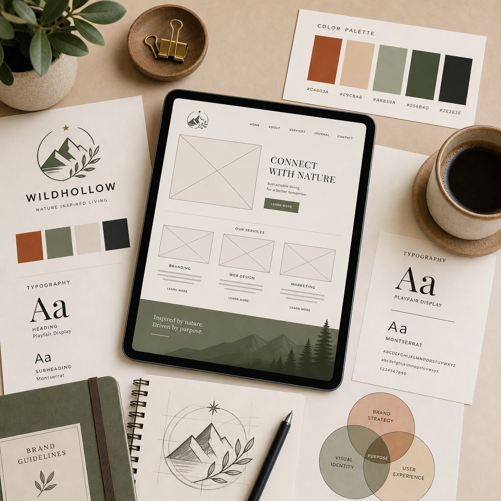


The conversation opened with Tori confirming the remaining deliverables needed for the Great and Station brand identity (03:28). The team needs PNG and SVG exports across all color variants — with the exception of the sage variant, which is still being workshopped. The terracotta primary color was confirmed at hex #B55633 (10:07), aligning with what James had already been using.
James confirmed the primary typeface as I am Fel DW Pika, a Google Font that works well for both headlines and body copy (05:07). For secondary font pairings on assets like menus, James recommended a few directions:
The team aligned on the refined square logo version with the finer leaf linework and updated mountain fill (11:43). James will provide each version both with and without the paper texture overlay. Matt also requested isolated icon exports and a favicon asset — the team landed on the star as the favicon mark (13:39).
Matt raised the horizontal monument sign for the physical site, noting the current mockup was based on an older logo version (14:18). The discussion surfaced an opportunity to rebalance proportions — particularly making "Coffee Culture Kitchen" more prominent for legibility from a distance (15:29). James prefers an oval treatment over a literal rotation of the vertical lockup and will refine the linework to feel thinner and more rounded for signage application (19:21). Nika joined briefly as the team member sourcing sign builder quotes (17:17).
Matt introduced a re-skeletoned version of the site outline that better centers the dual-entity structure of Revillage Earth (25:11). Key architectural shifts:
Tori shared that working directly in copy on the prototype made the dual-entity clarity feel much more tangible, and the AI-generated copy has been a strong jumping-off point for tone and essence (22:07).
Matt raised a candid process question (28:32): rather than perfecting copy in Google Docs first, could the team move into Webflow [tag="webflow"] earlier so copy edits could happen against a live, felt version of the site? Switching between docs and prototype was making it hard to gauge sentence length, rhythm, and visual fit.
James was fully open to this approach (30:09). The plan:
Matt will create a Webflow workspace account and grant James access to begin the build (32:17).
Matt identified three signature graphics that will carry significant weight across the site (36:46):
James affirmed that the felt sense of these graphics will sharpen once the full site comes together, and that the site itself should function as an evolving visual and verbal workspace integral to the conversations Revillage is having with its community (41:02).
[technology="Community Facilitation Tools"]
Matt referenced the Shorefast model where project tiles can link internally to subpages or externally to standalone sites (44:00) — relevant since Grayton Station will have its own evolving site rather than living as a Revillage subpage. The team aligned on a flexible tile-based grid where:
James confirmed they can build this as a duplicatable component with flexible column-spanning (50:18).
Matt asked whether events could carry location tags (Town Square, Grayton Station, Grayton Green, etc.) and descriptor tags (e.g., family-friendly), with filtering functionality as the events list grows (50:43). James confirmed this is feasible, and noted a future iteration could include a map view of events [tag="mapbox"].
[technology="Directory Systems"]
Matt named the underlying pressure honestly (34:00): the team is maxed out with the upcoming crowdfund launch this week and a community nonprofit fundraising festival in two weeks. A community town hall recently surfaced a swirl of questions about who Revillage is and how the moving parts relate — making the basic site (especially the homepage and the foundation/development pages) genuinely time-sensitive.
The strategic agreement: ship a credible, sturdy version now, keep unfinished pages hidden in the back end, and let the site evolve over time. As Matt put it, "it's like a pattern language" (36:08) — James affirmed the site is never "done."
Target: Live in Webflow [tag="webflow"] by May 27th, before James departs for Portugal and the Azores (59:23). James's team will continue work during his travel with check-ins.
James noted he's behind on invoicing and will send the deposit invoice (57:56). Tori is onboarding vendors through Ramp and will send James the onboarding details so future invoices flow through that system (58:14).
James Redenbaugh
Matt Jorgensen
Tori Immel
The conversation opened with Tori confirming the remaining deliverables needed for the Great and Station brand identity (03:28). The team needs PNG and SVG exports across all color variants — with the exception of the sage variant, which is still being workshopped. The terracotta primary color was confirmed at hex #B55633 (10:07), aligning with what James had already been using.
James confirmed the primary typeface as I am Fel DW Pika, a Google Font that works well for both headlines and body copy (05:07). For secondary font pairings on assets like menus, James recommended a few directions:
The team aligned on the refined square logo version with the finer leaf linework and updated mountain fill (11:43). James will provide each version both with and without the paper texture overlay. Matt also requested isolated icon exports and a favicon asset — the team landed on the star as the favicon mark (13:39).
Matt raised the horizontal monument sign for the physical site, noting the current mockup was based on an older logo version (14:18). The discussion surfaced an opportunity to rebalance proportions — particularly making "Coffee Culture Kitchen" more prominent for legibility from a distance (15:29). James prefers an oval treatment over a literal rotation of the vertical lockup and will refine the linework to feel thinner and more rounded for signage application (19:21). Nika joined briefly as the team member sourcing sign builder quotes (17:17).
Matt introduced a re-skeletoned version of the site outline that better centers the dual-entity structure of Revillage Earth (25:11). Key architectural shifts:
Tori shared that working directly in copy on the prototype made the dual-entity clarity feel much more tangible, and the AI-generated copy has been a strong jumping-off point for tone and essence (22:07).
Matt raised a candid process question (28:32): rather than perfecting copy in Google Docs first, could the team move into Webflow [tag="webflow"] earlier so copy edits could happen against a live, felt version of the site? Switching between docs and prototype was making it hard to gauge sentence length, rhythm, and visual fit.
James was fully open to this approach (30:09). The plan:
Matt will create a Webflow workspace account and grant James access to begin the build (32:17).
Matt identified three signature graphics that will carry significant weight across the site (36:46):
James affirmed that the felt sense of these graphics will sharpen once the full site comes together, and that the site itself should function as an evolving visual and verbal workspace integral to the conversations Revillage is having with its community (41:02).
[technology="Community Facilitation Tools"]
Matt referenced the Shorefast model where project tiles can link internally to subpages or externally to standalone sites (44:00) — relevant since Grayton Station will have its own evolving site rather than living as a Revillage subpage. The team aligned on a flexible tile-based grid where:
James confirmed they can build this as a duplicatable component with flexible column-spanning (50:18).
Matt asked whether events could carry location tags (Town Square, Grayton Station, Grayton Green, etc.) and descriptor tags (e.g., family-friendly), with filtering functionality as the events list grows (50:43). James confirmed this is feasible, and noted a future iteration could include a map view of events [tag="mapbox"].
[technology="Directory Systems"]
Matt named the underlying pressure honestly (34:00): the team is maxed out with the upcoming crowdfund launch this week and a community nonprofit fundraising festival in two weeks. A community town hall recently surfaced a swirl of questions about who Revillage is and how the moving parts relate — making the basic site (especially the homepage and the foundation/development pages) genuinely time-sensitive.
The strategic agreement: ship a credible, sturdy version now, keep unfinished pages hidden in the back end, and let the site evolve over time. As Matt put it, "it's like a pattern language" (36:08) — James affirmed the site is never "done."
Target: Live in Webflow [tag="webflow"] by May 27th, before James departs for Portugal and the Azores (59:23). James's team will continue work during his travel with check-ins.
James noted he's behind on invoicing and will send the deposit invoice (57:56). Tori is onboarding vendors through Ramp and will send James the onboarding details so future invoices flow through that system (58:14).
James Redenbaugh
Matt Jorgensen
Tori Immel
Export logo PNGs and SVGs in all color variants except sage, with and without paper texture overlay
Export PNG and SVG files across all confirmed color variants (excluding sage, which is still being workshopped). Each version should include both with and without the paper texture overlay. Terracotta primary confirmed at hex #B55633. Referenced at (04:48).
Send link to I am Fel DW Pika Google Font to Matt and Tori
James to send the link to the I am Fel DW Pika Google Font confirmed as the primary typeface for both headlines and body copy. Secondary pairings discussed include Baskerville, Montserrat, Open Sans, and Inter. Referenced at (05:15).
Provide isolated icon exports and star favicon asset for Great and Station brand
Export isolated icon versions of the logo mark and a star favicon asset — the team aligned on the star as the favicon mark. Referenced at (13:24) and (13:39).
Refine horizontal monument sign with adjusted proportions, larger Coffee Culture Kitchen text, and thinner rounder linework
Refine the horizontal monument sign mockup based on the newer logo version. Make 'Coffee Culture Kitchen' more prominent for legibility at distance, apply an oval treatment rather than a literal rotation of the vertical lockup, and use thinner, more rounded linework for signage application. Referenced at (19:21).
Update Figma mockup with re-skeletoned site architecture and begin Webflow build starting with homepage
Once Matt shares the updated content/architecture doc, James updates the Figma mockup with the new dual-entity structure (Foundation and Development as top-line nav, About consolidating Mission, dedicated Projects page), then begins the Webflow build from there. Target launch May 27th before James departs for Portugal. Referenced at (32:17) and (59:23).
Send Webflow site plan and setup instructions to Matt once workspace is created
Once Matt creates a free Webflow workspace account and grants James access, James sends the site plan details and setup instructions to get the build underway. Referenced at (59:53).
Send deposit invoice to Revillage Foundation and complete Ramp vendor onboarding
James is behind on invoicing and will send the deposit invoice. Tori is onboarding vendors through Ramp — James to complete that vendor onboarding process so future invoices flow through the Ramp system. Referenced at (57:56) and (58:14).
Share updated site content and architecture doc with James
Matt to share the re-skeletoned content/architecture doc with James so he can update the Figma mockup and proceed with the Webflow build. The new structure pulls Foundation and Development to top-line nav and consolidates Mission and About. Referenced at (30:30).
Create free Webflow workspace account and grant James access to begin build
Matt to create a free Webflow workspace account and grant James access so the Webflow build can begin. Referenced at (32:17).
Do a quick pass filling in placeholder copy across all pages so James can gauge rough shape and content volume for layout
Matt to do a quick pass filling in rough placeholder copy across pages so James can gauge sentence length, rhythm, and content volume for layout decisions before building in Webflow. Referenced at (56:59).
Add readiness status notes at the top of each page in the content doc indicating ready, in development, etc.
Matt to add notes at the top of each page in the content doc indicating its readiness status (e.g., ready / in development / placeholder) so James knows what to prioritize and what to hold back during the Webflow build. Referenced at (55:00).
Coordinate Alex callback regarding boulder and sign work for Grayton Station
Matt to coordinate a callback with Alex regarding the boulder and monument sign work for Grayton Station. Referenced at (16:25).
Send Ramp vendor onboarding information to James's email
Tori to send James the Ramp vendor onboarding details so future invoices from James can flow through the Ramp system. Referenced at (58:18).
Continue copy refinement across pages, particularly the consolidated About page and new Foundation and Development pages
Tori to continue refining copy across site pages, with particular focus on the consolidated About page (combining Mission and About) and the new dedicated Foundation and Development pages that reflect the dual-entity structure. The AI-generated copy has been a strong jumping-off point for tone and essence. Referenced at (23:00).
Design and build a new Webflow website for Revillage Foundation to replace existing Squarespace site. Inspired by Shorefast model with clean structural clarity combined with The Ecology Center's vibrancy and approachability. Building a versatile backbone that can support connected but distinct sub-sites over time - an ecology of brands approach.
Core page architecture restructured (25:11) to center dual-entity clarity: Foundation and Development pulled up to top-line navigation as distinct pages, Mission and About consolidated into single About page, dedicated Projects page showcasing flagship initiatives like Grayton Town Square and cafe. Homepage serves two primary user flows: (1) action-oriented visitors arriving via QR codes who need quick navigation to specific destinations, and (2) inspired newcomers with no context who need enough signal about the larger vision to feel drawn deeper.
Homepage features portal/doorway shape hero section evoking Christopher Alexander pattern language. Terracotta color confirmed at hex #B55633 (10:07) - represents bridge between Earth and human, ties to Grayton Station, provides warmth and hand-of-maker texture feeling. First section after hero helps visitors orient: why are they here, what do they want, what depth are they looking for.
Watershed topography illustration identified as one of three critical signature graphics (36:46) - will be expanded to include subtle human infrastructure elements layering human activity into ecological reading. Three-dimensional horizon visualization to show layered timeline: café (present), town square (near future), future projects as shapes on horizon. Foundation × Development relationship diagram makes business/nonprofit relationship instantly legible. Progressive disclosure approach inspired by Naia Trust investments page precedent.
Projects page uses flexible tile-based grid (44:00) where some tiles link to internal subpages, some link to standalone project sites (e.g., Grayton Station), some are static coming-soon placeholders. Tile sizes can vary within grid to give landmark projects more real estate.
Rounded corner aesthetic across cards affirmed (37:20) - professional but friendly, good nervous system feeling. Light background color accents on cards to help text pop while preserving soft, image-forward feel. Mission language organized around six core convictions as potential website pillars with icons: (1) Joyful by Nature, (2) Rooted in Place, (3) Layered by Design, (4) Tangible Before Theoretical, (5) Bridging Worlds, (6) New and Ancient Coherence. Key through-line: 'Joyful by nature, participatory by design.'
Design approach shifted from philosophical manifesto to tangible-first - lead with visible reality of work (cafe, town square, events) and let deeper philosophy emerge through exploration. Visual language: terracotta primary brand color (#B55633), oat milk companion, black grounding neutral, blues/yellows as seasonal accents. Portal/threshold framing devices, curvilinear patterns, earth-from-above imagery, hand-feeling imperfection aesthetic. Integrating geodesic/organic architecture references and cultural glyphs - grounded solarpunk aesthetic.
Typography: Primary typeface I am Fel DW Pika (Google Font) for headlines and body (05:07). Secondary pairings: Baskerville, Montserrat, Open Sans, or Inter for menus and supporting assets.
Future projects (housing, farming, wholesale processing, sauna club) presented with progressive disclosure - balancing transparency for solarpunk philanthropists while respecting community input process. Partner section shows both local Sonoma County relationships and global organizational connections. Bilingual accessibility through Webflow Locales feature.
Donate/Contribute/Support page features sliding scale contribution interface with Stripe integration - drag slider to choose amount, paid once/monthly/annually (18:43). Page encompasses donations, investment conversations, gifts of land/assets, legacy bequests, and volunteering time. Slider shows what each tier enables. Integration with GiveButter for foreseeable future, including upcoming Friends of Grayton Public Spaces monthly-giving campaign.
Get Involved surfaces: attending events, volunteering/co-creating, deeper commitment pathways. Events linked to existing platforms (Eventbrite/Partiful) initially, with option for custom event CMS later. Participatory-by-design meta-treatment being added - small sticky-note function inviting visitors to share skills, giveaways, or things that would light them up to offer in service of community (22:30).
Process shift (28:32): Moving into Webflow build earlier rather than perfecting copy in Google Docs first. Team will workshop copy directly in Webflow, leaving comments on design elements needing adjustment. This allows testing sentence length, rhythm, and visual fit against live site rather than switching between docs and prototype.
Design philosophy guided by Christopher Alexander's pattern language (13:28) - lean into generosity, move away from pressured CTAs, create entryways and approaches that invite landing, honestly display who team is and what's alive. Also weaving in Fernando Flores's action language (45:40) - designing for deeper, slower actions (sitting with, witnessing, communing, transforming) beyond typical click/scroll/share patterns. Measuring against Alexander's 'quality without a name' as design principle (39:50).
Timeline pressure driven by crowdfund launch this week and community nonprofit fundraising festival in two weeks (34:00). Recent community town hall surfaced questions about who Revillage is and how moving parts relate - making basic site (especially homepage and foundation/development pages) genuinely time-sensitive. Target launch: May 27th, before James departs for Portugal.
Build intelligent, easy-to-update calendar system using Webflow CMS synced with Airtable for event management. Enables multiple team members to create and manage quarterly programming events. Centralized event database in Airtable with location tags (Town Square, Grayton Station, Grayton Green, etc.) and descriptor tags (e.g., family-friendly) powers unified view on main Revillage site, with filtered views serving individual entity pages showing only contextually relevant events (50:43).
Events should support flexible tile-based grid display matching Projects page architecture (50:18) - some tiles link to internal event pages, some link to external registration platforms (Eventbrite/Partiful initially). Location-based filtering and descriptor-based filtering functionality to help users navigate growing events list. Future iteration could include map view of events using MapBox integration (50:43).
Calendar should be regularly updatable as new nonprofit programming emerges. Foundation for future automation triggers based on event signups. Part of building versatile backbone that supports ecology of brands approach.
Finalize Grayton Station botanical logo mark and comprehensive brand identity system. Square logo version with finer leaf linework and updated mountain fill confirmed as primary direction (11:43). Team needs PNG and SVG exports across all color variants except sage (which is still being workshopped), with versions both with and without paper texture overlay (04:48). Isolated icon exports and star favicon asset required (13:24).
Horizontal monument sign for physical site needs refinement (14:18) - rebalance proportions to make 'Coffee Culture Kitchen' more prominent for distance legibility (15:29). James prefers oval treatment over literal rotation of vertical lockup, with thinner and more rounded linework for signage application (19:21). Sign builder quotes being sourced by Nika (17:17).
Typography system finalized: Primary typeface I am Fel DW Pika (Google Font) works for both headlines and body copy (05:07). Secondary font pairings for menus and supporting assets: Baskerville (versatile serif), Montserrat (modern sans-serif, Tori's favorite), Open Sans or Inter (clean readable alternatives).
Comprehensive brand color palette: Terracotta confirmed as primary brand color at hex #B55633 (10:07) - consistent since early firehouse heritage conversations, represents bridge between Earth and human. Paired with oat milk as standard companion and black as grounding neutral. Blues and yellows available as seasonal/contextual accents. Concept of limited-edition colorways for future merchandise.
Distinctive visual language and brand guidelines covering: curvilinear/flowing forms, hand-feeling imperfection, earth tones with less stark contrast, geodesic/organic architecture references, earth-from-above imagery, cultural glyphs and ancient markings integration, fractal but grounded (not digitally trippy) aesthetic. Working aesthetic anchor: 'grounded solarpunk'. Portal/doorway shapes emerging as compelling visual device.
Guidelines must address multi-generationally aspirational positioning while maintaining tangible rooted-in-now expression - speaking to spectrum from local community members to solarpunk funders. Avoiding spiritual bypass/Mexico City boutique hotel aesthetic in favor of lived-in, rooted feeling.
Using hand-drawn sketching to develop visual and verbal ideas, distilling brand ecology into early website concepts. Logo finalization critical for sign fabrication (wooden form with vector projection, jigsaw cut or CNC approach). Complete brand purpose questionnaire analysis to extract alignment threads. FigJam board with website precedents, mood board images, and inspiration informing direction.
Develop lightweight Field Notes page and content system to keep website alive without requiring blog-level commitment (15:00). Short, ~120-character updates from any team member - an event, a thought, a neighbor's idea - would surface what's currently engaged. Format's lightness allows casual community voice sharing.
Parallel input channel where community members can contribute observations via simple form feeding Airtable (15:00). Creates participatory documentation stream showing what's alive in the village week to week. Alternative to traditional blog that feels more accessible and authentic to team's workflow.
Supports Christopher Alexander's pattern language principle of making the site alive and generous - showing honest reality of where team is at and what's engaged rather than curated marketing content (13:28). Ties to broader participatory-by-design ethos and community listening infrastructure.
Implementation through Webflow CMS collection synced with Airtable via Whalesync. Simple form interface for both team and community submissions. Potential for AI moderation or curation support using Claude to maintain quality while keeping submission barrier low.
Develop collaborative wiki updating Christopher Alexander's pattern language and anti-patterns for the modern digital world (45:06). James has created digital pattern language infographic pairing Alexander's traditional patterns with digital translations and anti-patterns (memory disenfranchisement, fake activity indicators, roach motel UX).
Matt found anti-patterns especially powerful - 'the shadow teaches the light' (45:06). Vision is to create larger collaborative resource that documents both healthy digital patterns and their shadow equivalents. Would serve as reference framework for consciousness-focused organizations building ethical digital experiences.
Invitation extended to Matt, Tori, and Spencer to participate in developing this body of work (40:57). Matt expressed strong interest and offered to be of service, noting Christopher Alexander's work is major thread in what he's currently channeling. Spencer originally introduced Matt to Alexander years ago.
This extends beyond Revillage engagement into broader Iris Cocreative research and knowledge development. Potential to become foundational framework for studio's approach to web design and platform development. Could manifest as wiki, course content, or collaborative knowledge base.
Reflects intersection of ancient wisdom traditions (Alexander's pattern language) with contemporary technology - core Iris focus. Ties to broader conversation about what's uniquely human in age of AI assistance and how to co-create new narratives for digital spaces.
Build and deploy Revillage Foundation website in Webflow based on finalized architecture and design direction. Process shift to build in Webflow earlier rather than perfecting copy in Google Docs first (28:32), allowing team to workshop copy directly against live site and test sentence length, rhythm, and visual fit.
Workflow: Matt shares updated content/architecture doc → James updates Figma mockup with new structure → Team builds in Webflow from there → Tori and Matt workshop copy directly in Webflow leaving comments on design elements needing adjustment (30:09-32:17).
Matt creating free Webflow workspace account and granting James access (32:17). James will send Webflow site plan and setup instructions once workspace is created (59:53). Matt doing quick pass filling in placeholder copy across pages so James can gauge rough shape and content volume for layout (56:59). Matt adding readiness status notes at top of each page in doc (ready / in development / etc.) to guide build prioritization (55:00).
Technical implementation includes: Flexible tile-based grid system with duplicatable components and variable column-spanning for Projects and Events pages (50:18), location tagging and descriptor tagging infrastructure for events with filtering functionality (50:43), integration points for GiveButter donation system, Webflow Locales for bilingual accessibility, responsive design across all breakpoints.
Site will evolve over time using pattern language philosophy (36:08) - ship credible sturdy version now, keep unfinished pages hidden in back end, let site grow organically. Target launch: May 27th before James departs for Portugal and Azores (59:23). James's team will continue work during travel with check-ins.
Priority pages for initial launch: Homepage, About (consolidated Mission + About), Foundation page, Development page, Projects page. Get Involved and Donate pages follow. Events calendar and Field Notes can evolve post-launch.
00:00:02
James Redenbaugh: This meeting is being recorded. Hey, folks.
00:00:31
Tori Immel: Hello. Come on.
00:00:33
James Redenbaugh: Howdy, matt. You're muted.
00:00:36
Matt Jorgensen: What's up? It's all. It's all happening here. We got h vac installers going and. Patio. What?
00:00:54
James Redenbaugh: Awesome.
00:00:55
Matt Jorgensen: Yeah. Do the big sunken garden. Just got. Just got boulders delivered. It's really fun.
00:01:09
James Redenbaugh: Look at that. Cool.
00:01:11
Matt Jorgensen: Yeah. Fun and fun and hectic and. Yeah. You're just specking out where that sign you designed is going to go in the front.
00:01:25
James Redenbaugh: Wonderful.
00:01:26
Matt Jorgensen: They're just putting the beams in for it. This is the post in for it this morning.
00:01:31
James Redenbaugh: Exciting.
00:01:34
Matt Jorgensen: How you been?
00:01:36
James Redenbaugh: I've been good. Was a little sick. Now I'm playing catch up. Spring has sprung. Yeah. Getting ready. Big time. Take off to Portugal and a little over two weeks.
00:01:56
Tori Immel: Yum. Where to?
00:02:00
James Redenbaugh: I'm doing a conference in outside Lisbon, and then we're going to the Azores for 10 days, so.
00:02:09
Tori Immel: Good.
00:02:10
James Redenbaugh: Oh, yeah, Yeah.
00:02:12
Tori Immel: I was there years ago. Are you a hot spring guy?
00:02:15
James Redenbaugh: Yeah.
00:02:16
Tori Immel: Yeah. So fun. Enjoy that.
00:02:20
James Redenbaugh: Thanks.
00:02:22
Tori Immel: Yeah.
00:02:23
James Redenbaugh: Can't wait. How are you guys doing?
00:02:28
Tori Immel: Good. I feel like things are moving over here. That's why Annalise calls it. What is it? The Hundred days of May, I think maybe. So deep. We're deep, but it's gorgeous. It feels like there's a. I'm moving at the beginning of the next month, so I feel like I'm in that period of just, like, really stoking up the last moments of the land where I'm at nature and the people that live here. So that's been really sweet. Yeah. Lots of change and just energy and community. I feel like it's. You can see it physically manifest over at the cafe. And a ton of events coming up this spring and summer, so just kind of hands on the work. Nice nourishment along the road.
00:03:15
James Redenbaugh: Where are you moving to?
00:03:17
Tori Immel: Just down the road. Six minutes closer to great. And I think that's a pretty good clip. If I move six minutes closer to great in every two years, I'll be there soon.
00:03:28
James Redenbaugh: Totally awesome. I was just looking through my email, and I realized I missed one from you guys about the great and station stuff. So why don't we. Why don't we take care of that real quick? Let's see what's. What's needed there and get that wrapped up.
00:03:55
Matt Jorgensen: Thank you. Sorry,.
00:04:00
Tori Immel: What was that?
00:04:02
Matt Jorgensen: I think that was your request.
00:04:04
Tori Immel: Oh, perfect. Yeah. I think we had two.
00:04:06
Matt Jorgensen: Right.
00:04:07
Tori Immel: One was also for your sign, but for the logos. Yeah, we are. I think we're pretty well zipped up. Was just hoping to get Exports. Let me go back to the actual email so I can just refresh myself. You have a long email thread. I love this. Yeah, perfect. So we were just hoping to get PNGs and SVGs for all the colors with the exception of the sage. We're still kind of dreaming on the sage.
00:04:48
James Redenbaugh: Cool.
00:04:51
Tori Immel: And then, yeah, I think this looks like the original Terracotta, which is awesome. We like that.
00:04:57
James Redenbaugh: Terracotta.
00:04:58
Tori Immel: Yeah. Pretty simple. And then also we were curious about the typography. The font name.
00:05:07
James Redenbaugh: Yes. It is called I am Fel DW Pika.
00:05:15
Matt Jorgensen: Very.
00:05:16
James Redenbaugh: The name rolls off the tongue. It's a Google font. I can send you a link.
00:05:24
Tori Immel: Cool, thank you. That's amazing. I mean, kind of as a related question too. Like, we can play around with secondary fonts, but I think we'll probably be getting to that soonish on the menu piece. So if you have any recommendations on secondary fonts, I'd welcome that.
00:05:44
James Redenbaugh: Sure. Yeah. Okay. I think that this font works well as a. As a headline and as a body font. And there's lots of different variations as well. Let's look at it real quick. Actually, there's not lots of. There's a small caps regular and an italic. So for things like menus, you can decide to either balance with a more versatile serif font like Baskerville, which is going to be similar, but won't have the little details that our stylized font has, the little jagged edges and artifacts. It's gonna. But it's a. It's a variable font, so it can have lots of different weights. It works well for body, but we could also pair it with a sans serif font, which is going to be more modern. Montserrat is a Go to. This might be a little too modern for our needs here. It's very versatile, very readable.
00:08:06
Tori Immel: My favorite fonts, actually.
00:08:08
James Redenbaugh: Yeah, classic. And of course, we don't need to limit ourselves to Google fonts, but that's always, always a possibility. I could noodle on it as well. I think Open Sands would or Inter are other easy choices. Yeah, there's one I'm thinking of on the tip of my tongue. What is it? I'll have to think of it and come back to you.
00:09:25
Tori Immel: Sounds grooving.
00:09:26
James Redenbaugh: Yeah.
00:09:27
Tori Immel: Thank you so much. I just. These ones, Baskerville, Montserrat, and then the screenshot where the. This one intern. Open Sands. I mean, perfect. That's exciting. And then Matt was able to pull down and get a. A temperature thing on the. The hex code for the Terracotta. So I can find that and add it to this like brand kit. Colorings too.
00:09:54
James Redenbaugh: Okay.
00:09:58
Tori Immel: Unless that's like easy and just kind of fingertips for you.
00:10:04
James Redenbaugh: Yeah. What's the code?
00:10:07
Tori Immel: Let me find it. B55633.
00:10:30
James Redenbaugh: Cool. Yeah. That's what we are using.
00:10:34
Tori Immel: Sweet.
00:10:40
James Redenbaugh: Great.
00:10:43
Tori Immel: Awesome. Cool. We're so stoked. I'm excited to see all of these colors come to life in different formats. It's going to be beautiful.
00:10:56
James Redenbaugh: Yeah. Real quick for the square version. Do we like this? Why can't I drag this out? This version here matches the logo better. I think we want to roll with that. But just to confirm it's a bit different from what we had before.
00:11:41
Tori Immel: You're saying roll with the bottom one?
00:11:43
James Redenbaugh: Yeah,.
00:11:46
Tori Immel: I like them both personally, so yeah, I'm great with the bottom one.
00:12:00
Matt Jorgensen: Sorry. What's the difference?
00:12:02
Tori Immel: I think like the fine lines on the leaf and the fill in on the. On the mountains.
00:12:09
James Redenbaugh: Yeah, on the mountains.
00:12:12
Matt Jorgensen: Yeah.
00:12:12
James Redenbaugh: Yeah.
00:12:15
Matt Jorgensen: Which one do you like better?
00:12:18
James Redenbaugh: The one on the bottom.
00:12:19
Matt Jorgensen: Yeah, me too. Okay, that's great.
00:12:22
James Redenbaugh: Cool. And I'll also give you versions with and without this texture so you can have the solid color version and then also the one that we've added this paper texture to. Awesome.
00:12:38
Tori Immel: Cool.
00:12:39
Matt Jorgensen: Yeah, I like.
00:12:43
James Redenbaugh: Cool.
00:12:46
Matt Jorgensen: Are you also able to just pull out just the. Just the icon set maybe in all three of them and then maybe just the. I don't know, something for like the favicon thing for.
00:13:07
James Redenbaugh: I don't know how to say that.
00:13:09
Matt Jorgensen: Favicon.
00:13:10
James Redenbaugh: Yeah.
00:13:13
Matt Jorgensen: I don't know.
00:13:14
James Redenbaugh: Yeah, sure.
00:13:15
Matt Jorgensen: I don't know which one we would want for that either. Maybe the. Maybe the leaf.
00:13:24
Tori Immel: What's this for?
00:13:25
Matt Jorgensen: Leaf and star for the little thing that goes like in the top of the browser on the browser tab.
00:13:38
Tori Immel: Love it.
00:13:39
James Redenbaugh: I think maybe the star.
00:13:44
Matt Jorgensen: I just like there's so much going on here. I might have. I might have just gotten 3 tons of the wrong size gravel dropped off.
00:13:59
James Redenbaugh: Oh no. My God. Oh, All good.
00:14:18
Matt Jorgensen: The other thing, James. Well, last thing on this is for we. We do want to do this like horizontal monument sign idea and I was wondering, did you change anything on the. Did you change anything on the aspect ratio of. Or like the. The proportions of the logo here other than the circle on the outside?
00:14:54
James Redenbaugh: That is. That was a kind of rough mock up. So the AI. It's missing a bean. Oh, yeah, Yeah. I mean that's.
00:15:12
Matt Jorgensen: That's the old. That's the old logo too. Or sorry, like less. Less hills and everything. Yeah.
00:15:19
James Redenbaugh: So I can just make a Horizontal version here real quick.
00:15:29
Matt Jorgensen: We also now knowing the fonts and having exports of the different elements, we could potentially futz around with it a little. The one impulse I have is that Coffee Culture Kitchen could be a little bigger. Like if we're go horizontal, we might be able to do. We might be able to sign with the lettering a little bit more efficiently.
00:16:00
James Redenbaugh: Yeah. The designer working on the monument sign. Yeah. Oh, cool.
00:16:16
Tori Immel: And James, it is the I am foul D.W. pica, right?
00:16:20
James Redenbaugh: Yes.
00:16:20
Tori Immel: Okay, sweet. I found that.
00:16:25
Matt Jorgensen: You want to try to get in touch with Alex.
00:16:28
James Redenbaugh: Sure.
00:16:28
Matt Jorgensen: And I've called three times but yesterday and this morning before I got this delivered.
00:16:33
James Redenbaugh: But it's awesome, like performance.
00:16:39
Tori Immel: Yeah.
00:16:41
Matt Jorgensen: Getting, like figure out what to do with that rock and not have the cork hold up, you know? Yeah, I'll try and call him.
00:16:52
James Redenbaugh: Yeah.
00:16:53
Matt Jorgensen: If you, if you get him, I'll just step out and help on. James, this is Nika. It's another member of our team.
00:17:17
James Redenbaugh: Hi, James. Hello. Good to see you. Thank you.
00:17:23
Matt Jorgensen: Nico's. Nico's been getting sign. Sign builder quotes for this. The wooden rendition of this sign. So. This is relevant. Yeah, I do feel like. I feel like in the horizontal, it's. It's just not using the space as effectively yet.
00:17:51
James Redenbaugh: Could you bring up that mock up again? I'm going to screenshot it real quick.
00:17:57
Tori Immel: It.
00:18:41
Matt Jorgensen: Yeah.
00:18:41
James Redenbaugh: I'm actually liking the oval here more for some reason. Then a literal rotation of the vertical.
00:19:00
Matt Jorgensen: I'm not. I don't see your screen.
00:19:02
James Redenbaugh: Oh, you have to. You have to imagine it. Here we go.
00:19:14
Matt Jorgensen: Yeah,.
00:19:21
James Redenbaugh: So I'll just. I'll play with this and massage it. To have it feel better because I think that this line should. Should be a little different on the sign. I think it can be thinner and more. More round.
00:19:50
Matt Jorgensen: One sec.
00:19:53
Tori Immel: We were getting some banners made as well, and one thing I was kind of noticing is just once we get things like on signage, like if it's on paper, on cups, I feel like the coffee culture kitchen is like, you know, it's right in front of your face. But I am wondering if. Yeah, like just how to. How to make sure it's like super readable from afar. And maybe that's a size thing. But now that I'm looking at it again, I'm like, I don't know if there's too much room to make it go bigger and still have the same really elegant feeling. Always looking for harmony.
00:21:10
James Redenbaugh: I think this cleaner version of the font is going to be better. Yeah. I'll play with this and get it feeling good and send it to you as soon as I can.
00:21:57
Tori Immel: Awesome. Thank you so much.
00:22:00
James Redenbaugh: Cool. And then you guys have been working on the content and the structure?
00:22:07
Tori Immel: Yeah, we have Matt. I think Matt emailed, but there was a. He had some. Some fun kind of like, revamp at the, like, skeletal level. And the main difference being. Let me pull up or find the tab I have open. The main difference being kind of pulling up the foundation and development up to the like, headliner bar to like, I guess the nav items. But we. I went through and was starting to like. I feel like actually Matt should probably like, introduce this because it's. It's mostly his. His brainchild. And I think the. The piece that was like, coming forward is. Yeah, just like doing a little bit more thinking with you on the graphic side of the house. I think the copy, it's like, amazing to be inspired by the AI pieces and like the. Just like the tone and the essence. And I had a lot of fun getting in there and just like really dreaming into all the ways that we want to be conveyed and you know, how neutrally and also how. How kind of like in the spirit of some of what was created and then additionally trying to get like a felt sense of like how to get people on the journey of this really dual entity structure and just seeing that in a really front and center and clear way. So kind of peeling down a different page also for projects. So there we can have Grayton Station and the cafe or, sorry, Grayton Town Square and the cafe. So that it's a bit of this separate thing of what's live. So I think there's a lot of elements that will. Will like, hold from what you originally created. And I think really it's not like such big differences, but part of what I think Matt will probably want to jump in on is just some curiosities about chatting through graphics and then also kind of next steps as we're living in the prototype format compared to moving to webflow and kind of like the general next steps of the process.
00:24:38
James Redenbaugh: Great.
00:24:39
Tori Immel: Yeah, it was fun. I feel like it's getting so much more real to really be in the copy and see the whole design. And I think there's definitely quite a few of the pages that were like, you know, beyond like us finishing copy tweaks. There's really nothing that I personally want to change. So.
00:25:02
James Redenbaugh: Yeah.
00:25:03
Tori Immel: Matt, are you. Can you hear us? Sweet. We're just kind of transitioning to website.
00:25:11
Matt Jorgensen: And yeah.
00:25:11
Tori Immel: Wondering if you want to jump in and share a little bit More I was just kind of giving James an overview of like some of the high level changes to really help center the dual entity structure and like how we want to have a different projects page that will show the flagship projects and then how we're in process of thinking more about graphics and getting our fingers deeper into the actual copy across the pages.
00:25:38
Matt Jorgensen: Yeah, I think what we were finding is just that copy editing like with track changes on the, on the AI like blocks of text was just kind of hard and it. And so what I was curious about and like from a process perspective was how much we could just kind of like re skeleton a couple of things. And specifically in this I, I created a fresh like fork of your outline and changed the top line nav and then, and then started to populate within that top line nav. Like the home pages, the homepage, we didn't really change, we started copy editing it. But then the other pages felt like they, they because we were changing the architecture, like consolidating. I think in the prototype you had like a mission page and an about page. And so we consolidated mission and about into about and then we broke out separate pages for the foundation and the development side of the house. And basically like, I think a lot of the content blocks for these could be the same. Like from a visual perspective I feel like your existing kind of types of content blocks work really well, but it's just a slightly different, it's a slightly different schedule skeleton. And. I'm kind of wondering like just from a process perspective, would it be possible to reskeleton it, put the, put the blocks of content kind of in place and then at what point will your like if we get aligned on the graphical and skeleton of it, but haven't finished all the copy editing within that, does it ever make sense to move to webflow and actually have a live version in webflow and then have us edit directly the text in webflow? I'm sure you that might, you might not like that. But I also, I'm like personally finding.
00:28:32
James Redenbaugh: That.
00:28:35
Matt Jorgensen: There's something psychological about like directly editing a live prototype and seeing it, just seeing how the text looks on the page as I do it that I'm very used to doing with like managing website, my own websites just in squarespace and it feels somehow harder to have a felt sense of like do I want this to be one sentence or two sentences etc. When I'm flipping back and forth between a Google Doc and a prototype. And so yeah, I guess I was just curious where you might Go from here knowing that, and I'm perfectly aware of that once you move to webflow, you're not going to want to change some of the big like visual design elements. So I think from our perspective we'd be pretty comfortable committing or at least like if we re architect a few of these top line nav and major section headings. Like we'd be willing to just commit to working within a visual framework like these blocks of text and knowing that we'll just be editing copy and not design at the point that you move to webflow. But just, just curious or, or do you really. Is your strong desire like for us to get to 90, 95% on copy in Google Docs?
00:30:09
James Redenbaugh: No, I don't have a strong need for that. I think we mainly just want to have a, a good shared sense of the overall architecture and, and style goals as well. And so I feel like we can, we can move into that articulation. So yeah, feel free to share that, share that doc with me. I can update this mock up here and. Look at our figure. And then we can start building the webflow site from what we've got here in Figma and use your new content and then, yeah, I think then that'll be a fine, fine process and you guys can workshop your copy there and also leave comments for us on any design elements in there or pieces that need restructuring, stuff like that. So. Yeah, you should create your own webflow account and give me access to it.
00:32:15
Matt Jorgensen: Great.
00:32:17
James Redenbaugh: And then we can start building there.
00:32:20
Matt Jorgensen: So perfect. That sounds really good. So within figma we have, do you, do you want us. I think we have three ABC options on this homepage layout. And then is the other, the other content blocks? I saw one little bit there over to the left, but I don't see most of the other visual content blocks from other pages represented here in figma. So were those just kind of generated or is there something. Do you want us to come into Figma and kind of like comment on visual styling for, for all of the pages or just really the homepage and then you kind of will build from there?
00:33:19
James Redenbaugh: Yeah, I think just the homepage. Then we can build from there and further articulate in webflow.
00:33:26
Matt Jorgensen: Okay.
00:33:30
James Redenbaugh: Yeah.
00:33:32
Matt Jorgensen: Great. Yeah. My, my. I shared with Tori yesterday, like my basic feeling is just that what you are creating here is, is just like so many orders beyond what we currently have and we're just so, we're so maxed out that like we haven't, we haven't been able to just like carve out Creative time to really sit down and like reimagine our verbiage on mission, vision, values and all that stuff. And so the most important stuff is, is just this kind of like a sturdy, credible representation of the top line stuff on the homepage, which is why we were kind of copy editing there. And then, and then I think having this clear breakout of the foundation and development company with, with a clear graphic on how the two of them relate is probably. There's a feeling of, of timeliness on those pieces. Just because we're launching our crowdfund this week or we're. We're launching a big community nonprofit fundraising campaign and festival at a festival in two weeks. And so there's just going to be a lot more eyeballs. And we're noticing like we did a community town hall last week and it was. Or the week before and it was really successful. But there's just a swirl of kind of questions now cropping up about like who are these people? Like what are all these different moving parts? And I think the basic website here gets us a lot of the way there and we can just refine the copy over time. I think we're kind of tripping over ourselves trying to do it too much on the front end right now because of capacity.
00:35:45
James Redenbaugh: And.
00:35:48
Matt Jorgensen: I just want your team to be unplugged, to start moving this towards a place where we could get it live.
00:35:55
James Redenbaugh: Yeah, great. I think we can definitely do that. And it's, it's never going to be done, you know, it's always going to be, of course.
00:36:03
Matt Jorgensen: Yeah.
00:36:03
James Redenbaugh: Of all that.
00:36:04
Tori Immel: Thanks for saying that, James.
00:36:05
James Redenbaugh: Yeah,.
00:36:08
Matt Jorgensen: It's like a pattern, like it's like a pattern language.
00:36:11
James Redenbaugh: Exactly. Exactly. So yeah, let's get the, the version up that, that you need now, which is. Was our intention to begin with anyway. And we can, you know, make visible on the site the pages that are ready to be public and other pages can stay in the back end until they're ready. And it can all evolve over time.
00:36:46
Matt Jorgensen: Yeah, that sounds, that sounds really great. And I think that it'll also help us. Having a live version of the pages will help us kind of see, see more clearly. Like my, my sense is that there's probably three really like critical graphics of the, of the site and it's a little bit hard to like have a felt sense of those right now. But I think this kind of like watershed portal, however that wants to evolve to kind of gesture at the watershed view and the ecology mixed with human intervention that feels like that's the first impression of what we're doing. This, this kind of relationship between the foundation and the development company is the second one, which I think you had like a Venn diagram version. I. I've repasted another Venn diagram version and here I'll replace the share here back to shore fast. Which is, you know, got that, that about us vision that is just extremely, extremely simple of. Oops, where is it? Dang it. Where's there. It's. It's not so different here artwork. It's just this very simple graphic of like, oh, it's businesses and a charity and they work together, you know, So I feel like that's this. That's the second really crucial graphic that we just want to be like dead simple so that people can stop freaking out about us like being some sort of shady organization that's like, you know, somehow commingling business and a nonprofit work in unsavory ways and instead just be like, oh, I get it. There's like businesses that are generating surplus for the shared mission with the foundation. And then I think the third graphic, which I put like a pretty random. This is a lot. This is a ton of content here on this Google Doc. But I think there's some graphic about. And I'm not sure it's a graphic, but this like horizons of change thing that I feel like could just help us talk about the work in a way that maybe it's on our about page, maybe it's on the homepage in a very simple way that's just sort of like talks to this ethos of revillage of addressing the practical, urgent and immediate realities of the now with things like food access and gathering space and livelihoods, transitional elements like moving towards these shared ownership, co housing, circular economy models and then. And then the longer arc of the seven generations transformation of rethinking culture and sense of self at a fundamental level. And I think if we did those three graphics really well, which I think we'll have a better felt sense of how they want to be done and even how graphical they are. Once we start to get the full site put together, I think that it'll.
00:40:49
James Redenbaugh: It'll help.
00:40:50
Matt Jorgensen: It'll really help address some of the critical pain points that I'm feeling right now in terms of just speaking to different types of people about what we're doing.
00:41:02
James Redenbaugh: Great. Awesome. Yeah. The whole. I feel a major function of this site and sites like these in general is to have this visual and verbal workspace that can be integral to the conversations you want to have about These things. So it's yours. And you get to define it and you get to add to it, you get to evolve it and change it over time and share it. And the people you're in dialogue with get to see it and you get to see the same things together. And it's different from looking at a. Just a deck or doc. It's. It's your. Your space. So yeah, I think we can. I think we can be very close to. To getting you there to that point where it can start to be that asset. And then of course, it will evolve over time and be more things to more people as you share resources and field notes and case studies and all kinds of stuff.
00:42:48
Tori Immel: Yeah, I love that. I feel like that's a really great point of just the mixed use. It's not just the deck explainer and it's not just narrative fluff like a substack either. Just finding that sweet spot that people can come and get inspired and also find their way into action and understanding. It's a good balance to hold. I think we were kind of feeling that as we were touching the copy too. There's so many design goals here, like from many different angles and yeah, it's an exciting prospect.
00:43:33
James Redenbaugh: Great.
00:43:35
Matt Jorgensen: I did have two. It's. It's in the. It's kind of noted in the document, but I. I did have two kind of, I guess more like block and tackle type of stuff questions about um. Oh, by the way, I double checked and the quote was actually 52,000 that we got on the. On the Captivair and MAU install. So yeah, the first one is about the projects page, which I was just kind of wondering like, how much do we really want to, um. Let's see if I can share this. How much do we really want to like have it be relatively like proclaiming like what the. What the projects are as discrete projects versus having. Having more of like a. Like I'm on the Shorefast website, they kind of just have these like tiles for their projects. And what, what you notice about them is some of them will link out to interior pages within Shorefast and some of them that are like standalone businesses will link out to that business's own page. And I, I kind of feel like we're going to be in a similar territory where for example, like Great and Station, we don't necessarily want to be keeping a Great and Station subpage live within the Revillage website. We actually just want to link out to the constantly evolving page that. That will be its own, you know, Standalone website that Grayton Station will be versus other pages like the Museum of the Future. And we had kind of talked about, like a very simple, you know, project page template that we could use for additional projects. They might, they might live within as like hidden pages that you'd navigate to by going to this projects page and just clicking. They wouldn't live anywhere else in the navigation, but there might be some hidden pages that you could find through the project page with a little bit more detail on specific things like our youth initiative or our arts initiative. And then there might even be some where you're looking at these projectiles and this is all the information you're going to get because instead of any of this, it just says co housing coming soon. You know, we envision da da da da da da happening. And it's two sentences and it's not even clickable, you know, and all we have. All we have to do is add an image for it. Yeah. So that feels like maybe a little bit of a heavier lift from a web dev perspective. So I was just. Was just curious about it as opposed to the more. The more static version that. Where we're kind of proclaiming, like really making a statement about some different things and having it potentially feel a little bit less. I don't know, it feels a little bit less nimble to me.
00:47:25
James Redenbaugh: Mm.
00:47:28
Tori Immel: Matt, is what you're envisioning maybe if you click over to the mission to the.
00:47:34
Matt Jorgensen: Click over to what mission?
00:47:37
Tori Immel: Where you just were on the prototype. If you go to mission and then down like these kinds of tiles.
00:47:45
Matt Jorgensen: Yeah, it could be.
00:47:46
James Redenbaugh: Yeah.
00:47:52
Matt Jorgensen: Yeah. I mean, maybe if. Maybe since these already exist,.
00:48:01
James Redenbaugh: That would.
00:48:01
Matt Jorgensen: Be the easiest and some of them could just.
00:48:07
James Redenbaugh: The.
00:48:08
Matt Jorgensen: The copy itself could just contain a hyperlink that might be like, eventually. I, I do like the idea of these kind of like living tiles because then you could also filter by like foundation initiatives or business initiatives in the same way that they have that on the shorefast website. Or we could have different types of filters, but that would be a heavier lift, I think, development wise. And this probably gets us a lot of the way there. And the design's already done. So I think maybe the question is just, is there a way. I mean, another thing I've often done is just like the kind of sliders where you can. You look, I forget, maybe I didn't use it on here like a. Like a carousel view. I guess my question is if we, if we go with something like this, could we make it easy enough to add or remove tiles as projects as Projects crop up or disappear without. Without a lot of new custom webflow work?
00:49:45
James Redenbaugh: Yeah, I think so. We can make it. We can make a component that's easy to duplicate and it can even. We can have a kind of grid where tiles can be different sizes, you can decide how many. How many columns it takes up. So you could have a little thing, you know, and that bigger thing.
00:50:18
Matt Jorgensen: Yeah, Yeah, I do like that for kind of being able to showcase more like relative, like the landmark projects in a way, having a little bit more real estate.
00:50:34
James Redenbaugh: Yeah. Cool.
00:50:43
Matt Jorgensen: Sweet. And then the other little question about just mechanics was, is, is there a world where these events could have a tag or two? Like a location. A location tag. I'm just thinking about this as like feeding off of an air table. Could it have a location tag like town square or Grayton Station or Grayton.
00:51:18
James Redenbaugh: Green or.
00:51:21
Matt Jorgensen: All over town or whatever, like for a parade? And could those. I mean, in. In future I could see having a subpage, for example, for the town square that shows just events happening at the town square. I don't think that we need to worry about that yet, but it would be kind of cool to just have those tags built in. So you could have potentially like a location tag and also a descriptor tag and we could decide how we want to use that. Thinking about like family friendly or whatever. And then could that potentially have a filter function so that depending on how big this running list of events is, you could, you could see just things happening at a certain place or in a certain thematic category. Maybe, maybe it's not super critical, but I'm just thinking about the, the functionality of an events page as, as we start to have like, you know, 20, 30 events on here across different locations.
00:52:43
James Redenbaugh: Yeah, definitely. We can have a location tag.
00:52:51
Tori Immel: And.
00:52:55
James Redenbaugh: Eventually have a map where there's.
00:53:01
Matt Jorgensen: Yeah. Future iteration.
00:53:03
James Redenbaugh: Yeah.
00:53:05
Matt Jorgensen: Cool. That's all. That's what I got.
00:53:10
James Redenbaugh: Great.
00:53:13
Matt Jorgensen: Yeah. But mostly, mostly the. The headline for me is I feel great about the design direction and. Even some of the AI copy was surprisingly good, but I think we'll be able to take a kind of a final pass at a lot of it once. Well, I guess first step is reskeletening it in the prototype version perhaps. But then. And I would be happy to like do another, keep plugging on kind of at least placeholder copy and, and then just the way, just the way my brain works and also capacity works right now, I'm like really, I'm really stoked to just have a webflow version that we can edit directly and Just like have a felt sense of it as we. As we try to late night push it to completion, you know.
00:54:22
James Redenbaugh: Great. Sounds good.
00:54:23
Matt Jorgensen: Cool.
00:54:24
Tori Immel: What do you, what do you need from us like for next steps before we push to webflow?
00:54:34
James Redenbaugh: I think the go ahead when the copy just say that the copy's at a place where we should make that move. So that's up to you. When you want to have us really jump into mocking things up there. We can also like just start with the homepage if that's helpful and maybe in the doc add a little note on the top of each page like this one's ready, this one's in development, et cetera. Great.
00:55:21
Tori Immel: Sweet.
00:55:23
Matt Jorgensen: Yeah. Part of, part of my thinking was like for. Given that we're not going to be copy like tracking changes on specific, specific text from the current prototype. So like for example with. With the re jiggered about page, which is a combination of mission and about from. From the prototype, is it good with you if we just kind of like block out the sections in text and then. And then you figure out which modules from the like from the mission and about page of the prototype you want to. You want to suit for that text or would you like us to try to kind of give visual guidance alongside the copy?
00:56:25
James Redenbaugh: Any visual guidance you have.
00:56:31
Matt Jorgensen: But yeah, because basically it's like a lot of these modules are just good, but probably, probably will. Will change based on the.
00:56:47
James Redenbaugh: Shape of.
00:56:48
Matt Jorgensen: The copy a little bit. So I think probably like most. Most of the about page will kind of look like this, but we might want to pull something from.
00:56:59
James Redenbaugh: Like pull.
00:56:59
Matt Jorgensen: This headline from the mission page. So. Okay, that sounds. That sounds good. I think we are. We'll probably do a quick pass on filling these out just so you can get a sense of like the shape of the amount of copy that would go into them, the amount of text and then we can just collectively know that it's less of like final copy and more like this is the rough shape of things for visual layout purposes.
00:57:41
James Redenbaugh: Cool.
00:57:43
Matt Jorgensen: Sweet. Thank you. We've probably not been the most ideal so far in this process, so thanks for rolling with us.
00:57:56
James Redenbaugh: No, you guys are super ideal. You guys are great. I keep forgetting to send you guys an invoice for the deposit, so I'm going to do that.
00:58:08
Matt Jorgensen: Please. Please.
00:58:09
James Redenbaugh: Yeah, I'm way behind on my invoices, James.
00:58:14
Tori Immel: Actually, would it be best to send it to you? We're doing. I'm getting some vendors onboarded to ramp.
00:58:18
Matt Jorgensen: Thank you.
00:58:19
Tori Immel: Where we're going to be paying vendors and contractors from. Would you be the best person to send that, like, onboarding info to?
00:58:29
James Redenbaugh: Sure.
00:58:30
Tori Immel: Okay. Yeah, I'll send it to your email. Sweet. And then you can just. You. Basically, it's pretty easy. You get onboarded, and then you can just submit an invoice through there, can give you instructions for where to email it.
00:58:43
James Redenbaugh: Sounds good.
00:58:44
Tori Immel: Okay, great.
00:58:46
Matt Jorgensen: What's. What's your. Are you. Are you going dark at some point later this month for your family vacation?
00:58:56
James Redenbaugh: Yes, not completely dark and. But I'll take off on the 27th. The conferences that we weekend, and then I'll be reachable in the Azores, and. And my team will be working on things while I'm away, and I'll be checking in with them.
00:59:23
Matt Jorgensen: Do you think that we can get this live in webflow by the 27th?
00:59:29
James Redenbaugh: I think we could. Yeah. I think the version that we're talking about, I think we're. We're very close. So create that webflow account, give us access and. Yeah, it'll be great.
00:59:48
Matt Jorgensen: Is there a specific tier, anything of webflow that we need to sign up.
00:59:53
James Redenbaugh: For a free workspace account? And then you'll need to get a site plan for the site once we create that. So I can send you a message on how to do that. Okay,.
01:00:07
Matt Jorgensen: Sweet. Thank you so much, James. Good to see you.
01:00:11
James Redenbaugh: You too. Good to be with you guys. I'll talk to you soon.
01:00:15
Tori Immel: Anything.







.svg%20(1).png)


.png)