


The team discussed realistic timelines given the holiday schedule. James confirmed availability through the new year (excluding Wednesday and Thursday of that week), with flexibility to complete work before year-end without compromising quality (01:43). The group agreed to finalize materials internally among the three of them before bringing Deborah and Nancy in for input. Diane emphasized they should feel confident about the direction before expanding the review circle (00:31).
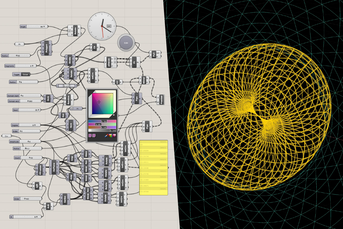
James presented significant progress on the background animation, describing it as "super alive" (02:16). The animation includes interactive elements that respond to mouse cursor movement, creating an engaging, touchable quality (05:19). The team discussed placement challenges with overlaying the logo and text on the animated background, as they were competing visually rather than working in synergy.
Diane suggested exploring color adjustments, perceiving the animation as orange while wanting to see it more gold (03:39). Interestingly, Barbara saw it as yellow rather than orange, highlighting how different people perceive colors differently (03:42). The team acknowledged these perception differences might stem from different screens and viewing conditions (48:52).
[technology="Parametric Geometric Interfaces"]
The discussion revealed several text readability concerns throughout the design. Diane pointed out that the "Our Mission" header appeared too small in proportion to surrounding content and needed to be larger (10:27). She also suggested bolding the key question "What will it take?" to make it stand out more effectively (11:48).
For the "Source Effect" section, Diane expressed dissatisfaction with the secondary font, noting the double-F configuration looked awkward (14:09). The team agreed to explore alternative typefaces that would better serve the content while maintaining visual hierarchy.
James introduced a design philosophy around creating breathing room in the user experience. After the question "What will it take?" he proposed featuring the mandala animation alone without text overlay as "a moment to just be in the question" (12:22). He emphasized that the foundation isn't claiming to have all the answers but rather inviting discovery together.
Barbara strongly responded to this approach, describing it as "a really nice feel" that provides "a much needed pause" (13:36). She contrasted this with many websites that bombard visitors with content, causing fatigue. The contemplative space offers visitors a chance to breathe and reflect rather than consuming information continuously (13:46).
James shared that he vectorized the logo for infinite resolution scalability (16:28). The team explored different arrangements emphasizing the "S Factor" and "Sourcing Synergy" concepts. Diane suggested pulling out the two S's to make them more visible, reinforcing the "sourcing synergy" meaning (17:15).
For the Synergy Circle section, they discussed moving away from the current circular logo arrangement made from multiple logos, which appeared more oval than circular (18:34). James proposed a simpler approach using a white circle with animated points around it, similar to the main animation but simplified, possibly featuring a toroidal field in the center (19:18).
The orange background section sparked considerable discussion. Diane found the orange too bright and preferred something more yellowish-gold (20:09), while Barbara appreciated the muted quality but agreed the white text was hard to read (20:13). The team recognized that managing contrast while maintaining the desired warm, inviting palette would require careful adjustment.
James suggested incorporating more green into the overall design to achieve a fuller spectrum and strengthen the connection to planetary themes (40:03). While Diane initially hesitated, expressing concern about green clashing with the blue and yellow, James emphasized the importance of not having everything match too perfectly and representing diverse possibilities (40:09).
A significant portion of the discussion centered on how to present Synergy Circles to website visitors. Diane clarified that existing circles within the Evolutionary Leaders community are private, but the public-facing site should inspire people to start circles around topics that move them—whether environment, youth, spiritual exploration, or other interests (22:51).
Barbara wanted clearly defined, tangible examples rather than vague suggestions so people could easily understand and relate to the concept (23:05). However, Diane emphasized the circles are meant to be user-initiated rather than organization-managed, particularly due to liability concerns. The site would provide inspiration and basic guidelines—clarify your intention, create welcoming space, connect and stay in touch—but individuals remain responsible for their own circles (25:08).
James probed on the call to action, asking what visitors should do next if inspired to start a circle. The team agreed on including a simple input form where people could share their goals or what synergy means to them, with submissions going directly to the organization rather than appearing publicly on the site initially (33:47).
Barbara expressed interest in providing a way for visitors to connect with each other without the organization being responsible for moderating every interaction (26:56). James explained they're currently building tools that would enable profiles, groups, and social threads with intelligent moderation—potentially using an agent to filter content before it reaches the website (28:13).
Diane raised concerns about spam, referencing ongoing issues with the Call to Conscious Evolution site where Deborah constantly removes inappropriate content (27:40). For now, the team agreed to focus on the resource-oriented site with simple input collection, saving more complex social features for future phases when appropriate infrastructure and moderation capacity exist (29:14).
[technology="Community Facilitation Tools"]
The team conducted a detailed review of imagery across different sections. Diane strongly advocated for moving away from stock photos to authentic images of actual gatherings, retreats, and community moments, even if not perfectly polished (35:31). She offered to locate high-resolution photos from past events.
For the Evolutionary Leaders section, they discussed using a pixelated group photo that shows everyone without leaving people out. While the technical quality had issues, the inclusive representation mattered more than perfect resolution (42:09). Barbara enthusiastically supported featuring the photo with all arms raised, calling it "a great photo" that "says so much" about the collective spirit (42:49).
For Health and Wellness, Barbara indicated the current image didn't capture the breadth of the initiative, which would encompass everything from personal wellness to weather modification and environmental concerns (37:32). She committed to finding something more appropriate.
The Edge newsletter image prompted discussion about representation. Diane felt it should look more cosmic and alive, conveying the "cutting edge" nature of the content and the paradigm-shifting work of the Evolutionary Leaders (41:33). The green plant image, while pretty, didn't communicate that it was a newsletter with diverse topics and features (40:17).
Diane identified a missing element: a graphic that would show visitors at a glance all the things the organization does (43:56). She suggested this could appear in the opening animation or hero section, possibly as a word cloud or node-based visualization showing initiatives like Multi-Dimensional Exploration, Health and Wellness, Evolutionary Leader Circle, and Synergy Circles.
This overview would help visitors immediately understand the scope and nature of the organization rather than discovering it gradually through scrolling (44:54). The team agreed this contextual framing should come early in the user experience.
During a brief sidebar conversation, Diane and Barbara discussed broader organizational concerns around the retreat budget and overall financial health (29:50). Diane noted they need to raise $150,000 to meet their budget goals, suggesting that once the website is complete, focused fundraising should become the next priority (30:07).
She mentioned potentially asking Nancy to organize a fundraiser in Palm Beach or exploring auction options, expressing confidence they could do well with concentrated attention on development (30:38).
James explained his collaborative workflow, noting that Ivana was actively working on the design during the meeting (14:56). He emphasized the files are quite large and encouraged the team to review on their own machines for accurate color and scale perception rather than relying solely on screen sharing (11:37).
He offered to share a version with an adjustable color picker so Diane could experiment with different hues on her own device and multiple screens to address the color perception differences they'd discovered (48:33). This approach would help resolve whether the orange-versus-yellow debate stemmed from actual design choices or screen calibration variations.
James
Diane
Barbara
Team
The team discussed realistic timelines given the holiday schedule. James confirmed availability through the new year (excluding Wednesday and Thursday of that week), with flexibility to complete work before year-end without compromising quality (01:43). The group agreed to finalize materials internally among the three of them before bringing Deborah and Nancy in for input. Diane emphasized they should feel confident about the direction before expanding the review circle (00:31).
James presented significant progress on the background animation, describing it as "super alive" (02:16). The animation includes interactive elements that respond to mouse cursor movement, creating an engaging, touchable quality (05:19). The team discussed placement challenges with overlaying the logo and text on the animated background, as they were competing visually rather than working in synergy.
Diane suggested exploring color adjustments, perceiving the animation as orange while wanting to see it more gold (03:39). Interestingly, Barbara saw it as yellow rather than orange, highlighting how different people perceive colors differently (03:42). The team acknowledged these perception differences might stem from different screens and viewing conditions (48:52).
[technology="Parametric Geometric Interfaces"]
The discussion revealed several text readability concerns throughout the design. Diane pointed out that the "Our Mission" header appeared too small in proportion to surrounding content and needed to be larger (10:27). She also suggested bolding the key question "What will it take?" to make it stand out more effectively (11:48).
For the "Source Effect" section, Diane expressed dissatisfaction with the secondary font, noting the double-F configuration looked awkward (14:09). The team agreed to explore alternative typefaces that would better serve the content while maintaining visual hierarchy.
James introduced a design philosophy around creating breathing room in the user experience. After the question "What will it take?" he proposed featuring the mandala animation alone without text overlay as "a moment to just be in the question" (12:22). He emphasized that the foundation isn't claiming to have all the answers but rather inviting discovery together.
Barbara strongly responded to this approach, describing it as "a really nice feel" that provides "a much needed pause" (13:36). She contrasted this with many websites that bombard visitors with content, causing fatigue. The contemplative space offers visitors a chance to breathe and reflect rather than consuming information continuously (13:46).
James shared that he vectorized the logo for infinite resolution scalability (16:28). The team explored different arrangements emphasizing the "S Factor" and "Sourcing Synergy" concepts. Diane suggested pulling out the two S's to make them more visible, reinforcing the "sourcing synergy" meaning (17:15).
For the Synergy Circle section, they discussed moving away from the current circular logo arrangement made from multiple logos, which appeared more oval than circular (18:34). James proposed a simpler approach using a white circle with animated points around it, similar to the main animation but simplified, possibly featuring a toroidal field in the center (19:18).
The orange background section sparked considerable discussion. Diane found the orange too bright and preferred something more yellowish-gold (20:09), while Barbara appreciated the muted quality but agreed the white text was hard to read (20:13). The team recognized that managing contrast while maintaining the desired warm, inviting palette would require careful adjustment.
James suggested incorporating more green into the overall design to achieve a fuller spectrum and strengthen the connection to planetary themes (40:03). While Diane initially hesitated, expressing concern about green clashing with the blue and yellow, James emphasized the importance of not having everything match too perfectly and representing diverse possibilities (40:09).
A significant portion of the discussion centered on how to present Synergy Circles to website visitors. Diane clarified that existing circles within the Evolutionary Leaders community are private, but the public-facing site should inspire people to start circles around topics that move them—whether environment, youth, spiritual exploration, or other interests (22:51).
Barbara wanted clearly defined, tangible examples rather than vague suggestions so people could easily understand and relate to the concept (23:05). However, Diane emphasized the circles are meant to be user-initiated rather than organization-managed, particularly due to liability concerns. The site would provide inspiration and basic guidelines—clarify your intention, create welcoming space, connect and stay in touch—but individuals remain responsible for their own circles (25:08).
James probed on the call to action, asking what visitors should do next if inspired to start a circle. The team agreed on including a simple input form where people could share their goals or what synergy means to them, with submissions going directly to the organization rather than appearing publicly on the site initially (33:47).
Barbara expressed interest in providing a way for visitors to connect with each other without the organization being responsible for moderating every interaction (26:56). James explained they're currently building tools that would enable profiles, groups, and social threads with intelligent moderation—potentially using an agent to filter content before it reaches the website (28:13).
Diane raised concerns about spam, referencing ongoing issues with the Call to Conscious Evolution site where Deborah constantly removes inappropriate content (27:40). For now, the team agreed to focus on the resource-oriented site with simple input collection, saving more complex social features for future phases when appropriate infrastructure and moderation capacity exist (29:14).
[technology="Community Facilitation Tools"]
The team conducted a detailed review of imagery across different sections. Diane strongly advocated for moving away from stock photos to authentic images of actual gatherings, retreats, and community moments, even if not perfectly polished (35:31). She offered to locate high-resolution photos from past events.
For the Evolutionary Leaders section, they discussed using a pixelated group photo that shows everyone without leaving people out. While the technical quality had issues, the inclusive representation mattered more than perfect resolution (42:09). Barbara enthusiastically supported featuring the photo with all arms raised, calling it "a great photo" that "says so much" about the collective spirit (42:49).
For Health and Wellness, Barbara indicated the current image didn't capture the breadth of the initiative, which would encompass everything from personal wellness to weather modification and environmental concerns (37:32). She committed to finding something more appropriate.
The Edge newsletter image prompted discussion about representation. Diane felt it should look more cosmic and alive, conveying the "cutting edge" nature of the content and the paradigm-shifting work of the Evolutionary Leaders (41:33). The green plant image, while pretty, didn't communicate that it was a newsletter with diverse topics and features (40:17).
Diane identified a missing element: a graphic that would show visitors at a glance all the things the organization does (43:56). She suggested this could appear in the opening animation or hero section, possibly as a word cloud or node-based visualization showing initiatives like Multi-Dimensional Exploration, Health and Wellness, Evolutionary Leader Circle, and Synergy Circles.
This overview would help visitors immediately understand the scope and nature of the organization rather than discovering it gradually through scrolling (44:54). The team agreed this contextual framing should come early in the user experience.
During a brief sidebar conversation, Diane and Barbara discussed broader organizational concerns around the retreat budget and overall financial health (29:50). Diane noted they need to raise $150,000 to meet their budget goals, suggesting that once the website is complete, focused fundraising should become the next priority (30:07).
She mentioned potentially asking Nancy to organize a fundraiser in Palm Beach or exploring auction options, expressing confidence they could do well with concentrated attention on development (30:38).
James explained his collaborative workflow, noting that Ivana was actively working on the design during the meeting (14:56). He emphasized the files are quite large and encouraged the team to review on their own machines for accurate color and scale perception rather than relying solely on screen sharing (11:37).
He offered to share a version with an adjustable color picker so Diane could experiment with different hues on her own device and multiple screens to address the color perception differences they'd discovered (48:33). This approach would help resolve whether the orange-versus-yellow debate stemmed from actual design choices or screen calibration variations.
James
Diane
Barbara
Team
Adjust animation color palette toward golden tones and create color picker tool
December 30, 2025
Address color perception differences where animation appears orange to some viewers and yellow to others. Create shareable color picker so team can test different hues on their own devices and multiple screens. Discussed at 48:33 and 03:39-03:42.
Increase font size for 'Our Mission' header and bold 'What will it take?' question
December 30, 2025
Make 'Our Mission' header larger in proportion to surrounding content (10:27). Bold the key question 'What will it take?' to make it stand out more effectively (11:48).
Clarify fonts + Style Guide
December 30, 2025
Find replacement for current secondary font where double-F configuration looks awkward (14:09). Maintain visual hierarchy while improving aesthetics.
Develop vectorized logo variations emphasizing S Factor with visible double S's
December 30, 2025
Create logo variations that pull out the two S's to make them more visible, reinforcing the 'sourcing synergy' meaning (17:15). Logo already vectorized for infinite resolution scalability (16:28).
Create simplified animated circle with toroidal field for Synergy Circle section
December 30, 2025
Replace current circular logo arrangement (which appears more oval) with simpler approach using white circle with animated points around it, similar to main animation but simplified. Feature toroidal field in center (19:18). Discussed at 18:34.
Replace stock images with authentic photos across website sections
December 30, 2025
Use authentic images of actual gatherings, retreats, and community moments across Evolutionary Leaders, Synergy Circles, Health and Wellness, and Edge newsletter sections. Prioritize authentic representation over perfect polish (35:31).
Design cosmic-themed visual for The Edge newsletter section
December 30, 2025
Create imagery that looks more cosmic and alive, conveying the 'cutting edge' nature of content and paradigm-shifting work of Evolutionary Leaders (41:33). Should communicate newsletter with diverse topics and features rather than single static image (40:17).
Design project overview graphic showing all organizational initiatives
December 30, 2025
Create graphic showing at a glance all things organization does - Multi-Dimensional Exploration, Health and Wellness, Evolutionary Leader Circle, Synergy Circles (43:56). Could be word cloud or node-based visualization appearing in opening animation or hero section to provide immediate contextual framing (44:54).
Share Google Drive link with collected images and design files
December 23, 2025
Provide team access to shared Google Drive with current design files and collected imagery (51:02).
Source high-resolution photos from past retreats and community gatherings
December 27, 2025
Locate authentic images showing actual community moments from past events. Move away from stock photography to genuine representations even if not perfectly polished (35:31). Upload to shared Google Drive.
Locate and upload Evolutionary Leaders group photo with arms raised
December 27, 2025
Find and provide high-resolution version of group photo showing everyone with arms raised. Use inclusive representation despite technical quality issues (42:09). Photo 'says so much' about collective spirit (42:49).
Find and upload multi-dimensional exploration image from past materials
December 27, 2025
Locate previously used image for multi-dimensional exploration section (36:51).
Upload logo variations to shared Google Drive
December 27, 2025
Provide logo variations to team through shared drive (50:35).
Find appropriate image for Health and Wellness section representing broader scope
December 27, 2025
Source imagery that represents full breadth of Health and Wellness initiative including personal wellness, environmental concerns, and weather modification (37:32). Current image doesn't capture scope.
Review design materials on multiple devices for color perception consistency
December 29, 2025
Team members should review files on their own machines and multiple screens to assess color accuracy rather than relying on screen sharing. Address perception differences where animation appears orange to some and yellow to others (48:52). Files are quite large so local review recommended (11:37).
Complete design elements in Webflow
Design/Develop About Page
Design/Develop 'Synergizing' page (see content)
Design/Develop simple news page with CMS
Design & Develop Simple Donate page
See: https://www.sourceofsynergyfoundation.org/contact-donate/
Brand design for Source of Synergy
Strategic planning and content organization for Source of Synergy Foundation website. Key strategic decisions: positioning Synergy Circles as primary CTA while addressing privacy/accessibility tensions between inspiring public participation and protecting private circles, clarifying organizational relationship between Source of Synergy Foundation and Evolutionary Leaders to reduce visitor confusion, content hierarchy prioritizing synergy definition before action frameworks, balancing information with inspiration to avoid overwhelming visitors. Homepage strategic restructuring reflecting refined messaging flow: 1) Hero with animated portal establishing brand identity 2) New video defining 'source' and 'synergy' and inspiring action as primary educational tool (14:38) 3) Mission statement section with 'Synergy starts with connection' as anchoring design element following video context (12:25) 4) Sourcing Synergy: How We Do It project showcase demonstrating organizational activities 5) Our Moment of Choice book/video section 6) Take Action / Become a Source of Synergy conversion points 7) Why Synergy Matters Now and What is Synergy? foundational content moved lower following video coverage 8) Partner logos with unified tagline. Video integration strategy: incoming ~1-week video covers foundational synergy definition content, allowing text sections to be trimmed once video edit complete to avoid duplication (14:38). Project grid strategic presentation: uniform 3x3 layout showcasing nine key initiatives (Evolutionary Partners Network, Multidimensional Explorations, Health and Wellness, Global Oneness Day replacing Our Moment of Choice (19:40), etc.) with enhanced visual consistency and clear call to action (15:15). Content sensitivity strategy: responsive removal of recently problematic public figure from team page, founding history, and Call to Conscious Evolution section (01:33), balancing appropriate response with avoiding reactive appearance. Mission statement positioning: placed after video rather than before to leverage video's explanatory power, with background imagery removed due to insufficient legibility and replaced with text-based design element (12:25). Workflow optimization strategy: consolidation of all feedback, notes, and assets into single shared Google Doc to prevent scattered communication and missed updates across 17-page notes document (18:26). Navigation strategy including Evolutionary Leaders link and enlarged branding (26:45). Footer strategy with mailing address, social media links, and improved navigation prominence (26:13). Donation section enhancement with graphics and PayPal integration. About page strategy: vision statement leading, founding history condensed to 1-2 paragraphs with read more expansion, team members alphabetized, memorial banners for honored members, removal of problematic imagery and affiliated figure content (01:33). Synergy Circles page strategy showcasing all 30 evolutionary leaders circles for funder visibility while using non-interactive Kumu map and introductory text inviting public to form their own circles. Concept paper integration for Global Oneness Day (20:28). 3/18 session strategic refinements: Take Action section messaging pivoted from joining existing circles to empowering visitors to form new circles, with 'Steps to Form a Synergy Circle' copy linking to seven-step Get Involved page outline (15:52). Strategy to consolidate engagement touchpoints by moving Edge newsletter and Call to Conscious Evolution banner from Synergizing page to homepage Take Action section, reducing navigation friction for conversion actions (43:00). Content refinement for Call to Conscious Evolution banner replacing 'Climate Change' with more inclusive 'Environmental Challenges' language covering broader issues like geoengineering and glyphosate (01:00:02). New dedicated Synergy Circles page strategy separating detailed circle information from general Get Involved content, with instructional copy clarifying icon interaction since hover/click wasn't intuitive (21:02, 27:33). About page strategy refinement: Founding History shortened to concise overview with Read More link to full document for interested visitors, photo collage grid of historical images to provide visual sense of organizational history (01:24:49, 01:27:11). Board bio strategy confirmed as expandable modals to surface already-loaded content without page navigation (01:29:15). Cultural sensitivity addressed for custom Synergy Circle icon resembling Star of David, requiring redesign to remove unintended religious symbolism (20:41). Mobile-first strategy deferred temporarily to prioritize desktop content completion, with full mobile responsiveness pass scheduled as separate initiative (57:43). Team coordination strategy enhanced with direct email communication to Iván for urgent changes to reduce scheduling delays (01:41:14). Documentation strategy with Diane maintaining clean working reference in Google Drive by removing completed items (01:42:02).
00:00:00
Barbara Layton: So what. What's a realistic time frame at this point? What do you. What are you thinking? Because we have the holidays here, we have to.
00:00:11
Diane Williams: We've promised Deborah and Nancy that they can give input too, so we'll need to have a call with them.
00:00:17
James Redenbaugh: Yeah. When. When do you think would be a good time to have that. That call with them? Or should we share something asynchronous with them to review before the call? What do you think?
00:00:31
Diane Williams: I think once the three of us feel. Feel like it's in a place that we, you know, we think we got it, then I think that's when we show it to them and then they can just give input on that.
00:00:43
James Redenbaugh: Cool. Well, you can tell me what you think about it today and this week. I'm just not working on Wednesday and Thursday, and then I'll be working up until the new year. And it's not a whole lot that needs. That needs doing. And so I can still totally get this done before the new year. But I know that you guys are in more of a rest mode than I, so I'm. I'm flexible. I want to make sure that we get. Get what we need, when we need, and I don't want to compromise quality.
00:01:38
Barbara Layton: Okay.
00:01:43
James Redenbaugh: So why don't we look at what we have and then talk about timeline?
00:01:48
Barbara Layton: Okay, great.
00:01:51
James Redenbaugh: So I was just playing with dropping the logo in here as well. But the background animation, I think, is really coming along. It feels super alive right now. I want to find a way to have the text more readable in here. Maybe the animation comes in and then there's something to hover.
00:02:16
Diane Williams: Or maybe you could put, you know, shading around the letters, you know, darker shading.
00:02:21
James Redenbaugh: Yeah, we can definitely do some texture of.
00:02:23
Diane Williams: In the foundation, but, yeah, you can hardly see that. Or maybe make it a little bigger. Like.
00:02:31
Barbara Layton: I think maybe it's just the, The. The, you know, lightness of it that you can't see.
00:02:37
James Redenbaugh: Yeah, yeah, But. So we'll, you know, we'll tweak, tweak that. Because right now these elements are competing a little bit. We want them to be.
00:02:51
Barbara Layton: Yeah.
00:02:51
James Redenbaugh: In synergy. Pun intended. But check out this animation in the background. Are you guys a fan? I'm going to hide the foreground for a second so you can get a better view of it.
00:03:10
Barbara Layton: I like, I like the animation a lot. I just feel like the. The logo is kind of misplaced. So it's gone now.
00:03:24
James Redenbaugh: Yeah, I just want to look at the animation first.
00:03:27
Barbara Layton: Okay, great.
00:03:28
Diane Williams: I think the animation. I like it. I would Prefer it more gold than orange, maybe something about the orange that. And yellow to me.
00:03:39
Barbara Layton: Actually, it looks more yellow to me.
00:03:42
Diane Williams: Oh, really? That's interesting how people see colors differently.
00:03:45
Barbara Layton: Yeah.
00:03:46
Diane Williams: Yeah, I see a. Kind of a light orange. Yeah, I like it. I don't. I'm not 100%, but I like it. Yeah, I do like it. I'm just wondering if it would be better, like, on the side, but. Yeah, I don't know. It'd be good to see different variations of what we could do with that one.
00:04:12
Barbara Layton: I actually like it a lot.
00:04:14
James Redenbaugh: Yeah.
00:04:15
Barbara Layton: Yeah, I do. I think it's very alive, very captivating. It definitely draws me in.
00:04:29
James Redenbaugh: It's actually.
00:04:31
Diane Williams: Maybe the words don't have to be on it. Maybe the words could be above or below it or. Because that was the first thing. I was kind of struggling to read it, you know, what it was saying. So maybe we shouldn't put words on top.
00:04:47
James Redenbaugh: Yeah, maybe it could be off to the left and the words are off to the right.
00:04:52
Diane Williams: Yeah. Or maybe the words are above and below.
00:04:56
James Redenbaugh: There's not a lot. A ton of vertical space here, but definitely in the center where it's most dense. We don't want the text to be.
00:05:06
Diane Williams: Yeah, Competing. Yeah. Also competing with that beautiful.
00:05:10
James Redenbaugh: Yeah.
00:05:11
Diane Williams: Circle. Because the up was kind of in the. Almost to the side of the middle.
00:05:19
James Redenbaugh: And it's actually interactive. Like. Let me. Show you. One sec. It responds to my mouse cursor, and so I want it to feel like.
00:06:13
Diane Williams: Touchable dots. Yeah.
00:06:14
James Redenbaugh: Static animation. That's nice, but I haven't got that. Working on the. The page mockup that we're looking at.
00:06:22
Diane Williams: That's cool. Can you see what it would look like with maybe a little more goldish, like, instead of the orange?
00:06:31
James Redenbaugh: Yeah.
00:06:32
Barbara Layton: It's so funny. I don't see any orange.
00:06:37
Diane Williams: Different colors. I say that to me, it's very golden.
00:06:40
Barbara Layton: Yeah, it's very golden as it is. It's very funny.
00:06:48
James Redenbaugh: I actually have a version of this that has a color picker.
00:06:55
Diane Williams: Let me find just a little more. I mean, it doesn't have to be extreme, but. I mean, the words could be okay on it, just as long as they pop out and don't compete with the middle part, you know?
00:07:27
James Redenbaugh: Yes. Yeah, we'll play with that. I just asked Claude to put. Put the color picker back in. Let's come back to that. Okay, one sec. And continue down our page. This is the old version, New version. So just looking at copy first, and then there's a. There's also a new More polished version that I want to look at with you guys in a second, but I'm keeping the content in the top fold. Pretty simple. Big source of Synergy Foundation. Together we achieve more than we ever could alone. Simple call to action.
00:08:22
Diane Williams: That's also kind of hard to read too. Like, I just noticed that together.
00:08:27
James Redenbaugh: Yeah, I'll massage that.
00:08:32
Diane Williams: Yeah.
00:08:33
James Redenbaugh: Then down below, I'm thinking going right into Synergy, bringing these definitions back in here, but just the first three. And I want these to come in in a kind of a dynamic way. Right now this section feels pretty boring.
00:08:53
Barbara Layton: But.
00:08:54
James Redenbaugh: And we'll look at a slightly different version of this in a second and then create, Ignite, Connect, the fourth Synergy line. Synergy inspires us to create, connect and connect. And then this copy here, I don't know if we should have an image that corresponds to each of these, or we could make each of them hoverable and then have some additional content down below and then maybe the background changes to just give a little more context. I could come up with some copy suggestions if you're into it, to see what. What might work well here. Any thoughts on that?
00:09:51
Barbara Layton: Yeah, I'd be curious to see. To see that, James.
00:09:54
Diane Williams: Yeah, it would be good to see that because I like it because it's very clean and me too. But it's true. You don't want it to look too boring either, like you said, you know, so. But sometimes boring is okay. You know, like, I mean, I like. I like this actually.
00:10:12
James Redenbaugh: Great. Big. Our mission. Still got the quotes there, but I'm going to take those. Those away.
00:10:23
Diane Williams: Yeah. I would put our mission a little. The. I think it's too small font.
00:10:27
James Redenbaugh: Our mission too small.
00:10:29
Diane Williams: Yeah. The font of our mission looks too small compared to. Yeah. In proportion with the other. Yeah, I'd still put it bigger. It doesn't pop out so much. The. Our mission. I would make it a much bigger font than that.
00:10:48
James Redenbaugh: I can do that.
00:10:49
Diane Williams: Yeah. And. And you know, make the other like the.
00:10:51
Barbara Layton: Like.
00:10:52
Diane Williams: This is a good size. It looks like.
00:10:53
James Redenbaugh: Yeah. In this defining moment in time, there's a yearning in the heart of humanity for a radical new way to relate to ourselves and each other. We long to discover and reimagine what is possible. What will it take? What will it take?
00:11:15
Diane Williams: Yeah, I think I need to see it on a big screen because it. That also looks a little small font, you know, defining moment. And then maybe what will it take should pop out more, because that's the question.
00:11:26
James Redenbaugh: So, yeah, these files are very large right now, so you should definitely view it on your own machine. I'll share a link to this.
00:11:37
Barbara Layton: Yeah, I don't. I don't have any issue with the size the way it is actually the way on my computer.
00:11:43
Diane Williams: I would bold. What will it take? You know, just so it pops out a little bit.
00:11:48
James Redenbaugh: Yeah, I can do that for sure.
00:11:50
Diane Williams: Yeah.
00:11:52
James Redenbaugh: And then what. What will it take? This kind of leads into the source effect. I have this. Another version of the. The moving image here. But maybe this kind of divides things too much. Or it might.
00:12:15
Barbara Layton: Yeah.
00:12:15
James Redenbaugh: Or it's like a moment to just be in the question of what will it take? Because I don't think.
00:12:22
Barbara Layton: Yeah.
00:12:23
James Redenbaugh: You guys are saying that you have all the answers. I think the point is that the answer is, you know, in the space between us and we have to find it together.
00:12:34
Barbara Layton: Yeah. And the answer is an invitation, actually for us to discover together.
00:12:42
James Redenbaugh: And I like having a moment to have this kind of mandala here without the text around it. Because it's kind of a little meditation.
00:12:54
Diane Williams: Yeah, it's nice.
00:12:54
Barbara Layton: It gives you a moment to breathe actually in. Into it. It's kind of cool. Yeah, I actually like that. Yeah, it's nice. It's a really nice feel.
00:13:04
James Redenbaugh: So maybe I'll make this even bigger.
00:13:06
Barbara Layton: Yeah, it's a beautiful feel. It's very calming.
00:13:11
James Redenbaugh: Awesome. Yeah. I spent way too much time in this animation and not enough time on the rest of the site.
00:13:19
Diane Williams: But you like doing this.
00:13:20
Barbara Layton: Oh, no, it's. It's really beautiful.
00:13:22
Diane Williams: Nice.
00:13:23
Barbara Layton: I love it. The of it is just fabulous.
00:13:27
James Redenbaugh: Awesome. I really love.
00:13:30
Barbara Layton: Just gives you a little pause. A much needed pause.
00:13:35
James Redenbaugh: Yeah.
00:13:36
Barbara Layton: Where as you know, so everything isn't thrown at you like so many websites, like one thing after another where. Where you get so tired, you know, so quickly.
00:13:46
James Redenbaugh: Exactly. Take a break.
00:13:49
Barbara Layton: Take a breath too much. Exactly. Take a breath.
00:13:55
Diane Williams: You have the source effect. I don't love this font. The. Don't know if we could try different fonts.
00:14:01
James Redenbaugh: The main headline font.
00:14:03
Diane Williams: Not the main headline font. That's okay. But the one underneath.
00:14:08
James Redenbaugh: Yeah.
00:14:09
Diane Williams: Except the two Fs in the effect look a little funny, but that's okay. But yeah, I don't know if we can find another font.
00:14:19
James Redenbaugh: Definitely. And let me just show you the other version of this. It's in progress. I'm just going to publish the latest because Ivana is working on it as we speak.
00:14:52
Diane Williams: That's okay. Is that a different one?
00:14:56
James Redenbaugh: No, it's the same here.
00:14:57
Diane Williams: Okay.
00:15:05
James Redenbaugh: Sorry.
00:15:25
Diane Williams: Is there some maybe logo or graphic that you could put with the S factor to really make that pop out. Like the.
00:15:33
James Redenbaugh: Yeah, I think maybe a version of the logo. With the S factor or the source effect.
00:15:45
Diane Williams: Well, I just saw something with the S factor, but it was just on top of the page. It was another page. You were on this. It looks tiny. And like, I was thinking something like if we could create some beautiful graphic with that or. Yeah, you know, maybe with the two S's or.
00:16:05
James Redenbaugh: Yeah, I was actually playing with these. I vectorized the logo so that we have a infinite resolution version of it to play with.
00:16:28
Diane Williams: The logo. Our logo is actually to the left. So I don't know. That's like. This is the Synergy Circle logo. And that one. I don't know what that one is actually. Is that. Did Tom do that? I can't remember.
00:16:46
James Redenbaugh: I mean, I did this arrangement here.
00:16:49
Diane Williams: Ah, okay. Because. Yeah, he was playing with the logo too. And.
00:16:56
James Redenbaugh: But for the S factor.
00:16:58
Diane Williams: Yeah, like something like. And maybe pulling out the S's a little bit so you can see that it's two S. Maybe not pulling out.
00:17:12
James Redenbaugh: The two.
00:17:15
Diane Williams: Because it's sourcing synergy. So maybe if they.
00:17:28
James Redenbaugh: Like this.
00:17:28
Diane Williams: Yeah. Or maybe put that one, the first one a little bit higher. Yeah. Like. Yeah. So don't know. I'm not sure. Just it doesn't even have to be the. The logos per se, but just something really beautiful that conveys sourcing synergy. It could be like a mandala. It could be a. Yeah, maybe it doesn't work so much like that.
00:18:00
James Redenbaugh: Yeah, no, no, I'll play with it.
00:18:05
Diane Williams: Yeah, yeah, Just another. Something pretty there. Yeah. Like, that shows two S's.
00:18:10
James Redenbaugh: That.
00:18:12
Diane Williams: It really looks like it's a header, you know? Like.
00:18:17
James Redenbaugh: Cool. And then for the Synergy Circle, I don't like this white text on the orange background. I want to do something a little different.
00:18:27
Diane Williams: And it could look more circular. Now it looks oval, you know, like, it could be more like a circle.
00:18:34
Barbara Layton: Where is that?
00:18:35
Diane Williams: To the right. The one that you're seeing to the right. That's the one Dale Colton did, but for the Synergy Circle. So she just took the logos and, you know, put it together to make a circle. But it could be more circular.
00:18:47
Barbara Layton: Yeah, I'm just not crazy about those, actually.
00:18:50
Diane Williams: Yeah, it's just the Synergy Circle logo.
00:18:53
James Redenbaugh: Yeah. I think it. It doesn't have to be made out of the logo. The. Here in the Synergy Circle section, I think some simple, like, circle of light up here, like a. A white circle with maybe some white points around it.
00:19:18
Diane Williams: That would be nice.
00:19:19
James Redenbaugh: Maybe it's animating similar to this, but in a simpler way. Yeah, a little bit of a toroidal field in the center.
00:19:31
Barbara Layton: That could work for sure.
00:19:35
James Redenbaugh: And then I like the. Or the change in the section here with the orange background, but. I want to make sure the text is readable, so I darken things up here.
00:19:51
Barbara Layton: Yeah, it's a little hard on the eyes to read it for sure. But I do like. I do like the color.
00:20:00
James Redenbaugh: Cool.
00:20:00
Diane Williams: Yeah, the orange is a little bit too orange for me. I think I'd if there was like a. Maybe more yellowish.
00:20:09
Barbara Layton: Well, it's kind of muted, actually.
00:20:13
Diane Williams: Yeah, it's just hard for me to. I feel it's hard to read even what's below it for me. Like maybe you circles.
00:20:21
Barbara Layton: Yeah, it's hard. It definitely is hard to read. Maybe it's just the white on. On the orangey background.
00:20:29
Diane Williams: So are you saying these are the possible circles they could create because. Or are these some examples of the circles that we have because Creative Arts, Community building, environment.
00:20:40
James Redenbaugh: I was thinking kind of both.
00:20:43
Diane Williams: So are these going to go somewhere or is it just ideas for them?
00:20:47
James Redenbaugh: It's up to you. I wanted to talk to you again about the synergy circles and see what. Sorry, my cats are going crazy over here. They get so many boxes to play with this time of year. Yeah, I wanted to talk to you guys about the. The synergy circles and how we might put them forward on this site in. In a way that makes sense for a source of synergy. I think that we should share about at least some of the circles here as examples of what this is if we really want people to make. Make new ones or, or even recognize that they're already in a circle. Like, oh, I'm in this. I'm in this group with my friends. Or, you know, we gather in this way. Maybe it's already close to this and we can make it more like this and maybe there's some more resources to explore. You know, I want to make it more for people, so I wonder how much we can share about the existing circles and put that forward.
00:22:13
Diane Williams: Maybe it could be more like. Because those don't totally correlate with this. I mean, I don't think they should correlate actually with the circles because the circles, like we said last time, are kind of private. But we could say, you know, you could start a circle on whatever is interesting to you. It could be on. And then some of these, you know, you can go come together in a spiritual exploration. You can have, you know, one on youth on the environment, on health and wellness. Kind of like that. But I think we need. What. What's kind of missing for me is like, photographs or images or, you know, it just feels very texty. So. Okay, here's some pictures.
00:22:51
James Redenbaugh: Yeah, yeah, so, but also with the.
00:22:54
Barbara Layton: With the circles, they should be very well defined, not. Not vague examples, because people really need to be very directed.
00:23:05
James Redenbaugh: Just.
00:23:05
Diane Williams: But the thing is, they're gonna. Very tangible, but they're gonna start their own circle. So we can just inspire them, you know, to start learning what they're interested.
00:23:14
Barbara Layton: Yeah, but with. Yeah, but with tangible, you know, tangible examples, I would say.
00:23:19
Diane Williams: Yeah, so we can say. Maybe we could say something like, are you concerned about what's happening in your environment? You know, start an environmental circle? Because it's really talking. It's like, it's not so connected to what the evolutionary leaders are doing, because we've had circles beyond the evolutionary leaders. You know, we had Finhorn, so this is really like the public's synergy circle. So how do we inspire them to, you know, do what's moving them in their community or in their schools?
00:23:52
James Redenbaugh: Yeah, so I want.
00:23:53
Barbara Layton: They can relate to.
00:23:54
James Redenbaugh: Yeah, I want to inspire them or ignite them to. To make their own circle or grow their circle.
00:24:07
Diane Williams: Yeah.
00:24:08
James Redenbaugh: And then I also want to make sure that they have the tools to. To make it work. And I'm curious if there's an opportunity to connect. Like, what is the. What is the real call to action here? If I'm coming and I have a circle or, you know, I read the site and I'm like, yeah, I think I could start a circle. What do I do next? Is there a form I'm gonna fill out? Is there a class I can take about it? You know, And. And what do I do once I've start. Once I've.
00:24:44
Diane Williams: Yeah, well, we just had those instructions here. Clarify your intention. You know, create a welcoming space, connect and stay in touch. Because we're not going to be like, we're not going to be responsible for these circles, because even the liability alone, you know, so if we can convey that, you know, they're responsible for their circle, you know.
00:25:08
James Redenbaugh: Yeah.
00:25:15
Diane Williams: So, yeah, there's no form or anything like that. You know, with the evolutionary leader circle, we do have, like, forms if somebody wants to start a circle, but that's within the, you know, the parameters of the. The group.
00:25:29
James Redenbaugh: Cool. So it's.
00:25:36
Diane Williams: So here the form your own circle. It almost looks like they would click on and go somewhere, but. But we don't really, you Know, probably wouldn't do that.
00:25:48
James Redenbaugh: Cool.
00:25:48
Diane Williams: I mean, we could just say it in words, but not like looking like they're going to click and go somewhere.
00:25:53
James Redenbaugh: Yeah. Great. So I'll try to make this more outward facing. Like here's, here's what we think you should do.
00:26:08
Barbara Layton: Right. Kind of like up to you.
00:26:10
James Redenbaugh: Yeah. And then. But should we have some kind of call to action of like share.
00:26:18
Diane Williams: Well, they can share on a call to Energy Circle here or if we could do that. Or we can always direct them to the call to Conscious Evolution and they can write it there. But if it's something where they could share on our site, that would be good.
00:26:34
Barbara Layton: Yeah, I was, I was originally hoping that there was a way for viewers to be able to like talk to one another like in some kind of, some kind of way without us being responsible for it, just in terms of giving them a way to connect. But.
00:26:56
Diane Williams: Would that be via social media or is that something that we could put on the site that could be developed on the site or do we have capacity to do that or.
00:27:08
James Redenbaugh: Yeah, I think.
00:27:08
Barbara Layton: And whereby we're not responsible for responding. It's just a thread that we provide between the viewers for them almost to cut. For them to connect with each other.
00:27:20
Diane Williams: That would have a really heavy spam filter because with the cult of Conscious Evolution, it's always being spammed, you know, and that kind of like Jen's always taking. Deborah is always taking spam off. So we don't want that either because then if people are putting porn sites on our website, that's not good.
00:27:40
James Redenbaugh: Yeah, well, I would, If, if we, if we wanted something that would go right to the website, I would build a, an agent to make, to make that, that possible and it would intelligently mediate any, any responses. But usually I say people should, you know, approve things before they go on the website.
00:28:13
Diane Williams: Yeah. And that's hard because we don't really have the bandwidth to do that, you know, so we have to almost set something up that, you know, contains that, that doesn't require any responsibility from us.
00:28:28
James Redenbaugh: I was thinking, you know, for now it could just be an input and then we'll see who responds and what, what people share, you know, share about your synergy Circle or join and they.
00:28:41
Barbara Layton: Can share between themselves, I mean, which I think would be a really nice feature if that were possible, you know, if we didn't have to worry about spam and that kind of thing.
00:28:52
Diane Williams: But that's more than input. Right. Then that's an interactive.
00:28:57
James Redenbaugh: Well, over the next few Months. We're building a ton of tools for doing just that to enable sites like this to have more social features.
00:29:14
Diane Williams: Oops. Oh, no. He. Disappear. We need you.
00:29:22
Barbara Layton: James. Come back. Come back here.
00:29:27
Diane Williams: He'll pop back.
00:29:28
Barbara Layton: On another note, I just. I just saw the email about the retreat. You know, Deborah's question, because Saturday I didn't pay any attention to emails.
00:29:37
Diane Williams: Yeah, of course.
00:29:38
James Redenbaugh: Yeah.
00:29:39
Diane Williams: Well, yeah, I think she's just worried about the finances.
00:29:42
Barbara Layton: Yeah.
00:29:43
Diane Williams: If it's going to pay for itself because the registration fee can't be very high because it's expensive.
00:29:50
Barbara Layton: Yeah, it has to. I mean, we cannot lose.
00:29:54
Diane Williams: Yeah. No, we can't lose. So I was even thinking of the budget. You know, we. We think we're so much in the. In the money, but we're really not.
00:30:01
Barbara Layton: No, we've been saying that we have.
00:30:03
Diane Williams: To raise $150,000 to make our.
00:30:06
Barbara Layton: Exactly.
00:30:07
Diane Williams: New budget. So I think that once we get the website done, I think that's the next thing is we really have to focus on just, you know, creating the proposal and just maybe Nancy could do a fundraiser there in Palm beach or something like that, because she does other ones. So we can ask her if she can maybe.
00:30:26
Barbara Layton: Yeah.
00:30:26
Diane Williams: You know, think about doing something or an auction. I don't know, but I know that we could. I. I have a feeling we could do really well if we just put some concentrated attention.
00:30:38
Barbara Layton: Oh, wait, his computer died.
00:30:41
Diane Williams: Oh, the battery or.
00:30:44
James Redenbaugh: Oh.
00:30:46
Diane Williams: Okay. I'm going to run to the bathroom.
00:30:48
Barbara Layton: Go ahead, Honey. How's my girl? You okay? Don't be sad today. You're fine, my love. I love you. I'll get you out today, I promise. Maybe the beach. Maybe we'll get to the beach.
00:31:35
James Redenbaugh: It.
00:32:06
Diane Williams: Yeah. Meeting sylvia today at 12.
00:32:09
Barbara Layton: Okay.
00:32:10
Diane Williams: Yeah, that.
00:32:12
Barbara Layton: Oh, that's going to be really great.
00:32:13
Diane Williams: Yeah, we're looking forward to it.
00:32:16
Barbara Layton: Oh, that's going to be great. All right. So I'm still waiting for. I don't know what's happening with James.
00:32:22
Diane Williams: Maybe it. The battery just gunked out.
00:32:29
Barbara Layton: Yeah, Nothing right this minute, So. And even the response, I mean, not the response. Desiree's, you know, take on in person events are very minimal. Hi, James.
00:32:53
James Redenbaugh: Hi. Sorry about that.
00:32:54
Barbara Layton: No worries.
00:32:55
Diane Williams: Okay.
00:32:59
James Redenbaugh: I was just saying we. We are building these tools that will allow sites like this to host, you know, profiles. People can create a profile, people can join groups, things like that. It is more complicated of a. Of a thing. It's something to think about in the future. Not for right now. I think for right now we want to make it as like a resource that's available to people. Here's what you should do. But then I think we should also have just an input at this point of a nice form where people can share about. About their goal or what synergy means to them or something like that.
00:33:47
Diane Williams: So do they. So the form, does that go to us or do they see that on the site or.
00:33:52
James Redenbaugh: It would just go to you. Okay, it wouldn't. We wouldn't see anything yet.
00:33:59
Diane Williams: Okay, so then we would. If we want in the future to take some of those quotes, we can do that.
00:34:05
James Redenbaugh: Yes.
00:34:05
Diane Williams: Okay.
00:34:06
James Redenbaugh: Yeah. And we can also build an agent to take things from that data and serve it on the website in whatever way it makes sense. So. Okay, there's lots of things we can do with that. But I think a nice form like this where people can just walk through a few questions and then like feel like they're sending something out out there and we can see what kind of responses we get and decide what to do with it. Going back over here. Sorry, back here. So, yeah, then we have. How are we sourcing synergy, our initiatives? I think this would just be a picture of the evolutionary leaders, but I think this is a good picture for a synergy circle. I like the colors.
00:35:17
Diane Williams: Yeah, the evolutionary leaders. I think we should have the actual thumbnail, you know.
00:35:23
James Redenbaugh: Yeah, that's what I would.
00:35:24
Diane Williams: Yeah. Synergy circle. Not so sure about that one.
00:35:31
Barbara Layton: Yeah, I'm not too crazy about that one, Jane. I like the colors, but it just looks very stagnant.
00:35:37
Diane Williams: Yeah, it looks too eye stock. Like we could get like we do have pictures, but then it's not like high resolution of actual people meeting, you know, in circles at some of our retreats, if that would work. But I don't know, it's not too polished, like.
00:35:55
James Redenbaugh: Yeah, that'd be great. Yeah, whatever you have, I think, you know, real pictures of you guys are better than.
00:36:06
Diane Williams: Yeah, yeah, sure.
00:36:14
James Redenbaugh: And I'll share a link to that Google Drive after this call. More things like that are very good. Health and wellness, multi dimensional experience, Exploration.
00:36:37
Diane Williams: We have a kind of cool one for multi dimensional that we used in one of our. I'll send it to you. I mean, that's nice too, but I don't. Health and wellness, Barbara, does that capture what you're thinking for your.
00:36:50
Barbara Layton: It's. I don't know, it's just a little too, I don't know, not mainstream, but just. I don't know, it doesn't. I don't know what I would put. Yeah, it like just. Yeah, I would. Maybe I'll try and find something else, James.
00:37:12
James Redenbaugh: Sure.
00:37:13
Barbara Layton: Yeah.
00:37:17
James Redenbaugh: No problem.
00:37:19
Barbara Layton: Because you know. Yeah. Because the health and wellness is going to, it's going to include like so many different. It'll. It'll include weather modification and all kinds.
00:37:28
Diane Williams: Of other stuff, you know, not just like personal.
00:37:32
James Redenbaugh: Right.
00:37:32
Barbara Layton: Yeah.
00:37:35
James Redenbaugh: Cool.
00:37:35
Barbara Layton: We got to get rid of those chem trails, James.
00:37:39
James Redenbaugh: Yeah. Okay.
00:37:43
Diane Williams: I'll look for the picture for the multi dimensional.
00:37:50
Barbara Layton: I'll take a. I'll. I'll take a look.
00:37:53
Diane Williams: Yeah. And then. Okay, so then we might have miss Synergy circles or maybe there's just like, I don't know, something else. Doesn't even have to be people in the synergy circles. Maybe it's just like a circle and. But anyway we can find that. I like that. Our moment of choice. That's a nice one.
00:38:10
Barbara Layton: It's. It's really pretty. Yeah, I like it a lot.
00:38:15
Diane Williams: Yeah. I think the sign, the call looks very similar to their moment of choice and maybe we can have a different one.
00:38:22
Barbara Layton: Yeah.
00:38:25
James Redenbaugh: Okay.
00:38:28
Diane Williams: You know. Yeah. Because we had the faces of everybody but it's not even, you know, that's kind of old fashioned style. So I don't know, we'll have to think about that too. Which photo? Okay. And what's the one underneath? Oh, that's the Edge. Yeah. I would also. The Edge, I would make it look more. I would put the Edge Evolutionary leaders newsletter, you know, so they know what the Edge is.
00:39:00
Barbara Layton: It's really, it is really pretty.
00:39:06
Diane Williams: It's nice. But it doesn't convey it's a newsletter, you know, like I might.
00:39:12
Barbara Layton: Can we use it maybe for something else, James? I mean the color is gorgeous.
00:39:16
James Redenbaugh: Sure. Yeah. I like this one.
00:39:18
Barbara Layton: Yeah, it's really, really pretty.
00:39:22
Diane Williams: Yeah. I don't love it. I have to say I don't love it. I don't love the green because it doesn't seems to clash with the blue and the yellow. At least for me. We have different tastes.
00:39:35
James Redenbaugh: I think we need a little green on this page.
00:39:38
Barbara Layton: Yeah, I always thought about putting some green on too, Diane. Yeah, but just, you know, very, very light and subtle.
00:39:46
James Redenbaugh: Everything doesn't have to be.
00:39:48
Barbara Layton: Yeah.
00:39:49
James Redenbaugh: So match, so matched. You know, we want a full spectrum of possibilities and you know, connection to planet is really important here.
00:40:03
Diane Williams: Yeah.
00:40:05
James Redenbaugh: So something, something green.
00:40:09
Diane Williams: The Edge is a newsletter and it has like a lot of different features with different topics and everything, not just environment, you know.
00:40:17
James Redenbaugh: I agree. This is more of a background.
00:40:20
Barbara Layton: Yeah. We'll use it for something else.
00:40:22
Diane Williams: Yeah.
00:40:22
Barbara Layton: But James saved That one, yeah, sure.
00:40:25
James Redenbaugh: They're all saved the. For the edge. It could be something a little more. Kind of cosmic. You know, we could have an edge, some. Some stars to indicate the. The different things included in the newsletter or. What are you thinking, Deborah? Something that would represent this.
00:40:51
Diane Williams: Well, Diane.
00:40:53
James Redenbaugh: Oh, sorry. Diane. Talking about Deb.
00:40:57
Diane Williams: Yeah, something. Yeah, because it's the evolutionary edge. Right. That's why we called it the edge. So everything is supposed to be on the cutting edge, stepping into a new paradigm. So, yeah, I mean, maybe something more cosmic and like you said, maybe little nodes that have different topics or whatever. And it's basically the work of the evolutionary leaders. So somehow the picture should convey that it should be alive somehow. Like this is the cutting edge.
00:41:33
James Redenbaugh: Cool.
00:41:34
Diane Williams: Yeah. And it could be. I mean, I don't know. For the evolutionary leaders, I think we should definitely take, like. Because we had the thumbnail pictures of them in the boxes and then it was shrunk, so. So you couldn't really tell the people because we don't want people to be left out. So it was like the picture that we have of all the els. And then it was like. And I can ask Deborah for that. And then it was kind of pixelated. It was very small faces, but you couldn't see the faces. So maybe for the evolutionary leaders part we can use that.
00:42:06
James Redenbaugh: Cool.
00:42:07
Diane Williams: You know, instead of.
00:42:09
James Redenbaugh: Yeah. I was going to put a screenshot from the EL page, but it would be great to have one image with. With everybody.
00:42:18
Diane Williams: Yeah. So I'll try to find that. And also we had the other picture with people, like, holding their hands up, but maybe that could be on the inside. But yeah, it was really. It looks really alive of all them.
00:42:35
Barbara Layton: Is that the one with all of our arms up? Yeah, I think that should be a prominent place, that. In a prominent way space. I mean, because it says so much and it's all of us.
00:42:49
Diane Williams: Yeah. I sent you that picture maybe a week or so, two ago, James. I don't know.
00:42:54
Barbara Layton: Yeah, it's a great photo, James.
00:42:56
James Redenbaugh: Yeah, I'll drop that in there for sure.
00:42:59
Diane Williams: Yeah. So maybe one. Maybe one could be like the evolutionary leaders. We can almost use that picture for the evolutionary leaders and for the edge. Maybe we could use the picture of all of them, you know, I don't know. Or something cosmic.
00:43:14
James Redenbaugh: Okay, cool. Yeah, More people on here. Okay, great. Diane, I know you gotta go.
00:43:26
Diane Williams: Yeah. One thing that I didn't see was that we talked about having some graphic where all the projects, you know, they could see at a glance that this is all the things we do. So I don't know if we want to put that in the beginning on the animation. You know, like multi dimensional exploration, health and wellness, you know, the first graphic that they see. Evolutionary leader circle, you know, synergy circles, you know, that type of thing.
00:43:56
James Redenbaugh: Yeah, I think that I. I think that could come up in the hero. Maybe along the bottom.
00:44:07
Diane Williams: Yeah.
00:44:08
James Redenbaugh: In an interesting way.
00:44:09
Diane Williams: Yeah.
00:44:12
James Redenbaugh: I'll play with that.
00:44:13
Diane Williams: Yeah. We're coming off the different nodes, but there's not enough of them, you know, to really. But yeah, like it could even come in like a word cloud somehow. Because we wanted to show them everything we do right away at once, you know, like, so they get a sense of what we're about because, you know, now they get a sense of what synergy is and you know, like the synergy circles. But it's like to know right away, oh, this is what this organization does. And then the Synergy Circle page underneath that. We have to change what's in those boxes because.
00:44:53
Barbara Layton: Yeah, we will.
00:44:54
Diane Williams: Right. And just kind of make it sense, make it like, for them, you know, like you create what you're interested in.
00:45:02
James Redenbaugh: Yep. Cool.
00:45:05
Diane Williams: Okay, so what do we need to do? We need to get you pictures. Right. A picture for Synergy Circle for the Health and Wellness.
00:45:11
Barbara Layton: Health and Wellness.
00:45:12
Diane Williams: The sign, the call, the Edge newsletter and the elf. Well, we already sent you the hands up picture, so maybe you can try that one in that and then the newsletter we could see for something cosmic or the faces of everyone.
00:45:28
James Redenbaugh: Mm.
00:45:30
Diane Williams: Or the faces of everyone in the El. And then we use the hands up picture later on or something.
00:45:44
James Redenbaugh: Yep, I'll play with that. I will. We're gonna be bringing a lot together on the site today and I can share a link at the end of the day with. Well, I'll share this, this link to the Google Drive with you guys now if there's anything.
00:46:05
Diane Williams: Okay. And if you could just try it different instead of that dark orange like the, the goldish would be. Even for the background. I'm not so much connecting with the orange.
00:46:17
James Redenbaugh: Yeah. Maybe we could look at this together real quick if you have a moment.
00:46:28
Diane Williams: Yeah, I have like five minutes and have to go.
00:46:30
James Redenbaugh: Okay. So more gold to you. Would that mean more in the yellow?
00:46:49
Diane Williams: That would be okay. Yeah, like that.
00:46:52
Barbara Layton: That's. That's very yellow to me. I don't. I don't see any gold with.
00:47:20
Diane Williams: That's nice. Do you see. How do you see that? Because. Oh, wait, that. Now it's looking a little more orange than Gold.
00:47:31
James Redenbaugh: This still looks very yellow to me.
00:47:33
Barbara Layton: Yeah, I see yellow. I see yellow. I don't see any orange.
00:47:38
James Redenbaugh: I wonder if it's your screen. Deborah.
00:47:41
Diane Williams: Deborah.
00:47:44
James Redenbaugh: I'm too tempted.
00:47:45
Diane Williams: Well, I'm taking off my screen. Screen thing and see if I see it any.
00:47:48
Barbara Layton: Yeah, I just. I just see yellow.
00:47:51
Diane Williams: See, I see like an orange yellow there.
00:47:54
Barbara Layton: Yeah, I don't see any orange.
00:47:55
Diane Williams: To me, that's better than the bright orange. Because the background. The background that. I think the orange is too bright for me. Like, not even for this, but just in general, the sight, like, it felt very orange.
00:48:13
James Redenbaugh: Cool. This. Good feedback. Why don't I send you this link as well and you can actually change the color here and play with it and let me know what. What feels good for you and. And maybe look at it on your phone as well.
00:48:33
Diane Williams: Yeah.
00:48:33
James Redenbaugh: Or a different screen.
00:48:35
Diane Williams: Okay.
00:48:37
Barbara Layton: Yeah, it might be the screens because we're. We're all seeing different colors.
00:48:41
Diane Williams: I know. Well, that's how it is. People do see different colors. Right. And they hear differently. They hear words like.
00:48:47
James Redenbaugh: And screen see stays. You know, render differently. I use.
00:48:50
Barbara Layton: Yeah, exactly.
00:48:52
James Redenbaugh: Plugs to warm everything up on my screen.
00:48:54
Diane Williams: This is a very old computer, so could be.
00:48:57
Barbara Layton: James, what do you use to warm everything up?
00:49:00
James Redenbaugh: It's called flux.
00:49:02
Barbara Layton: Flux. Okay.
00:49:04
James Redenbaugh: Good.
00:49:04
Diane Williams: Good progress, James.
00:49:07
James Redenbaugh: Thanks.
00:49:08
Diane Williams: We're getting there. Yeah, we're getting there.
00:49:10
Barbara Layton: It's looking great. It really is. Thanks.
00:49:16
Diane Williams: So when can we meet? Like, Neck. Next week is okay or it's totally fine for me. Okay. Because I can meet, like, what day? I think Tuesday or Wednesday.
00:49:30
James Redenbaugh: Tuesday is good for me.
00:49:31
Diane Williams: Okay. At what time?
00:49:40
James Redenbaugh: I could do any time before four, actually.
00:49:45
Diane Williams: Okay. Do you want to do, like, I don't know, two or three, something like that?
00:49:50
James Redenbaugh: Sure.
00:49:51
Barbara Layton: So what's the date that we're looking at?
00:49:52
Diane Williams: The 30th. December 30th.
00:49:56
James Redenbaugh: Does that work for you, Barbara?
00:49:59
Barbara Layton: I don't have my.
00:50:05
Diane Williams: So that's.
00:50:06
Barbara Layton: That's a Tuesday, right?
00:50:07
Diane Williams: Tuesday.
00:50:09
Barbara Layton: Tuesday the 30th should be okay, I think.
00:50:12
Diane Williams: What time, like, is two or three okay with you? Tuesday the 30th?
00:50:18
Barbara Layton: Yeah, two. I mean, two is great for me.
00:50:20
Diane Williams: Okay, so let's do two.
00:50:22
James Redenbaugh: Great.
00:50:22
Barbara Layton: That work for you, James?
00:50:24
James Redenbaugh: Huh?
00:50:25
Barbara Layton: Okay, great.
00:50:26
Diane Williams: Okay. And then we'll get you those photos soon. And then I'll resend the. Well, I'll upload the. The logos on the Google Drive.
00:50:35
Barbara Layton: Diane, is your family still there? Still in the city with you?
00:50:39
Diane Williams: That's okay. That's okay. I think they're leaving. I think that's when they're leaving.
00:50:43
Barbara Layton: Well, when are they leaving? Don't you.
00:50:45
Diane Williams: I think they're leaving on the 30th, but in the morning, so I think that's fine.
00:50:49
Barbara Layton: Okay. All right, great. Okay. Okay.
00:50:55
Diane Williams: Okay. Good job, guys. Your friend.
00:50:58
James Redenbaugh: Google Drive now, and I'll. I'll talk to you guys soon.
00:51:02
Diane Williams: Okay, good. Okay. Happy holidays. Yeah. Merry Christmas, guys.
00:51:07
James Redenbaugh: See you soon.
00:51:08
Diane Williams: Okay, bye. Bye.


.png)