


The team aligned on creating a sophisticated yet accessible brand that bridges professional credibility with consciousness evolution aesthetics (07:11). Diane Williams emphasized the need to appeal to both scientists and spiritual seekers, avoiding designs that feel too feminine or masculine. James Redenbaugh committed to developing sacred yet clean aesthetics, drawing inspiration from Collective Evolution's approach of white backgrounds with vibrant, diverse imagery.
Color palette decisions centered on warm golds and muted blues that create visual continuity with the Evolutionary Leaders website (23:43). The team selected a darker blue for navigation elements to signal organizational connection, while incorporating warm tones—yellow, gold, and brown instead of black for text. This strategy addresses ongoing confusion about the relationship between Source of Synergy Foundation and Evolutionary Leaders, using subtle visual cues to demonstrate their interconnection.
[tag="webflow"]
Font exploration focused on classic serif styles with modern lightness to maintain brand consistency while avoiding dated aesthetics (29:15). The current logo uses Perpetua Tilting MTS TD Bold, which the team tested for various applications. Barbara Layton emphasized the importance of fonts with flow and movement rather than heavy, stagnant styles.
James suggested pairing geometric fonts with circular letterforms (where O's are perfect circles rather than ovals) to evoke sacred geometry principles (52:41). The team agreed this approach feels more aligned with their consciousness-focused mission.
Logo hierarchy was refined with "Source of Synergy" as primary and "Foundation" positioned as secondary (38:09). Diane noted that "Source" and "Synergy" carry the core meaning and should dominate visually. The team decided to remove "Foundation" from navigation bars to lighten the interface while keeping it visible on the homepage for legal clarity (45:27).
James initiated backend development in parallel with design work to accelerate the timeline and enable real-time content refinement (15:15). He's building the site structure in [tag="webflow"] immediately, creating linked Google Docs for each page to enable collaborative editing throughout the process. This workflow allows the team to evolve content while visual design progresses.
The team will export existing WordPress content and import it into the new Webflow environment to preserve continuity (17:32). A Webflow account will be opened only at launch when the hosting plan activates and the domain switches—an instantaneous transition with no downtime anticipated.
[technology="CRM System Templates"]
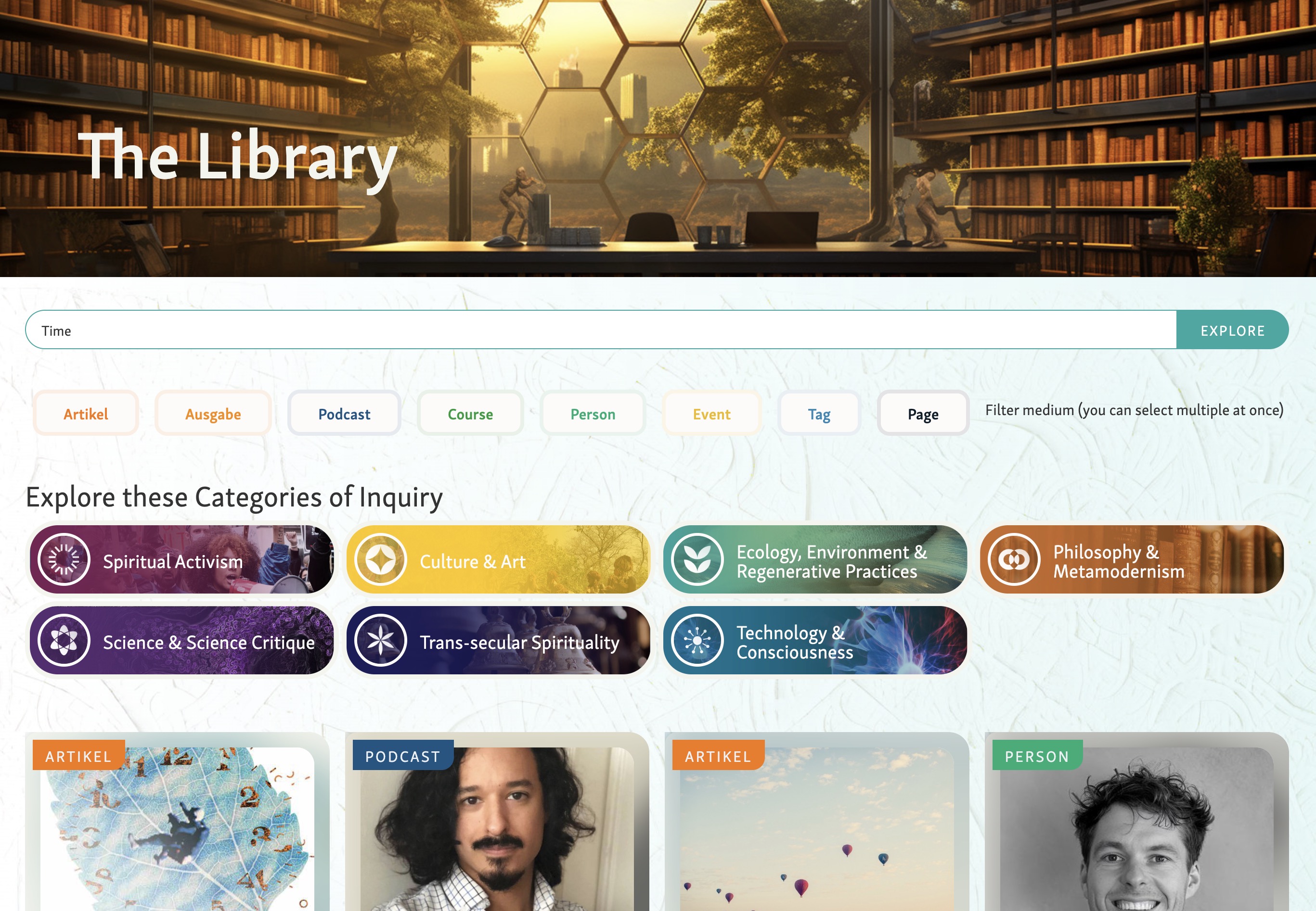
Homepage strategy will feature interactive motion graphics that respond to user input, visualizing synergy and connection (13:01). Rather than image sliders or static designs, James proposed a dynamic web-weaving graphic that tells a visual story while framing key messaging. The initial call to action will likely center on "Become a Source of Synergy," supported by segmented themes like Connect, Create, and Ignite.
The team acknowledged having substantial text content and agreed to streamline once designs provide context (11:51). Breaking longer sections into separate pages or collapsible sections will prevent overwhelming visitors while maintaining depth for interested readers.
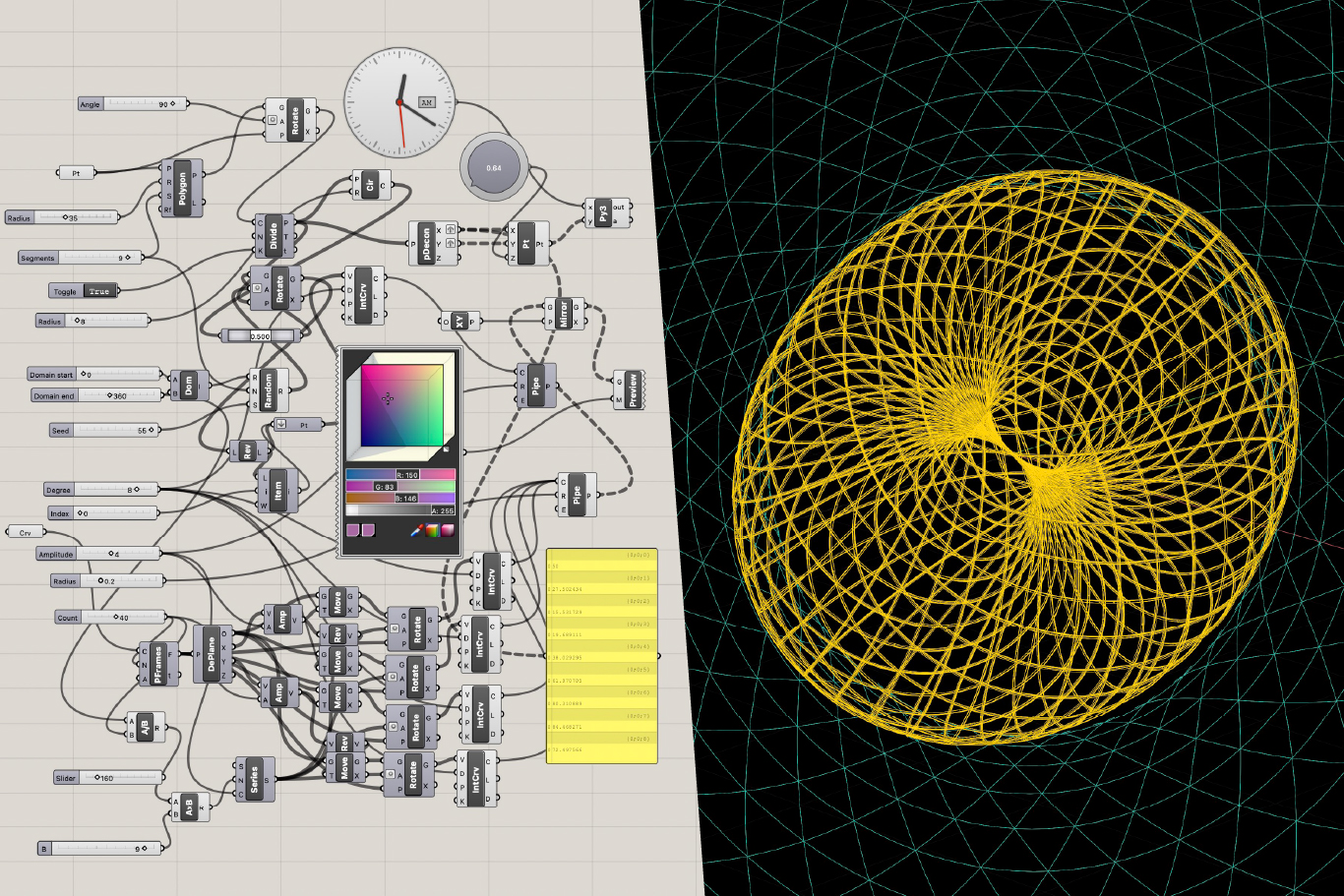
James demonstrated advanced geometric visualization techniques using parametric modeling to recreate and enhance the preferred iStock graphic (01:05:06). He's developing this with geometry nodes—mathematical functions that create dynamic, responsive animations rather than static images. The approach allows randomness, rotation, and interactive properties that can respond to mouse movement.
[tag="grasshopper"]
Diane asked whether these graphics could serve as project navigation nodes, while James suggested they work better as background elements with navigation handled separately (01:07:00). He'll continue refining these visualizations in gold tones on white backgrounds, creating organic, alive aesthetics that align with the brand's consciousness focus while maintaining professional credibility.
[technology="Parametric Geometric Interfaces"]
The team established a phased feedback approach limiting early stakeholder involvement to avoid conflicting opinions (15:56). Barbara and Diane agreed to refine designs together with James first, then bring in board chair Nancy and Deborah once solid iterations exist. This balances creative clarity with organizational inclusivity.
Next design review scheduled for Wednesday at 3:00 PM to evaluate initial concepts and graphics (01:16:35). The 50-minute session will focus on reviewing layouts, color applications, and interactive elements. James will share draft visuals via email before the meeting for asynchronous feedback.
The team emphasized maintaining a collaborative, enjoyable working dynamic throughout the project (01:19:37). Diane invited James to share graphics between meetings for ongoing input, supporting steady momentum without overloading meeting schedules.
A critical objective is clarifying the Source of Synergy Foundation's relationship with Evolutionary Leaders through visual and contextual cues (28:24). Using shared blues and complementary design language will signal connection while respecting Evolutionary Leaders' semi-autonomous operation. This addresses persistent public confusion about organizational structure.
The website will prominently feature tangible offerings like the "Our Moment of Choice" book (44 evolutionary leaders contributing chapters) and the Call to Conscious Evolution (approaching 50,000 signatures) as concrete engagement points (25:00). These elements provide clear pathways for visitor action and demonstrate organizational credibility.
The design will maintain apolitical, inclusive positioning to appeal across diverse audiences including scientists, spiritual communities, and general public (03:03). Following Collective Evolution's model, the approach balances cosmic themes with grounded professionalism, avoiding heavy political imagery or polarizing content.
Diane Williams
Barbara Layton
James Redenbaugh
The team aligned on creating a sophisticated yet accessible brand that bridges professional credibility with consciousness evolution aesthetics (07:11). Diane Williams emphasized the need to appeal to both scientists and spiritual seekers, avoiding designs that feel too feminine or masculine. James Redenbaugh committed to developing sacred yet clean aesthetics, drawing inspiration from Collective Evolution's approach of white backgrounds with vibrant, diverse imagery.
Color palette decisions centered on warm golds and muted blues that create visual continuity with the Evolutionary Leaders website (23:43). The team selected a darker blue for navigation elements to signal organizational connection, while incorporating warm tones—yellow, gold, and brown instead of black for text. This strategy addresses ongoing confusion about the relationship between Source of Synergy Foundation and Evolutionary Leaders, using subtle visual cues to demonstrate their interconnection.
[tag="webflow"]
Font exploration focused on classic serif styles with modern lightness to maintain brand consistency while avoiding dated aesthetics (29:15). The current logo uses Perpetua Tilting MTS TD Bold, which the team tested for various applications. Barbara Layton emphasized the importance of fonts with flow and movement rather than heavy, stagnant styles.
James suggested pairing geometric fonts with circular letterforms (where O's are perfect circles rather than ovals) to evoke sacred geometry principles (52:41). The team agreed this approach feels more aligned with their consciousness-focused mission.
Logo hierarchy was refined with "Source of Synergy" as primary and "Foundation" positioned as secondary (38:09). Diane noted that "Source" and "Synergy" carry the core meaning and should dominate visually. The team decided to remove "Foundation" from navigation bars to lighten the interface while keeping it visible on the homepage for legal clarity (45:27).
James initiated backend development in parallel with design work to accelerate the timeline and enable real-time content refinement (15:15). He's building the site structure in [tag="webflow"] immediately, creating linked Google Docs for each page to enable collaborative editing throughout the process. This workflow allows the team to evolve content while visual design progresses.
The team will export existing WordPress content and import it into the new Webflow environment to preserve continuity (17:32). A Webflow account will be opened only at launch when the hosting plan activates and the domain switches—an instantaneous transition with no downtime anticipated.
[technology="CRM System Templates"]
Homepage strategy will feature interactive motion graphics that respond to user input, visualizing synergy and connection (13:01). Rather than image sliders or static designs, James proposed a dynamic web-weaving graphic that tells a visual story while framing key messaging. The initial call to action will likely center on "Become a Source of Synergy," supported by segmented themes like Connect, Create, and Ignite.
The team acknowledged having substantial text content and agreed to streamline once designs provide context (11:51). Breaking longer sections into separate pages or collapsible sections will prevent overwhelming visitors while maintaining depth for interested readers.
James demonstrated advanced geometric visualization techniques using parametric modeling to recreate and enhance the preferred iStock graphic (01:05:06). He's developing this with geometry nodes—mathematical functions that create dynamic, responsive animations rather than static images. The approach allows randomness, rotation, and interactive properties that can respond to mouse movement.
[tag="grasshopper"]
Diane asked whether these graphics could serve as project navigation nodes, while James suggested they work better as background elements with navigation handled separately (01:07:00). He'll continue refining these visualizations in gold tones on white backgrounds, creating organic, alive aesthetics that align with the brand's consciousness focus while maintaining professional credibility.
[technology="Parametric Geometric Interfaces"]
The team established a phased feedback approach limiting early stakeholder involvement to avoid conflicting opinions (15:56). Barbara and Diane agreed to refine designs together with James first, then bring in board chair Nancy and Deborah once solid iterations exist. This balances creative clarity with organizational inclusivity.
Next design review scheduled for Wednesday at 3:00 PM to evaluate initial concepts and graphics (01:16:35). The 50-minute session will focus on reviewing layouts, color applications, and interactive elements. James will share draft visuals via email before the meeting for asynchronous feedback.
The team emphasized maintaining a collaborative, enjoyable working dynamic throughout the project (01:19:37). Diane invited James to share graphics between meetings for ongoing input, supporting steady momentum without overloading meeting schedules.
A critical objective is clarifying the Source of Synergy Foundation's relationship with Evolutionary Leaders through visual and contextual cues (28:24). Using shared blues and complementary design language will signal connection while respecting Evolutionary Leaders' semi-autonomous operation. This addresses persistent public confusion about organizational structure.
The website will prominently feature tangible offerings like the "Our Moment of Choice" book (44 evolutionary leaders contributing chapters) and the Call to Conscious Evolution (approaching 50,000 signatures) as concrete engagement points (25:00). These elements provide clear pathways for visitor action and demonstrate organizational credibility.
The design will maintain apolitical, inclusive positioning to appeal across diverse audiences including scientists, spiritual communities, and general public (03:03). Following Collective Evolution's model, the approach balances cosmic themes with grounded professionalism, avoiding heavy political imagery or polarizing content.
Diane Williams
Barbara Layton
James Redenbaugh
Brand design for Source of Synergy
Strategic planning and content organization for Source of Synergy Foundation website. Key strategic decisions: positioning Synergy Circles as primary CTA while addressing privacy/accessibility tensions between inspiring public participation and protecting private circles, clarifying organizational relationship between Source of Synergy Foundation and Evolutionary Leaders to reduce visitor confusion, content hierarchy prioritizing synergy definition before action frameworks, balancing information with inspiration to avoid overwhelming visitors. Homepage strategic restructuring reflecting refined messaging flow: 1) Hero with animated portal establishing brand identity 2) New video defining 'source' and 'synergy' and inspiring action as primary educational tool (14:38) 3) Mission statement section with 'Synergy starts with connection' as anchoring design element following video context (12:25) 4) Sourcing Synergy: How We Do It project showcase demonstrating organizational activities 5) Our Moment of Choice book/video section 6) Take Action / Become a Source of Synergy conversion points 7) Why Synergy Matters Now and What is Synergy? foundational content moved lower following video coverage 8) Partner logos with unified tagline. Video integration strategy: incoming ~1-week video covers foundational synergy definition content, allowing text sections to be trimmed once video edit complete to avoid duplication (14:38). Project grid strategic presentation: uniform 3x3 layout showcasing nine key initiatives (Evolutionary Partners Network, Multidimensional Explorations, Health and Wellness, Global Oneness Day replacing Our Moment of Choice (19:40), etc.) with enhanced visual consistency and clear call to action (15:15). Content sensitivity strategy: responsive removal of recently problematic public figure from team page, founding history, and Call to Conscious Evolution section (01:33), balancing appropriate response with avoiding reactive appearance. Mission statement positioning: placed after video rather than before to leverage video's explanatory power, with background imagery removed due to insufficient legibility and replaced with text-based design element (12:25). Workflow optimization strategy: consolidation of all feedback, notes, and assets into single shared Google Doc to prevent scattered communication and missed updates across 17-page notes document (18:26). Navigation strategy including Evolutionary Leaders link and enlarged branding (26:45). Footer strategy with mailing address, social media links, and improved navigation prominence (26:13). Donation section enhancement with graphics and PayPal integration. About page strategy: vision statement leading, founding history condensed to 1-2 paragraphs with read more expansion, team members alphabetized, memorial banners for honored members, removal of problematic imagery and affiliated figure content (01:33). Synergy Circles page strategy showcasing all 30 evolutionary leaders circles for funder visibility while using non-interactive Kumu map and introductory text inviting public to form their own circles. Concept paper integration for Global Oneness Day (20:28). 3/18 session strategic refinements: Take Action section messaging pivoted from joining existing circles to empowering visitors to form new circles, with 'Steps to Form a Synergy Circle' copy linking to seven-step Get Involved page outline (15:52). Strategy to consolidate engagement touchpoints by moving Edge newsletter and Call to Conscious Evolution banner from Synergizing page to homepage Take Action section, reducing navigation friction for conversion actions (43:00). Content refinement for Call to Conscious Evolution banner replacing 'Climate Change' with more inclusive 'Environmental Challenges' language covering broader issues like geoengineering and glyphosate (01:00:02). New dedicated Synergy Circles page strategy separating detailed circle information from general Get Involved content, with instructional copy clarifying icon interaction since hover/click wasn't intuitive (21:02, 27:33). About page strategy refinement: Founding History shortened to concise overview with Read More link to full document for interested visitors, photo collage grid of historical images to provide visual sense of organizational history (01:24:49, 01:27:11). Board bio strategy confirmed as expandable modals to surface already-loaded content without page navigation (01:29:15). Cultural sensitivity addressed for custom Synergy Circle icon resembling Star of David, requiring redesign to remove unintended religious symbolism (20:41). Mobile-first strategy deferred temporarily to prioritize desktop content completion, with full mobile responsiveness pass scheduled as separate initiative (57:43). Team coordination strategy enhanced with direct email communication to Iván for urgent changes to reduce scheduling delays (01:41:14). Documentation strategy with Diane maintaining clean working reference in Google Drive by removing completed items (01:42:02).
00:00:02
Barbara Layton: Good color.
00:00:05
James Redenbaugh: Thank you. Thanks.
00:00:07
Diane Williams: What does your hat say?
00:00:09
James Redenbaugh: What does it say?
00:00:12
Diane Williams: I thought it was your logo. No, it's something else.
00:00:15
James Redenbaugh: I love Philly parks.
00:00:19
Diane Williams: Where are you from?
00:00:21
James Redenbaugh: I'm from Philadelphia.
00:00:22
Diane Williams: Oh, you are from Philadelphia and that's where you're living now?
00:00:26
James Redenbaugh: Yep.
00:00:26
Diane Williams: Oh, nice. Nice city.
00:00:29
James Redenbaugh: Yep. Back here after living in California for a long time.
00:00:33
Diane Williams: You're ready to go back home?
00:00:35
James Redenbaugh: Yeah, for a bit. For a bit, yeah.
00:00:39
Diane Williams: Jen just send you sent you the admin information. I don't know if you got that.
00:00:45
James Redenbaugh: Great. Awesome.
00:00:46
Diane Williams: You just sent it, so make sure it's what you need and you can get in.
00:00:51
James Redenbaugh: Cool. I'll check it out. Haven't. Haven't seen it yet, but.
00:00:56
Diane Williams: Yeah, it just popped in. I sent her a reminder because I noticed I didn't see any response, so she probably missed the first one.
00:01:04
James Redenbaugh: Great. Well, did you guys have a good Thanksgiving?
00:01:09
Diane Williams: Very nice. Barbara, is that your tree there? Maybe it's a plant.
00:01:13
Barbara Layton: It's a plant. No Christmas tree at the moment. It's way too early for me.
00:01:20
Diane Williams: My neighbor just got there, so.
00:01:23
James Redenbaugh: Oh, wow. Almost that time of year.
00:01:28
Diane Williams: Yeah, Three more weeks, right? It's like Christmas Eve, so.
00:01:33
James Redenbaugh: Yeah. Wild. Well, wonderful. Should we start with a little meditation And I wanted to see the review. Yeah, me too. Wanted to see if either of you wanted to lead us today.
00:01:46
Diane Williams: I'll let Barbara do that if she wants.
00:01:48
Barbara Layton: Not I. I'm just getting my bearings.
00:01:52
Diane Williams: I know, me too.
00:01:53
Barbara Layton: I'm definitely a bit under the weather today, so.
00:01:56
Diane Williams: James, you did such a lovely one.
00:01:58
James Redenbaugh: I can do it.
00:01:59
Diane Williams: Yeah.
00:02:02
James Redenbaugh: Wonderful. Well, let's close our eyes for a moment here. I'm going to put my feet on the ground. And come into my body. Feel myself breathing. Notice the breath. The air moving in and out of my lungs. Feeling the presence of the planet beneath me. This giant sphere. And the presence of our solar system. Bigger sphere. And our galaxy a bigger sphere. And our whole cosmos a bigger sphere. The synergy that created this all created us. And co. Creates through us. Feeling the little and big parts of this. Immense spinning. Spiraling. Letting it all be as it is. Letting it all go. Opening our eyes. Seeing each other. Here we are.
00:04:27
Barbara Layton: Thank you.
00:04:30
James Redenbaugh: December.
00:04:34
Diane Williams: Time's flying.
00:04:37
Barbara Layton: Really?
00:04:37
Diane Williams: Time is definitely speeding up. Doesn't it feel like it?
00:04:41
James Redenbaugh: Definitely doing something.
00:04:44
Diane Williams: Yeah. Well, we're spinning quicker, they said so. It really is happening. Time is definitely going faster.
00:04:52
James Redenbaugh: Yeah. In more ways than one.
00:04:56
Barbara Layton: Every moment.
00:04:58
James Redenbaugh: Yeah. So why don't we start with this branding questionnaire. I'm Curious how it was for you answering these questions. What, what came up? What's present with you today?
00:05:14
Diane Williams: Go ahead.
00:05:15
Barbara Layton: Yeah, James, I wasn't sure, were you able to get the responses just automatically without submitting them? Because I'm not sure how that worked because I answered everything, but I didn't see like a, a forward or a submit or anything.
00:05:32
Diane Williams: They were on a Google Doc. So it just automatically.
00:05:35
Barbara Layton: Okay, great. All right, great.
00:05:36
James Redenbaugh: Okay. Yep, I see them all.
00:05:41
Barbara Layton: Okay. All right, good. Okay, good.
00:05:45
Diane Williams: Yeah. So I think, for me, I think it was really helpful to kind of get clarity and, you know, on some of those questions. And I was thinking, and I mentioned to Barbara something that came up for me, because when you were mentioning the colors and I thought, and I mentioned to her, like, I think we have to just strike a good balance because we don't want it to be too feminine and we don't want it to be too masculine or, you know, whatever's in between. So, because I was thinking if we do the Health and Wellness Project, for instance, you know, we're going to have doctors and scientists and people coming to our site, so we want it to look. Kind of something that they would feel kind of comfortable with. But then also, you know, our work is about, you know, evolution of consciousness. So what would like that look like together? You know, like a merge of something that looks, you know, kind of professional, but also, you know, a little bit different, you know, so. James, I'm counting.
00:06:55
Barbara Layton: On you to just come up with that and know it. I'm not even, I'm not even, it's not even a question in my mind right now. But. Yes, but, you know, everything that Diane says is very true, and I'm sure you're aware of that.
00:07:11
James Redenbaugh: Yeah, Yeah. I think that. We want it to feel. Sacred. I think there's different ways that we can bring sacredness into the design. While it remains professional and clean and accessible.
00:07:40
Diane Williams: Yeah. And even I was thinking with the colors because, you know, maybe too many colors as our base colors will be, you know, too much busyness going on. But I, I, that's why I mentioned I like collective evolution, how they did their essays because it was like a white background, but then they had really cool pictures that had a lot of color in them, you know, so it was like, I don't know, I thought it was really quite nice how they set it up because the pictures were sacred. And, you know, some of them are cosmic. Some of them were just, you know, random pictures of nature or whatever. But it was a great Balance. So it wasn't too much towards the cosmic part. Even though that's kind of, you know, a lot of what we do and who we are, but it. It kind of balanced a little bit of everything. So it was something for everyone almost, you know, because it was the simple background, the white background. But then the pictures were very diverse and very interesting.
00:08:37
Barbara Layton: I think you actually accomplished that really well with the whole movement website, actually.
00:08:44
Diane Williams: Which page?
00:08:45
Barbara Layton: The whole movement website of the pictures of just the whole. The whole feel, the color schemes, all of it.
00:08:55
Diane Williams: I'm going back on their website because I don't remember.
00:09:02
Barbara Layton: Yeah, I think you did a great job with those colors.
00:09:05
James Redenbaugh: Thank you. I can share my screen on that.
00:09:12
Diane Williams: Yeah, I see it. Yeah.
00:09:14
James Redenbaugh: Yeah.
00:09:20
Barbara Layton: And it was really. It was really good answering the questions. James helped us to really zoom in. On all of it.
00:09:33
James Redenbaugh: Wonderful.
00:09:34
Barbara Layton: And then this. There's one part. I don't know what. What section it's in of the whole movement. We have that blue just. It's like an arc just. Rising. It's so fabulous.
00:09:49
Diane Williams: You mean the social movement transforming the world. This one. Wait, I can.
00:09:54
Barbara Layton: It's on the whole movement website.
00:09:57
Diane Williams: Let me just share my screen.
00:09:59
James Redenbaugh: Sure.
00:10:00
Diane Williams: It's.
00:10:00
Barbara Layton: It's an arc and it just. Grows and opens. It's beautiful.
00:10:05
Diane Williams: This one, right? Is this what you mean?
00:10:09
James Redenbaugh: Yes.
00:10:09
Barbara Layton: I love the movement of it. For some reason I thought it was blue, but maybe not.
00:10:14
Diane Williams: Well, it's a black background with blue kind of a logo.
00:10:18
Barbara Layton: It's not that. It's not. It's not that one. No.
00:10:20
Diane Williams: Oh, okay.
00:10:22
Barbara Layton: But it doesn't matter.
00:10:28
Diane Williams: Maybe it's on the page.
00:10:34
Barbara Layton: Yeah. Much. I don't. I don't know where it was, but anyway.
00:10:41
Diane Williams: Maybe it was like the. The wave. Was it on the wave?
00:10:45
James Redenbaugh: Maybe.
00:10:46
Diane Williams: Could have been the registration page.
00:10:49
Barbara Layton: Could have not sure.
00:10:52
James Redenbaugh: Yeah. Sounds. Sounds familiar.
00:10:56
Barbara Layton: Yeah, I'm sure. You do so many. Right?
00:10:59
James Redenbaugh: Yeah. Yeah.
00:11:01
Diane Williams: Okay. Good stuff.
00:11:02
James Redenbaugh: Sure. Wonderful. Yeah. I. I read through your responses. A lot there. It's helpful to have it. Have it down. And I feel like you were building on our. On our. Our conversation from last week. I feel like we're very much on the same page about what the design needs to look like and feel like. And I'm excited to. To start looking at some. Some more things with you both. And we can look at some. Some points of inspiration together today. But before we get into that, I wanted to. Align on structure and content process. So you've already shared a lot of content and. We want to move. Quickly on this project. And I'm just going to bring up your. Document you shared with me.
00:12:46
Diane Williams: Also with the document, there's a tweak because we have another project. We have the Cosmic Awareness Initiative and we have to come up with. Because we're tweaking what the mission of that would be. But I think we had something similar to that. There was something. So maybe we could put it under that. Let me look at what we had it.
00:13:55
James Redenbaugh: Cool. So I'm looking at. Source of Synergy foundation website ideas. 1124, 25. Is that, is there a new version of that?
00:14:08
Diane Williams: Well, just because yesterday or Monday we had a board meeting and let me see here. 1124, 25. Yeah. Okay, so let me just open that one. Yeah. Originally we wanted to do a project more focused on the UN, but they were saying we don't know if the UN's ready for cosmic disclosure yet. So we're just going to do general public. But we're geoengineering. Yeah. So let's see, James, we're looking to.
00:14:45
Barbara Layton: Do really big projects that are going to really rock the world.
00:14:50
James Redenbaugh: Cool.
00:14:51
Diane Williams: Okay. We do have Cosmic Awareness Initiative. We just don't have the description in there. And that could be multi dimensional explorations and that could be together maybe. So. Okay, we'll just think about that and we'll come up with like a paragraph for that. But that's the only change, I think, from the last time we sent this.
00:15:15
James Redenbaugh: Yeah. Okay, great. Well, I'm thinking out loud just to make this process easiest for. Everyone and smooth. We've actually already begun. Development. Which usually happens after design. But we wanted to just go ahead and start building the back end. And bringing content in. And I want to go ahead and take the content that you've given me and put it into a very basic structure on the website so we can click around the different pages and see what we have. And then for each page I'll make a Google Doc and I'll put each of those Google Docs in a folder and then I'll put a link to those Google Docs on the website itself. So as we're viewing things, we'll also have a temporary button that's a link to the content so that you guys can get in there and. Continue to evolve it, add what's needed and. Yeah, edit anything. We, we see that we need to edit while the. While we're building things out on the site. And then we'll be designing in different design programs and exploring some concepts and color palettes and things together. But. We can, it'll just be nice to already start to see everything come into place. And then at a certain point, we'll continue the design process on the website and in the last couple of weeks, we'll really see things come together over there. So. Any questions about that? It'll be clearer once you see it.
00:17:22
Diane Williams: So something like when we put the paragraph in for the cosmic awareness. You want me to just put that directly on the Google Doc and not, like, update this?
00:17:30
James Redenbaugh: Okay, exactly.
00:17:31
Diane Williams: That's fine.
00:17:32
James Redenbaugh: Yeah. Yeah. Cool. And now that I have the. WordPress access, I'm going to export all the CMS items and import them into the webflow site that we're working on so that we'll also start to see what. What content we have available to us from that.
00:17:58
Diane Williams: And at what point do you need us to open a webflow account? Is that something that we should do immediately? Is that something after it's built or.
00:18:07
James Redenbaugh: When we're ready to launch? It'd be good to have your own webflow account. The webflow workspace is free and you just pay for the hosting on the site. So once we're ready to connect it to your domain, then we'll make sure it's on your account and give it a hosting plan and then it will be live over there.
00:18:30
Diane Williams: Okay.
00:18:30
Barbara Layton: So not until we launch. Is that right? Okay.
00:18:35
James Redenbaugh: Yep. And yeah. And when we launch. We'Ll switch the domains and it will go from pointing to the old website one minute to pointing to the new website the next minute. It's very quick. Do you guys have any email addresses connected to this domain?
00:19:04
Diane Williams: I do. I mean, we all do, but I'm the only one that really actively uses it. Mine is. I have two. It's. Well, Diane Williams at SourceOfSynergyFoundation.org and then I just have Diane at SourceOfSynergyFoundation dot org because sometimes I can't fit the big long thing, so I needed a second one.
00:19:23
James Redenbaugh: Cool.
00:19:23
Diane Williams: And then Barbara has one and Nancy has one, but they don't use it yet.
00:19:29
James Redenbaugh: Cool, cool. That's not a problem.
00:19:37
Diane Williams: So is that going to be any issues with our emails or.
00:19:41
James Redenbaugh: No, we just want to be aware of that when we switch the DNS information over. But we'll get to that when we get to that.
00:19:52
Diane Williams: So we wouldn't lose any emails or anything. Switching over.
00:19:56
James Redenbaugh: Okay. Yeah. Great. Well, I thought it would be fun to look at some More points of inspiration together and some potential fonts and color schemes. I'm just going to start pulling some things together in Pinterest. And in your responses, you're talking about colors. Talk about white backgrounds, sunrise colors. Clean and spacious, professional but creative. The web of connection, golden threads, dots, sparks merging into some birds in formation. So, yeah, I think warm colors, hues. I think we'll want. You know, of course, we'll need a. A black for text. We don't have to go with the.
00:21:05
Diane Williams: Use brown instead of black for text.
00:21:07
James Redenbaugh: We could. Yeah, we could totally go.
00:21:08
Diane Williams: Because brown kind of goes better with the gold and, you know, orange and yellow, I think, than a black.
00:21:16
James Redenbaugh: Yeah, definitely.
00:21:18
Diane Williams: And I wrote. I don't know if you saw my comment there. I wasn't really attuning so much to sunrise because I was thinking, like, the pink and all that to me would feel a little bit too feminine. So I don't know how it would look, but I'm not really. I don't know. Sunrise doesn't really appeal so much. But the. Yeah. Maybe just the colors.
00:21:43
James Redenbaugh: Yeah, let's. Let's look at some. Color palettes together. Just a sec. And then I've also started playing with the geometry from. This Istock image that you guys like. I think we can do some really cool stuff with that, with motion. That'll be. That'll be fun to play with. Wonderful. Sorry, I'm just trying to bring up this doc.
00:22:33
Diane Williams: And I'll get you the number, the licensing number or whatever, because I didn't bring my passwords here. It's on my hard drive. They're on my hard drive. We do. We did buy two of those. Two versions of that graphic.
00:23:08
James Redenbaugh: So. These palettes. A bit. You know, there's no context to any of these, but I'm curious. What jumps out of you just in terms of color. There's a few that I pulled together. Obviously, you know, a lot of yellows warms. We're not seeing the.
00:23:43
Diane Williams: Dark blue. If we could get a blue close to the Evolutionary Leaders website blue just because we want it to look like it's connected. So right in. That site might change at some point, but I'm wondering if we could just make them.
00:24:01
Barbara Layton: Yeah, I think definitely some blue in it, James. For sure.
00:24:05
James Redenbaugh: Great.
00:24:06
Barbara Layton: If it's very muted. I think I have written that in my notes.
00:24:12
Diane Williams: So that's. Yeah, that's their color. That's our color blues. So the blue goes actually pretty well with, like, yellow, I think, like the yellowish.
00:24:23
James Redenbaugh: Mm.
00:24:27
Diane Williams: And I don't even know if we want like the font styles to be similar or not, but. I don't think it has to be. But yeah.
00:24:57
James Redenbaugh: And tell me about this book.
00:25:00
Diane Williams: So the book is our Moment of Choice. It's the first book that Source of Synergy put out. Evolutionary Visions and Hope for the Future. And it's 44 of us from the evolutionary leader circle that wrote chapters in the book. And it's really a call at this moment in time, you know, how to do things in a different way. So we have that now featured on our homepage of Source of Synergy. So we might want to continue to keep it on our homepage because we don't have too many tangible things. So that's one thing that's tangible that they can go and click on to our moment of choice.com and order the book and learn more about it. And we have videos on that website. So, you know, there's something that and A Call to Conscious Evolution are kind of like the two things that, you know, people can actually do. Like they can sign on to this Call to Conscious Evolution. I mean, we don't necessarily need the faces anymore because that's almost like 20 years ago and they all look much younger. But you know, maybe we could have something else other than people's faces, you know.
00:26:12
James Redenbaugh: Cool. Great. Almost at 50,000.
00:26:16
Diane Williams: Yeah, I know. Almost there. And it gets spammed a lot like that looks like it's spammed right there. So yeah, Jen's always cleaning up the spam, whatever that is. That looks like a spam, the first one.
00:26:32
James Redenbaugh: Cool. I can help her put some better.
00:26:34
Diane Williams: Filter filters on there.
00:26:36
James Redenbaugh: Yeah, we use AI for spam filtering now because.
00:26:41
Diane Williams: Does it work?
00:26:41
James Redenbaugh: Well, the spammers are using AI to get around spam blockers.
00:26:46
Diane Williams: Oh my gosh. So that the logo there should click to our website. I think that's, I think it goes. Yeah, yeah.
00:26:59
James Redenbaugh: Wonderful. So this is the same blue in the background up here.
00:27:03
Diane Williams: Yeah, but that's an old fashioned style site.
00:27:06
Barbara Layton: Right.
00:27:07
Diane Williams: Where they had all that space on the side and.
00:27:13
James Redenbaugh: Yeah, we don't need that space anymore.
00:27:16
Diane Williams: Yeah. Blue, yellow, gold. You know, they, the orangish, you know, they all seem to go together. But I think if we mix too many colors, it's, you know, it's going to just. If we have photos, I don't think we need so many color.
00:27:37
Barbara Layton: It's also not the greatest shade of blue right there, but.
00:27:43
Diane Williams: Well, there's other shades on the Evolutionary Leaders website, like a little darker shade of Blue. Can you go back to the Evolutionary Leaders site? So like, on the top, you see on the top there's like a darker shade of blue.
00:28:00
James Redenbaugh: Mm.
00:28:01
Diane Williams: So maybe our bar could be the same somehow. Our navigation bar on the top, or at least the very top strip or whatever. We can have it the same color or. Some way that they look like they're connected.
00:28:23
James Redenbaugh: Yeah.
00:28:24
Barbara Layton: Because that's also a very big issue for us, James. Just, you know, people are just so. The relationship between Source of Synergy foundation and the Evolutionary Leaders is pretty misunderstood. So we're going to really try and remedy that in a number of ways. And hopefully the website can help with that as well.
00:28:45
James Redenbaugh: Yeah.
00:28:45
Diane Williams: Because it's one of our projects. But they don't understand, you know, sometimes because it almost seems like it's. It's on its own sometimes. Which we're happy, you know, it does. But we still want to make the connection. Like this is part of our. Our organization. We. We founded this.
00:29:02
James Redenbaugh: Mm. Yeah, totally. Tell me about the font that we have in the brand here.
00:29:15
Diane Williams: The font that's in Evolutionary Leaders or the font that we have. Oh, you mean in the logo or.
00:29:21
James Redenbaugh: In the Source of Synergy here. It's either easier to see here.
00:29:25
Diane Williams: Oh, in the logo.
00:29:28
James Redenbaugh: Yeah.
00:29:31
Diane Williams: The font. We're open. Did you see the. The new logos that Tom did that I sent you a while back? Because we thought how it's placed maybe was. I mean, we can decide which one looks better for, but that's an opt.
00:29:54
Barbara Layton: We'd like your input also, James, on font as well. I mean, aside from what we, you know, life is, you know.
00:30:02
James Redenbaugh: Totally. Yeah. Happy to.
00:30:05
Diane Williams: Yeah. And this doesn't stick out so much because it looks very thin. So even though if it's. Bolded, I don't know. But. Yeah, that's. That was. That was one of them. So in terms of the navigation area, what do you think is the best? Because we could use any of these versions because sometimes we co sponsor and we have to send them our logo. And the top one is better because it's not so long, but for the navigation bar, maybe, you know, maybe it's better another way.
00:31:14
James Redenbaugh: Do you happen to know what font this is?
00:31:19
Diane Williams: I don't remember. Yeah, I don't remember either. It doesn't come up.
00:31:26
James Redenbaugh: I can find it out.
00:31:28
Diane Williams: It wasn't our original font. It was one that he found because he. I don't think he could find our original. And this was like the closest he found. But it's a pretty nice font. I think it's A nice font.
00:31:49
Barbara Layton: Do you think it's too. I don't know. Do you think it's too dated, this. This font, James?
00:31:58
James Redenbaugh: I think that we. Try a few.
00:32:03
Barbara Layton: Out and maybe a little stagnant. I don't know. I'm not sure.
00:32:07
James Redenbaugh: Mm. I can't tell exactly what it is. I think it's worth also. Playing with some different kinds of fonts. Not necessarily. Staying with the. The serif font that we have. I do. I like the classicness of the serifs.
00:33:10
Barbara Layton: Yeah.
00:33:12
James Redenbaugh: We do want to maintain a brand consistency. But.
00:33:36
Diane Williams: I can try to look and see if you wrote what font it was.
00:33:42
James Redenbaugh: Yeah. Do you guys have a brand guidelines?
00:33:48
Diane Williams: You mean from him? From. From Tom? I don't know if he did that. I'm not sure. I don't recall. But I know when he sent the font, maybe he said the. He might have said what the font was. I mean, when he sent the logo, he might have said what the font was. Okay. Okay. He says the original font I used was perpetia tilting mt std light. I changed it to perpetua tilting mts td regular. Here, I can put this in the chat.
00:34:34
James Redenbaugh: Okay.
00:34:38
Diane Williams: Let me just make sure it's the right one, though. Okay. So he said I changed it to Perpetua Tilting MTS TD Bold. Does that font come up for you or is that not.
00:35:28
James Redenbaugh: I'm seeing if I can download it.
00:35:51
Barbara Layton: So. Yeah.
00:35:51
Diane Williams: What are you.
00:35:52
Barbara Layton: What are you thinking about the lowercase letters?
00:35:57
James Redenbaugh: Yeah, I wanted to see what. What it might be like.
00:36:08
Barbara Layton: Yeah.
00:36:09
Diane Williams: Yeah.
00:36:21
James Redenbaugh: I think I like the. Smaller of.
00:36:28
Barbara Layton: Yeah.
00:36:33
Diane Williams: And I think the fact that he had it in the middle kind of. You see it more than if it's on the bottom. You know, the. Is in the middle.
00:36:43
James Redenbaugh: Yeah.
00:37:45
Diane Williams: The one thing I do like how he has it because source and synergy is what you see the most. And, like, oven foundation is kind of secondary. You know how he has it here on the bottom? So kind of that one just source of synergy and then foundation on the bottom. It just kind of. The two most important words is what you see first.
00:38:09
James Redenbaugh: Yeah.
00:38:09
Barbara Layton: So you're saying you like foundation underneath Diane?
00:38:13
Diane Williams: Yeah, I think so. Yeah. Just because it's like the whole purpose of source and synergy. Right. And then the foundation of is not so important.
00:38:23
Barbara Layton: Yeah. It just feels too very chopped up from Maya for my eyes. It doesn't flow for me. There's no flow to it. There's like. Like there's actually no synergy to it when the foundation's underneath it. I don't know.
00:38:42
Diane Williams: Well, I mean, for the top, we could just put it, you know, all the words together. It doesn't have to be like that. But maybe for logos, when we co sponsor something, it's too long. You know, like having a logo that's out of proportion.
00:38:57
Barbara Layton: Yeah.
00:38:58
Diane Williams: So.
00:39:06
Barbara Layton: Maybe if it's centered foundation.
00:39:11
Diane Williams: Well, look at the one. Can you see down towards the bot? Well, now it's not on the screen, but there. Remember he worked with us on this one. I think, I think it's.
00:39:19
Barbara Layton: It softens it. If it's. If it's. If it's centered. For sure.
00:39:24
Diane Williams: Yeah. That's the one I was referring to.
00:39:43
Barbara Layton: God, James, this must take you hours and hours. My God.
00:39:52
James Redenbaugh: Some things do.
00:39:55
Barbara Layton: Wow.
00:39:57
Diane Williams: But it's fun, right? It's fun playing around with things.
00:40:02
James Redenbaugh: Yeah. Yeah. I think that. Serif is going to be the way to go.
00:40:10
Diane Williams: The what?
00:40:11
James Redenbaugh: The serifs. These little. These guys here that make the font more.
00:40:18
Diane Williams: Oh, yeah, we like that.
00:40:20
James Redenbaugh: Classic.
00:40:21
Diane Williams: Yeah, I like that because. And also, like you said earlier, it's the branding. So we're just so used to seeing it like that. It kind of like he tried to get it as close as what we had.
00:40:31
Barbara Layton: It was very classic.
00:40:33
Diane Williams: Yeah, it's really nice. That's too hard to see the. The word.
00:40:49
James Redenbaugh: Yeah.
00:40:57
Barbara Layton: It's kind of cool, though.
00:41:00
James Redenbaugh: And this, the color here is like. It is a dark brown.
00:41:04
Diane Williams: It's a dark brown, yeah.
00:41:07
James Redenbaugh: Mm. It's nice.
00:41:31
Diane Williams: So in terms of the blue then, we'll stick with the evolutionary leaders darker blue that we have on the top.
00:41:40
James Redenbaugh: I think. I'm not sure. I think we can try some different things out. I think it might feel too dark. Yeah.
00:42:03
Diane Williams: Do you have like a little bit lighter blue than that?
00:42:07
James Redenbaugh: Yeah, of course.
00:42:21
Diane Williams: What do you think of that blue, Barbara?
00:42:23
Barbara Layton: Because I like it. I prefer. I definitely prefer it.
00:42:28
Diane Williams: It's close to the one that you didn't like so much though, right? The.
00:42:39
Barbara Layton: I don't like the. I don't like the super light blue at all. I like. I like the blue with a little more depth to it.
00:42:49
James Redenbaugh: Mm.
00:42:54
Diane Williams: No, not that one. That blues. Okay. That one. But then it doesn't look like the El site so much, but maybe the side, you know, the side areas of the site.
00:43:11
James Redenbaugh: Right.
00:43:16
Barbara Layton: Well, I think as long as it's not too drastic, you know, once you click onto the AL website, you know, as long as it's somewhat close enough, I think it should work.
00:43:31
Diane Williams: So now it looks like the side parts. Right. But originally you were saying you thought it was Too light of a blue.
00:43:47
James Redenbaugh: I don't think we want side parts on this website.
00:43:52
Diane Williams: No, definitely not. Yeah. Can you bring the blue down a little bit so it goes past the logo so you can see if it's a little bit. Maybe a little more down. So that's what. All the letters the same, Right. Nothing smaller or. Okay. I mean, almost. If we're going to have it long, then maybe just make the. Of the same. Well, I don't know.
00:44:57
James Redenbaugh: I'll be playing with it.
00:44:58
Diane Williams: Yeah.
00:44:59
Barbara Layton: Okay, great. Thank you.
00:45:00
James Redenbaugh: Yeah.
00:45:00
Diane Williams: Because now the of kind of looks a little small, you know, like. I'm just wondering if it should just be all the same so people can actually. Yeah, Just for that navigation area.
00:45:17
Barbara Layton: James.
00:45:18
James Redenbaugh: Uhhuh. We also don't. It's up to you. But we don't necessarily need the foundation in the navigation.
00:45:27
Barbara Layton: Yeah.
00:45:27
Diane Williams: But legally that's our name, so it's the first thing they see. We should probably have it on there.
00:45:34
James Redenbaugh: Well, I think we. We want, you know, on the home page Hero, a larger. Something that gives.
00:45:48
Diane Williams: Oh, I see.
00:45:49
James Redenbaugh: Just gives a name. But then in the top of every page, I think it doesn't necessarily need.
00:45:55
Diane Williams: Mm.
00:45:57
Barbara Layton: You know, it kind of lightens it up, actually, without.
00:46:00
James Redenbaugh: It.
00:46:03
Barbara Layton: Just. It lightens up. The feel of. It.
00:46:07
Diane Williams: Lightens up what?
00:46:09
Barbara Layton: The feel of it.
00:46:11
Diane Williams: What lightens up without.
00:46:13
Barbara Layton: Without the foundation up there.
00:46:16
Diane Williams: Oh, up there.
00:46:17
Barbara Layton: Just lightens it up and I don't know, it just feels so much easier.
00:46:21
Diane Williams: Yeah. If we have the whole name somewhere else. Yeah. That'S fine. Yeah, it's a good idea.
00:46:30
Barbara Layton: Yeah, I like that. I think that's great.
00:46:39
Diane Williams: And maybe like instead of the big logo in the background for here, this part, maybe we can have somehow that nice graphic like to the left or something like that.
00:46:51
James Redenbaugh: Yeah.
00:46:51
Diane Williams: Or. Or a video of some sort or some images coming in.
00:47:02
James Redenbaugh: Yeah, totally. Cool. I'm gonna take these. And put them down here for now. And just while we're here. We could talk about a paragraph font. And a headline font.
00:48:01
Diane Williams: Can we have the font match the logo font? Or is that not a good idea?
00:48:07
James Redenbaugh: Yeah, definitely.
00:48:12
Barbara Layton: Will it be too heavy?
00:48:16
James Redenbaugh: That's my question.
00:48:18
Diane Williams: So maybe for titles or.
00:48:24
James Redenbaugh: Here I'm playing with the logo font, but it could also be a nice readable.
00:48:35
Barbara Layton: Is that the same font that you had there right now, James?
00:48:40
James Redenbaugh: This is the same font that I'm using in this logo with the.
00:48:43
Barbara Layton: With the headline right there.
00:48:45
James Redenbaugh: Yeah, yeah, that's.
00:48:48
Barbara Layton: I. I don't. I don't like that saying.
00:48:50
Diane Williams: Yeah, it looks a little heavy.
00:48:52
Barbara Layton: It's too heavy. Way too heavy. And Source of Synergy is not heavy.
00:48:59
James Redenbaugh: Yeah. Yeah. I mean, it might definitely be too bold.
00:49:05
Diane Williams: That's okay. That one, the top one. What do you think of the top one, Barbara?
00:49:13
Barbara Layton: It's. It's definitely better. The other one just felt too. Too. Too heavy.
00:49:18
Diane Williams: Yeah. But we have to also think if we're. If it's titles. Right. It has to pop out more than the font and the text. Right.
00:49:27
James Redenbaugh: Mm.
00:49:37
Diane Williams: What about just something like Times New Roman? What does that look like with the.
00:49:43
James Redenbaugh: Times Is.
00:49:49
Barbara Layton: Or Ariel?
00:49:50
Diane Williams: Like just a regular font.
00:50:01
James Redenbaugh: They're a little dated. No.
00:50:04
Diane Williams: Yeah. I'm not fond of the second one. That. That's slanted.
00:50:14
Barbara Layton: Well, we definitely don't want anything dated, James. For sure.
00:50:29
Diane Williams: That's okay. The second one is okay. Are they the same?
00:50:33
James Redenbaugh: No, they're different. That's Proxima Nova down below.
00:50:38
Diane Williams: The second one. What do you think, Barbara? I think that's pretty nice. Can you see the second one?
00:50:46
Barbara Layton: Yeah, I'm not sure, actually.
00:51:04
Diane Williams: Yeah, I think with the font for the text, it just. As long as it's not too small. You know, I think it's better to be bigger than smaller.
00:51:13
James Redenbaugh: Mm.
00:51:24
Diane Williams: But I guess our challenge is going to be, like, we have a lot of text, so how do we make it not so text heavy?
00:51:33
James Redenbaugh: Yeah.
00:51:34
Barbara Layton: Yeah, that's why I think it's. Yeah, that's precisely why we need to keep it, you know, the font, you know, very visible, but as light as possible. You know, light feeling as possible.
00:51:48
James Redenbaugh: Mm.
00:51:52
Diane Williams: And maybe chop some of the text or have it go into another. Another page or something or.
00:52:01
James Redenbaugh: Yeah, we could definitely. Play with that.
00:52:20
Diane Williams: Is the top one. Is that a pretty typical one or.
00:52:25
James Redenbaugh: Not? Super. It's a little more modern. It's very geometric.
00:52:30
Diane Williams: Yeah, I like that one. I think that one's fine.
00:52:33
James Redenbaugh: I think it's. It's readable. I love a more geometric font where the. The O's are circles. It just feels a little more. Sacred to me.
00:52:49
Diane Williams: Or the O's are. Circle.
00:52:52
James Redenbaugh: Yeah. Like. Like some fonts. The O's will be more.
00:53:01
Barbara Layton: Like an oval.
00:53:02
James Redenbaugh: Oval. Yeah.
00:53:05
Diane Williams: Yeah. I don't like. Oh, I like circle like you do. I think that's nicer.
00:53:17
James Redenbaugh: Railway could be a good choice, too. Classic. Cool. Well, this is helpful for me.
00:53:31
Diane Williams: Yeah, they're all similar. I mean, I would be fine with. With any of those.
00:53:36
James Redenbaugh: And once we see it, I think.
00:53:37
Diane Williams: The top one is probably. They're. They're so similar. It's hard to.
00:53:42
James Redenbaugh: Yeah, I. I'm just Looking for as like, a starting place.
00:53:47
Diane Williams: Yeah. It's funny. It's like a little Italian, but not really. Is this. Italian?
00:54:00
James Redenbaugh: Yeah.
00:54:02
Diane Williams: Yeah.
00:54:03
Barbara Layton: Just as long as the font doesn't feel heavy. That has some movement to it, you know. And just like a flow to, you know, not, you know, of. Yeah, a flow. So it's just not heavy and stagnant. Something like that.
00:54:27
James Redenbaugh: Let's pop back over to Pinterest. And see. Some things over here. So bringing in some, like, weaving graphics. Golden threads.
00:54:53
Diane Williams: I really like the one. The gold with the sun. The colors of the goal with the sun coming up. Just the one to the right. The sec. Third column. Yeah. Third one down. I kind of. I don't know. My eye went to that, but.
00:55:11
James Redenbaugh: My.
00:55:12
Barbara Layton: My eye goes more to the. The. To the left of that with the 1, 2, 3, with the 5, like, circles coming down.
00:55:24
Diane Williams: That's nice, too.
00:55:25
Barbara Layton: It's a little. It's just a little more muted, but very calming.
00:55:33
Diane Williams: Coming.
00:55:34
Barbara Layton: And with the same, you know, with those same beautiful tones that we like. That we like.
00:55:39
Diane Williams: Except the pink. I have something with pink. Like, pink tone.
00:55:43
Barbara Layton: I think it's a. If it's really, you know which one I'm talking about, right?
00:55:47
Diane Williams: The one with the five circles. Yeah.
00:55:49
Barbara Layton: Yes. Yes.
00:55:49
Diane Williams: The second one is pink. It looks pink. So I don't really like pink so much.
00:55:54
Barbara Layton: I think it's. If. As long as you can. If you can really mute it changes completely.
00:56:05
James Redenbaugh: Yeah.
00:56:06
Diane Williams: Also, what goes with the logo? You know, like, we had to think about what colors. But that's cool. This one, first row. One, two, three, fourth over. Like, the. The wires or whatever. That's kind of a cool gold as well.
00:56:25
James Redenbaugh: This one?
00:56:25
Diane Williams: That one? Yeah, that one. The colors, at least the color of the wire.
00:56:31
Barbara Layton: I like. I like the color of that as well. Yeah. Yeah, I do.
00:56:34
James Redenbaugh: And how. How do you feel about this. The graphic treatment there?
00:56:39
Diane Williams: The graphic treatment? What do you mean? Like, how the graphic is the.
00:56:43
James Redenbaugh: Yeah, the shapes, the form.
00:56:45
Diane Williams: I don't like it. I don't like the. But I think the color is.
00:56:49
Barbara Layton: Yeah, it's okay.
00:56:53
James Redenbaugh: Cool. And how about any of the graphics that we see here? Do they. Do any of those resonate with you?
00:57:04
Diane Williams: Not really. Maybe this one. The. The one. Let's see. It's. If you can move your cursor over to the right. Wait, it's the one. Let's see. Where's your cursor? Is it. Just move your. Okay, so over to the left. Yeah, that one. That one's kind of cool. But I don't know.
00:57:28
Barbara Layton: It's a little Seashell Ish.
00:57:29
Diane Williams: Yeah. I don't love it. Yeah. I mean, I think if you could do something with the graphic that we all liked, and then we could have it. Because I don't think the homepage has to be too full with stuff. You know, if we have the white background and we have a couple graphics we all like, and then, you know, maybe the different projects, we can highlight them in some way, you know, like a wheel or something cool that they can click on and go to the projects. And then maybe we can have, like, some of the photos, you know. Like what? You know, I think I showed the collective evolution. Let me see if I can find it.
00:58:22
Barbara Layton: James, did you have a chance to look at that website that I had sent with the partis. The team? Their faces change into one another's. Have. Did you. Were you able to see that? It was so cool. But it might be too elaborate.
00:58:39
James Redenbaugh: Let me bring that up.
00:58:43
Barbara Layton: I take. I take what I said about that image. I'm kind of liking that image at this point.
00:58:49
Diane Williams: Again, which one?
00:58:50
Barbara Layton: The one that. That I saw was seashell ish.
00:58:53
Diane Williams: Oh, yeah.
00:58:55
Barbara Layton: It's pretty close up. But anyway, I'm. I'm. You know, I'm going off on something else right now with the.
00:59:05
Diane Williams: Someone else is sharing. Oh, okay. Because you're sharing.
00:59:11
James Redenbaugh: In here.
00:59:14
Barbara Layton: Diane. Mickey Willis was in that one.
00:59:16
Diane Williams: Oh, he was in that video. I didn't even notice him.
00:59:20
Barbara Layton: Is this the one?
00:59:22
Diane Williams: Courage is secure.
00:59:24
Barbara Layton: Is that the video?
00:59:26
Diane Williams: Yeah, but you had another where their faces. Oh, wait, is this their faces turning into. Yeah, I know. That was a little strange.
00:59:34
Barbara Layton: Yeah.
00:59:35
Diane Williams: That's Mickey.
00:59:35
Barbara Layton: I didn't even.
00:59:36
Diane Williams: Oh, yeah, that's so funny.
00:59:40
Barbara Layton: I mean, it's very elaborate, for sure. Peter McCulloch. He's great.
00:59:52
Diane Williams: He's amazing. It is kind of weird.
00:59:57
Barbara Layton: Very cool people involved.
01:00:02
James Redenbaugh: What is this?
01:00:05
Barbara Layton: I just came across it. It's. It's like a salons series of. I'm not even sure. I think this woman is. Is the woman who runs it. It teaches people how to, like, do really effective salons and whatnot.
01:00:26
James Redenbaugh: Mm.
01:00:27
Barbara Layton: Focused on health and wellness. It's cool.
01:00:31
Diane Williams: I don't know if we really.
01:00:33
Barbara Layton: Yeah, no, I need to do that. Yeah.
01:00:35
Diane Williams: For the website.
01:00:36
Barbara Layton: We don't need it. No, no. James, do you know Mickey?
01:00:44
James Redenbaugh: Yeah. Is he an evolutionary leader?
01:00:54
Barbara Layton: He was.
01:00:56
Diane Williams: He was. But then somebody didn't want him to be anymore because of the January 6 issue.
01:01:05
James Redenbaugh: What. What happened?
01:01:07
Barbara Layton: Oh, he was filming.
01:01:09
Diane Williams: He was filming and he Was calling everybody patriots and things. And I don't know, it was somebody that actually. I don't want to say his name because you would know him for sure. But he just felt like he was inciting. You know, like, egging them on, kind of.
01:01:29
Barbara Layton: Which he absolutely was not. He was there as a. As a filmmaker and somebody recording history. That's. That's my.
01:01:36
James Redenbaugh: That's.
01:01:37
Diane Williams: But he did say certain things. I mean, he did say certain things.
01:01:39
Barbara Layton: So he went on to bigger and better things.
01:01:42
James Redenbaugh: Yeah.
01:01:42
Diane Williams: So, I mean, I. I didn't agree with, like, asking him to step down for that. That was not something that I thought was fair. But this other person was so insistent, you know, it was just making everybody uncomfortable.
01:01:57
Barbara Layton: He's doing really, some really terrific work right now.
01:02:02
James Redenbaugh: Cool.
01:02:03
Barbara Layton: Yeah.
01:02:08
Diane Williams: Do you want me to show you this page again? I can just.
01:02:11
James Redenbaugh: Yeah, please.
01:02:12
Diane Williams: Can I share? Okay. So where is. Oh, here it is. Okay. So see how they have the different images, like, you know what, the ice melting and. But then they have people. They have all different types. So that just kind of enlivens, I think, the page, because of the pictures. I know. There's something about this page I really like because it's simple, you know, and the boxes are kind of uniform.
01:02:48
James Redenbaugh: Yeah.
01:02:54
Diane Williams: Do you know them? Do you know Joe Martino and Collective Evolution?
01:02:58
James Redenbaugh: Yeah. From a long time ago.
01:03:01
Diane Williams: Yeah. He does good work.
01:03:03
James Redenbaugh: Cool.
01:03:05
Diane Williams: So they're about consciousness, but it's not too, you know. It's something that I think could appeal to anybody coming to the page.
01:03:13
Barbara Layton: And it's apolitical. Haven't seen much of him lately. I used to get all of his newsletters more frequently. I haven't gotten many things from him lately.
01:03:26
Diane Williams: Yeah, it's true.
01:03:29
Barbara Layton: Maybe taking a break.
01:03:31
Diane Williams: Yeah. I think he also got married not so long ago. Maybe they're having a baby. Who knows?
01:03:42
James Redenbaugh: So. I'm playing also with some geometry. I'm going to share this whole screen over here. So I'm just starting to recreate this guy. Out of geometry notes. So this is math that I'm using to create these functions. So I have 12 circles, and then I've introduced some randomness in. How these. Dots are arranged and then also in how they rotate or how these arcs are created between them. And then we can kind of increase the. Pitch there and then start to multiply this. To do a similar kind of thing with a different. Seed. Take that. And send them out further. Seed up. And make a different kind of arc. Do the same thing with these. Interior numbers.
01:06:06
Diane Williams: Is it something like copilot. Could you do something like that, where you show them the design and say, can you design me something similar to this, or does that. Not the AI? Do you use AI at all or.
01:06:19
James Redenbaugh: I do. Yeah. Well, I can. It'll take some iterating, but I can. Recreate this exactly with geometry nodes and then do it in a way where it's dynamic. And it can respond to different input. So.
01:06:45
Barbara Layton: Hold on.
01:06:45
James Redenbaugh: We can.
01:06:46
Diane Williams: Hold on, baby. I know.
01:06:51
James Redenbaugh: We can make it kind of bring it to life and make it feel more organic and alive. Doesn't have to be.
01:06:59
Barbara Layton: Yeah.
01:07:00
Diane Williams: And could you see us putting the projects on each little node, like, and then they click on and go to that page? Or is. Do you think that's another design we could.
01:07:12
James Redenbaugh: I was thinking it would be more of a. More of a background graphic. But there's loads of possibilities. For sure.
01:07:23
Barbara Layton: Yeah.
01:07:23
Diane Williams: I mean, maybe we use this as a background graphic and then another one for the. How to present the projects in some creative way.
01:07:32
James Redenbaugh: Yeah. Take the sky around. So here we could see, like, those guys are.
01:07:47
Diane Williams: Yeah.
01:07:48
James Redenbaugh: Rotating.
01:07:49
Barbara Layton: Yeah.
01:07:57
James Redenbaugh: Oops. And I'll just keep. Keep playing with stuff like this.
01:08:09
Diane Williams: Yeah.
01:08:10
James Redenbaugh: And then we can. See what's going to make the most sense.
01:08:21
Diane Williams: And you can make that gold, like the.
01:08:24
James Redenbaugh: Yeah.
01:08:25
Diane Williams: With the white background.
01:08:29
James Redenbaugh: And then we can even do things like. Intersect and multiplication functions. So we have one set of arcs here. Okay. And then another one. And we find these points that they connect. We could go see who that is.
01:08:55
Diane Williams: Go see who that is. Yeah.
01:08:58
James Redenbaugh: Go draw those points and. Create other arcs from that. We go like that. Now that gets really complicated, but you get what I mean. And then, as. You know, as one parameter changes, it automatically recalculates everything, so things can get to be really dynamic.
01:09:32
Diane Williams: That's cool.
01:09:34
Barbara Layton: Yeah, it is very cool.
01:09:48
Diane Williams: So do you think that's how this woman created this image? The image that we. We have from iStock or.
01:09:56
James Redenbaugh: Probably not. She probably just drew a few lines in Illustrator and then rotated them around. Which is a fine way to do it. But I happen to love this geometry.
01:10:12
Diane Williams: So I like the. Because with hers, with this, it almost looks like the sun is in the middle. Right. Like the one with the white background.
01:10:20
James Redenbaugh: Mm.
01:10:24
Diane Williams: And everything's coming out from that.
01:10:28
James Redenbaugh: Yeah. Cool.
01:10:33
Diane Williams: Yeah. Okay, good. We look forward to seeing that.
01:10:46
James Redenbaugh: And let me see what else we had on my agenda over here. Talked about structure. Tonight. Yeah. I feel really clear on. My next steps, and. I think that we're aligned on a sense of what wants to be created here. I Feel like we want to start to see things in context and. You know, have actual designs to look at. So I'm eager to. To get into that. We can evolve things as they come into place. Of course. Is it worth talking about. Any of the content items right now? Do you want feedback on anything that you've shared?
01:11:51
Diane Williams: Do you think it's just too much. Too much information for the homepage that we kind of were thinking should be on it or.
01:11:59
Barbara Layton: And we just threw everything, every thought and idea at you, James. You know.
01:12:06
James Redenbaugh: Yeah.
01:12:06
Barbara Layton: Wanting you to, like, really cipher, you know, siphon through.
01:12:12
James Redenbaugh: Well, it's good to have more and not less. I think that we can definitely. Reduce once we see it in context, but I don't think that it's necessarily too much right now.
01:12:31
Diane Williams: Okay. And what about the first thing they see, like, you know, when they come on and, you know, first thing that pops out at them? Do we want that to be a rotating graphic? Do we want that to be a video? Do we want that to be a slide of photos? Or do we want that to just be language? Like, you know, become a source of synergy and maybe some pictures? Like, what should that be? Because I think that's really key. Whatever is on the top there.
01:13:01
James Redenbaugh: Yeah.
01:13:01
Barbara Layton: And whatever it is has to really clarify what synergy is. Like right there. Right there. And then to bring the viewer in.
01:13:12
James Redenbaugh: Yeah. I think it should be an interactive graphic with motion that. That frames some key text explaining what synergy is and then inviting the user into a call to action. Not sure yet what that call to action should be.
01:13:41
Diane Williams: Does that become a source of synergy? Maybe that's the call to action?
01:13:46
James Redenbaugh: Yeah, probably. But I think that we should see this. This kind of movement and web weaving. And. That tells a story in itself. Especially if it's responding to the movement of the mouse and the user on the page. And then the initial text is really important about what, you know, what are we. What are we sharing there? And maybe we have. Different words coming in at different times. I wouldn't do a slider or too many images or things like that, but I might do. Some simple intro text and then, you know, maybe three or four columns beneath it where. Breaks down connect, create, ignite, or the. The different statements about synergy or something like that. But that's. That I think will definitely evolve as we see things coming together. We can feel into what's going to be most powerful for that.
01:15:14
Diane Williams: Okay, great. And then how. How should we move forward? Because should we have another call next week when you get a little bit further and then at some point, Deborah and Nancy want to be part of the process. You know, when we feel like we have something that we all like, then we show to them for their input. And Nancy's our board chair and I think, you know, Deborah, mold out. Right. Yeah.
01:15:39
Barbara Layton: Once we have like, you know, like a real design happening already, you know.
01:15:46
Diane Williams: Yeah. And if everybody's aligned, like, okay, this is it for us. And then we frame, bring them in and they can maybe tweak it or whatever. But yeah.
01:15:56
James Redenbaugh: Great.
01:15:57
Barbara Layton: Not before because then it gets too crazy. Yeah, we would drive you totally crazy. So.
01:16:03
Diane Williams: Too many opinions.
01:16:04
Barbara Layton: Yeah, once. Once we're really, you know, way closer. Like the first iteration.
01:16:12
James Redenbaugh: Yeah.
01:16:13
Barbara Layton: Does that sound okay to you?
01:16:15
James Redenbaugh: Yeah, sounds good. Okay. Yeah, it'd be good to have a check in next week. For an initial design review. When would work well for YouTube.
01:16:32
Barbara Layton: Let me just check my calendar.
01:16:35
Diane Williams: I gotta move right now. I could do Monday. That's probably the best day. Is Monday. Are Mondays good for you?
01:16:47
James Redenbaugh: I could do Monday or is that too soon?
01:16:49
Barbara Layton: I'll be in D.C. on Monday. I can't.
01:16:51
Diane Williams: Okay, so I can't do.
01:16:54
Barbara Layton: As long as I'm okay.
01:16:55
Diane Williams: We have the inner focus on. Tuesday and I have to do. Let me see. Okay, so I can do Wednesday. Thursday I couldn't do, but I can do Wednesday.
01:17:12
Barbara Layton: So we have a call with that woman on at two.
01:17:16
Diane Williams: Yeah, we. Yeah, we have.
01:17:18
Barbara Layton: How long is that going to be?
01:17:21
Diane Williams: Probably less than an hour.
01:17:23
Barbara Layton: Yeah, as long as we can keep it short.
01:17:29
Diane Williams: So we could do that afterwards like at 3, our time.
01:17:33
Barbara Layton: 2:30.
01:17:35
Diane Williams: Well, I don't know if it's going to be that short, but.
01:17:39
Barbara Layton: Well, we're just interviewing her, aren't we?
01:17:41
Diane Williams: Yeah, but we don't know how long. We don't know how long that's going to be. Right. Because she's leaving from two to three. Right.
01:17:51
Barbara Layton: I wouldn't want to be on an hour call with her and then jump on a call with James after that for an hour and a half.
01:17:58
Diane Williams: Yeah, well, we could do it earlier. We could do it if James is free. Like a 12 hour time.
01:18:11
James Redenbaugh: I could do that.
01:18:13
Barbara Layton: That's okay for me too. Also. Yep.
01:18:16
Diane Williams: Or we do it at three and we just tell her we only have a half an hour. So we have a half an hour in between the calls. What's.
01:18:27
Barbara Layton: I'm fine with 12, Diane.
01:18:28
Diane Williams: Okay.
01:18:29
Barbara Layton: Is that good for you?
01:18:32
Diane Williams: It's okay. You know, usually I don't do calls be. But I'll. I can do it. I can do it.
01:18:37
Barbara Layton: Well, if it's not, we can do it later.
01:18:41
Diane Williams: Can we just do it at 3? And tell this lady we're only meeting her for half an hour?
01:18:48
Barbara Layton: Then it has to be only a half an hour. Yes, because I'll need a break.
01:18:52
Diane Williams: Okay.
01:18:55
James Redenbaugh: Cool. And we don't need to meet for as long. Next week. I think it can be 50 minutes max.
01:19:02
Diane Williams: Okay.
01:19:03
Barbara Layton: So, James, what time? 3:00', clock, did we say on the test?
01:19:06
Diane Williams: Yeah. Yeah.
01:19:07
Barbara Layton: Okay. That's perfect.
01:19:09
Diane Williams: Okay, that's good.
01:19:11
James Redenbaugh: Great.
01:19:12
Barbara Layton: That work sounds great.
01:19:13
James Redenbaugh: Okay. Yeah.
01:19:18
Diane Williams: And if there's anything you want to run by us, like graphics. Do you like this? Whatever. Just send it to us and we'll give you our input.
01:19:27
James Redenbaugh: Great. Good.
01:19:29
Diane Williams: Alrighty. Thank you.
01:19:32
Barbara Layton: Oh, thank you so much, Jay.
01:19:35
Diane Williams: Have a good day.
01:19:37
Barbara Layton: We're still having. We're still having fun.
01:19:42
Diane Williams: That's key.
01:19:43
Barbara Layton: It's just good to be with you. Thank you.
01:19:46
James Redenbaugh: Good to be with you both.
01:19:50
Diane Williams: Take care. Bye.
01:19:51
James Redenbaugh: Bye.


.png)