
Forest and James met to review the C-LAB homepage copy, refine logo direction, and align on the interactive design approach for the five movements. The core insight driving much of the discussion: C-LAB is curriculum-centric, not psychedelic-centric (49:06). Psychedelics are one of many tools that support movement through the five movements — a distinction the homepage architecture needs to clearly communicate.
James noted the current hero opening — "there's got to be more to life than this" — risks "negging" the user on arrival (04:06). Instead, the hero should feel like landing in a bright oasis that quickly communicates what C-LAB is and why it exists. The narrative arc can address disconnection later; the hero itself needs to lead with brightness and clarity.
James suggested treating the hero as a fractal representation of the whole site and message (03:30), and recommended saving hero finalization until the rest of the page is settled.
Forest explained that the "disconnection is the root cause, connection is the remedy" framing is anchored in two research bodies:
James suggested reordering the copy so the Watts framing leads:
He also flagged that "the world disconnects us" needs specificity — the modern world disconnects us, while the natural and cosmic world reconnects us (16:04).
James identified several AI-writing tells to move away from (13:00):
Forest confirmed the staccato rhythm doesn't match his authentic writing voice and welcomed the shift toward more varied, natural prose — including run-on sentences where they serve the meaning (18:56).
The line "C-LAB is a reality-tested path back to connection, back to aliveness…" should read as one continuous sentence to reinforce the path metaphor (20:33). The path/journey metaphor can recur throughout the site in both language and graphics.
Forest wants the full 360° mandala logo as the centerpiece of the five movements section — not a spiral — so that users come to recognize the logo itself as a direct expression of the map (25:18). Each movement arranges around the mandala.
James proposed layering interactivity:
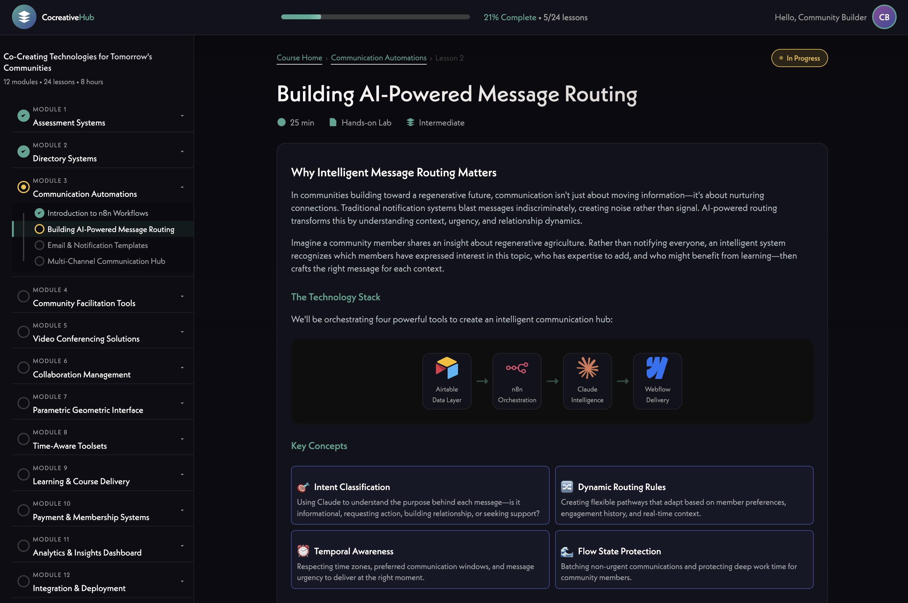
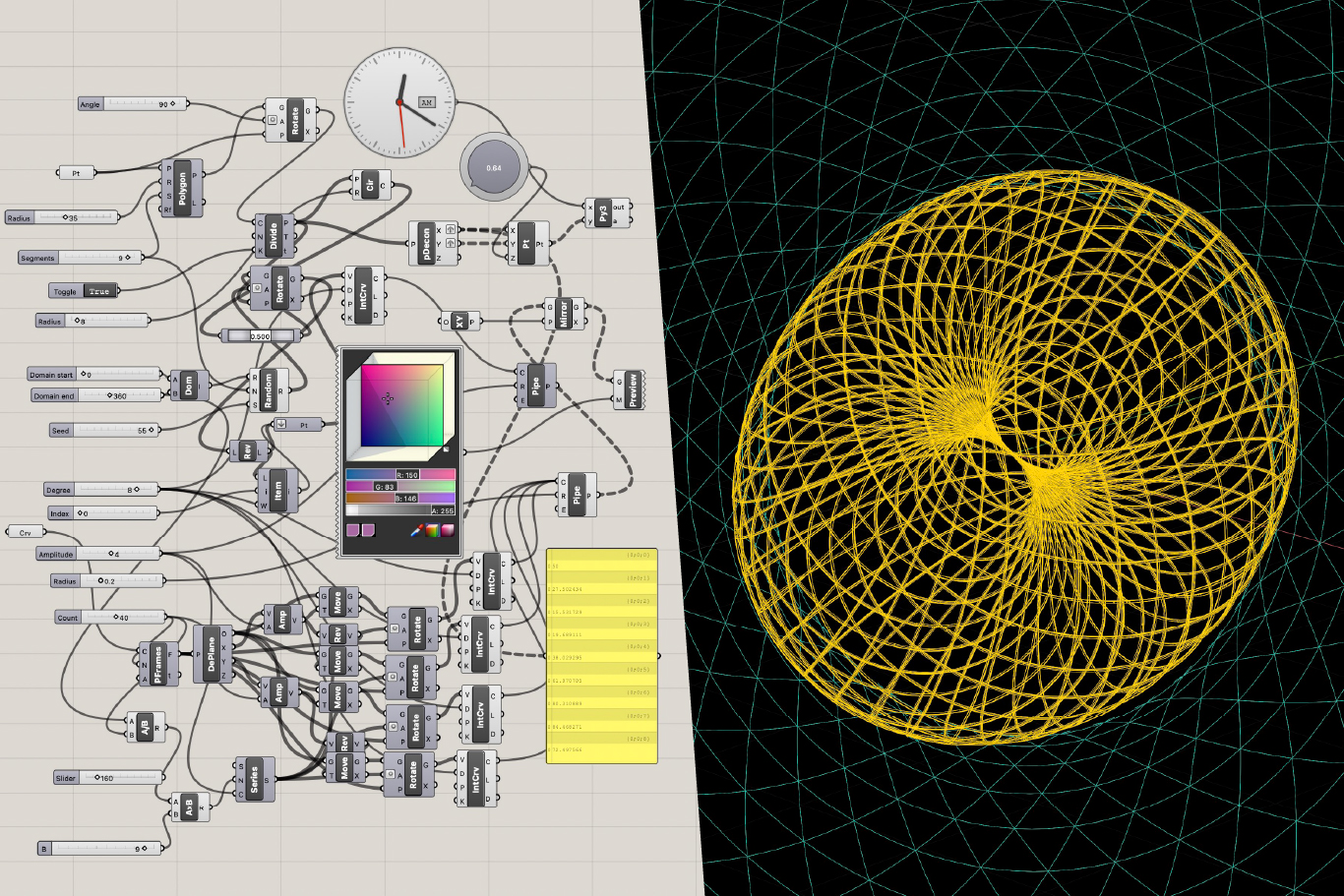
[technology="Parametric Geometric Interfaces"]
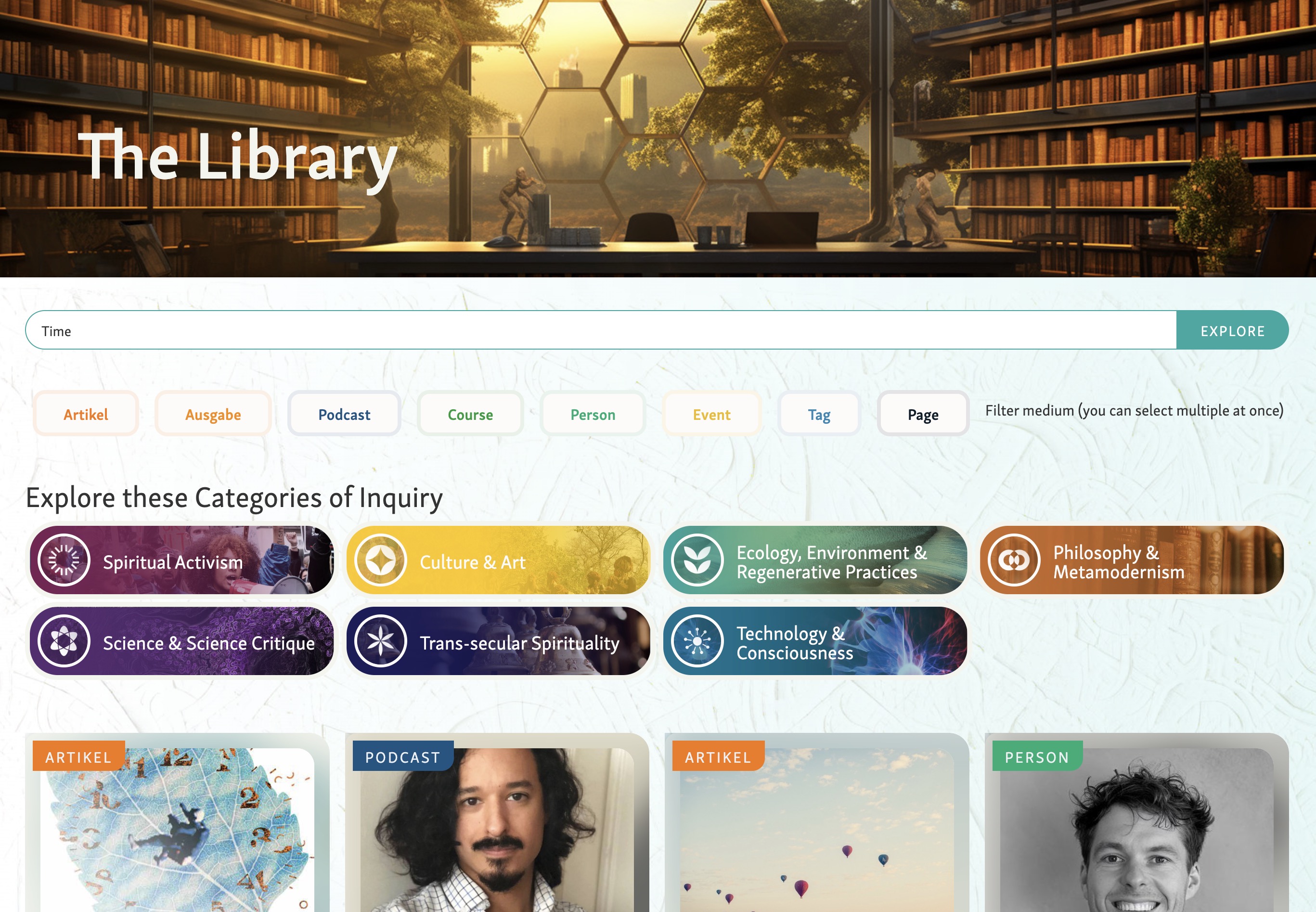
Forest shared reference examples for the testimonial section (30:05):
He also raised the question of interspersing endorsements from credible public figures with participant testimonials to build authority without feeling like a sales pitch (33:22). James agreed the two can be interspersed with distinct visual styles, and separated later if needed. Phase 1 will focus on testimonials, with endorsements layered in later.
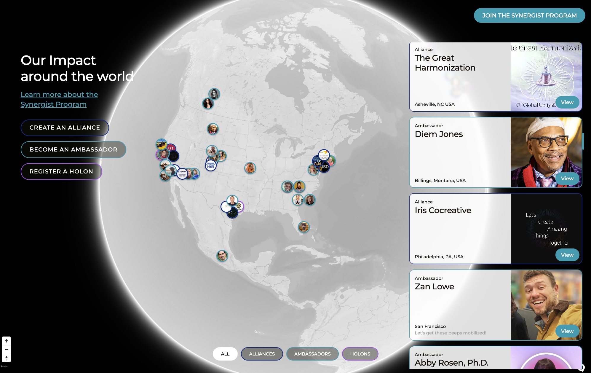
The community page will feature an interactive globe map showing members across the world (39:00). Key design considerations:
[technology="Directory Systems"]
The offerings section needs to clearly separate:
James suggested this could be handled through tabs, color coding, or grouped sections so users immediately understand that psychedelics are one modality among many, not the center of gravity (52:33).
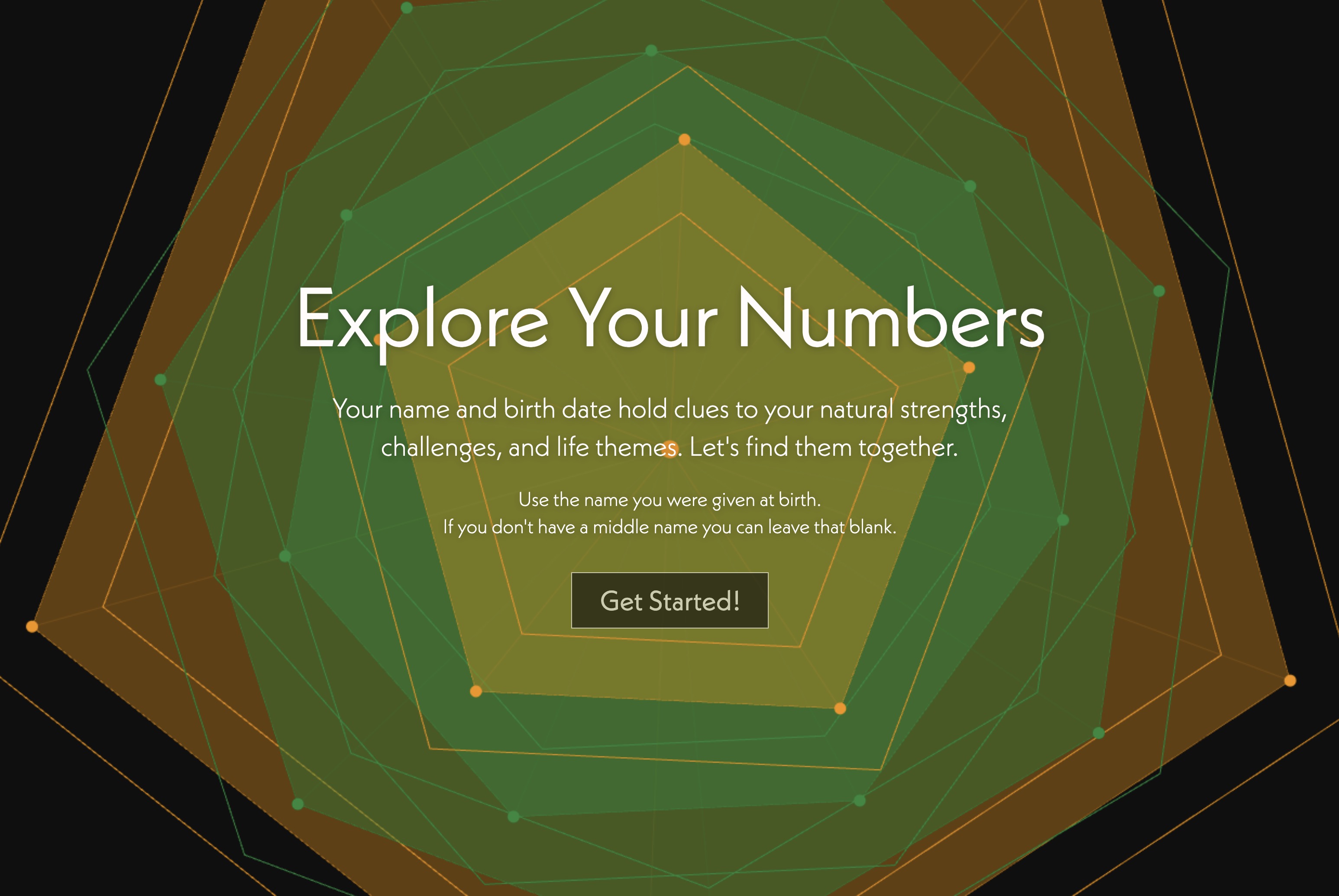
Forest wants a Connection Quiz on the homepage grounded in the Watts Connectedness Scale (57:01). The quiz would:
An open question: should the existing Readiness Quiz (for retreat intake) and the Connection Quiz be merged into one, or remain separate? James observed that the readiness quiz feels appropriate for people already close to committing, while the connection quiz needs to be broadly accessible to anyone (01:03:14). He'll review both and recommend a structure.
Both quizzes will feed into the same CRM so that intake calls can reference a user's connection profile (01:04:41).
[technology="Assessment Systems"]
Forest walked James through the FMRI imagery and additional context including Amanda Fielding's framing of the default mode network as the neurological correlate of ego — and the parallel that just as the DMN consumes disproportionate brain resources, the ego (individual and collective) consumes disproportionate world resources (01:09:18). Equitable resource distribution in the brain enables hyperconnectivity, insight, and mystical experience.
The homepage science section will stay concise, with a link into deeper science content on the About page for users who want to go further (01:11:12).
Two logo directions were reviewed:
Forest likes both but leans toward the minimalist direction for its organic feel and better scalability at small sizes (01:14:59). James confirmed both can coexist as use-case variants — full lattice version for large placements, cleaner version for small applications like favicons (01:17:03).
Refinements needed:
Forest wants to nix the rainbow-colored copy direction discussed previously (01:20:29). The logo already carries rainbow tones, and applying it to typography risks over-signaling in a way that could narrow how C-LAB is perceived. James raised whether gradient fonts (not full spectrum) could still be explored — Forest is open to seeing options.
Forest shared that the hero-through-five-movements copy has been the hardest part of the process, and where he most needs James's help. The remaining site copy feels more straightforward. James confirmed he'll take a first pass and bring drafts to the next review, while Forest continues generating raw material — messy and long is fine at this stage (22:24).
Next meeting will focus on reviewing the full style guide and revisiting homepage copy together.
James Redenbaugh
Forest
Forest and James met to review the C-LAB homepage copy, refine logo direction, and align on the interactive design approach for the five movements. The core insight driving much of the discussion: C-LAB is curriculum-centric, not psychedelic-centric (49:06). Psychedelics are one of many tools that support movement through the five movements — a distinction the homepage architecture needs to clearly communicate.
James noted the current hero opening — "there's got to be more to life than this" — risks "negging" the user on arrival (04:06). Instead, the hero should feel like landing in a bright oasis that quickly communicates what C-LAB is and why it exists. The narrative arc can address disconnection later; the hero itself needs to lead with brightness and clarity.
James suggested treating the hero as a fractal representation of the whole site and message (03:30), and recommended saving hero finalization until the rest of the page is settled.
Forest explained that the "disconnection is the root cause, connection is the remedy" framing is anchored in two research bodies:
James suggested reordering the copy so the Watts framing leads:
He also flagged that "the world disconnects us" needs specificity — the modern world disconnects us, while the natural and cosmic world reconnects us (16:04).
James identified several AI-writing tells to move away from (13:00):
Forest confirmed the staccato rhythm doesn't match his authentic writing voice and welcomed the shift toward more varied, natural prose — including run-on sentences where they serve the meaning (18:56).
The line "C-LAB is a reality-tested path back to connection, back to aliveness…" should read as one continuous sentence to reinforce the path metaphor (20:33). The path/journey metaphor can recur throughout the site in both language and graphics.
Forest wants the full 360° mandala logo as the centerpiece of the five movements section — not a spiral — so that users come to recognize the logo itself as a direct expression of the map (25:18). Each movement arranges around the mandala.
James proposed layering interactivity:
[technology="Parametric Geometric Interfaces"]
Forest shared reference examples for the testimonial section (30:05):
He also raised the question of interspersing endorsements from credible public figures with participant testimonials to build authority without feeling like a sales pitch (33:22). James agreed the two can be interspersed with distinct visual styles, and separated later if needed. Phase 1 will focus on testimonials, with endorsements layered in later.
The community page will feature an interactive globe map showing members across the world (39:00). Key design considerations:
[technology="Directory Systems"]
The offerings section needs to clearly separate:
James suggested this could be handled through tabs, color coding, or grouped sections so users immediately understand that psychedelics are one modality among many, not the center of gravity (52:33).
Forest wants a Connection Quiz on the homepage grounded in the Watts Connectedness Scale (57:01). The quiz would:
An open question: should the existing Readiness Quiz (for retreat intake) and the Connection Quiz be merged into one, or remain separate? James observed that the readiness quiz feels appropriate for people already close to committing, while the connection quiz needs to be broadly accessible to anyone (01:03:14). He'll review both and recommend a structure.
Both quizzes will feed into the same CRM so that intake calls can reference a user's connection profile (01:04:41).
[technology="Assessment Systems"]
Forest walked James through the FMRI imagery and additional context including Amanda Fielding's framing of the default mode network as the neurological correlate of ego — and the parallel that just as the DMN consumes disproportionate brain resources, the ego (individual and collective) consumes disproportionate world resources (01:09:18). Equitable resource distribution in the brain enables hyperconnectivity, insight, and mystical experience.
The homepage science section will stay concise, with a link into deeper science content on the About page for users who want to go further (01:11:12).
Two logo directions were reviewed:
Forest likes both but leans toward the minimalist direction for its organic feel and better scalability at small sizes (01:14:59). James confirmed both can coexist as use-case variants — full lattice version for large placements, cleaner version for small applications like favicons (01:17:03).
Refinements needed:
Forest wants to nix the rainbow-colored copy direction discussed previously (01:20:29). The logo already carries rainbow tones, and applying it to typography risks over-signaling in a way that could narrow how C-LAB is perceived. James raised whether gradient fonts (not full spectrum) could still be explored — Forest is open to seeing options.
Forest shared that the hero-through-five-movements copy has been the hardest part of the process, and where he most needs James's help. The remaining site copy feels more straightforward. James confirmed he'll take a first pass and bring drafts to the next review, while Forest continues generating raw material — messy and long is fine at this stage (22:24).
Next meeting will focus on reviewing the full style guide and revisiting homepage copy together.
James Redenbaugh
Forest
Take a first pass at rewriting the hero and intro-to-five-movements copy
James to draft the hero section reframe (leading with brightness as oasis rather than negating the user) and the intro-to-five-movements copy. Forest to continue generating raw material in parallel — messy and long is fine at this stage. Next meeting will review full style guide and homepage copy together. Referenced at 01:23:31 and 04:06.
Refine minimalist logo version to tighten gaps so the C reads clearly while keeping rounded corners
Forest leans toward the minimalist positive/negative space version for its organic feel and better scalability at small sizes (01:14:59). Refinements needed: tighten gaps so the C reads more clearly, keep rounded corners on geometric shapes. Both lattice and minimalist versions can coexist as use-case variants — full lattice for large placements, cleaner version for small applications like favicons (01:17:03). Referenced at 01:19:13.
Develop full brand style guide including logo variants, fonts, and gradient exploration for next review
Full style guide to include logo variants (lattice/grid for large placements, minimalist for small/favicon), font pairings, and gradient exploration. Overall geometry is solid and ready to move into style guide phase (01:19:39). To be reviewed at next meeting alongside homepage copy.
Review Connection Quiz and Readiness Quiz and recommend whether to merge or keep as separate tools
Connection Quiz (Watts Connectedness Scale, homepage-facing, broadly accessible) and Readiness Quiz (retreat intake, for people already close to committing) may serve different audiences and moments. James observed readiness quiz is appropriate for near-committed users; connection quiz needs to be broadly accessible to anyone (01:03:14). Both quizzes should feed into same CRM so intake calls can reference connection profile (01:04:41). Referenced at 01:04:35.
Explore gradient non-rainbow font direction and prepare options for Forest's review
Forest nixing the full rainbow-colored copy direction (01:20:29) — logo already carries rainbow tones and applying to typography risks over-signaling and narrowing how C-LAB is perceived. James raised whether gradient fonts (not full spectrum) could still be explored. Forest is open to seeing options. Referenced at 01:21:44.
Continue polishing and expanding website copy beyond the homepage sections
Forest confirmed the hero-through-five-movements copy has been the hardest part of the process. Remaining site copy feels more straightforward. Forest to continue generating raw material — messy and long is fine at this stage (22:24). Keep working on hero copy in parallel as inspiration allows (01:23:15).
Continue gathering testimonial videos and endorsement sources for homepage and community page
Forest shared reference examples for testimonial section: video testimonials in stacked ratio format, pulled key quote below each video, simple attribution (first name + age), and a few strategic stats (30:05). Credible public figure endorsements to be interspersed with participant testimonials to build authority (33:22). Phase 1 focuses on testimonials; endorsements layered in later. James confirmed both can coexist with distinct visual styles.
Design interactive five movements section with mandala centerpiece, hover/click movement reveal, and scroll-tied rotation behavior
Forest wants the full 360° mandala logo as centerpiece of the five movements section — not a spiral — so users come to recognize the logo as a direct expression of the map (25:18). James proposed layering interactivity: hover/click each movement to reveal copy on the right (29:00), section also tied to scroll so sequential movement through the five movements rotates the mandala to connect to the active movement. Mobile gets simpler analogous treatment.
Design offerings section with clear visual separation between psychedelic and non-psychedelic C-LAB offerings
C-LAB is curriculum-centric, not psychedelic-centric (49:06) — psychedelics are one tool among many supporting movement through the five movements. Offerings section needs to clearly separate C-LAB offerings without psychedelics from C-LAB + psychedelics offerings. James suggested handling through tabs, color coding, or grouped sections so users immediately understand psychedelics are one modality among many (52:33).
Reorder and rewrite science section copy so Watts framing leads followed by ancient wisdom bridge then FMRI imagery reveal
James proposed reordering the science section copy (17:21): (1) Lead with Watts framing — 'The more connected we feel to ourselves, others, and the living world, the more we flourish. The more disconnected, the more we suffer.' (2) Then 'Ancient wisdom knew this. Now research confirms it.' (3) Then 'Now science can see how' — leading into FMRI imagery. Also flag that 'the world disconnects us' needs specificity — the modern world disconnects us, while the natural and cosmic world reconnects us (16:04). Homepage science section stays concise with link to deeper content on About page (01:11:12).
Core website development for C-LAB including retreat program information, one-on-one session scheduling, payment processing integrated with nonprofit structure, and Tally registration system integration. Development approach shifting to GitHub + Claude architecture rather than pure Webflow - design components and style guide in Webflow, export HTML/CSS, host in GitHub repo where Claude acts as content administrator enabling conversational updates and true collaboration. Six-week delivery window before Forest becomes unavailable for three months (first ~3 weeks after baby arrives). Phase 1 priorities: logo design and branding, two foundational C-LAB maps, working website version with lorem ipsum acceptable as placeholder if copy not ready. Focus on beautiful custom design with AI-augmented development and parametric geometric interfaces. Budget range $5,000-8,000 with phased approach. First-draft website to be spun up from content outline document for visual/collaborative review. Design direction confirmed: Typography selection finalized with Montserrat (primary sans serif for headlines and body) and Frances (complementary serif accent) - both Google fonts matching Holo Movement typeface combination. Interactive sections planned: Five Movements map/diagram with rollover breakouts, Three Centers/Circles/Times parallel interactive treatment. Transformation motif established as primary design concept - rainbow mandala as living symbol woven throughout site with animated transitions between contrasting old-world/new-world image pairs (industrial monocropping → permaculture garden, meta-crisis → ecological civilization). Reusable animation widget concept for contrasting image montages throughout site. HTML mockup in GitHub repo accessible to Forest for Claude-assisted iteration. Homepage architecture refined: Hero reframed as bright oasis (fractal of whole site), science section reordered to lead with Watts Connectedness Scale, AI voice patterns removed for natural prose, five movements centered on full 360° mandala (not spiral) with scroll-tied and hover/click interactivity, testimonials section with video + pulled quotes + simple attribution. Offerings section needs clear separation between C-LAB (without psychedelics) and C-LAB + psychedelics via tabs/color coding/grouped sections. Core positioning: curriculum-centric, not psychedelic-centric. Path/journey metaphor throughout site language and graphics.
Comprehensive brand identity development including logo redesign with four core ingredients: mandala (Tibetan black-and-white geometric), taurus (head-on toroidal form via Grasshopper), eye (perception/cosmogenesis with stars in pupil), and rainbow (360-degree circular gradient at CAAB saturation level). Visual identity themes emphasize micro/macro philosophy, wonder and gratitude, living universe concept. Logo explorations include fractal rotation system in Illustrator using diamond and circle shapes, taurus geometry with more segments and smaller center hole, Tibetan mandala as mask testing rainbow-through-white and rainbow-through-black versions, eye effect through darker outer circumference shading and dark central circle. Logo must work on white backgrounds, black backgrounds, and grayscale. Animation potential noted for parametric model structure. Includes time-lapse photography exploration, iStock video research (credits expire April 23rd), and establishing visual language that bridges cosmic and professional aesthetics. Dual entity strategy: C-LAB (psychedelics-free) and The Church (medicine ceremonies) with shared visual DNA but distinct identities. Current iteration focus: Evolved from original C-LAB logo geometry with mosaic technique and inner glow effects. Refining C-shape with subtle triangular angle opening (narrowing toward pupil) to evoke light glare on eye while reading as C. Testing hard-edge vs soft-edge variations (preference for hard edges). Adding subtle dark shading around inner pupil and outer Taurus edge for dimensionality. Exploring gradient/drop shadow on inner thorny crown details. Design must translate well to digital screens, printed apparel, and embroidered hats. Figma collaboration space shared with Forest for direct commenting. Logo direction refined: Two variants reviewed - lattice/grid version with visible connecting lines, and minimalist positive/negative space version with geometry implied. Forest leans toward minimalist for organic feel and better scalability at small sizes (01:14:59). Both can coexist as use-case variants - full lattice for large placements, cleaner version for small applications like favicons. Refinements needed: tighten gaps in minimalist version for clearer C reading, keep rounded corners on geometric shapes. Overall geometry solid and ready for full style guide. Rainbow-colored copy direction nixed (01:20:29) - logo already carries rainbow tones, applying to typography risks over-signaling. Gradient fonts (not full spectrum) still open for exploration.
Establish comprehensive AI-assisted workflow infrastructure for C-LAB using Claude desktop + Claude Code as primary AI layer, Obsidian for knowledge management and memory, GitHub for version control and collaboration, Google Workspace integration, and Chrome browser automation. Build C-LAB brain knowledge base by uploading approximately 1,000 existing C-LAB files into Claude project to enable AI-assisted generation of website copy, book drafts, facilitator training content, and ecourses. Develop C-LAB-specific glossary of terms to give AI distinctive voice. AI used as writing assistant with all final editing done manually to avoid generic AI output patterns. This infrastructure enables Forest to work in his preferred visual/canvas thinking style while maintaining quality and voice consistency. Current focus: Forest dedicating weekend to refining C-LAB second brain in Obsidian to strengthen Claude as writing assistant. Goal to generate close-to-final website copy in Google Doc before baby arrives. GitHub mockup repo shared with Forest for Claude-connected iteration or URL reference for drafting. Key insight: AI voice patterns to avoid identified including 'this is not X, it is Y' construction, uniformly short staccato sentences, and vague filler phrases (13:00). Shift toward more varied, natural prose including run-on sentences where they serve meaning (18:56). James helping rewrite hero and intro-to-five-movements copy as Forest finds this section hardest - messy and long raw material is fine at this stage (22:24).
Develop reusable animation widget system featuring the rainbow mandala as living symbol of transformation. System enables contrasting old-world/new-world image pair montages throughout the website with animated rainbow mandala transitions dissolving or spinning between states. Example implementations: industrial monocropping → permaculture garden, meta-crisis scenes → ecological civilization visions. The logo itself becomes emblematic of the C-LAB journey through five movements of personal transformation. Animation leverages parametric geometric interfaces technology with the rainbow mandala serving as the transformational element woven throughout the site. Widget designed for easy content swapping to support multiple transformation narratives across different page sections. Five movements section will feature full 360° mandala logo as centerpiece (not spiral) so users recognize logo as direct expression of the map (25:18). Layered interactivity: hover/click each movement to reveal copy on right, also tied to scroll so scrolling guides users through each movement sequentially with mandala rotating to connect to active movement (29:00). Mobile gets simpler but analogous treatment.
Future development of online courses (free resource library and paid content), community platform for education and community space, custom membership system, facilitator training program support tools (marketing assets, payment processing, registration, design templates, private community spaces), and advanced integrations. Includes C-LAB Local community mapping with toggled layers (members, local groups, certified facilitators) and 3D morphing globe visualization. This represents phase 2+ development beyond initial website, to be scoped and budgeted separately as C-LAB grows and additional funding becomes available. Community page will feature interactive globe map showing members across the world (39:00) with tiered privacy levels (default low-transparency with opt-in for richer profiles), involvement tiers represented via color (retreat alumni, monthly gathering attendees, facilitators), and potential mycelial-style connections between members as visual metaphor (42:16). Case studies and additional testimonial videos live on this page for deeper exploration.
Develop two assessment tools for C-LAB website: Connection Quiz grounded in Watts Connectedness Scale for homepage (57:01) giving users reflection on where they feel more/less connected, segueing naturally into offerings and exploration call CTA, and functioning as low-pressure entry point inspired by Odyssey's readiness quiz approach (58:28). Existing Readiness Quiz for retreat intake remains separate or potentially merged pending James's structural recommendation (01:03:14). Connection Quiz needs broad accessibility for any visitor while Readiness Quiz appropriate for people already close to committing. Both quizzes feed into same CRM so intake calls can reference user's connection profile (01:04:41). Assessment Systems technology with AI-powered interpretation, Airtable storage, and custom JS visualization to create conversation-like experience with results as starting points for community engagement.
Collaborative copywriting for C-LAB homepage focusing on hero section, science section, and intro-to-five-movements content. Hero reframed as bright oasis and fractal representation of whole site (03:30-04:06) rather than negging opener. Science section reordered to lead with Watts Connectedness Scale thesis ('the more connected we feel to ourselves, others, and living world, the more we flourish'), then 'ancient wisdom knew this, now research confirms it', then FMRI imagery showing how (17:21). Modern world disconnects us while natural and cosmic world reconnects us (16:04). Remove AI voice patterns: 'this is not X it is Y' construction, uniformly short staccato sentences, vague filler phrases (13:00). Shift to varied natural prose including run-on sentences where they serve meaning (18:56). 'What is C-LAB' line reads as one continuous sentence to reinforce path metaphor (20:33). Path/journey metaphor recurring throughout site language. James taking first pass at hero and intro-to-five-movements sections as Forest finds this hardest part (22:24). Forest continues generating raw material for remaining site sections which feel more straightforward. AI-assisted workflow with Claude referencing C-LAB knowledge base while maintaining authentic voice through manual editing.
Develop comprehensive brand style guide for C-LAB including logo variants (lattice/grid version for large placements, minimalist positive/negative space version for small applications like favicons), typography system (Montserrat primary sans serif for headlines and body, Frances complementary serif accent), color palette, and gradient exploration. Logo refinements: tighten gaps in minimalist version for clearer C reading, maintain rounded corners on geometric shapes (01:19:13). Explore gradient (non-rainbow) font direction for potential use - rainbow-colored copy direction nixed as logo already carries rainbow tones (01:20:29-01:21:44). Style guide must support applications across digital screens, printed apparel, and embroidered hats. Overall logo geometry solid and ready for formalization. Full style guide to be reviewed at next meeting (01:19:39). Builds on established brand identity with four core ingredients (mandala, taurus, eye, rainbow) and visual themes of micro/macro philosophy, wonder and gratitude, living universe concept.
00:00:01
Jenny Cundari: This meeting is being recorded.
00:00:21
Forest: How's it going?
00:00:22
James Redenbaugh: Hey, Forest.
00:00:25
Forest: Good to see you.
00:00:26
James Redenbaugh: Good to see you too. How are you doing?
00:00:29
Forest: Pretty good.
00:00:31
James Redenbaugh: How's. How's the baby?
00:00:34
Forest: Just gets cuter and cuter every day.
00:00:37
James Redenbaugh: Oh, awesome. Yeah.
00:00:44
Forest: You. You are not that long ago coming back from your European tour, right?
00:00:51
James Redenbaugh: Yeah. Still. Still remembering how to use a computer.
00:01:02
Forest: Well, that's a good thing.
00:01:04
James Redenbaugh: Yeah, it was great.
00:01:09
Forest: Am I remembering correctly, you guys were doing like little belated honeymoon or something?
00:01:13
James Redenbaugh: Yeah, that's right. Yeah.
00:01:16
Forest: Cool.
00:01:17
James Redenbaugh: It was real special. Real good to be offline for a minute, explore and have a lot of fun about.
00:01:26
Forest: Yeah. Well, we got a lot to go over today.
00:01:33
James Redenbaugh: Yeah.
00:01:37
Forest: I want to be just, I guess, mindful of your time, but also clear on what, what, what kind of time we have. Are we trying to do this in the next 45 minutes?
00:01:51
James Redenbaugh: I have more time if we need it.
00:01:54
Forest: Okay. Okay, great. Well, let's see where, where would be. I mean, I have some ideas, but let me ask it as a question. Where would be a good. Do you have a place that you'd like for us to start?
00:02:18
James Redenbaugh: No, it's up to you. We can start with the copy or the logos that you share. I'm curious to get a high level sense of how your sense of C Lab has evolved since we last spoke and I read through the copy and happy to give feedback on that and then plot out the, the next steps for getting this all done.
00:02:51
Forest: Okay, great. Maybe, maybe we could start with feedback on the copy.
00:02:57
James Redenbaugh: Sure. Yeah. I did a quick mock up just to see it in context, so maybe we could go through it and I can give you a copy there. I mean, feedback.
00:03:16
Forest: Always helpful to see it in context.
00:03:18
James Redenbaugh: Yeah. So design wise, I'm not loving the design. This was just a quick.
00:03:28
Forest: Yeah, no, I get that.
00:03:30
James Redenbaugh: Taking the copy, but the, the hero. Let's not spend too much time on this because it is the thing we're going to spend the most time on. It's always the hardest to decide what to do in this section and I find it helps to not worry about it too much until we have a sense of the whole. And then the hero should be like a fractal representation of the whole site and the whole message.
00:04:06
Forest: Okay, sounds good.
00:04:09
James Redenbaugh: But I mean, high level feedback, first of all, I think it's definitely moving in the right direction and it's super clear. Clear and the structuring is really good. It's a lot of like pithy statements. It's really readable. There's not too much Text. The sections are, are really clear and they make sense and then getting into the nitty gritty. So without spending too much time on, on the hero here, I think that to say there's got to be more to life than this. And we can talk about what will accompany this if it's like an illustration, but if we put our, ourselves in the minds of the user who's first encountering this website, it's kind of. It has the potential of like negging yourself, either consciously or unconsciously where we want it. We want people who land here to feel like they're landing in a bright oasis like, oh, C Lab, what is this? This is really cool. What's going on. I don't think we should immediately turn their attention to what's missing in life. I think that that's definitely appropriate to do in the narrative arc, but I think that in the, in the hero, we really want to communicate as fast as possible what C Lab is and why it exists. And this is definitely part of the why, but the what is missing here. And we definitely want to include the brightness of the Y. Does that make sense?
00:06:39
Forest: Totally cool.
00:06:48
James Redenbaugh: So this is not a belief, it's a finding. Disconnection is the root cause, connection is the remedy. The world disconnects us. We can definitely play with some cool connection graphics, having things animate, points that are disconnected coming into connection. And I'd love to play with more than just the typical, oh, here's points that are connected in geometries, because this isn't life. You know, people don't look like this. It's, you know, it can be more expressive, colorful, curvilinear, wave of coals.
00:07:39
Forest: This. Sorry to interrupt, James. This is actually. I don't know if you had a chance to look at it, but this is directly connected to FMRI brain scan images. So, you know, the kind of the. The idea is, you know, disconnection is the root cause, connection is the remedy. And then this whole section is basically kind of the science section. And it's a way of like communicating the.
00:08:15
Jenny Cundari: That.
00:08:15
Forest: Well, just that it's not a belief, it's a finding.
00:08:19
James Redenbaugh: So.
00:08:21
Forest: You, you may be aware of it, but they did some really cool research at Imperial College. And you have somebody who's like, basically in their ordinary state of consciousness and they did a brain scan and you see that there's just the. Just the part of the brain which they call the default mode network is lit up and that basically correlates to like, ordinary egoic awareness. And then they gave somebody Psilocybin. And the whole brain is lit up. The whole brain is hyperconnected.
00:08:58
James Redenbaugh: Nice.
00:08:59
Forest: So that research also supports long term meditators. Okay. So the, so the idea is that, you know, we have what you could call ordinary consciousness and that's reflected in a brain that's kind of just pretty limited in its connection. And then we have this human potential where the brain is hyper connected. And then the corresponding subjective experience that arises with that, which is people are like, they feel really connected. There's a sense of want, oneness, they're hyper creative. You know, like all these capacities, human capacities come online. And so I was trying to find a way to basically, in a very pithy way, summarize that research, which I think has two powerful images that people can kind of probably immediately recognize.
00:09:54
James Redenbaugh: Yeah.
00:09:55
Forest: And then the other piece of research that this, excuse me, this particular section is based on is the Watts Connectedness scale. And the Watts Connectedness Scale. You know, these are things that to us are just like common sense. But it's nice to have the research to basically back up this claim, which is disconnection is the root cause. Connection is a remedy. So what that research shows is that basically it's a scale that assesses people's felt. Felt experience of their connection to themselves, to others and to the world. And no surprise what they find is that people that have, you know, are, have the felt experience of feeling more connected to themselves. Others in life experience greater health and well being. And people that score low on the, on that scale are more prone to anxiety and depression and meaninglessness and those kinds of things.
00:11:03
James Redenbaugh: Yeah, yeah.
00:11:05
Forest: So what that and one other just, it's, it's significant. Which is the difference between an antidepressant and somebody who is actually living from a place of greater connection. So antidepressants will alleviate symptoms. Somebody who is able to experience greater connection in their life will also experience the alleviation of symptoms similar to the antidepressant, but they will continue to.
00:11:49
James Redenbaugh: Go.
00:11:49
Forest: Beyond what the antidepressants are able to provide. So what's, you know, why that's important is because the alleviation of symptoms is of course an improvement in quality of life, but it's what we're capable of. Human, human beings in terms of experiencing greater meaning, greater fulfillment that comes from greater connection on all these levels is something that antidepressants isn't able to provide. But this is basically the setup for. And this is what C LAB does well, so we're not disparaging antidepressants. We're just saying it's limited and we need a, a solution that's more holistic and comprehensive.
00:12:34
James Redenbaugh: Yeah, yeah, totally. Great. Got it. Those, those images will go really well there. And I think that this can become a lot more clear. And I think you can elaborate more. Right now. When I read this, I'm wondering the root cause of what. Right. And it's a bit, it's further confusing because disconnection is also the, the result. And it's very general and vague. And I know we mean it in, in multiple ways. And so we want to think about how to be specific but also poetic. Another thing to be aware of. There's this pattern in AI writing where it loves to say like this is not something, it is this other thing. And I know that we're going to become more and more allergic to that pattern as time goes on. It's a really helpful like verbal framing for communicating understanding. That's why it does it. But it's, it's super overused. And again, in the context of this section, if the intention is to be, you know, really clear and get into the science and explain the background we want to name, like what, what is the finding? What is the problem, what is the solution? What does C lab have to do with it? And then not to just pick apart every little piece. But the world disconnects us is true. But I think you'd also agree that the world connects us as well in a different way, right?
00:15:31
Forest: I mean, not really. I mean it has that potential. But I think that the, the, the, you know, the, the experience that so many people are having these days is one of feeling disconnected, dysregulated, stressed out, overwhelmed, totally.
00:15:58
James Redenbaugh: Our, our modern world, our modern society disconnects us.
00:16:04
Forest: Oh yeah.
00:16:05
James Redenbaugh: But our, but the natural world, our cosmic world reconnects us for sure. So we want to get clear about what, what world we're talking about, what worlds we're talking about.
00:16:19
Forest: That makes sense. Good point.
00:16:30
James Redenbaugh: Maybe you've tasted it. Moments you felt connected, really alive. Ancient wisdom knew this research now can confirms it. The more connected we feel to ourselves and others, the living world, the more we flourish, the more disconnected, the more we suffer. Now science can see how.
00:16:48
Forest: Yep, yep. So that, that's basically the summary statement of the Watts connectedness scale research.
00:16:55
James Redenbaugh: Uhhuh.
00:16:56
Forest: Is the ancient, you know, the, the more connected, the more we flourish, the more disconnected, the more we suffer. And then the now science can see how that's relating to the brain scans.
00:17:09
James Redenbaugh: Yeah. So this is really good. And this is my, you know, AI's fault. I think it should. This should be higher. This can all be together.
00:17:21
Forest: Okay.
00:17:23
James Redenbaugh: And it's, it's good to get the user thinking about themselves. Maybe you've tasted it. Moments you felt connected, really alive. And then I almost want this to be the first sentence here. The more connected we feel to ourselves, others in the living world, the more we flourish, the more disconnected, the more we suffer. And then ancient wisdom knew this and now research confirms it. It's maybe a little less poetic, but it's. I think it's gonna make more sense.
00:18:11
Forest: Yeah, I like that.
00:18:15
James Redenbaugh: Now science can see how when our brains become more connected, we feel more alive. Cool. I think this can get elaborated a little bit. Another thing that AI loves is really short sentences and a similar rhythm. So if you want to elaborate and you know, create content that doesn't have to be perfect, run on sentences are fine. Just to create a little more variation. Okay.
00:18:56
Forest: And James, just quick, quick question. You're recording this, right? So we get some, could get some kind of summary of the notes.
00:19:03
James Redenbaugh: Yeah, definitely.
00:19:05
Forest: Awesome.
00:19:06
James Redenbaugh: And then how connected are you? See where you stand? This can be a nice call to action. And I saw the screenshots of the quiz that you sent me.
00:19:20
Forest: Yeah.
00:19:22
James Redenbaugh: So I think that's the, that's a great impulse. We can definitely get into that something that I would.
00:19:29
Forest: I mean, I like the idea of having some kind of quiz and it sounds like you like that, that direction too. And I know that you've created a bunch of other like quizzes. Just some, something I don't have any experience with, so. Would love your input and ideas on how to make that. Yeah. Engaging and something worthwhile for somebody to spend a few minutes doing.
00:20:01
James Redenbaugh: Yeah, definitely. Cool. Now what is C lab? C lab is a reality tested path back to connection, back to aliveness. To live a more fulfilling lives and contribute to a more loving world. I think this can be one sentence and we can play with it being really big. It can still be broken up.
00:20:33
Forest: Okay.
00:20:34
James Redenbaugh: But the periods. I get it. But it, I think it'll read more as a path if it's one thing.
00:20:48
Forest: Yeah. I would say, you know, you're. I think what you're pointing to in terms of like a. Can be kind of a signature of AI has a particular kind of this short kind of staccato rhythm to it.
00:21:05
James Redenbaugh: Yeah.
00:21:07
Forest: I like it. But it's not that. It's not actually my voice, like when I write.
00:21:12
James Redenbaugh: Yeah.
00:21:13
Forest: And I was, and I was kind of like, okay, I can, you know, like I Was trying to stay open to it because it was. It lent itself to being like short and pithy copy for a website. But at the same time, I'm like, it doesn't feel totally aligned with my voice and my writing. So I like that you're point pointing to that and. Yeah, just wanted you to know I feel aligned with you around that.
00:21:43
James Redenbaugh: Yeah. Yeah, totally. And we're all navigating how to use these. Use these tools and figure it out because they're so helpful and we want to use them in a way where it helps us get our authentic voice out. So I hope this is helpful and, and feel free to play with it and feel free to make stuff that's. That's messy. Like, don't worry about it being polished or too long. We can, we can workshop it and, and fix it up.
00:22:24
Forest: Okay.
00:22:28
James Redenbaugh: Rooted in ancient wisdom and modern science. Built for these times. This is another one of those AI things. It's like saying a lot, but not really saying a lot. And we've already said this, so I would just take this out unless we really. Want to elaborate on that or say it in a very novel way.
00:23:02
Forest: Okay.
00:23:06
James Redenbaugh: And we call it in the five moments.
00:23:10
Forest: We call it the five movements.
00:23:12
James Redenbaugh: Yeah, sorry. We call it the five moments. Yes. I think that instead of this sentence, something else can lead into this.
00:23:23
Jenny Cundari: Like.
00:23:25
James Redenbaugh: We've engineered. Processes or practices or perspectives or whatever synonym for these movements you want to. You want to use with. We've built these and played with them, tested them over time. We call them the five movements. And then, And then we get. Obviously that leads into the next section. So a living nap journey back to yourself, to each other, to the living world for the love of life. Yeah. Again, you know, I like the staccato statements, but I think we can find our own way to do. Doesn't have to be just like text in a sentence. It can be words that find themselves on the path. I definitely think that the path and the journey can be repeating metaphor and tool on the site. And it can show up in the. In the language and in the graphics.
00:24:55
Forest: Okay.
00:24:58
James Redenbaugh: Five movements, one spiral. Each turn takes a deeper personal transformation. Collective repair. Holistic, rational, embodied. We have somewhere that. That mock up of the spiral and the movements on there. I think that something like that would be really good.
00:25:18
Forest: Yeah, I don't want to do the spiral. I mean, I understand because I'm talking about it as a spiral, but I basically want to use the, like the logo. You know how the logo, like right now is like that mandala but it's like a C shape. I want to use the mandala, but just the whole 360° mandala and then have the five movements around that.
00:25:44
James Redenbaugh: Cool. Great.
00:25:50
Forest: I just, I like, I like how the logo. I like making a. Basically it's, it's. It's a way of helping people to recognize that the logo is more than just a logo. It's actually tied directly into the map itself. And so it's like as people learn the five movements and the logo takes on greater significance.
00:26:19
James Redenbaugh: Yeah, yeah. We could even make this interactive in some way where this is like rotating and this is a slider with each one and as you slide it, this rotates something like that. And we can play with icons for these as well. Cosmos, unbroken wholeness. That connects us. We have text in there. It's really hard to read with the design. We don't have to get into each one. But I think that this, this is going to be really key.
00:27:17
Forest: Hey, James, I lost you for the last couple of minutes. So you were just starting to talk about. We were talking about kind of using the logo as the kind of the design element at the center of the map. And then I think you were starting to talk about it, something about it being interactive and then I lost you.
00:27:40
James Redenbaugh: Yeah, I was saying we could have the five around the logo and this could even be rotating and maybe these are slides that get navigated between. And as you navigate them, the logo turns and connects the. The movement.
00:28:08
Forest: Okay.
00:28:08
James Redenbaugh: You know what I mean?
00:28:10
Forest: Yeah, I mean. Yeah, I, I mean, if you've got a vision for this, I'd love to see it. What I was imagining is that you'd have like, you know, the 360 degree mandala in the center. That would be the center design element. And then there would be. Starting at the top would be movement one. And then, you know, kind of around the circle would be the five movements and that, that whole. That would be the interactive map that would be on the, you know, on a web browser. It would be on the left side. And then as somebody rolled over each one of these five elements that then the, the copy and stuff would kind of appear on the right side. But if you have.
00:28:54
James Redenbaugh: Yeah.
00:28:55
Forest: If you have other ideas, I'd love to. To see it or hear about it?
00:29:00
James Redenbaugh: No, that's pretty much exactly what I'm thinking. Except. Okay. We could also connect that to scroll. So as the user scrolls down the page, they don't just scroll over this without interacting with it, but they actually see each one. Because I.
00:29:21
Forest: That's really cool.
00:29:22
James Redenbaugh: This copy is really key. These cards don't do it justice, but I think it would be good to make sure we're exposing the user to. To each of these.
00:29:36
Forest: I love that idea.
00:29:37
James Redenbaugh: Yeah. Cool.
00:29:39
Forest: So they could, they could both interact with it as well as if they scroll, they're still going to get exposed to all five of them.
00:29:45
James Redenbaugh: Yeah, yeah. And on, on mobile it would be a little simpler but similar. Okay. And then testimonials. Super good.
00:30:05
Forest: Yeah. Let's talk about this section. Just wanted to make. Just wanted to be sure that in my mind testimonial section would have. Did you get the. The testimonial video example I sent you?
00:30:26
James Redenbaugh: Yeah.
00:30:31
Forest: And then I also sent you some examples of a couple websites that I found that I liked how they were handling their testimonials. I guess it was, it was like there was the video. You could click on the video and watch the video. It was like they took a, like a, a key quote from the video and that was underneath it.
00:30:57
James Redenbaugh: Yeah.
00:30:59
Forest: And then it probably makes sense that I would like your input to also have like just a few stats in this section, you know, like 98 of. Yeah, exactly. I thought this was kind of cool.
00:31:19
James Redenbaugh: Yeah.
00:31:21
Forest: You know, something simple. I like how they have just their first name and age. I feel like that's personalizes it in a simple way. Helps it to feel like a real human being.
00:31:38
James Redenbaugh: Can you get video testimonials.
00:31:47
Forest: And then this other one here where it says real people, real results. So this is going to be more or less the kind of the ratio format the testimonial videos will be in.
00:32:02
James Redenbaugh: Great.
00:32:02
Forest: At least that's what I was. I was thinking. Unless you think it's better to have it, you know, like the more YouTube video format.
00:32:13
James Redenbaugh: No, this would be good. Okay. Yeah, that makes sense.
00:32:22
Forest: And then it. So you know, some kind of video, some kind of little key quote underneath the video that's from the video itself. And there would be some stats. You know, 98% of participants love C Lab retreat or whatever that is. And then I had a question for you around like I'm guessing that's probably more than enough for that section. And then there's. I guess it could be like another place on the website that has like more, more videos. More test. Just written testimonial videos, things like that. Or what would you suggest?
00:33:04
James Redenbaugh: Yeah, that makes sense. Okay.
00:33:11
Forest: And then one other question I had about the testimonial video or testimonial section is the example. Can you bring those examples back up again?
00:33:22
James Redenbaugh: Yeah. Which one?
00:33:32
Forest: Yes. See the one on the, just to the right there where it's, it's actually, it's more like endorsements from like well known people. I can get endorsements from. I mean, not this well known, but I can get endorsements from, you know, like credible people. Kind of like this. And I'm wondering, I guess my question for you is since I can get those endorsements we could have, but like they're basically stacking this. They're starting with endorsements and then they're moving to testimonials. I guess my question is, do we include endorsements on the homepage? If so, do we do two different sections like this? Endorsements and testimonials, just two different sections. Is there a way to potentially combine that into, you know, like testimonial endorsement. Testimonial endorsement. And I think for me there's a little bit of a. I've got a question for you around this which is I like the idea of how the endorsements can bring a level of credibility to C lab, especially because it's. At the same time, I don't want it to be to come across as like, I don't know, like a sales pitch or do you know what I mean? I'm not quite finding the language for it, but yeah,.
00:35:22
James Redenbaugh: Yeah, I think it's a good idea to intersperse them and they could have a different style and we can play with it and if it doesn't look right, we can separate them.
00:35:43
Forest: Okay. But the possibility of having it kind of dispersed. Testimonials, some endorsements.
00:35:57
James Redenbaugh: Yep.
00:35:57
Forest: On the, on the, on the homepage.
00:35:59
James Redenbaugh: Yeah, yeah, easy.
00:36:03
Forest: Okay. Right, for phase one, it's probably going to be just testimonials, but I just wanted to talk that through with you.
00:36:13
James Redenbaugh: Sure.
00:36:15
Forest: Okay, no problem.
00:36:26
James Redenbaugh: Likewise. It was scrolling. Yeah. So then TLAB community coming back to life or a growing international community of families and businesses, leaders and philanthropists, healers and builders, innovators and change makers living more fulfilling lives and contributing to a more loving world. This is great. I love this paragraph and area. Awesome. Meet the community. And where would this go?
00:37:06
Forest: I didn't. That wasn't my copy. Meet the community. I mean, I like it. I mean. Yeah, we'd have to think. I didn't come up with that copy, but I. I like it.
00:37:22
James Redenbaugh: Cool.
00:37:27
Forest: Did you get the site map that I sent you? I don't know if that HTML loaded for you. If not, it's okay, I can bring it up on my end.
00:37:42
James Redenbaugh: No, I don't Think so. Was it in the same email? Yeah, I don't see it.
00:38:00
Forest: Okay, well, you want to share your screen? Yeah, yeah, let me, Let me bring that up.
00:38:10
Jenny Cundari: And.
00:38:21
James Redenbaugh: Yeah,.
00:38:24
Forest: Can you see that, James?
00:38:33
James Redenbaugh: Oops.
00:38:35
Forest: Are you seeing my calendar or the sizeMap?
00:38:39
James Redenbaugh: Website architecture v4.
00:38:43
Forest: Okay, So, yeah, right now we're here kind of going over the homepage.
00:38:55
James Redenbaugh: And.
00:38:56
Forest: I'm guessing that it would like, meet the community would be probably maybe something page. Oh, no, there's a community. There's a community page here. Can you see that? So this is where they're, you know, the back interactive map would live. And then I want to have actual case studies so, you know, like, somebody can actually get more in depth, more than just like a testimonial video, actual case studies of people talking about how their lives have been changed. I think this is also a place we can have more testimonial videos. Yeah, I mean, we can kind of flesh that out. But it would be, it would be. Yeah, please. For people to just, if they were curious, to like. Yeah, meet. Meet more people in the community. More testimonial videos, more stories, things like that. Pull quotes.
00:40:17
James Redenbaugh: How would people be added to the map? Who would be included? And is it public.
00:40:29
Forest: To the map to the globe? Well, we had talked about in the past, we had talked about maybe different levels of transparency. So that, you know, as, I mean, probably the safest thing is as we're gathering this data and this database is growing with more and more people would be. I mean, there'd be a kind of a. Well, I guess you'd call it a low level of transparency. That would be the safest. That would probably be comfortable for anybody. And then we'd have to figure out if there were different ways for people to opt in for higher levels of transparency. I'm guessing, I'm. I'm, you know, I'm okay. If somebody is like. Like the map that you created, like, you click on somebody and you get like a whole profile, like specifically who this person is and what kind of work they do, especially for phase one, even phase two. Basically, I'm just trying to communicate like that there are people scattered across the globe that are involved in the community. Like, it doesn't necessarily even have to have. I mean, it'd be great if I had their first name and their general location, like San Francisco, California. But even if it was just, I don't know what's your. You have more information, you have more experience with this kind of thing, like, what would you recommend?
00:42:16
James Redenbaugh: Yeah, I think first name and what people want to share. We can start a database. Could be the same thing that the testimonials reference. And, you know, some may have a testimonial, some won't. Some may have an image, some won't. And we could do a funky, cool, cool way of representing them on. On a map. Maybe some mycelial connections between them.
00:43:03
Forest: Yeah, I mean, and we had talked about, like, you know, different, potentially, like there's these different levels of involvement and that. That could be somehow represented with different colors. You know, if like somebody is a retreat alumni versus somebody who's maybe just come to like an online monthly gathering versus somebody who's. Who's a facilitator.
00:43:33
James Redenbaugh: Yeah. Yeah. Cool. You want to share that HTML file with me or did you?
00:43:44
Forest: Yeah, I thought that. I thought I did, but maybe. Maybe I didn't. I can share it with you.
00:43:57
James Redenbaugh: Yeah, I only see the readiness quiz. HTML.
00:44:01
Forest: Okay, let me pull it up one second. Artifact. Let me try finding this another way. Created a badass retreat tracker for myself I'm very proud of.
00:44:49
James Redenbaugh: Cool. What does it do?
00:44:55
Forest: It affects everything. Like, you know, brings in people's names and location. It's tracking, you know, if they paid, how they paid, room assignments, scholarship fund, scholarship disbursements, all kinds of stuff.
00:45:18
James Redenbaugh: Nice.
00:45:22
Forest: Oh, here it is. I found it.
00:45:23
James Redenbaugh: Okay.
00:45:27
Forest: Website map and. Oh, there it is. Okay. It.
00:46:43
James Redenbaugh: All right.
00:46:44
Forest: Should I email that to you, James? Is that best or.
00:46:50
James Redenbaugh: Yes. All right.
00:47:12
Forest: Okay. That's sent.
00:47:32
Jenny Cundari: It.
00:48:24
Forest: That working on your end?
00:48:26
James Redenbaugh: Yep. Right. So. Then we've got your path to a more fulfilling and loving world. Costa rica retreat, Private sessions, businesses. Yeah, this is different offerings.
00:49:06
Forest: This is. This is all kind of outdated, but there's more placeholders.
00:49:15
James Redenbaugh: And then I stay connected and. Yeah, great homepage.
00:49:24
Forest: Well, we're getting there. I did want to talk with you. Just talk through with you, the. The offering section. So again, you know, some of these are placeholders. But the main thing that I want to make sure that we're both clear on is because I've had to put a lot of thought into this. Calab is not psychedelic centric. C Lab is curriculum centric.
00:50:06
James Redenbaugh: Yeah.
00:50:06
Forest: So the reason why that's important is because there's a lot of, you know, psychedelic retreat centers and psychedelic retreat companies out there.
00:50:20
James Redenbaugh: And.
00:50:21
Forest: And if you go to their homepage, that's what's front and center. Basically, we do psychedelic retreats, and then everything's organized around that.
00:50:31
James Redenbaugh: Yeah.
00:50:32
Forest: And something that I've gotten clear on is that C Lab is not psychedelic. Centric. We are. Everything is centered around the five movements of transformation. And psychedelics is just one of many tools that can help people to move through those five movements and move from disconnection to connection. Yeah, it's just one. One of many tools that can help someone to transform their lives. And so once I got clear on that, then kind of the design challenge, and I don't think it's a huge challenge, but it's important, is that there's a. We're, we're finding a way to clearly communicate that on the homepage.
00:51:20
James Redenbaugh: Right.
00:51:21
Forest: And so what I, and I'm, you know, I'm open to any ideas that you have, but I want to make it very clear. C lab is curriculum centric. And, you know, here's the different offerings that are C lab without psychedelics. Basically just C lab. And then here underneath that is all of the offerings that are C lab plus psychedelics.
00:51:45
James Redenbaugh: Yeah. Yeah. I think that it will, it will be made clear with the movements, you know, centering those, The community, the way that you're talking about everything. And. You can always elaborate further in the, in the manifesto or the blog or things like that.
00:52:23
Forest: Yeah, no, that. I think all of that is very clear. This is just more specific to the offerings section.
00:52:31
James Redenbaugh: Huh.
00:52:33
Forest: So, you know, just, like, whether we're doing that through, like, some kind of color coding, like, everything along the, you know, the top row is all the C lab offerings without psychedelics, and everything's in green, and then everything that C lab plus psychedelics is in blue. I mean, you kind of get the gist of it.
00:52:54
James Redenbaugh: Yeah, I think that makes sense. We can have tabs.
00:52:57
Forest: Oh, you know, like. Yeah. Something that's like C lab plus psychedelics and then it's, I don't know, but I just, Yeah. I just want to find a way to make that.
00:53:08
James Redenbaugh: Yeah.
00:53:09
Forest: Clearly communicate that and organize things so that, you know, it's just very clear. These, these are offerings that do not include psychedelics.
00:53:19
James Redenbaugh: Totally good idea. Okay. Okay.
00:53:27
Forest: So, so my, I guess my. Okay, well, sorry, James, where would you like to go from here?
00:53:34
James Redenbaugh: No, I'm curious. What, what were you going to say?
00:53:38
Forest: Well, so I, I, I like the feedback that, that you're giving me on the copy for the home page. And this has been the, this has been the part of the process that is by far the most challenging for me. And I feel like once we can get the copy for the home page nailed, like, it's not that there isn't a chunk of work ahead of me, but the rest of the copy feels much more straightforward.
00:54:13
James Redenbaugh: Yeah.
00:54:15
Forest: So I guess that's the part I feel like I need the most help with. And, you know, even things like, what's the copy for these offering cards, like, that feels like that. It feels like it's more. Just delivering like, that feels more straightforward to me. I think the part that feels the most challenging is basically from the hero to. To the intro to the five movements.
00:54:52
James Redenbaugh: Yeah.
00:54:55
Forest: Like, I feel good about the copy that I've written for each one of the five movements. I feel, you know, more or less good about the copy for everything underneath that. I think there's ways that, you know, you can help me kind of refine and put a polish on it. And I. I would love your suggestions, but especially with the feedback you just gave me. I agree with it. It resonates. I just. I'm like, I've spent so much time trying to figure out the hero through the kind of introductory description to the five movements. And, yeah, I feel like that's. That's the piece I could really use some help on.
00:55:39
James Redenbaugh: Yeah, of course. Happy to help with that. And. Yeah, those. That's the hardest. The hardest part. And I've got a lot of experience helping clients articulate those things, so don't worry about it. We'll. We'll play with it. We're tuning into the essence, and we'll find the right words and the right design that'll accompany it. Okay. And it'll be really great. And you can. It'll be helpful to keep working on the rest of the content, the rest of the site. You know, keep. Keep flushing that out.
00:56:29
Forest: Okay. I think something else I'd really love your help with is around that connection quiz.
00:56:42
James Redenbaugh: Yeah. And. Yeah,.
00:57:01
Forest: Because, you know, one of the themes that does feel clear to me with C Lab is just around connection disconnection. Like, I feel confident about that. And I like that this can be based on, like, the Watts connectedness scale. So it's like, it's actually grounded in research. It's not just the lab saying, like, hey, if you're connected, you feel better. So this is actually not the connectedness quiz, the connection quiz. This is something. This is something that I created is another thing that feels really important to me, which is something that Odyssey is doing. They're a psilocybin retreat company that I think they're doing really well, better than anybody else, which is all over the site. It's like, it says, like, start your journey, and then you click on that button. And then basically what you were just Click, click. This is the connection quiz. But what you. You were just clicking through was like this little three or four minute questionnaire that they take somebody through and then at the very end it asks for their email and then it leads into. It funnels into a. An intake call.
00:58:27
James Redenbaugh: Yeah.
00:58:28
Forest: And so it's, it's a way in which they're like right out of the gate starting to build a relationship with someone and also gather data on them. And so that when they do have the. If they have the call with somebody, they've actually got some useful information which helps to have a more meaningful conversation with them. And that person has already started to develop a relationship with them with. With Odyssey and with themselves through the questions that they answered.
00:58:58
James Redenbaugh: Yeah, yeah.
00:59:03
Forest: So maybe these two things can be combined. You know, this connection quiz and that.
00:59:08
James Redenbaugh: What.
00:59:09
Forest: What Odyssey calls the readiness intake. Or maybe it would be two separate things of your input. But.
00:59:18
James Redenbaugh: Yeah. So what's the purpose of the connection quiz?
00:59:23
Forest: Well, the purpose of the connection quiz is, you know, we've basically presented like, some research which is like, the more connected you are, the better you feel. The more disconnected you are, the more shitty you feel. And then it's like, take the quiz, see how connected you are. And then if you go to the next. And by the way, these categories are more or less aligned with the questions from the Watts connectedness scale. And then if you go to the last. I know it's a screen grab, but if you go to the. Yeah, there it is. You can start to get a sense of like, oh, somebody gets a reflection of like, hey, these are the areas they're more connected. These are the areas that they're less connected. This is what the research says. So they're getting some kind of helpful, hopefully helpful feedback. And then from there, I think it naturally segues into like, hey, C lab is a reality tested pathway back to connection. And then some different C Lab offerings that they could get involved in. There's an opportunity to book an exploration call. But the quiz is, I mean, I think that's a nice segue into, hey, this is what we do. This is what we're good at. Here's some different offerings you might consider participating in or book an exploratory call, but trying to give, you know, some kind of quiz that gives somebody some kind of useful information for taking a couple of minutes to do it.
01:01:13
James Redenbaugh: Cool, Great. I'll be excited to play with that and make.
01:01:27
Forest: And it could be that. Okay, that'd be awesome. And it could be that, you know, this replaces the readiness quiz. It could be there's elements of the readiness quiz that we incorporate into this. So that's another thing I'd like your input on is like, probably makes sense to just have like one kind of quiz and then we can have, you know, different buttons throughout the website that lead to that quiz. But I guess I'm. For me, the question is like, is there like a connection quiz that we have on the homepage? And then if somebody's like clicking on, like, they're interested in a retreat, then that takes them to a readiness quiz. Like, are these two different, kind of two different quizzes, or do we just combine it into one quiz that we can use everywhere? Because when I was making the readiness quiz, in my mind that was going to be like, if somebody like, hey, I'm interested in that retreat, then that would be their first step. And then the connection quiz was more something that came as a, A later idea when I found the Watts connectedness scale and was trying to connect it to the research on the homepage. But maybe there's a way they could be combined. Maybe it's better that they're separate. I don't.
01:03:14
James Redenbaugh: I think it seems like the readiness quiz is more for people that are really ready, but it's good to have something that anybody can take and it's really easy and you don't feel like you're being sold something.
01:03:30
Forest: Exactly. What I liked about the readiness quiz on the Odyssey website was it's a bunch of kind of interesting information and then interspersed. Interspersed like they ask some cool questions and then interspersed to like, flash like, hey, you know, 90% of people who've gone through Odyssey have had life changing experiences, and then they go back into some questions and then they're not asking for any personal information like email or anything like that until the very end. So it doesn't feel like they're just trying to, like, upsell you right out of the gate.
01:04:10
James Redenbaugh: Yeah.
01:04:18
Forest: Anyways, if you don't mind, James, take some time and just like, look at the connection quiz, look at the readiness quiz I put together, and then I'd love your input if. Yeah, one quiz, two different quizzes, and then what. What those could be.
01:04:35
James Redenbaugh: Mm, yeah, sure. No problem.
01:04:40
Forest: Awesome.
01:04:41
James Redenbaugh: Awesome. Cool. And they, they can populate the same CRM.
01:04:56
Forest: Okay.
01:04:57
James Redenbaugh: So if you do have a call with somebody, it'll be good to see the connection profile and whatever that quiz yielded.
01:05:09
Forest: That'd be great.
01:05:12
James Redenbaugh: Cool. Yeah. What else should we discuss while we're here?
01:05:23
Forest: Well, we went over homepage copy and the Readiness quiz and the connection quiz. You got to see some of the design inspiration images that I sent you.
01:05:38
James Redenbaugh: Did you.
01:05:38
Forest: Did you actually get to see the actual FMRI brain scan images?
01:05:46
James Redenbaugh: No, I didn't see those. They didn't. I didn't.
01:05:50
Forest: Let's take a quick look at those just because I think it'll make that science section on the homepage a lot more clear.
01:06:01
James Redenbaugh: Yeah. Do you want to share your screen and show me?
01:06:06
Forest: Sure, sure. I'm pretty sure I sent those to you, but yeah, I can share my. It. Okay, let's see. Yeah, here it is. Okay, so share and. Okay. Can you see that?
01:07:13
James Redenbaugh: Yep.
01:07:16
Forest: So the, the top images are actually the, the images from the Imperial College study. The bottom images here, I'll give you a bigger. These are actually FMRI images, which to me, this is going to just immediately make a lot more sense to people.
01:07:40
James Redenbaugh: Than,.
01:07:43
Forest: You know, than these images.
01:07:47
James Redenbaugh: Yeah.
01:07:49
Forest: So, yeah, Brain imaging is showing psychedelics and meditation dampen activity in the default mode network of the brain. So that's what you're seeing on the left there. This is the region of the brain that maintains a sense of separate self. So that, you know, relates directly to this idea of separate self or the disc. Just the experience of disconnection and a region that went overly active is associated with depression, rumination, obsessive compulsive thought patterns. So the idea here is like, you know, this is like when we're suffering, you know, this is basically or experiencing ourselves as separate or disconnected. This is what's happening in the brain. And then on the right says, when the activity of the default mode network is reduced, many people report a decreased sense of separate self identity and an increased feeling of connection and oneness. So now we're like connected self connection and oneness with their surroundings. They report novel insights and ability to perceive previously unseen connections. So there's that word again. And increased access to raw emotional states and memories without the normal tendency to analyze them. And this is interesting. You're probably familiar with Amanda Fielding's work.
01:09:18
James Redenbaugh: She's.
01:09:18
Forest: She's the one woman who is behind Beckley retreats. She recently passed away. But she's basically saying. The default mode network, she's saying, is basically what. What we call the ego. And just as the ego consumes most of the resources in the brain. I'm sorry. Just as the default mode network consumes most of the resources in the brain, the ego, meaning our. Our separate selves, personally and collectively are consuming most of the resources in the world. Equitable, Equitable distribution of resources in the brain leads to a hyp. Hyper connectivity. There's the word again. Connection leads to connection, insight and mystical experience and a fuller, deeper, richer experience of reality.
01:10:16
James Redenbaugh: So,.
01:10:18
Forest: Yeah, that's. That's. So those are those images. Do you want to, like, take a screen grab of that?
01:10:28
James Redenbaugh: Yeah, I got it.
01:10:31
Forest: Okay. This is also. This is interesting. This is from Joe Dispenza. It's on the same kind of theme.
01:10:50
James Redenbaugh: Okay. Yeah. I think we should definitely let people go deeper into the science if they want.
01:11:12
Forest: Yeah. Like have a link off of the science section on the homepage to more information or what are you thinking?
01:11:19
James Redenbaugh: Yeah, something like that. Where we can share some of these quotes and information.
01:11:36
Forest: Okay. Probably makes sense to have it on the about page where we're going to have some additional information about the five movements and.
01:11:52
James Redenbaugh: Yeah, things like that. I think that makes sense.
01:11:59
Forest: Okay. And then I wanted to also just talk with you about the logo.
01:12:06
James Redenbaugh: Yeah.
01:12:09
Forest: So did you. Did those logos I sent you come through?
01:12:37
James Redenbaugh: Yeah. What are you thinking?
01:12:43
Forest: Are you able to bring those up? So I'm thinking. I guess I wanted to get your input because I like. So this is one direction, Right. Which one's on a black background, one's on white background. And then there's the other direction, which is. There's no kind of lattice work. And, you know, as these, you know, kind of. With, you know, kind of. These are 2, 2, 2, 2d. Different directions. I like them both. I'm aware that. I don't know. I just want to get your input. I think one of. One of the considerations is like, this. This direction, like, when it gets really small, is probably not going to work as well as the other direction.
01:14:13
James Redenbaugh: Mm.
01:14:16
Forest: And there's something about the other direction that I kind of. I like the minimal. Minimalism of it.
01:14:24
James Redenbaugh: Yeah.
01:14:25
Forest: Kind of. It's working more with positive negative space. It's less kind of. You know, you can, like, foreground background where it's like you shift in your perception and suddenly you're looking at these different geometric shapes and then you kind of shift back and it's like, oh, you can see the C pattern. You can see the letter C. I think, think it would probably work better at a smaller size. And I think sometimes with logos, less is more.
01:14:59
James Redenbaugh: Yeah.
01:15:00
Forest: I'm also. I'm also aware that with this direction, it's probably going to work better, like in like a monotone, like grayscale or if we wanted. You know what I mean? Yeah. I just was curious to get your thoughts. Another thing that I Like, about this is you. It still has, like, the kind of. That the grid work is implied,.
01:15:33
James Redenbaugh: But.
01:15:33
Forest: It's not like literal lines. And I like the lines, but I think there's also something about the lines that can contribute it to feeling more like graph paper for me, which is more of kind of an engineering, sciencey kind of feel. This one feels a little bit more organic. I don't know, man. I like them both.
01:16:03
James Redenbaugh: Just.
01:16:03
Forest: What do you. Any thoughts?
01:16:06
James Redenbaugh: Yeah, I think. Did you round the corners on these shapes or had I friend.
01:16:18
Forest: No, a friend of mine did. This is a little bit different than the version you sent me, and I'm not attached to it being exactly like that. This was just more to represent two. Two different directions.
01:16:32
James Redenbaugh: Yeah. I think I like the rounding of the corners. Yeah. And the one thing, it doesn't really read as a C. If we don't have the lines and these smaller shapes get kind of lost. Yeah.
01:16:56
Forest: I think that would need to be refined a little bit.
01:17:03
James Redenbaugh: And. But I think that the. You can have different versions of the logo for different use cases, and maybe smaller versions don't have the lines, and the fuller version has the lines. That's totally fine. But I think the geometry is really solid now.
01:17:33
Forest: Okay. So you're suggested having two versions.
01:17:39
James Redenbaugh: Yeah. You can have a. Have as many versions as you want.
01:17:46
Forest: Okay. And then on the version that doesn't have the lines, if you could go back to that one. I feel like where. Kind of the. Where this. Where we're trying to indicate a straight line, you know, for the c. Like, that needs to get cleaned up a little bit. So that. Because right now there's not enough geometric shape there to actually, you know, to visually create that line in a person's mind.
01:18:25
James Redenbaugh: Mm.
01:18:29
Forest: But if it was, you know, like. So see where the. Like, there's the purple diamond shape and then there's. It's almost like the purple diamond shape that gets cut off would need to be more complete. And then the diamond shape. Purple diamond shape in the middle is. What I'm trying to say is like. Like, how do we have more geometric shape there so that it defines that line? Do you know what I'm saying?
01:19:13
James Redenbaugh: Yeah. Yeah. We would have to make the gap thinner.
01:19:18
Forest: Exactly. That just. I think that would make it work. Just making the gap a little thinner and then. Yeah. That there'd be more consistent color there.
01:19:37
James Redenbaugh: I can do that.
01:19:39
Forest: Okay.
01:19:42
James Redenbaugh: Yeah.
01:19:43
Forest: Well, then in that case, I feel like we're. You know, in my mind, I'm more or less, you know, I'm really happy with. With both directions and they just need to be cleaned up a little bit.
01:19:55
James Redenbaugh: Great. Sounds good. I've got to run. But we. We definitely have what we need to go deeper into full style guide creation now. I'm excited to do that and next time we meet, we should review that.
01:20:29
Forest: That'd be awesome. One thing, just a detail, but we had talked about, like, some of the copy, like having like a rainbow color through it, and I'd like to nix that.
01:20:46
James Redenbaugh: Okay.
01:20:49
Forest: Everything else that we've talked about in terms of like the fonts and all that stuff, like, I still feel a big yes around, but I'm. I'm really wanting to walk.
01:20:59
James Redenbaugh: Be.
01:21:00
Forest: Be my. Like the. The logo already has rainbows in it and I want it to kind of walk in this fine line between, like, wanting it to, you know, convey inclusiveness but without becoming so much that it's like we're like a, you know, gay pride centered organization.
01:21:27
James Redenbaugh: Yeah.
01:21:27
Forest: Or we're not a gay pride parade. Like, this isn't just for we, you know, we support gay and trans people coming to these. But I don't want it to communicate that, like.
01:21:38
James Redenbaugh: Yeah, cool. I get it.
01:21:42
Forest: Okay.
01:21:44
James Redenbaugh: What about gradient fonts in general? Not the whole spectrum, but yeah, I'm.
01:21:53
Forest: Open to looking at it.
01:21:55
James Redenbaugh: Sure.
01:21:56
Forest: Looking at that. And you still have the. We talked about some fonts and kind of a design direction and one of the last. One of our last meetings. You've still got that somewhere?
01:22:11
James Redenbaugh: Yeah, I've got that.
01:22:13
Forest: Okay. Yeah. So it sounds like next steps is you guys are going to play around with design and then. Yeah, like, talk to me about next steps, then we can wrap up.
01:22:28
James Redenbaugh: Yeah, we'll play more with style guide, putting things into place. Next time we meet, we can review that and. I think have a deeper sense of what the site wants to really look like.
01:22:48
Forest: Okay. And then at what. At what point, James, can we maybe spend a little bit more time together, me getting your help with that copy for the first couple of sections?
01:23:01
James Redenbaugh: Yeah, I think I should spend some time on my own with it and come up with some ideas. You should keep working on it as much as your inspiration pulls you and also feel free to work on the content for the rest of the site and we'll. We'll hone in on it. So next time we meet to review the. The brand, we can also look at copy again.
01:23:31
Forest: Okay. Yeah. And please. Sounds like you're planning on doing this anyways, but would love for you to take a stab at it and just see what you come up with?
01:23:39
James Redenbaugh: Yeah, definitely.
01:23:41
Forest: Okay. All right. Awesome. Thanks so much for your time today.
01:23:45
James Redenbaugh: No problem for us. Have a good day. I'll talk to you soon.
01:23:49
Forest: You too.
01:23:50
James Redenbaugh: Bye.
01:23:50
Forest: Bye.







.svg%20(1).png)


.png)