


00:00:06
James Redenbaugh: Good morning.
00:00:09
Frank Kuhnecke: Oh great. Good morning. Good morning.
00:00:13
James Redenbaugh: Good to not man.
00:00:15
Will Dragon: Frank, look at you. You're on your island again.
00:00:22
Frank Kuhnecke: Yeah, Yeah. I will never leave it.
00:00:26
Andy Bittner: Amazing.
00:00:28
Andreas Fauler: I'm in the train. I'm in the very north of Germany so unfortunately I had to take a little bit of a round trip. But I hope the connection. Yeah. Is working.
00:00:42
Frank Kuhnecke: Yeah.
00:00:44
Andreas Fauler: For all.
00:00:45
Frank Kuhnecke: Not Germans. It's not a problem to sit in the train because.
00:00:49
James Redenbaugh: No, no drive.
00:01:01
Will Dragon: We have a technical issue.
00:01:03
James Redenbaugh: Yeah.
00:01:03
Will Dragon: Did Andreas buy a ticket?
00:01:07
Frank Kuhnecke: Yeah, it looks like. But not the trains in German are not riding. So you have a good connection to the Internet.
00:01:16
Andy Bittner: They're always late.
00:01:19
James Redenbaugh: Really?
00:01:22
Frank Kuhnecke: Two years, three years ago, it was india and this was amazing how punctual the trains are.
00:01:30
Will Dragon: I hear that in Japan they apologize if they're like a couple of seconds late leaving.
00:01:36
James Redenbaugh: Yeah, yeah.
00:01:36
Frank Kuhnecke: They have in Japan the high speed trains have about two or three minutes a day. Like late. All trains compound.
00:01:48
Andreas Fauler: Wow.
00:01:53
James Redenbaugh: Wow.
00:01:53
Will Dragon: Yeah.
00:01:53
Andy Bittner: Friend of James and me, he actually was in Japan this year. Christian, you know, he was there four weeks and he told me about the train. Sounds really amazing.
00:02:04
Will Dragon: Yeah.
00:02:04
Andy Bittner: Super fast, super on time. Everything.
00:02:10
Will Dragon: Just like British trains. British trains are some of the best in the world.
00:02:15
James Redenbaugh: Really.
00:02:16
Andy Bittner: Germans are the worst.
00:02:20
Will Dragon: No.
00:02:24
James Redenbaugh: I think Americans are the worst. Our trains are non existent.
00:02:29
Will Dragon: For a country. Your trains will be so much better, shouldn't they?
00:02:33
James Redenbaugh: Yeah.
00:02:34
Andy Bittner: And the fun part is like our trains are the exact opposite that Germany is known for. Like not on time, bad quality.
00:02:42
Will Dragon: I know my. My brother was recently in Germany. He traveled around Germany for a couple of weeks and he said he was actually slightly disappointed that the Germans had let themselves down because their train system wasn't as. As kind of, you know. Exactly. And you know, on time as he thought it would be.
00:03:05
Andy Bittner: It's horrible. And sometimes you're staying at the station and you don't even know what train is coming and when your train is coming. And it's really weird sometimes.
00:03:15
Andreas Fauler: I'm back. Sorry, I had to talk to the guy taking the tickets.
00:03:22
Frank Kuhnecke: Okay. My father created the railroad. He was a railroad worker and the whole family was employed at the barn. Now it's hard.
00:03:41
Andreas Fauler: Disruptive technology.
00:03:45
James Redenbaugh: Yeah.
00:03:47
Frank Kuhnecke: And you're not able to understand it, but is not able to understand it. And very hard if they try to speak English. It's very hard. Next stop is whereby. That's all you understand. Okay, enough jokes about. A sad joke about the ban.
00:04:15
James Redenbaugh: Great. So here we are today, August 13th. And why don't we start with this content doc. Frank Andreas, how would love your reaction to. To the doc? I've seen some updates coming in. They're looking good to me. Yeah, where are you guys at with this?
00:04:51
Frank Kuhnecke: Yeah, Andreas, did you send. Okay.
00:04:58
Andreas Fauler: Yeah, it's a doc. I think James shared it and I started to update it in the Google Docs format but I did not go completely through. But I overall liked it. So I think it's very well in the right direction. Some aspects are probably more, let's say focused since our last conversation. For example, the idea we are giving the how of challenges as a medic and probably even sales overall. So how do you do sales and not what you do? So this kind of stuff I think is more specific now than in the original one. And then I updated some things that are quite obvious. Others I think we need to probably spend more time, but I think it's quite good. Well.
00:05:52
James Redenbaugh: Great.
00:05:53
Frank Kuhnecke: I think it doesn't make sense to go through every sentence.
00:05:57
James Redenbaugh: Yeah.
00:06:00
Frank Kuhnecke: I have one question for this because I was thinking about should we our self description. Should we do it in the firm of I was or I did or is it better to do it like Dr. Frank did and lived and so on? I don't know how Andreas did it. Third person or first person?
00:06:27
Andreas Fauler: I think third person is better.
00:06:30
James Redenbaugh: Yeah, yeah, third person and it. But in general a lot of the content is in first person plural. Our methodology comes from studying the behavior. But when you're talking about you guys individually, third person.
00:06:49
Frank Kuhnecke: Okay, good. We decided to have we the main page, the company business and sales journey. And we are thinking about a fourth page. But it's not so easy to create it. This is what we know in science about sales. We had a lot of information and we want to put it together. And I think this is enough for starting.
00:07:30
James Redenbaugh: I think this is definitely enough for starting. I think that long term it's a great idea to have like a, a science of sales page or maybe it'll be a blog post. But as you're going through and you know, maybe reviewing old content or ideas, if you have things that aren't quite for, you know, aren't quite appropriate for this initial iteration, you might still want to gather them in here. And so I'm just adding a place at the end of the doc for like future ideas. And yeah, so if there's science of sales content, feel free to drop it in. And then when we look at it, maybe it'll make sense like, oh, maybe we want to put some of this on the about page or Some of this on the homepage or something like that. Okay.
00:08:43
Frank Kuhnecke: That has been all of my questions.
00:08:47
James Redenbaugh: Great. So yeah, you guys can keep moving through this. If there's any sections that you feel just aren't needed, don't hesitate to take them away. Either just delete them or turn on suggesting and delete that. And of course, you know, if there's sections that we haven't thought of yet, feel free to add them in. But overall, do you guys feel like the structure of the website is working in terms of the pages and the sections on each page?
00:09:44
Andreas Fauler: I have created a document for the sales leader section without this design format, but probably make. I mean, I see I tend to have longer texts and so. And of course we want to have visualizations. So I, I wrote it down in a way that I think it's self explanatory with some visuals and probably one of the next steps could be to migrate it into this format because I guess it makes sense not to have too much text on it. So I would say generally I like it and it's a little. It's not too much text. So probably it's quite difficult to come up with a shorter version. That's the one.
00:10:36
James Redenbaugh: Cool. This one, correct?
00:10:37
Andreas Fauler: Yeah.
00:10:41
James Redenbaugh: Great.
00:10:45
Will Dragon: I mean we can definitely do something fun with those so that, you know, we can make them more. Yeah. Visually. Visually kind of aligned with what we're doing.
00:10:59
Andreas Fauler: Yeah. Well.
00:11:04
James Redenbaugh: This is great to have and a fine format.
00:11:10
Andreas Fauler: And for the about page we said we want to have some kind of biography then some. What's the difference of Andreas? What's the difference of Frank? And then one quote probably a little bit. It's a little bit nicer to read but it shouldn't be too short. So we want to use the background that probably is quite interesting.
00:11:34
James Redenbaugh: Very good. I'm gonna paste a link to that here. Now you shared a, a word doc and I've opened it in. It's the same in Google Docs and so if we can start working off this document now. But if you want to make more changes to it, let us know or make them write into the Google Doc. I'll also link this in the.
00:12:17
Andreas Fauler: What I like is to have this. Exactly. If we use. I like to have the Chinese letters too. It's a little bit, it's. It's interesting. But. Okay. Yeah, so. And probably we need to shorten the text, I guess. What do you think? But probably it's too long though.
00:12:41
James Redenbaugh: The text overall is four pages.
00:12:44
Andreas Fauler: Yeah, it's just the enterprise page and the about aws. This is only the enterprise page or the sales leader page.
00:12:55
James Redenbaugh: Mm. It is a lot of text, but it's broken up nicely. You know, maybe this could be reduced a bit. The outcomes. Five outcomes. That's nice to see. I like the bold. I don't think it's necessarily too much.
00:13:24
Andreas Fauler: Okay.
00:13:26
Frank Kuhnecke: I would say feel free to shorten it because if we are disturbed, we can change it afterwards. Do it in this way. You have the feeling that's. That's the best.
00:13:42
James Redenbaugh: Right?
00:13:46
Frank Kuhnecke: I. I created last hour something like the white paper for sales. You got it already? I have a translation in English. Should I put it in the chat?
00:14:07
James Redenbaugh: Yeah, sure.
00:14:10
Frank Kuhnecke: Okay. There are on. Oh, God, I'm lost in three screens up here. Here we are. So. No, it's not allowed to transfer PowerPoint.
00:14:41
James Redenbaugh: Yeah. Why don't you email it to us?
00:14:45
Frank Kuhnecke: I. I can change it into a PDF. That's not a problem.
00:14:53
James Redenbaugh: You can't put a PDF in the chat there either. Yeah, but PowerPoint or PDF is fine. Or Google Slides.
00:15:04
Andy Bittner: Yeah.
00:15:07
Frank Kuhnecke: I have my personal struggle with Google Slides. I never feel comfortable and I make a lot of mistakes. Not to blame Google. It's.
00:15:24
James Redenbaugh: Yeah. It's surely their fault.
00:15:29
Frank Kuhnecke: So try it again. PDF is even restricted.
00:15:48
James Redenbaugh: Yeah. Do you want to email it to us?
00:15:52
Frank Kuhnecke: Yeah, I can do.
00:15:57
James Redenbaugh: Do you want to look at that together right now?
00:16:00
Andreas Fauler: Yep.
00:16:01
Frank Kuhnecke: It's just more information and you get the same information about sales from another angel. That was my idea, just to break it down. I couldn't send it in front. I give it. I send it by email. It's fine. Okay.
00:16:27
James Redenbaugh: Great. Andres has turned off his video, I assume for Internet reasons, but assuming he can still hear us. Will, do you want to share your screen and we can look at some design things together?
00:16:44
Will Dragon: Yeah, well, it's on the. It's on the figma, so I don't know if you can. I don't know how I share.
00:16:58
James Redenbaugh: Yeah, I can. No problem. I can share here and.
00:17:03
Will Dragon: Okay, cool.
00:17:05
James Redenbaugh: And then I can follow you if you want to take us into this.
00:17:12
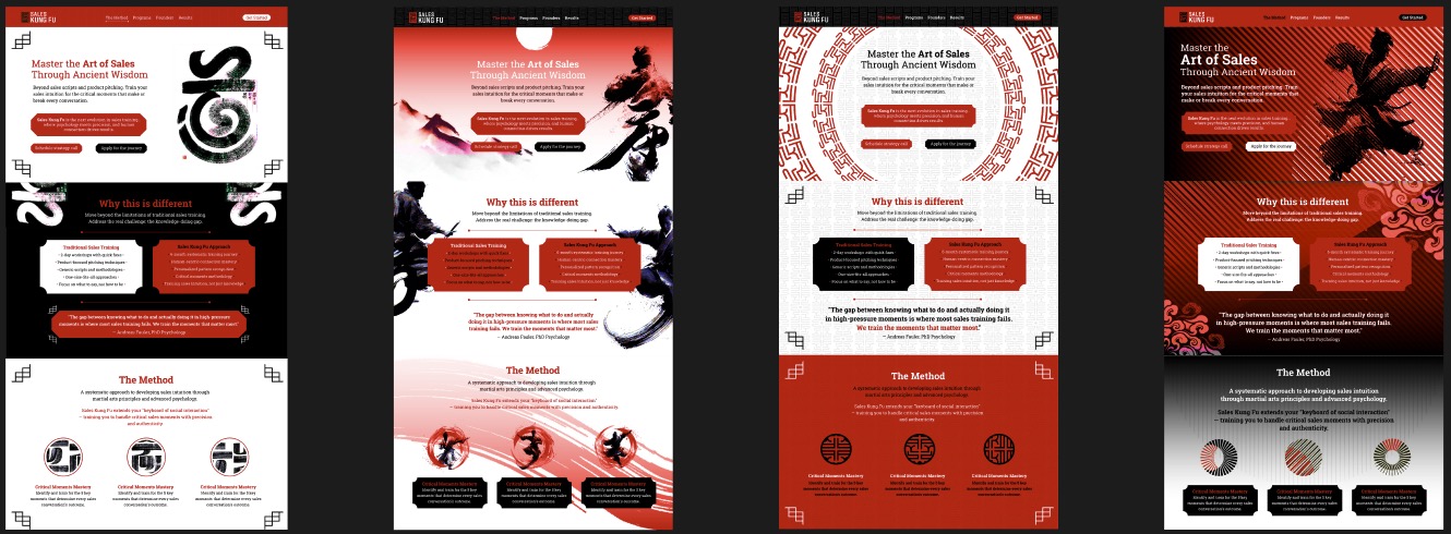
Will Dragon: Cool. So just bear in mind that everything that we've got here is just a sketch. Even though it doesn't look like a sketch. It's just some ideas to kind of get conversation started on what we think or where we think sales. Kung Fu needs to be visually. So obviously keeping with the red, white and black theme, that can be toned up or down. I think maybe the fourth one is a little too dark, but, you know, it was just an alternative to what we've got. So just to go through them one by one. The thought on this one was to use the Chinese brush calligraphy to create. Not this. This is just a. This is just a visual representation of what potentially we could do. So we would create our own brush strokes that would. Could either represent a character, like a kind of kung fu character or someone like a kind of pose or something like that. Or we could just create some abstract kind of shapes that then start to represent various things within the sales kung fu world. And we can use these also for the. So for instance, in the method at the bottom here we've got. We're showing these might be representing the gates or something like that. So we can start to use this kind of like visual language throughout everything that we do. And then we've just got some kind of very simple graphic devices that hark back to some kung fu film posters and that kind of stuff. So again, it's just kind of using that. That kind of sort of visual identity that we see from a lot of kung fu kind of films, etc. Etc. So, yeah, I mean, that's. That's really where that one came from. So I think I. I like it. I think there are kind of, you know, you're kind of fusing quite sort of quite a modern look with some visual language that harks back to very early Chinese culture. So that, you know, we're kind of implying that ancient wisdom that we're talking about is. Is kind of present in what we do. So that's really where that idea came from.
00:20:14
James Redenbaugh: The.
00:20:15
Will Dragon: The next one kind of follows on from that, but taking it another stage. So this was more inspired by, I think, the stuff that James had done very quickly in AI the kind of visuals that you'd shown the other last meeting where you had a kind of character on the hill, the silhouette. So this was kind of taking that idea and just kind of expanding on that really, which was again focusing on that Chinese brushstroke calligraphy, which I think is very elegant and has a kind of beautiful flow to it. And then. So we start to get some kind of landscapes and this kind of character who's almost made up of the calligraphy, but he's also, you know, you can kind of see that there's, you know, a physical human character there. And then. And then again on this page, we're just expanding on that so you can again clearly see these kind of like kung fu characters being created from the brush strokes. And again, something we could use in the method and Other as a visual kind of language. Throughout this style we could create a number of characters or poses or, you know. So again, it's quite versatile. I like the kind of brushstroke idea. Again, it feels fluid, like Bruce Lee, you know, be the water. I don't know if I'm misquoting him there. So again, I, I, I kind of like what we've got here because it focuses on.
00:22:05
Andy Bittner: That.
00:22:07
Will Dragon: The thing is, sorry, to just kind of like break off. The thing is with Kung Fu is that it's a difficult thing to represent because it's very physical and there are certain things that are aligned with it, which is obviously fighting violence, you know, and things like that we might not, we might want to lean on but we might want to steer away from as well. So there's something that, where we have to be careful about maybe how combative we make what we do, if that makes sense. So some of the poses and things like that are not so kind of confrontational as it were. They're more elegant, which is something that I think this one does well in focusing on because you've got the mix of calligraphy and character, etc. Because again, we just need to be mindful of the audience that we're talking to is going to be, not everyone's going to be a massive Kung fu fan, but you know, equally we want to appeal to them across both sexes, genders, you know, whatever. So it has to be something that can be elegant yet also have a nod to that kung fu kind of visual identity. This one is something that is very much based on some stuff that I'd already done for Andreas and Frank. So with some of the early identity work we'd looked at. So this is using the sales Kung Fu identity to create a pattern. So again, this one's much cleaner, kind of is probably the most basic one, but again gives us quite a strong identity in the patterns that, you know, hark back to a lot of kind of Chinese culture and textiles, et cetera. So we're still getting that Kung fu esque visual look and feel, but without, like I just mentioned, having characters that could be misinterpreted or, you know, not particularly liked by certain people. So, you know, it's just something gives us another option. Again, using, we could start to create. This is just something done very simply and basic using these visual identity, the visuals at the bottom here, but more to show how we could create certain graphic symbols that could be used across all of the gates. And also just as navigation tools within the website so we could create our own visual language using this type of thing. Again, these were just done very quickly to kind of be representative of that. And the final one is maybe the most out there. I don't know, but it's, it's. So it's using again, the kind of character, but again, just applying this dynamic kind of graphic feel to it that makes it feel a little bit more modern, a bit more. A bit more. Has a bit more energy in it. And again, just using very simple graphic devices from Chinese culture. Again, we've got a kind of like the red sun here, maybe like a kind of like hillside, but just done so that it's not overtly obvious what it is, but it just kind of like nods back to, again, Chinese kind of art and things like that. And then one thing to explore would be the use of pattern and shape. Again, we could create our own series of graphic devices that could be used to represent various aspects of cells. Kung fu. And again, they did this kind of graphic style links back to the kind of visual that we were kind of creating at the top end there. So this one's a bit more dynamic. There's room for exploration in it. At the moment it's very dark. I'd say it's probably too dark, but I just wanted to throw something out there that the other three didn't kind of have as much. So the other first three were very clean. This one's maybe a bit more. A bit more moody, a bit more edgy. All of the designs, layout wise, follow closely with what James had done initially. And I know that, James, you've just done this to kind of get some information on the page and to get some kind of structure. So, of course, you know, we can do whatever we want with the designs, but I just kind of stuck with what we had at the moment without kind of trying to break away and do anything too exploratory outside of what we already had as a kind of structure. But of course, everything, you know, is up for discussion and can be changed, moved. And it was really just to kind of get a visual look and feel and to see if there was anything that kind of stuck with you guys or anything you liked. Hopefully there was some aspects of it that you like. If not, then obviously, you know, we can go back to the drumming board, but it just gives us something to kind of play off and discuss about what you might like or what you dislike. You know, if anything's right or wrong, then obviously, yeah, like, I Said hopefully there's enough here to give us some talking points.
00:28:26
James Redenbaugh: Great. Andreas and Frank, what are your impressions?
00:28:35
Andreas Fauler: I like the brush strokes very much, so I think a little bit less red, probably I would really be more. Yeah. So I like 1 and 3 most from the visual, let's say experience, and probably a little. I like both very much and probably one the most because I like the brushstrokes idea. Question is, can we come up with elements that are somehow that can have some information in there? So can we create some visuals that have some kind of reconnaissance elements so that we can say if we use it, you can recognize it and see, okay, this stands for that. But probably that's a little bit of a challenge. But if we can get there would be even greater. Of course.
00:29:33
Will Dragon: Yeah. I mean, there are certain things we can do, Andreas, in regards to. So for instance, if you needed things like, you know, things like targets and things like that and to show movement.
00:29:43
Frank Kuhnecke: And.
00:29:45
Will Dragon: It becomes quite difficult if you want to be too specific about what you're describing. I completely get what you're saying. You know, if we're going to use them as icons almost, then, you know, we need to. To try and represent things that, you know, people can maybe make a connection to. But whether that's done in a more of an abstract way is. Is something that we can obviously look at. But I think for me it was more about a starting point around, you know, to find out what. What you guys really kind of liked. And then from any feedback we can take, I can take that forward and then start to explore maybe some more graphic elements. And I think once we also find out, I think there might be a need to have our own icons anyway, because icons are always useful. So maybe we have a top level thing where we can start to use maybe some of these symbols and brush strokes to represent the larger top end things, top level. And then once we bring it down a level, we can have some icons that would work as icons should do. So they're much more, from a utility point of view, easier to understand and easier to use because we don't want people to have to kind of try and dissect what we're discussing each time. If it's too abstract, people just won't get it. I think, you know, obviously we can look at that side of things as well.
00:31:30
Andreas Fauler: Frank.
00:31:35
Frank Kuhnecke: My first impression, I'm overwhelmed, like feeling acceleration with a Honda fireblade.
00:31:44
James Redenbaugh: Boom.
00:31:48
Frank Kuhnecke: And first, I'm impressed how much you can do with the small informations. My problem is what I Like most for me, but it's. For me, it's number two. But the bait must appeal. The fish, not the fishermen. This. I. I don't know really whether it's too massive, but I don't. At the moment, I'm overwhelmed. I like it. The. The force is too dark. That's fine.
00:32:32
Will Dragon: Yeah.
00:32:32
Frank Kuhnecke: The queen of the third feels most easy, but. But because I know all the symbols already, I have seen them a lot of times. And since Kahneman, we know what you see often you like. It's number two. Maybe it's. It's a little bit too much dynamic, but it's. It's only a feeling. I. I can't say very specifically.
00:33:05
Andreas Fauler: With two, I would remove the red in the background. I would just have black and white and. And then some few. Very few red elements. So I would say this is. But also I would say the brush strokes. And I think we agree on the brush strokes somehow. And I would remove the red in the background there with two. The brush strokes with the blue or. Yeah.
00:33:28
Will Dragon: So just. Just to kind of jump in as well. And I don't want to dilute what we've got here or done here, but the thing is that we can always borrow elements from without, you know, making it too much of too confusing. But if, for instance, there are some elements in number three that we like, because we've already got that established, then we can always introduce those to the website as well. So, you know, we don't have to stick on maybe one route, as it were. You know, if there are elements that we like that we can use to kind of pick and kind of mix and blend together, as long as it doesn't look too messy and the graphic language is still understandable from what we're kind of doing. It doesn't feel too much of a kind of mishmash, then there's no harm in kind of saying, okay, well, maybe we take some of these elements from number three and we use those with number one or two, for instance. So it just allows us to kind of mix that up, because I think some of the patterns and the backgrounds in number three are really nice. And maybe we can use those on some of the pages in, you know, number one and two, for instance, so that there's still some flexibility here in what we do.
00:34:46
Frank Kuhnecke: I try another approach on number two. The feeling I got is a lot of fighting, and the feeling I don't see is the art of precision and exercise. I can't explain it better.
00:35:11
Will Dragon: Yeah.
00:35:13
Frank Kuhnecke: And what I would like to avoid Is the feeling we are training hard, sales being very tough. It is a balance between relationship and precision. But I can't explain it. I can't translate it into graphics.
00:35:36
Will Dragon: Yeah. I mean, it's interesting you say that, Frank, because I think that was my. It's kind of what I touched on earlier is that obviously when you look at a lot of the visual language around kung fu, a lot of it is fighting and a lot of it is, you know, people, you know, you look at the posters and, you know, they're quite combative in their, you know, the. The kind of subject matter. So, you know, the Western view.
00:36:05
Frank Kuhnecke: In the Chinese view, Kung Fujiang White crane. This is. That's typist European. And in the Chinese way, Kung fu means a lots of repetition and hard work.
00:36:24
Will Dragon: Okay.
00:36:24
Frank Kuhnecke: Well, you can have a kung fu of cooking noodles.
00:36:30
Will Dragon: Yeah.
00:36:32
Frank Kuhnecke: That's another mental set. And if you go to Chinese kung fu training, they fight really rare.
00:36:42
James Redenbaugh: Okay.
00:36:42
Frank Kuhnecke: The exercise. The exercise. Exercise.
00:36:46
Will Dragon: Yeah.
00:36:46
Andreas Fauler: The wood tree. You. You are training with a wood tree, and probably you've seen it with these three, and you work with it hours and do exactly the same. And I like this picture, for example, if you go very picturesque, probably this is something. Yeah.
00:37:08
Frank Kuhnecke: I have one in the cellar. I can send you a photo.
00:37:16
Andreas Fauler: And it's more. It should be more of a dance than a fight, I would say. So just.
00:37:21
James Redenbaugh: Yeah.
00:37:22
Frank Kuhnecke: The feeling is, let's avoid too much impression of hard fighting and go more in the direction of precision and repetition and art. But I can't translate it into pictures. Maybe the. The gesture of the people is too aggressive.
00:37:48
Will Dragon: Yeah.
00:37:52
Frank Kuhnecke: And Kung fu. Okay.
00:38:01
Will Dragon: Andreas, can you meet? Okay.
00:38:03
James Redenbaugh: Okay.
00:38:03
Frank Kuhnecke: And for example, even qigong is kung fu. If you need pictures from qigong, there's a lot of standing. Yeah, that's, you know, the second one is funny. That's. It's the artwork, but doesn't work. But the left one, it's. It's correct. But the. The gesture is very wrong. Doesn't matter. And they have a lot of these training materials to do it 1,000 times because a partner will be. Get bored. So Kung fu is not only is a very dynamic. What you have, it's. It's background information. What you have on pictures is always the very expressive northern style big movements. And if you look for qigong, for example, there are small movements, they're more centered. But I. I don't want to make a page about kung fu.
00:39:11
Will Dragon: Yeah.
00:39:11
Frank Kuhnecke: I try to express a feeling that I got.
00:39:18
Will Dragon: Yeah.
00:39:19
Frank Kuhnecke: I hope you can understand what I mean.
00:39:21
Will Dragon: No, I completely understand what you mean. I think for us it's just going to be difficult to show that. I mean, maybe it's the fluid movement and things like that that kind of work. And for me it's maybe more. Is Tai Chi even close to kind of more that the kind of poses that we're after, or is that wrong as well?
00:39:46
Frank Kuhnecke: No, Tai Chi is Kung Fu and for instance, is one of the most deadliest Kung Fu. But if it's correct for Chinese Kung Fu, it doesn't matter for me is important. I don't want to repel some persons who are not aggressive.
00:40:10
Will Dragon: Yeah, yeah. I think that was my fear was anything where we're showing, you know, kind of fighting poses and things like that, it can start to feel quite aggressive, which is obviously not what we want to. We don't want to put that across. So kind of showing a kind of fluidity and the movement and maybe a journey is maybe closer to where we need to be with it. So maybe I'll look at some examples of that and see how that, that works. Just to let you know that the stuff in number two was generated using AI. So there's, you know, I was really happy with the results actually. I think what AI kind of throughout was actually, you know, pretty cool. So I think there's some stuff that we can do to look at how to produce these images as well to get something that really works for us, whether we then use those in their AI format or whether I recreate them to kind of make them closer to where we need to be. That, you know, I think either way is going to give us some good results. So, yeah, I mean, there's definitely room for exploration if that's one of the routes that you want to. Want me to explore. And then again, I think like you said, number one was something that you're interested in. Andreas and Frank, did you think number one was something that potentially could work?
00:41:48
Frank Kuhnecke: I don't understand the science there for the random.
00:41:54
Will Dragon: Yeah, I mean, at the moment they're random, but I think it was more about whether that there was something in that we could use from a kind of brushstroke point of view that you could create graphic patterns and devices that could then potentially we could use to. Yeah. Talk about the kind of keywords that we're going to be looking at, which might be precision, might be target, might be, you know, those types of things. So whether there was that, we could then start to use that calligraphy brushstroke style for at the moment. The one that I've dropped in there is, again, like I say, it was just something I grabbed off the Internet and used as a visual to kind of get across the idea. But I think something we could use to explore. So, again, whether that. That becomes a character forming a pose or something is something that potentially we could explore further.
00:42:55
Frank Kuhnecke: So to answer your question, on. On number one, the brushstroke. I think it's a good idea. Like Chinese pencil writing or Chinese calligraphy. That's fine. To have symbols in a circle looks fine. For me, I would avoid the black background because it's very massive.
00:43:24
Will Dragon: Yeah.
00:43:31
Andreas Fauler: Get from the impression the most. It's somehow clean, but it has some dynamic. It is. Can be repeated.
00:43:40
Andy Bittner: Sorry.
00:43:42
Andreas Fauler: Yeah, sorry. You can repeatedly use it. And I like the pictograms on the bottom the most. On the bottom. On the top, probably we have a fighter in the same style, probably mix. And what I like with the Kung Fu, I like the normal pose. So there is a specific stand which is very centered. And as far as I understand. But Frank, please correct me. Kung Fu is more about hand movements than leg movements. So I would say the strong stand is one of the elements that I like very much and that it also, for me, resonates very well with what we do. You're standing on two legs and you're un. You cannot be thrown away. And then you can. Based on this stand, you can do great moves and create impact. This kind of style, if you think about a fighter, I think would be very nice from my perspective.
00:44:43
Will Dragon: Okay. Yeah, I think there's. There's definitely room for exploration in the first two, for sure. I think number three for us is something that, like I said, I think we can always fall back on if we want to use. It's based on the kind of style that we initially created from the kind of toolkit. So those are elements that we already have. So those, you know, we can always fall back on if we want to use it anywhere across the website or, you know, in the future anyway. So I think, you know, that's fine. And I don't think potentially we explore that any further. So. Yeah. One and two.
00:45:31
Andreas Fauler: Yeah. But if I see the background, I love the background with a. With a slide. Like the slide forms on three, though. You have not a pure black background. Yeah, yeah. I mean, I'm somewhere between 1 and 3, to be honest, but okay.
00:45:50
Will Dragon: 1 and 3. Okay.
00:45:52
Andreas Fauler: The red on the bottom is too much red or too symmetric, probably. I don't know, probably there needs to be some element that is not symmetric based on this, but. No, yeah, exactly.
00:46:05
Will Dragon: Yeah.
00:46:08
Andreas Fauler: It's very elegant.
00:46:11
Andy Bittner: And I like the circles in the first section. Just kind of an elite impression. And the first one is very clean. I also like the black background because it gives some contrast, which I'm missing in the second one. So you don't. You can't really distinguish between sections in the second one. It's like, all in one might be harder to, like, consume the content for a visitor compared to being able to, like, consume each section one by one. But I don't like too much red because the red is so bright and aggressive.
00:46:51
James Redenbaugh: I like the black.
00:46:52
Andy Bittner: It gets like a. It's quiet. It's not. It's bold. But it also gives some calmness.
00:46:59
Will Dragon: I think the one thing I did like. Sorry, Andy, I was going to say one of the things I did like about number one was the way that the white panel at the top and then the graphic symbols in the white bled into the black. So you started to get this kind of connection between those two pages. But again, something that, you know, we could have explored further. But I thought that was quite interesting.
00:47:25
Andy Bittner: I'm with you here. Like, I like the first version the most. I also like the third one. But, yeah, the red background is a bit too much. Maybe a bit less opacity in the background. Even less, maybe. It's kind of distracting still. And the circles. I like the circle in the background. Like, it gives. You can use it for, like, the elite program, like, for a VIP community kind of thing. So it, like, emphasizes it that this is like your circle, your elite circle, VIP circle or something. You can just use it for some inner page. We don't have to use everything on every page. So you can, as you said, reuse some elements and just combine them together and just use them on some pages sometimes not. Yeah, way better. Red already. Not like that much in your face.
00:48:23
Will Dragon: Yeah.
00:48:24
Andy Bittner: Because the other one is really, like, bright.
00:48:29
James Redenbaugh: Yeah. I wonder. I think that the red that is here could be good for the logo and certain calls to action.
00:48:41
Will Dragon: Yeah.
00:48:42
James Redenbaugh: Having so much of. Feels like it flattens everything too much and dilutes the water. But first of all, overall, I haven't really shared much. I think there's so much great stuff to work with here and really awesome elements. I really like the. I love the circles here. I love the subtle backgrounds. I think that there's a lot we can do with brush strokes. And then I think more of the subtlety and the dimensionality and the fluidity and the journey can come in with evolving these reds a bit, I think, darkening, creative, creating some more negative space and some ways to contrast the sections that maybe aren't necessarily as dramatic as this black and white. And you know, we should also keep in mind the homepage is more than three sections. So, yeah, you know, the difference here feels very dramatic, but it might be appropriate for like the main call to action and. But yeah, so I think we should definitely explore some darker reds. I love these icons. These are my favorite because it feels like they can, you know, this language could be easily used to be more didactic and descriptive of actual things. It'd be exciting to use, you know, one of these styles to communicate these kind of concepts, you know, relevant concepts. And yeah, as we can see, as brought in a bunch of inspiration and, you know, we can drop some more in. I think that it's nice to see, you know, what we're calling the fighters because we want to. We want the user to see themselves on the website in these figures, but maybe they are in, you know, in more passive stances as well or even, you know, I really like this simplicity of this meditator who still feels like he's a kung fu guy, but he has all this space around him. And yeah, I think as the page gets larger as well, there might be some graphic elements that expand between sections. Some like really, you know, large elements that go into the background and move people through the site in a nice way.
00:52:05
Will Dragon: I think one of the. It's interesting, James, that you've in.
00:52:09
James Redenbaugh: In the.
00:52:12
Will Dragon: The examples you've shown one of the things that worked really well and works really well in Chinese art. And there was actually a modern Chinese artist I looked at, and she used a lot of large expanse of white with this beautiful brush strokes, black brush strokes. And then just using like maybe like one character, like a very small person in this huge landscape would be in red. So that red is just a very simple highlighting thing, device that is used. And so I completely agree with you guys that, you know, there's probably too much red here. And if we can find ways of using red as a highlighter, then maybe that can be something that we can use to kind of like, kind of navigate and describe a journey. Which is, again, I think, you know, between the first three, I think we're all agreed that the first three are probably working the best. That, you know, there's. There's elements where we could maybe do that. So once we've got a clearer kind of understanding of the structure of the site, then perhaps there's a journey that could be taken that is more fluid and we use little elements of red that maybe pick out certain things on that journey and if that makes sense. But again, that's probably going to be quite complicated to do, so we'll see how that kind of plays off. But I think there's definitely something beautiful in that, using the white space, the black, and then these little things of elements of red to pull out, call to actions or key points, etc.
00:53:58
James Redenbaugh: Yeah. Awesome. Will you and I can go back and forth a bit and, you know, tag team some stuff before the next call? I'm, I'm definitely excited to dig into this more and see it come together and we could also evolve and kind of solidify a palette. I think it'd be good to consider two different reds and use the brighter red, especially for calls to actions and buttons, just to make it really clear to the user what we want them to click on.
00:54:46
Will Dragon: Yeah, for sure.
00:54:50
James Redenbaugh: And this slap Serif font, is this something that you guys established in your initial work? Just curious about the.
00:55:02
Will Dragon: Yeah. So the font was. I can't remember what the font was now. I think it was Roboto. So it's, it was, it was just a Google font that I just chose because initially were choosing some fonts that maybe the guys could then use because Andreas was looking for a templated format that he could then do stuff with on LinkedIn, etc. So I chose a font that was going to be a Google font because obviously then that's just available universally for anyone to pick up as opposed to one of these flashy Adobe fonts that then no one can get hold of unless they spend like $1,000 or whatever it is. So again, the font is completely up for grabs, you know, again, whatever the guys are happy with or. James, if you've got any other suggestions. I'm, I'm not set on. Set on the font really. So.
00:55:58
James Redenbaugh: I, I like it. I think it works really well for headlines, especially with the mixing of the bold and the thinner variation in these headlines here. I wonder if it should be complemented with a, a simpler font. I'm not sure we can play with it.
00:56:30
Andreas Fauler: Yeah, I like the fonts also, but probably with the leaves, I wouldn't do it with fat. So with the bold thing, but with the version without The Zerifs. So for the headlines I would use it probably without the reefs and for the normal text with the reefs but not gold. But I like the fonts very much, to be honest with.
00:57:01
James Redenbaugh: Cool. Well, let's play with it and see what's going to work best here.
00:57:10
Will Dragon: Just to let you guys know, I'm actually going to be away next week and I think Andreas is maybe away as well. I'm away from the 19th Tuesday, so I'm not. I'll be available, James, to have a catch up obviously on anything up until then. But yeah, just to let you know, I will be out of action really to get any. Anything substantial done for a week from next Tuesday.
00:57:41
James Redenbaugh: Cool, that's totally fine. Like you said, let's jam on some stuff until then. And then while you're gone, I can keep jamming. Andy, you're fully invited as well to jam out. And then when you both are back in, we can hone in on clear direction and concept. So I think it. In the meantime too, by the time you're back, we should have all the content in place in a. A workable format either in Figma or Illustrator. Because I know you're more in. In Illustrator.
00:58:47
Will Dragon: Apologies, I just. I just had to do all this in Illustrator because it was so long to do it in. In Figma. By the time I'd learned how to work everything, I thought I'd just do it and then we can move everything across.
00:59:00
James Redenbaugh: Yeah, no, it's totally fine. I don't even know if we need to move it across because, you know, maybe we can just stay in Illustrator. It's just, you know, Figma is great for these kind of conversations and to have everything in one place that we can all access. But I'm faster in Illustrator also, so we can just, you know, share Illustrator files as well and play in there. So. And yeah, so I'll, you know, once these guys are done with the content, I'll bring it together either in here or Illustrator. If I do it in here, we can export it into Illustrator and then get a lot more finite about the design and what's going to go where and how that journey is going to be.
01:00:05
Will Dragon: Okay, cool.
01:00:11
James Redenbaugh: Cool beans.
01:00:15
Will Dragon: Awesome. Well, thank you guys. I'm just glad you liked something. I'll take something as a result.
01:00:24
Andreas Fauler: Thanks a lot to everybody. Great work so far. Fast start.
01:00:29
James Redenbaugh: Yeah. Thank you guys so much. Andres and Frank, why don't you let me know when you're. When you reach a point of completion in the. In the content, either using the doc that I shared or just making your own compilation docs. Whatever works best for you is totally fine. But just let me know when it's when it feels like solid. And that doesn't mean you know every word is perfect or we won't add something later, but when you feel like you fully digested it. And if you want my help, you know, if you're struggling to really say something or find the right words, you know, just highlight it, leave a comment, share your ideas about it and I'm happy to hop in there and help out. Yeah. Okie dokie guys.
01:01:29
Will Dragon: Awesome.
01:01:32
Andreas Fauler: Well thank yeah I will be away two weeks now so probably I will do some one run on the content but probably it will not be fun. But yeah, then the rest after the vacation.
01:01:45
James Redenbaugh: Cool. All right. We'll have some awesome vacations.
01:01:50
Will Dragon: Thank you.
01:01:52
James Redenbaugh: And we'll see you all when you get back.
01:01:54
Will Dragon: Yeah. Okay. We'll catch up soon.
01:01:57
James Redenbaugh: All right, take care. Bye Bye.
01:01:59
Andreas Fauler: Thanks a lot.
01:02:00
James Redenbaugh: Go.


.png)