


David Tusek and Ava Tusek presented their plan to completely overhaul the Cloud Medical website [tag="webflow"] and integrate CloudX as a premium sub-offering. Working with a robust coaching organization that provides guidance on financials and marketing, they've identified two critical needs: gutting the outdated main website that's causing misinformation and confusion, and repositioning CloudX as a premium tab within a unified Cloud Medical site rather than a standalone property.
The goal is to create an aesthetically integrated experience where CloudX appears as a premier offering within the same company, maintaining visual cohesion while clearly differentiating the service tiers.
The existing Cloud Medical site has several problems that need addressing (02:35):
Ava has completely rewritten the homepage copy with a clearer value proposition, integrated video embed, updated membership menu, and prominent testimonial placement using patient names and demographics for authenticity.
Ava shared reference websites in the healthcare space that capture the desired aesthetic (06:08). The key attributes they're targeting:
Brand positioning philosophy (23:00): Think of it like air travel - CloudX is business class while Cloud DPC is economy. Same plane, same destination, both great experiences, but CloudX offers white glove, enterprise-level care. CloudX at $1,200/month is literally 10x the price of Cloud DPC at $139/month, serving high performers while Cloud DPC serves families excellently.
The condensed structure will feature (14:02):
Current "Details" and "FAQ" tabs need significant streamlining (12:00). Rather than overwhelming text, the plan is to create a single condensed page (possibly "Cloud Philosophy" or "Why Cloud" or "About Cloud") featuring a video of Dr. Tusek explaining why they left the insurance sphere and how Cloud serves as "David to the Goliath of traditional health insurance."
Cloud offers services beyond traditional primary care that need visibility:
These could be featured in their own tab or integrated into the homepage.
David wants to preserve the work invested in the original CloudX site while making necessary refinements (20:15). The three-dimensional globe with contained X-sphere design should be adapted for Cloud Medical's logo, incorporating the M shape that represents multiple elements:
The CloudX logo with its "web flowiness" should remain as-is for the premium tier.
One concern raised: CloudX currently lacks visual cues that it's a healthcare company without the presence of people in imagery (07:30). Adding human elements would strengthen immediate recognition.
This is positioned as a relatively tight, MVP-level upgrade with elegant execution rather than a complete reinvention (15:10). Future enhancements could include:
Ava suggested some sections like Events could launch with "coming soon" placeholders that capture newsletter signups rather than fully built-out functionality, respecting the tight timeline and budget.
Timeline: Mid to late January 2025 target for launch (17:15)
Budget: Estimated range of $2,000-$5,000, with preference toward lower end. Ava noted their recent Google Ads landing page cost $1,250 for reference.
Resources: James confirmed the tight timeline and budget but identified low-hanging fruit opportunities given existing CloudX work and Ava's thorough content preparation. Proposal will include tiered options - smaller scope for January launch with roadmap for continued development and refinement.
Review shared content document in detail
December 23, 2025
Review content document provided by Ava with homepage rewrite, value proposition, video embed, membership menu, and testimonial content
Create visual sitemap and structure guide showing page relationships
December 27, 2025
Develop sitemap showing: homepage, CloudX tab, membership menu, events, media, patient login, and condensed philosophy/about page. Show how users navigate between Cloud DPC and CloudX tiers.
Develop tiered proposal with multiple budget options
December 30, 2025
Create proposal with bigger and smaller scope options. Include MVP-level upgrade for January launch ($2,000-$5,000 range, preference toward lower end) plus roadmap for future enhancements (biometrics visualizations, streamlined signup flow, integration work). Reference: recent Google Ads landing page cost $1,250.
Present logo adaptation options for Cloud Medical
January 10, 2026
Develop logo options incorporating M shape representing: Twin Peaks visible from Colorado's Front Range, EKG symbol for medical connection, CM inverted (Cloud Medical Center initials), and mountain symbolism. Should match CloudX aesthetic while working for main Cloud Medical brand. Preserve CloudX globe/X-sphere design for premium tier.
Consider creating Miro board for page structure and interactions
December 27, 2025
Optional: Flesh out page structure and user interactions in Miro if helpful for James's team to visualize content relationships, navigation flow, and tier differentiation between Cloud DPC and CloudX
Determine which content sections can launch with coming soon placeholders
December 27, 2025
Identify sections like Events that could launch with 'coming soon' placeholders capturing newsletter signups rather than fully built-out functionality. Prioritize what's essential for January launch vs. future enhancements.
Finalize which specialty services to feature prominently
December 27, 2025
Determine prominence and placement for specialty services: hormone replacement therapy (HRT), peptides, GLP-1s, and functionally informed approach. Decide if these need dedicated tab or homepage integration.
Complete website overhaul for Cloud Medical Center with CloudX integration as premium sub-offering. Current site has dark aesthetic, information overload, poor architecture, and minimal social proof. New site will feature unified brand experience with CloudX as business-class tier and Cloud DPC as economy tier. Includes homepage rewrite, condensed navigation, embedded video content, prominent testimonials, and specialty services highlight (HRT, peptides, GLP-1s). Logo adaptation to incorporate M shape representing Twin Peaks, EKG symbol, and CM initials. CloudX remains as premium tier with existing globe/X-sphere design.
Strategic planning for Cloud Medical website overhaul completed. Identified key issues with existing site (dark aesthetic, information overload, poor IA, minimal social proof). Established two-tier positioning strategy (CloudX as business class, Cloud DPC as economy). Defined content consolidation approach, retained sections (Events, Media, Patient Login), and specialty services to highlight. Budget range established at $2,000-$5,000 with preference toward lower end.
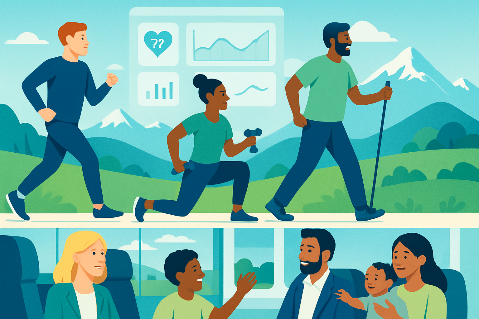
Visual design development for Cloud Medical website featuring human-centered visuals, modern clean aesthetic, bright and optimistic tone. Key design elements include: people moving and interacting with family, elevated healthcare feel distinct from insurance carriers, social proof integration with Heads Up Health dashboards showing biomarker results. Logo adaptation work to incorporate M shape (Twin Peaks, EKG symbol, CM initials, mountain symbolism) while maintaining CloudX globe/X-sphere design for premium tier. Design must create cohesive visual experience across both service tiers while clearly differentiating CloudX premium positioning.
00:00:00
David Tusek: Out and have kind of, you know, started and stopped and reposition.
00:00:05
James Redenbaugh: This meeting is being recorded.
00:00:08
David Tusek: Appreciate your patience with us on all of that. I'm going to let AA kind of pilot this ship for us today because she's really on top of it. But just to kind of paint the picture for you, James. So we are working with a very robust coaching organization that provides a lot of deep assistance for us as we think through financials, as we think through marketing plans and they have specialists in all these different domains and we're really being guided and I think it's, it's probably the right move to do two things that are relevant to you and your team. One is to really just gut our old website. Like it's causing a lot of problems, honestly a lot of misinformation there, a lot of confusion and just we need to streamline it, make it clean. It's a, it's a bit of a disaster and that predated you guys obviously. And then two, what to do with the CloudX website, where to put it, where to host it. And our current thinking is, is that it should actually be a sub tab of the cloud, the new cloud website. And so Ava and the marketing team and the people that are really smart and website building, messaging and storytelling on in our coaching platform. And to some degree I think there were one or two conversations with Ellen that may have helped, although they were focused more on kind of this new end of year re enrollment period. Not really a brand new website. Regardless, we have input about that and we want to kind of fast track building that out and then plug CloudX into that, have it all be aesthetically integrated so that the visuals and the icons and logos that we use feel flowy, like it's basically just a premier offer within the same company. So what, what do you want to add to that kid?
00:02:35
Ava Tusek: I do have some additions, but first, James, initial thoughts, questions, concerns?
00:02:43
James Redenbaugh: Yeah, sounds pretty clear. Sounds like a good thing to do.
00:02:49
Ava Tusek: Awesome. I am going to share my screen if you don't mind. So this is our current website as it exists. I remember you were actually the one who sort of pointed out some of the visual issues that are here. It's a little bit dark tonally. I mean visually it doesn't necessarily exude positivity and brightness. This guy kind of looks like he's spreading, struggling and you know, if I sit there and think about it, I can make the connection of like, okay, your healthcare is a journey and it's kind of uphill and eventually you get sort of to a summit. But as we know about people, most people kind of need to see a visual cue right away, otherwise they lose interest or they don't feel connected to it. And then to my dad's point, just kind of lots of information here that doesn't actually explain what the clear offering is. And so one of the things that we did was go through and make complete and utter updates to the entire copy. So I've got this long page here for the homepage. I think it's relatively clear we're going to embed a video into the homepage as well. We have a new membership menu so that as people are scrolling down, they are able to get to kind of the point and then the call to action. We really want to integrate these incredible testimonials that we've gathered over the years, and ideally do it in a way that's more visually interesting than just like the rotating carousel of like Google Ad reviews that you see on a lot of websites. You know, we've gotten permission to grab people's names and ages and so to really highlight like the demographics there, build an faq, et cetera, and kind of just take this to make sure that these additional tabs, which are often where people have to go to find the core information, like our rates and the philosophy and the personalized. These are the tabs that actually contain a lot of the messaging that we want patients to be seeing, actually right up here. So that's why we've redone sort of the copy and the flow. But there are just a couple of websites in this space that I have been admired for a long time because I find them just visually interesting and bright. And my favorite thing about them is that they also, they tend to highlight like people like, you can tell that this is a healthcare company. There are different people, they're moving, they've got, you know, videos that are integrated, neat graphics and design. And I think it, it, you know, it looks modern, it looks clean, it looks fresh. It definitely does not look like what you would expect your insurance carrier's website to look like. Like, this feels elevated. And this is really the, I mean, this is kind of the vibe that we're trying to unlock for cloud as a company. So not even just CloudX, but Cloud DPC is already 10x, the medical experience that you get within a traditional primary care clinic. And so how do we convey that through visuals? I mean, knowing that optimization and prevention are two of our main core values, how can we convey that with colors and light and graphics and movement and Videos and things like that. And some of these ongoing biomarkers we've partnered with Heads Up Health and so we actually have dashboards that sort of do the same thing and present the same visual prevent actual results for people, which is another, I mean, social proof does not really exist on our website. I think there might be a, a singular testimonial somewhere in here, but you have to go hunting to look for it. So to establish that proof right on the front page, make it feel a little bit homier and kind of give it the same like escalated or elevated feel that CloudX has. My only I think, piece of feedback for CloudX is that without the presence of people, it's hard for me to tell visually that this is a healthcare company. Like the copy all indicates that it's about medicine and healing and wellness. But I think some of these more, you know, again I, these websites are actually relatively basic despite having some cool gadgets. And so I'm not necessarily thinking that we need to like reinvent the wheel, but I appreciate they've got people. You know, this guy's active and he's also not, you know, he's clearly not a professional athlete. None of these people are, but they're just going about their lives and enjoying, you know, interacting with family and stuff. And I think that that would be something that we'd want to capture and imprint upon people from kind of the get go that this is for you, this is for your family and we're going to get you feeling better. So to my dad's point, I think that the, if I pop back in here on the homepage, all of this, like from our approach and our reviews and sort of how it works, that's actually pretty consistent across Cloud D and CloudX. And so I don't think that we need to present them on the homepage as totally separate offerings until we reach this sort of membership menu, at which point they can kind of visually determine, oh, I, you know, I want Dr. T to be my doctor. I'm definitely looking for the higher ticket offering and that would be, you know, you'd have your call to action here and then, you know, somewhere on the top, oops, somewhere on the top there would be, rather than details, perhaps it would say, you know, inquire about CloudX and then pop you into the page that is about Cloud X. But yeah, I spoke a lot. Does that track at all?
00:08:44
James Redenbaugh: Yeah, totally. This is awesome. Seems like you've really thought it through. Structure at first glance, looks great and makes a ton of sense at this point, I think we built the CloudX website like a couple years ago. And so yeah, if we were to kind of adapt it for the main, the main offering and put everything together, I think that there's more that we can do to, to refine things and make things pop in the right way, like the examples that you shared. So yeah, I think there's a ton we can, we can do here to help out.
00:09:36
Ava Tusek: And as far as the scope of the project, do you have any like initial gut estimates on pricing and timeline and you know, how many cooks would have to be in the kitchen? Because I'm assuming that you no longer spearhead all of you've got the people who can help with some of these more basic tasks. So I guess just what does that look like?
00:09:58
James Redenbaugh: Yeah, I'd love to have a deeper look at that document to generate a clear estimate. And besides the homepage, What, What other major content areas are there going to be on the website? What are, what are we keeping? Yeah, how can you give me a better sense of, you know, of the scope of what's, what's going to need to be included here?
00:10:41
Ava Tusek: Yeah, I think that some of the tabs that we definitely want to keep and exchange, I actually like under events that we have these, we have weekly events now that we do for people. They're cloud community hours. We've hosted like sauna pop ups and we're gonna get better about, about that. So I think keeping events, if we could find a more like I mentioned in like visually interest to, to populate these. I'm always down for that media definitely like dad, he's doing a ton of podcasts and interviews. We've got live recordings, we have blogs, articles. I think Mace, really what I want to do is kind of keep like all of these are fine, but where I get a little flustered is when we hit the details and the FAQs because just there's so much information here and I would like to condense this ideally into almost one page. And I think that part of the way to do that would actually be to have DT create a video. So it's like, you know, maybe this tab is condensed into just, you know, Cloud's philosophy or Cloud stories or about Cloud or why Cloud or something like that and have him actually go deep into, you know, why did we leave the insurance sphere? How does cloud, how does Cloud stand as like a philosophical, you know, opponent almost like the David to the Goliath of traditional health insurance? Because I just don't think that there's a better way to tell that story than to have him sharing it. Kudos. So to just condense that a little bit more. And then, you know, the other thing that we would want to integrate is just like a booking link for booking, a discovery call. I, you know, one of the things that this, these companies, what they all do, they're all, they all offer basically the same thing. They offer blood work and so they're able to get really clear and clean on, on, you know, this is glucose fasting and we offer the H A1Cs and all of the different things. And here's, here's what you get with cloud. It's really, you know, it's primary care. So we're very determinant on the conversation that you have with your provider to determine what type of care we're really going to be giving you. And there are certainly like standard tracks and, and flows that you can go through if you're on HRT and whatnot. So I think we would want to highlight some of those, you know, aspects of care that we do provide that are a little bit outside of the scope of traditional primary care. So we do hormone replacement therapy, we do peptides, we do GLP1s. We have this functionally informed approach. So finding a way, maybe that's its own tab, maybe that's integrated into the homepage to convey that to people. But before I continue rambling, is there a particular, like, is there a visual guide that I could give you that would be helpful, like if I were to just go on to like Miro or something and kind of flesh out like, these are the pages, this is sort of how they would interact. Is that what would be most useful to you and your team?
00:14:02
James Redenbaugh: Yeah. And, you know, based on this conversation, I can, I can create a starting place for that if you'd like, and we can go back and forth. I'm definitely getting a sense of a sense of things. How about the patient login?
00:14:24
Ava Tusek: And we would need to keep that.
00:14:27
James Redenbaugh: And so that is currently. Is that just a link to cloud.mdhq.com.
00:14:37
Ava Tusek: That'S their patient portal. And we don't really need or want to do anything fancier with that. They just need access to that link.
00:14:47
James Redenbaugh: Cool, cool. So we're not, we're not really talking about any advanced functionality here. A few different post types to organized media and posts and a few different static content pages, is that right?
00:15:10
Ava Tusek: I think that's right. I think that we definitely want it to be upgraded, but still kind of relatively MVP at this point particular moment in time. Like one of the cool things about CloudX is that we will start to get cool, awesome data and really interesting like the biometrics, the tracking that is going to be enabled by some of the tools that we're starting to using. Like starting to use. I think there are going to be cool ways to sort of visually highlight some of the actual diagnostics and some of our partners and things. But I kind of view that as more of like a additional iteration once the budget kind of opens up for even more fleshing out and we have the proof of concept with that particular program. And so I think to keep it relatively tight and basic with still maintaining like an elegant and upgraded feel would really be what I'm going for. You know, eventually we would definitely want to sort of talk to your team about a way to create a really like awesome signup flow for multiple offerings. So one of the things that I'm kind of thinking of is actually I think what we'd engaged with you with in November about having a single sign up for the cloud premium HSA and then cloud dpc so that it's just kind of, it flows or the information gets auto populated if it's you know, needing the same parameters across multiple sites so that they don't have to continuously like re enter the same information. But I kind of do that as like a cloud 2.0, like end of 2026 maybe we start having that conversation.
00:16:54
James Redenbaugh: Cool. Yeah. Okay, makes sense. Well, I can formulate proposal for you guys based on this information. Do you have a sense of a budget in mind and what's an ideal timeline for you?
00:17:15
Ava Tusek: I definitely think we are sort of wanting to target a like mid to late January for, for population and launch if that's possible. And then as far as budget, actually not sure. I don't. It's been a minute since we've done, since I've done website build outs, we did like a relatively basic Google Ad landing page and that was like I don't know, 1250. I don't see us wanting to spend more than 5 at the moment. But I don't know, I'm not the, I'm not the person who writes the checks. So maybe, maybe DT will jump in here.
00:18:00
David Tusek: Yeah, I mean it's always helpful to kind of have, and, and you're, you've been great James. To kind of have a sense of, you know, here's what you get for a, a smaller amount, couple of grand. Here's what you get for three or four grand. Here's what you get for five or six grand and knowing a little bit about us and also just, you know, calling out this like we've had a hell of a time getting clear about how to change primary care in America. Like that is not an easy thing. And so you've been kind of an observer of that complexity and how, how hard it's been to figure out how to both tell the story of one thing that's already paying our bills. And you know, we have a track record of for many years and almost 2000 members existing and we're trying to attract more and we are recognizing that all of that stuff was outdated and antiquated and needs a refinement both in the clarity of the message as well as some healthy boundaries. We never had healthy boundaries. Everything was unlimited for everybody, all the time. That was our message to the world and that caused an existential threat to the potential scalability. So we've had to kind of backpedal on a lot of the stuff, be clear about what we do and don't do do and don't offer. Meanwhile, you know, this percolation, incubation of, of a bigger, really, really more high end offering has always been there and how do those things coexist? So I guess that's a rambling way to say appreciate you just being there for us and here we are and your insight is always valuable and the clarity of knowing, hey, this is what my team can do for this type of a budget and this is what my team can do with this type of a timeline. Knowing that everybody's, you know, trying to get some family time and ski time in and whatever else over the holidays. Just, just that honesty and clarity would be really, really helpful and I really want to preserve the work that we've invested in that we've never capitalized on from the original website much as possible. Not reinvent the wheel. Certainly pop in a few photos here and there, change the copy here and there, but not. I'd rather not start from scratch obviously. I think we spent a lot of time on logo development and aesthetics and colors and things like that, so. Which I'm still very delighted by. So, so let us know.
00:21:15
James Redenbaugh: Man.
00:21:17
David Tusek: I don't know if I have bad.
00:21:20
James Redenbaugh: Yeah, sounds good. Can you share the. The document that we were just looking at? Ava, great. Brand wise, How are you imagining that evolving if at all on the Cloud? Medical DPC? How do you see that fitting with the CloudX brand thoughts on that?
00:21:55
Ava Tusek: I mean I definitely want them to feel cohesive, like they need it needs to feel like a family, like a single entity and just kind of elevating the, the Cloud X to be like visually clear that this is for like super performers. I mean this is going to be a much higher ticket, like 1200 bucks a month offer as opposed to 139 or 139 which is what we're at now. So it's literally 10x the price. And so I think there does need to be a little bit of that kind of like cloud is for families and Cloud X is for families who have Range rovers, if that makes sense. So it's still like, it's still keeping that same like and I guess, you know, CloudX is actually probably not for families, it's probably for like mom and dad and your kids are going to be just fine but you know, keep them in the, in the booster seat which is cloud DPC will take great care of them. But if you, at 35, 40, 50, 55 are ready for, you know, like the, the way that I think about it, I guess this is, this will maybe make sense. But we're now at the point of, of travel where my dad, when we go on family vacations, he and my mom will sit business class and me and my sister will be in economy and we're all on the same flight, same plane, but it's just a slightly different experience with what you're getting. And so I think like kind of conveying that through the, the brand as a feel would be ideal. Like whichever path you choose, you, we've got you, it's going to be great. But this one is much more white glove, kind of like an enterprise level experience. What you would expect at like the United Club. This is your, this is your TSA pre check, your clear pass and everything else is like still awesome but you're going to have to face a couple more barriers. Does that make sense?
00:24:02
James Redenbaugh: Yeah. But in terms of the Cloud Medical center, are you guys wanting to keep the same logo there or update to something that matches the aesthetic of the new site?
00:24:21
David Tusek: Yeah, I mean I would prefer to just what, what you've done there with that three dimensional globe that represents an X contained sphere. I think we could do something very, very similar for the, just the, you know, this one. And so we'll have like more of an M shape in there which you may recall is both the twin peaks which are just here on the Front Range, we're looking at them every day. They, they look like that as well as an EKG symbol looks like that as well as it's sort of a CM inverted C cloud medical center. So it's an M as well. EKGM mountain, all of the above. So that's just so you know, why that's that logo was born and I.
00:25:21
James Redenbaugh: Think.
00:25:23
David Tusek: It might be, you know, pretty doable to just represent that logo in the same kind of way and then just maintain CloudX with the, the one that you have there, which is basically kick ass.
00:25:38
James Redenbaugh: Love it.
00:25:39
David Tusek: And I love the web flowiness of it.
00:25:42
James Redenbaugh: Yeah, yeah, cool. Okay, well I can work out some options for you guys and have a deeper look at this document and the website. It is a tight timeline. We do have a lot, a lot else on the plate at the moment and, and it's a tight budget as well. But if we think of it as, you know, kind of what's. There's lots of room for improvement on the existing site and a lot of low hanging fruit and a lot of work that we've already done on the CloudX website. So I want to look at how can we deliver the most value with the least effort given what we already have. And you've already put a ton of work and thought into the structure and, and the content there, so that's great. That makes things a lot easier. So I'll look at that and see what's possible. And if the, the proposal will have bigger and smaller options and it's also possible to start with a smaller option, get something up for you guys in January and then also you can have a sense of what we could work towards. If you want to continue development and add more features and refinement.
00:27:30
Ava Tusek: That would be amazing. There are definitely, I mean I think ways to even constrain like when it comes to the media part with the events. If those had like a little, you know, coming soon button, like I've seen a little like under construction thing but in the meantime, sign up for our newsletter. And that's just the only button that is there. I mean that would be like an easy option as well rather than having to build out in this immediate iteration some of those things because they'll get information on all of that stuff by just signing up for the newsletter and then we capture their emails. So that actually might even be even better. But there are definitely ways. This is just me reiterating that we, I definitely want to be respectful to your team's time, especially during the holiday season. And so we're, we're not expecting yeah, the, the moon in this instance, but just curious to see what could be done in a shorter timeline.
00:28:26
David Tusek: And, guys, I have to do this presentation at 12:30, so I'm going to hop off. Eva, can you make sure I can log to that? Hopefully that's ready to roll. And, James, if I don't talk to you, thanks. Thanks for all of this and. And happy holidays. And we'll obviously keep the conversation going here.
00:28:48
James Redenbaugh: No problem. All right. See, David and I should have everything I need, so I'll hop off here, too, and talk to you guys soon. Amazing.
00:28:58
Ava Tusek: Thanks.
00:28:59
James Redenbaugh: Bye.


.png)